
The Family Crest: A Quiet Inheritance
THE ART OF MONOGRAMS
The Family Crest: A Quiet Inheritance Passed Between Generations
A family crest is rarely announced.
It appears instead on the flyleaf of a book, the seal of a letter, or the cufflink passed from father to son.
In Boston, where old brick townhouses still carry the names of the families who built them, this kind of quiet inheritance has never gone out of favor.
A family crest does not compete for attention the way a logo does.
It waits, patiently, to be recognized by those who already understand its meaning.
That restraint is precisely what gives it authority.
Beacon Hill and Back Bay were shaped by families who understood that identity, once well designed, does not need to be repeated loudly to be remembered.
The same instinct guides every family crest commissioned through this atelier today.
What follows is not a tutorial on symbols or shapes.
It is an examination of why a family chooses to formalize its identity at all, and what that choice says about the generations still to come.
There is a particular kind of confidence in choosing to design something meant to outlive the person commissioning it.
Most design work today is created with an expiration date already built in, whether that date arrives in a season or a decade.
A family crest rejects that premise entirely.
It is created with the explicit intention of being used, unchanged, long after its first commission is forgotten by anyone outside the family.
That intention alone separates it from nearly every other form of personal branding available to a family today.
THE ART OF MONOGRAMS
What a Family Crest Actually Represents
A family crest is often mistaken for decoration, when in truth it functions closer to a private constitution.
It states, in visual terms, what a family values and what it intends to protect across time.
This is different from a logo, which exists to be recognized by strangers in a marketplace.
A family crest exists to be recognized by descendants who have not yet been born.
That distinction shapes every decision made during the design process.
Color, form, and composition are chosen not for trend appeal but for permanence.
A crest designed to feel current in a single decade has already failed its purpose.
The finest family marks are deliberately built to resist the pull of fashion.
This is why heraldic design has changed so little in its essential grammar across centuries.
A shield, a charge, a motto: these elements persist because they were never meant to expire.
Families who commission a crest today are not reviving an old custom for nostalgia’s sake.
They are recognizing that some forms of communication are simply built to outlast their creators.
In New England particularly, where genealogical memory runs deep, this instinct feels less like invention and more like continuation.
A well-designed crest gives a family something a photograph or a monogrammed towel cannot: a symbol that belongs to no single generation.
It becomes, instead, a shared possession that each generation inherits and is trusted to carry forward.
This principle explains why so many families hesitate before commissioning a crest, even when they are drawn to the idea.
They sense, correctly, that the decision carries more weight than choosing a font for a wedding invitation.
A family crest asks a household to articulate what it stands for, often for the first time in a formal way.
That process alone can prove clarifying, regardless of what the final design ultimately looks like.
Families frequently discover, partway through the commissioning process, that they agree on their values more than they expected to.
Other families discover the opposite, and use the process as an opportunity to have conversations long overdue.
Either outcome justifies the undertaking.
A crest, in this sense, functions as much as a mirror as it does a mark.
It reflects back to a family what it already believes, simply rendered in a form durable enough to survive the family itself.
Few design commissions offer that particular kind of return.
CONTINUITY OVER NOVELTY
A crest is designed to remain legible and meaningful decades after its creation.
Nothing about its form should depend on a passing aesthetic trend.
A PRIVATE LANGUAGE
Every charge and tincture carries a meaning understood primarily within the family itself.
Outsiders may admire the mark without ever needing to decode it fully.
BEYOND THE INDIVIDUAL
Unlike a personal monogram, a family crest is built to represent more than one person at a time.
It must feel equally appropriate on a christening gift and a study door.
ROYAL TRADITIONS
Origins in Heraldic Tradition
The visual vocabulary used in a modern family crest did not emerge by accident.
It descends from a formal system of identification developed across medieval Europe, where a shield had to be recognized at a distance and in the confusion of a tournament field.
Heraldry solved a practical problem before it became an art form.
A knight in full armor was otherwise indistinguishable from any other, so his shield carried a mark unique to his lineage.
Over time, the institution long responsible for granting and recording armorial bearings formalized this system, ensuring that a given combination of charges and colors belonged to one family alone.
That principle of exclusivity is still central to bespoke crest design today.
A crest worth commissioning should never resemble one already claimed by another household.
The institutions that preserved this tradition, including one of the world’s most storied royal collections, hold centuries of armorial records that reveal just how disciplined this system once was.
Nothing was arbitrary in classical heraldry.
A lion signified courage, a chevron often marked protection earned through service, and a particular tincture could indicate loyalty to a specific cause or crown.
Even the direction an animal faced within the shield carried its own specific meaning, and reversing it without cause was considered a serious design error.
Marshals of arms were once employed for the sole purpose of preventing two families from adopting the same combination of charges.
That level of institutional care is difficult to imagine in most areas of contemporary design, where originality is often treated as optional rather than essential.
This grammar traveled well beyond the British Isles.
Even the layered history of a northern European kingdom reveals how thoroughly noble houses across the Nordic and continental courts adopted heraldic identity as a form of governance and memory.
Scandinavian noble families developed their own regional variations, often favoring cleaner, more geometric charges suited to the region’s visual sensibility.
Northern European heraldry tended toward restraint even in eras when other courts favored ornamentation, a preference that still resonates in Nordic design today.
A crest was, in effect, an early form of institutional trust.
It told allies and adversaries alike exactly whose word stood behind it.
A merchant’s sealed letter, bearing his family’s mark, carried legal and social weight long before signatures were widely codified.
Contemporary families rarely face medieval battlefields, but the underlying need has not disappeared.
A family still benefits from a mark that signals continuity, discipline, and shared identity across its members.
The atelier’s role is to translate that centuries-old grammar into a form suited to a modern American household, without diluting its formal integrity.
This means studying the original grammar closely enough to use it correctly, rather than borrowing its aesthetic without understanding its logic.
A family that understands this history tends to make better decisions during its own commission, even when the final design departs significantly from any historical precedent.
Knowing the rules, in other words, is what makes breaking them thoughtfully possible.
800+
YEARS OF HERALDIC TRADITION
1
UNIQUE MARK PER FAMILY
0
REPEATED DESIGNS
3
CORE FORMAL ELEMENTS
THE ART OF MONOGRAMS
The Anatomy of a Family Crest
A family crest is built from a small set of formal elements, each carrying its own function.
The shield, or escutcheon, forms the primary field on which every other element is arranged.
Its shape can shift slightly by tradition, but its purpose remains constant: to hold the family’s core symbols in a single, legible frame.
Above the shield often sits the crest proper, historically a three-dimensional emblem mounted on a helmet.
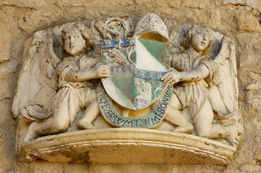
In modern applications, this element is frequently rendered flat, but its symbolic weight remains unchanged.
Charges are the individual symbols placed within the shield itself.
These might include animals, botanical forms, tools, or geometric devices, each chosen for a specific and documented meaning.
A stag may reference endurance, an oak may reference strength sustained across generations, and a ship may reference a family’s maritime or mercantile history.
Tincture, the formal term for color within heraldry, is never chosen for visual appeal alone.
Gold traditionally signifies generosity, silver signifies peace, and deep blue often signifies loyalty and truth.
A motto, when included, sits on a scroll beneath or above the shield and distills the family’s guiding principle into a single phrase.
The best mottoes are brief enough to be remembered after a single reading.
Supporters, the figures occasionally placed on either side of the shield, are reserved for the most elevated commissions and are used sparingly by this atelier.
Every element within a finished crest must justify its presence.
A crowded shield dilutes meaning just as a cluttered room dilutes taste.
The discipline lies in choosing fewer symbols and trusting each one to carry more weight.
This same principle governs how the shield’s overall composition is balanced, since asymmetry within heraldic design is rarely accidental.
A single dominant charge, placed with intention, communicates more confidence than several smaller charges competing for the same space.
The proportions of the shield itself matter as much as what sits within it.
A shield stretched too tall or too wide begins to feel unstable, regardless of how carefully its contents were chosen.
Classical heraldic proportion has endured for centuries precisely because it produces a shape the eye reads as settled and complete.
The Shield
The foundational field that holds every other symbol in disciplined order.
The Charges
The specific figures chosen to represent lineage, values, or history.
The Tincture
The formal color palette, each hue carrying a documented meaning.
The Motto
A brief phrase distilling the family’s guiding principle into words.
THE ART OF MONOGRAMS
The Motto: A Family’s Words in Miniature
A motto is the smallest element of a family crest and often the most personal.
Where the shield speaks through imagery, the motto speaks through language, and that shift matters.
A family choosing its own words is making a more exposed decision than choosing a symbol from an established heraldic vocabulary.
There is nowhere to hide behind tradition when the phrase is entirely the family’s own.
Historically, mottoes were often written in Latin, a language chosen for its permanence rather than its familiarity.
Latin does not shift in meaning the way living languages inevitably do across centuries.
A phrase that reads clearly today will read just as clearly to a descendant three generations from now.
This is precisely why so many enduring institutions, from universities to noble houses, have retained Latin mottoes long after Latin itself ceased to be spoken.
Not every family chooses Latin, and there is no requirement to do so.
Some prefer a phrase in their ancestral language, particularly when that language carries specific emotional or historical resonance for the family.
Others prefer English, valued precisely because it is the language their descendants will actually read without translation.
What matters more than the language is the discipline of the phrase itself.
A motto should be brief enough to be remembered after a single reading, ideally no longer than a short sentence.
It should also avoid describing what the family does for a living, since professions change across generations while values tend to persist.
A motto built around perseverance, integrity, or stewardship will remain relevant regardless of what any individual family member goes on to do.
The best mottoes function almost like a compass rather than a mission statement.
They do not describe a destination so much as a direction the family intends to keep facing.
Choosing the right words often takes longer than choosing the shield’s visual elements, precisely because language leaves so little room for ambiguity.
A single ill-chosen word can undercut decades of careful visual design.
This is why the motto is developed in close conversation with the family, refined across multiple drafts until it feels inevitable rather than composed.
Some families test a candidate motto by imagining it read aloud at a future wedding or graduation, decades removed from the present.
If the phrase still feels dignified in that imagined future, it has likely earned its place.
If it feels tied too closely to a current trend or turn of phrase, it is usually set aside in favor of something plainer and more lasting.
Plainness, in this context, is not a compromise.
It is often the clearest sign that a motto has been chosen correctly.
A crest can be admired without being understood. A motto, once read, cannot be unread.
LEGACY & FAMILY HERITAGE
Family Crests Across Generations
A family crest is unusual among design commissions in that its value increases with time rather than depreciating.
A logo may need to be refreshed within a decade to remain relevant to a shifting market.
A family crest, by contrast, becomes more meaningful the longer it remains unchanged.
Each generation that uses the mark adds to its accumulated significance without altering its form.
This is why the commissioning process treats the crest as a permanent artifact rather than a seasonal design choice.
A grandmother’s signet ring, a father’s cufflinks, and a daughter’s wedding stationery can all carry the identical mark without ever feeling dated.
That continuity is the entire point.
Few possessions a family owns are capable of this kind of quiet accumulation.
A house can be sold, a fortune can shift with the market, but a crest, properly maintained, does not depreciate in the same way.
Its value is entirely symbolic, which paradoxically makes it more durable than almost anything with measurable financial worth.
First Commission
The founding generation formalizes the family’s identity into a single considered mark.
Private Use
The crest appears quietly on stationery, signet rings, and correspondence within the household.
Celebratory Occasions
Weddings and christenings introduce the mark to a wider circle of family and friends.
Generational Transfer
Children inherit the mark, often adding a personal cipher alongside it without replacing it.
Institutional Presence
Some families place the crest within a study, library, or family office as a permanent fixture.
A crest is not designed for the person who commissions it. It is designed for the grandchildren who will one day inherit it.
LEGACY & FAMILY HERITAGE
A Regional Habit of Memory
Boston has always been a city attentive to lineage.
The old families of Beacon Hill and Louisburg Square built their houses to last centuries, not decades, and their habits of identity reflect the same instinct.
Names carried through Harvard’s oldest societies, through Brahmin family offices on State Street, and through the boardrooms of institutions founded well before the Civil War, share a common thread.
They understood identity as something to be protected rather than reinvented each season.
This same philosophy extends naturally to the family crest.
A Boston family with roots in shipping, banking, or philanthropy often possesses an oral history rich enough to translate directly into heraldic symbolism.
A vessel might commemorate a merchant ancestor who built the family’s early fortune along the Atlantic trade routes.
An open book might commemorate generations of service on the boards of the city’s academic and cultural institutions.
These are not abstractions invented for the sake of design.
They are documented histories waiting for a disciplined visual form.
In a recent heritage crest commission, a family with three generations of maritime commerce chose a shield built around a single ship charge, rendered with enough restraint to belong equally on a library door and a wedding invitation.
The result reads as inevitable rather than decorative, which is the highest compliment a crest can receive.
Families outside New England often ask whether a crest requires centuries of documented lineage to be legitimate.
It does not.
What it requires is honesty about the values a family wishes to carry forward, regardless of how long that family has existed.
A family only two generations old can commission a crest with just as much integrity as one tracing its history back centuries.
What matters is that the symbols chosen reflect something true, not how far back the documentation extends.
Newer Boston families, including many who arrived through academic, medical, or technology careers rather than inherited wealth, have commissioned crests for exactly this reason.
They are not borrowing someone else’s history.
They are formalizing the beginning of their own.
A crest commissioned by a founding generation carries a different kind of significance than one inherited passively.
It marks a deliberate decision to treat the family’s own story as worth preserving, rather than waiting for some future generation to decide that on their behalf.
This is, in many ways, the most forward-looking reason to commission a crest at all.
It does not require a family to have already achieved permanence.
It only requires the intention to build toward it, one careful decision at a time.
THE ART OF MONOGRAMS
Symbolism and Meaning within the Charges
Every charge placed within a family crest is chosen deliberately, never decoratively.
A family devoted to philanthropy might favor an open hand or a laurel branch, both traditional signals of generosity and honor.
A family with a history in medicine or law might favor a serpent entwined around a staff, a mark with roots stretching back to classical antiquity.
A family shaped by long voyages, whether commercial or personal, often gravitates toward a compass rose or an anchor.
These choices are never made in isolation from the family’s actual history.
The design process begins with extensive conversation, not with a catalogue of pre-made symbols to select from.
A crest built from a template will always read as generic, regardless of how elegantly it is rendered.

A crest built from a family’s documented history will read as authentic even to someone encountering it for the first time.
Color carries equal weight within this symbolic system.
A deep Oxford blue often signals intellectual or academic distinction, a tone particularly resonant for families with strong university ties.
A muted forest green can signal a connection to land, agriculture, or long stewardship of a particular property.
Gold, used sparingly, remains the most formal tincture available and should never be overused within a single design.
This is a discipline shared with royal heraldic tradition, where restraint has always signaled higher rank than excess.
The ceremonial role a royal house occupies in national life illustrates this principle well: the most enduring institutions rarely rely on visual abundance to communicate authority.
They rely on consistency, repetition, and careful restraint sustained over a very long period of time.
A family crest, designed correctly, borrows exactly that same discipline.
This is also why the atelier resists requests to include too many charges within a single shield.
A family may have several stories worth telling, but a crest can only hold a small number of symbols before it loses legibility.
The discipline of choosing which story matters most is often the hardest part of the entire process.
It requires a family to prioritize, which is rarely a comfortable exercise but almost always a clarifying one.
Families sometimes resolve this by reserving secondary stories for a companion element, such as a motto or a supporting motif used only in select applications.
This allows the primary shield to remain uncluttered while still preserving the fuller story elsewhere.
It is a practical solution to a problem nearly every family with a long history eventually encounters.
There is simply more to say than a single shield can hold, and accepting that limitation gracefully is part of the design discipline itself.
The finished mark becomes a visual record of the values a family intends to preserve, long after the original conversations that shaped it are forgotten.
DOCUMENTED, NOT DECORATIVE
Every charge traces back to a specific family history rather than a generic symbol library.
COLOR AS LANGUAGE
Each tincture carries formal meaning and is never chosen for aesthetic preference alone.
RESTRAINT AS AUTHORITY
The most distinguished crests use fewer elements, not more, to project lasting confidence.
LUXURY IDENTITY
The Family Crest in the Modern Home
A family crest is not confined to the formal register of a coat of arms hung above a mantel.
Its most meaningful applications today are often the quietest ones.
A crest engraved discreetly into the inside of a wedding band carries the same authority as one carved into stone.
A crest embossed on the endpapers of a family library speaks to generations who may never see the original commission documents.
Stationery remains one of the most enduring uses of a family crest, particularly for correspondence intended to carry weight.
A letter closed with a wax seal bearing the family mark communicates formality that no printed letterhead can replicate.
Interior design has also embraced the family crest as a quiet architectural gesture.
A study door, a library ceiling medallion, or a fireplace surround can all incorporate the mark without overwhelming the room.
The principle guiding every application is the same one that governs the crest’s original design.
It should never demand attention.
It should reward the attention of someone who already understands its significance.
This is precisely why a family crest suits homes built with restraint, whether a Federal-style townhouse on Beacon Hill or a contemporary residence along the North Shore.
The mark adapts to its setting without ever compromising its essential form.
Some families choose to reserve their crest exclusively for private use, never displaying it anywhere a visitor might see it.
Others incorporate it more visibly, treating it as a quiet point of pride within a shared family space.
Neither approach is more correct than the other.
What matters is that the family’s use of the mark reflects genuine intention rather than performance for an outside audience.
A crest displayed purely to impress visitors tends to feel hollow, regardless of how well it was originally designed.
A crest used quietly, in the way a family actually lives, tends to feel entirely natural within a decade of its creation.
This is ultimately a question each family answers for itself, shaped by temperament rather than any fixed rule the atelier imposes.
The design itself remains equally strong under either approach, since its integrity does not depend on how visibly it is displayed.
PERSONAL OBJECTS
Signet rings, cufflinks, and wax seals remain the most intimate applications of a family mark.
DOMESTIC ARCHITECTURE
Study doors, library ceilings, and fireplace surrounds offer permanent architectural placement.
CORRESPONDENCE
Stationery and wax seals restore a formality that digital communication has largely erased.
THE ATELIER JOURNAL
Commissioning a Family Crest
Designing a family crest begins with listening rather than sketching.
The earliest conversations focus entirely on the family’s documented history, values, and aspirations for future generations.
Only after that history is fully understood does symbolic research begin in earnest.
This stage draws on historical heraldic reference to ensure that every proposed charge, tincture, and composition has genuine precedent.
Nothing is invented arbitrarily, and nothing is borrowed carelessly from an existing family’s registered arms.
A period of refinement follows, during which early concepts are narrowed toward a single disciplined direction.
This is typically the longest phase of the process, since restraint requires far more judgment than addition.
The final crest is delivered in a form suited to every application a family is likely to need, from engraving to stationery to architectural use.
The process concludes not with a single file, but with a complete visual language a family can rely on indefinitely.
Throughout the process, the family remains closely involved, reviewing concepts at each stage rather than receiving a single finished design without context.
This collaborative approach ensures the final crest reflects the family’s own judgment, not simply the designer’s aesthetic preference.
A crest imposed on a family, however skillfully rendered, rarely earns the same lasting attachment as one shaped through genuine dialogue.
The timeline for a full commission typically extends across several weeks, allowing adequate time for research, refinement, and careful reconsideration.
Rushing this process tends to produce crests that feel clever in the moment but lack the deeper resonance that comes from patient development.
Families are encouraged to think of the commissioning timeline the same way they would think of a significant piece of furniture built to last generations.
No one expects an heirloom desk to be finished in a single week, and a family crest deserves the same expectation of care.
1. Discovery
Extended conversation to understand family history, values, and long-term intentions.
2. Symbolic Research
Identification of charges, tinctures, and forms with genuine historical precedent.
3. Concept Refinement
Careful narrowing toward a single composition, favoring restraint over addition.
4. Formal Delivery
A complete crest prepared for engraving, stationery, and architectural application.
THE ART OF MONOGRAMS
Crest, Monogram, or Cipher: Choosing the Right Mark
Families new to bespoke identity design often ask which form suits them best.
A family crest, a personal monogram, and a decorative cipher each serve a distinct purpose, and confusing them can weaken the final result.
A monogram is typically built from initials and speaks to an individual or a married couple.
A cipher is a more ornamental interlacing of letters, often chosen for its visual elegance rather than its symbolic depth.
A family crest, by contrast, is built from pictorial charges rather than letterforms and is designed to represent an entire lineage rather than a single person.
Many families ultimately commission more than one mark, using each for its intended purpose rather than asking a single design to do everything.
A couple might commission a wedding monogram commission for their wedding stationery while separately planning a family crest for the next generation.
Another family, in another wedding monogram commission, chose an interlaced cipher for the wedding itself and reserved the more formal crest for their household correspondence.
The distinction matters because each form carries different expectations about permanence and audience.
A cipher can be playful in a way a crest never should be, since a cipher’s lifespan is often tied to a single event rather than a full lineage.
A monogram sits somewhere between the two, personal enough for daily use but formal enough to outlast a single celebration.
Understanding these distinctions before beginning a commission prevents a family from asking one mark to accomplish work better suited to another.
| Mark | Represents | Typical Use |
|---|---|---|
| Family Crest | An entire lineage across generations | Stationery, architecture, heirlooms |
| Personal Monogram | An individual or a married couple | Linens, luggage, personal accessories |
| Decorative Cipher | Ornamental interlacing of initials | Wedding stationery, event design |