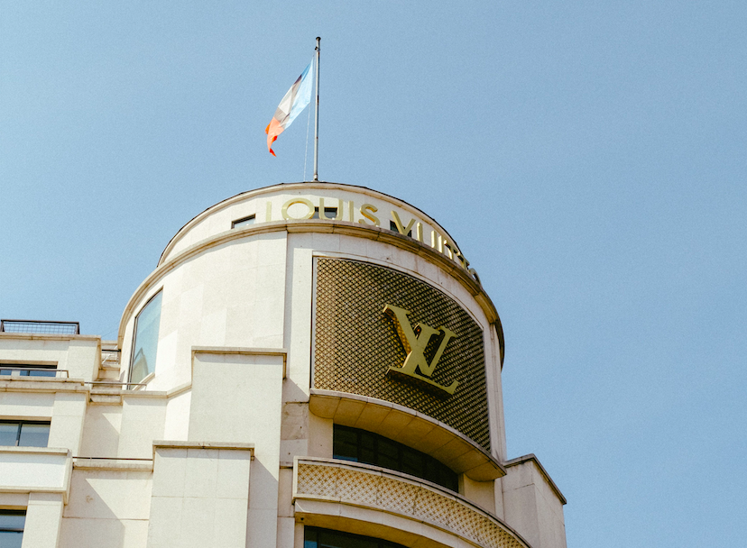
Brand Monogram: The Quiet Architecture of Distinction

The Atelier Journal
Brand Monogram: The Quiet Architecture of Distinction
A brand monogram is rarely the loudest mark in a room, yet it is often the one remembered longest.
Long before logos became commonplace, the most enduring marks of distinction belonged not to companies, but to individuals.
What began as a private signature gradually became a public language, one capable of speaking on behalf of an entire enterprise.
This essay considers what a brand monogram truly represents, and why so many discerning families and institutions continue to commission one.
It is an exploration of restraint, symbolism, and the particular kind of permanence that only a carefully considered mark can offer.
Brand Monogram as a Language of Distinction
A brand monogram is not merely an arrangement of letters.
It is a compression of history, intention, and identity into a single, enduring form.
In the finest examples, a brand monogram communicates before a single word is spoken.
It suggests permanence rather than promotion.
It implies discretion rather than declaration.
This is precisely why the most respected institutions in the world still rely on interlocking initials rather than elaborate insignia.
Restraint, when properly executed, communicates far more authority than embellishment ever could.
A mark that tries too hard to impress often accomplishes the opposite of its intention.
Observers instinctively sense when a symbol is reaching for significance rather than possessing it naturally.
A Point of Distinction
The most enduring brand monogram is often the simplest one, refined until nothing remains to remove.
Consider the great houses of Europe, whose monograms have outlived empires, wars, and generations of leadership.
Their initials were never designed to trend.
They were designed to remain legible across centuries, unaffected by the fashions of any single decade.
A well-considered brand monogram behaves the same way today.
It does not chase the visual language of the moment.
It sets a visual language of its own, and waits for the moment to catch up.
This is the essential difference between a symbol built for a season and a symbol built for a legacy.
At GUSTAVO ATHAYDE, every commission begins with this distinction firmly in mind.
I approach each brand monogram as an heirloom in waiting, rather than a temporary graphic solution.
The process is deliberate, the pace unhurried, and the outcome intended to be carried forward for decades.
Clients arrive with a name, a family, or an enterprise they wish to honor with permanence.
They leave with a symbol capable of representing that name long after the original conversation has been forgotten.
This philosophy shapes every stage of the process, from the earliest sketch to the final approved artwork.
Nothing is left to chance, and nothing is finalized without careful, unhurried consideration.
Some clients arrive already certain of what they want to communicate.
Others arrive only with a sense that their current visual identity no longer matches the seriousness of their work.
Both situations call for the same careful process, beginning with genuine conversation rather than immediate execution.
A brand monogram cannot be rushed into existence without revealing that haste later, often at the exact moment permanence matters most.
“The finest symbols are rarely created to follow trends. They are created to outlive them.”
To understand why a brand monogram carries such weight, it helps to examine where the practice began.
The Historical Roots of the Brand Monogram
The practice of condensing identity into interlocking letters predates modern commerce by many centuries.
Ancient artisans marked their finest work with a personal cipher, a private mark of authorship and accountability.
Medieval guilds later formalized this practice, requiring craftsmen to stamp their goods with a distinguishing symbol.
These early ciphers were not decorative afterthoughts.
They were declarations of responsibility, quality, and lineage.
By the time European nobility adopted the practice, the monogram had already matured into a serious visual discipline.
A collection dedicated to decorative arts in Paris preserves numerous examples of monogrammed linens, silver, and correspondence from this period.
Examining these artifacts reveals how much thought was once given to something as small as a single initial.
Every stitch, every engraving, and every embossed seal followed a set of proportions that had been carefully agreed upon in advance.
Antiquity
Artisans mark ceramics and metalwork with personal ciphers, establishing the earliest precedent for symbolic authorship.
Medieval Period
Guilds require craftsmen to identify finished work with a distinguishing mark, tying identity to reputation.
Renaissance Courts
Noble households commission monograms for textiles, silver, and architecture, elevating the initial into a household emblem.
Nineteenth Century
Trading houses and early luxury ateliers begin applying personal monograms to goods intended for export and trade.
Twentieth Century
The personal monogram evolves into the modern brand monogram, adopted by fashion houses and family enterprises alike.
Present Day
The brand monogram endures as a mark of permanence within a visual culture defined by constant change.
What is striking about this history is its consistency.
Across centuries and continents, the impulse remains the same.
Reduce identity to its essential form, and entrust that form to represent everything behind it.
Historical Note
Long before the term branding existed, families and craftsmen were already practicing its most disciplined form.
A brand monogram inherits this discipline whether its owner is aware of the lineage or not.
Every interlocking letterform carries an echo of the guild stamp, the household seal, and the artisan’s private cipher.
This is what separates a considered monogram from an arbitrary arrangement of type.
One is designed with awareness of its ancestry.
The other is designed without any awareness at all.
My own commissions are researched with this ancestry in mind, drawing on documented precedent rather than passing preference.
A collection housed within one of the world’s most visited art museums offers extensive documentation of costume and textile monograms across several centuries.
Studying these records informs decisions that a purely modern design process would likely overlook.
It is one thing to design a monogram in isolation, and quite another to design one aware of everything that came before it.
There is a particular humility required in this kind of research.
A designer must accept that the finest solutions were often discovered generations ago, and that originality lies in careful adaptation rather than wholesale invention.
This is not a limitation on creativity.
It is, in fact, the opposite.
Working within a long and disciplined tradition forces a kind of rigor that unconstrained invention rarely achieves on its own.
A brand monogram created without reference to this history often feels thin, however pleasant it may appear at first glance.
A brand monogram created with full awareness of its lineage tends to feel inevitable, as though it had simply been waiting to be discovered.
Brand Monogram in Royal and Noble Tradition
No institution has practiced the discipline of the monogram with more rigor than the royal houses of Europe.
Royal cyphers were governed by strict rules of proportion, placement, and hierarchy.
Every curve of a royal monogram was scrutinized, refined, and formally approved before it could be applied to a single document.
This level of care was never accidental.
A royal cypher represented an entire nation, not merely an individual.
It appeared on state correspondence, ceremonial silver, and the facades of institutions built to outlast any single reign.
The modern brand monogram inherits this same responsibility, even within a commercial rather than a monarchical context.
An enterprise built for generational continuity requires a mark capable of carrying that same institutional weight.
A Principle Borrowed From Royalty
A monogram intended to represent generations must be approved with the same rigor once reserved for a royal cypher.
Heraldic authorities maintained meticulous archives of family arms, ensuring that no two households claimed an identical emblem.
This principle of distinctiveness remains central to my own practice today.
A brand monogram must never risk confusion with another mark, regardless of how distant the resemblance may initially appear.
Uniqueness was never a stylistic preference within heraldic tradition.
It was a functional requirement, essential to preserving the integrity of lineage and reputation.
The same requirement governs a well-made brand monogram in the present day.
Clients seeking to explore this tradition further are welcome to browse a curated selection of completed commissions within the atelier’s portfolio.
A tour through some of the world’s most celebrated museums reveals how much discipline was once applied to something most visitors today would overlook entirely.
A monogram was never permitted to be casual within these institutions.
It was treated as a formal instrument of representation, subject to the same scrutiny as a coat of arms.
This inherited seriousness is what continues to separate a considered brand monogram from a hastily assembled logo.
Even the smallest royal cypher was cross-referenced against existing archives before it could be formally adopted.
This same cross-referencing occurs quietly behind every commission undertaken within this atelier.
Before a single concept is presented to a client, I research the visual landscape surrounding their industry, family history, and geographic context.
This research protects against unintentional resemblance, and it also deepens the eventual symbolism of the finished mark.
A monogram informed by genuine research carries a different quality than one produced through guesswork alone.
Observers may not consciously notice this difference, yet they tend to sense it nonetheless.
Noble households understood this instinctively, which is precisely why heraldic commissions were never rushed.
A family crest represented centuries of reputation, and its design was treated with the seriousness that reputation deserved.
A brand monogram, though built for a different era, deserves that same seriousness of process.
Brand Monogram and the Architecture of Trust
Trust is rarely built through volume.
It is built through consistency, restraint, and the quiet repetition of a single, well-considered symbol.
A brand monogram functions as a promise made visible.
Every time it appears, it reaffirms a standard the enterprise has committed to uphold.
This is why the finest institutions resist the temptation to redesign their monogram with each passing season.
A mark that changes too frequently forfeits the very permanence that gives it authority.
100+
Years some royal cyphers have remained unaltered across successive generations.
1
Symbol capable of representing an entire family, enterprise, or celebration with quiet authority.
3
Generations a well-considered brand monogram is designed to comfortably outlast.
Permanence is not achieved through inflexibility.
It is achieved through a design so carefully considered at the outset that revision is rarely necessary.
This is the ambition I bring to every commission, regardless of the industry it will ultimately represent.
On Permanence
A brand monogram should require explanation as rarely as possible, and recognition as immediately as possible.
Clients often ask how long a brand monogram should be expected to last before requiring revision.
My answer is always the same.
If constructed with sufficient discipline at the outset, it should not require revision at all.
Trust, once established through a consistent symbol, becomes an asset that compounds quietly over time.
It cannot be purchased outright, and it cannot be manufactured through repetition alone.
It is earned gradually, through years of a single mark behaving exactly as it promised it would.
The Anatomy of a Considered Brand Monogram
Every brand monogram is built from a small set of decisions, each carrying disproportionate weight.
Letterform, proportion, negative space, and balance must each be resolved with equal care.
A single misjudged curve can undermine years of careful reputation building.
Letterform
The chosen initials must feel inevitable together, as though no other arrangement could ever have existed.
Proportion
Every stroke must relate harmoniously to the next, preserving legibility at both a signet ring’s scale and a facade’s.
Negative Space
The space between letters often carries as much meaning as the letters themselves.
Balance
A monogram must feel stable when viewed quickly and rewarding when studied closely.
These elements cannot be resolved through templates or automated generation.
They require an eye trained in calligraphy, classical proportion, and the specific discipline of heraldic design.
My own background in classical architecture and calligraphy informs how I approach each of these decisions.
A monogram, much like a building, must be structurally sound before it can be considered beautiful.
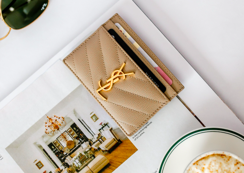
A Design Principle
A brand monogram should reveal new detail on the tenth viewing without losing clarity on the first.
Minimalist design has taught the industry to value restraint, but restraint without structure is simply emptiness.
A true brand monogram achieves simplicity through discipline, never through omission.
This distinction is often invisible to the untrained eye, yet it is the difference between a mark that endures and one that fades quietly from memory.
A monogram built on discipline rewards close inspection, while a monogram built on omission simply feels incomplete.
There is also a temporal dimension to these decisions that many clients do not initially consider.
A brand monogram must anticipate materials and applications that may not yet exist at the time of its creation.
A design finalized today may eventually appear engraved in metal, embossed on leather, or rendered in a digital format not yet invented.
Anticipating this range of application requires a certain humility about what cannot yet be known, paired with enough structural discipline to remain legible regardless of the medium.
Brand Monogram and the Discipline of Heraldic Craft
Heraldry developed its own strict grammar long before typography existed as a formal discipline.
Every division of a shield followed rules governing balance, hierarchy, and legibility from a distance.
A brand monogram borrows heavily from this grammar, even when its owner is unaware of the borrowing.
Consider the requirement that a coat of arms remain identifiable from across a battlefield.
This same requirement quietly governs a brand monogram intended to appear on packaging, signage, or a building facade at a distance.
Legibility at scale is not a modern concern invented by contemporary designers.
It is an ancient concern, inherited directly from heraldic tradition.
Heraldic authorities also insisted on a strict economy of form.
A shield crowded with too many elements became difficult to read and easy to forget.
The same principle applies directly to a brand monogram.
Every additional flourish must justify its presence, or it should be removed entirely.
This discipline of subtraction is, in many respects, more difficult than the discipline of addition.
It requires the confidence to leave a form incomplete until it is genuinely finished, rather than filling space simply because space remains available.
My training in classical architecture reinforces this same instinct.
A well-proportioned facade rarely announces its structural logic through ornament.
It reveals that logic through proportion alone, in the quiet relationship between column, span, and height.
A brand monogram succeeds through the same quiet relationship between letterform, space, and weight.
Clients occasionally arrive requesting more complexity than a monogram can comfortably support.
Part of my role, respectfully, is to explain why restraint will ultimately serve their legacy more faithfully than elaboration.
This conversation is rarely difficult, once the underlying heraldic logic is explained clearly and patiently.
Most clients arrive already sensing that less will serve them better, and simply need confirmation that their instinct is correct.
There is a further heraldic principle worth noting, that of differencing.
Heraldic differencing allowed related family branches to display marks that were clearly connected, yet unmistakably distinct from one another.
A younger son’s arms might echo his father’s, while introducing a small, deliberate variation to establish his own standing.
This principle proves remarkably useful for enterprises expanding across multiple divisions or family branches.
A brand monogram for a parent company can be thoughtfully differenced for subsidiary ventures, preserving a clear family resemblance while allowing each branch its own identity.
This is a far more elegant solution than starting from nothing with every new venture, and it honors the same disciplined logic heraldry perfected centuries ago.
Brand Monogram Within the World’s Luxury Houses
The most respected luxury houses in the world understand something many younger enterprises have yet to learn.
A logo can be replaced.
A brand monogram, properly built, rarely needs to be.
This distinction explains why so many storied maisons still rely on interlocking initials established generations ago.
Their founders were not merely naming a company.
They were establishing a visual inheritance intended for descendants they would never personally meet.
| Consideration | Generic Logo | Brand Monogram |
|---|---|---|
| Design Lifespan | Revised within a few seasons | Built to remain unchanged across generations |
| Primary Language | Trend and market positioning | Heritage, symbolism, and personal history |
| Emotional Register | Recognition through repetition | Recognition through meaning and craftsmanship |
| Ideal Application | Digital-first commercial identity | Heirlooms, ceremonial objects, and enduring institutions |
A fashion museum within a respected design institute in New York preserves numerous examples of monogrammed garments that have outlived their original wearers by more than a century.
These artifacts demonstrate that a well-made monogram does not merely survive its era.
It becomes a document of that era, studied by those who follow.
An enterprise that treats its monogram as disposable will never inspire the loyalty reserved for one that treats it as sacred.
Luxury identity is rarely built through aggressive visibility.
It is built through the quiet confidence of a mark that never needs to raise its voice.
A brand monogram, when correctly designed, achieves exactly this effect.
It does not compete for attention.
It simply waits to be recognized by those who already understand its significance.
Many of the houses most admired for their restraint began with founders who understood this principle instinctively, long before it had a name.
Craftsmanship Behind Every Brand Monogram
Craftsmanship is not a marketing term within this atelier.
It is a working discipline, applied with the same seriousness a master calligrapher brings to a single letterform.
Each brand monogram begins not with software, but with research.
I study the client’s history, industry, and personal narrative before a single sketch is attempted.
Only once this foundation is understood does the visual exploration begin.
01
A private consultation to understand history, values, and intended application.
02
Research into typographic, heraldic, and cultural precedent relevant to the client.
03
Hand-refined concept development, exploring proportion and letterform balance.
04
Formal presentation and collaborative refinement toward a final form.
05
Delivery of the completed brand monogram across all intended applications.
Nothing in this process is automated.
Every curve is drawn, reviewed, and adjusted by hand before it is ever finalized digitally.
On Craftsmanship
A brand monogram assembled from stock letterforms will always read as assembled, regardless of how it is described.
This is a fully digital creative process, allowing me to collaborate with clients regardless of their location.
Physical delivery of final artwork remains available when a client’s application calls for it, such as engraving, embossing, or ceremonial presentation.
Whether the final application is digital or physical, the underlying discipline remains identical.
A brand monogram must perform equally well at the scale of a business card and the scale of a building facade.
This requirement alone eliminates most shortcuts before they can even be considered.
Software can execute a design, but it cannot originate the judgment behind it.
That judgment comes from years spent studying proportion, observing how light falls across an engraved surface, and understanding how a mark will age over decades of use.
A brand monogram produced without this judgment may look acceptable on a screen, yet fail the moment it is engraved, embossed, or enlarged beyond its original context.
Craftsmanship, in this sense, is not a sentimental value added for marketing purposes.
It is a practical safeguard against a mark that cannot survive contact with the real world it is meant to represent.
I have seen well-intentioned marks fail precisely at this point, appearing crisp on a screen yet losing all coherence once enlarged onto a storefront or reduced onto a cufflink.
Testing a design across this full range of scale, early in the process, prevents this kind of costly discovery later.
Reflections on the Brand Monogram
Every commission leaves a lasting impression on the family or enterprise it represents.
Prospective clients are always welcome to reach out through contact before a single sketch begins, simply to discuss whether a brand monogram is the right direction for their story.
The following reflections were shared by clients who commissioned a brand monogram through this atelier.
“I inherited my grandfather’s initials on his cufflinks, but I never had a mark of my own until this commission gave our family a proper symbol to carry forward.”
A Private Client, Charleston
“Our firm had used the same generic logo for fifteen years. The brand monogram we now carry finally feels worthy of the work our attorneys do every day.”
Founding Partner, Regional Law Practice
“As a physician building an independent practice, I wanted something dignified rather than trendy. What I received was closer to a family crest than a typical medical logo.”
Independent Practitioner, New England
“Our export business has operated for three generations, yet we had never formalized a proper emblem. This atelier gave our family’s work a symbol equal to its history.”
Family-Owned Trading Enterprise
These reflections share a common thread.
Each client arrived seeking a symbol, and left with something closer to an heirloom.
None of them mentioned wanting something fashionable.
Each of them wanted something lasting, and that distinction shaped every decision made on their behalf.
Brand Monogram in Contemporary Luxury Identity
Contemporary luxury has grown increasingly cautious of excess.
The most admired brands today favor restraint, quality of material, and quiet confidence over visible extravagance.
A brand monogram fits naturally within this shift.
It offers presence without noise, and prestige without ornamentation.
Relevance of restrained symbolism among today’s most respected luxury institutions, according to recent design commentary.
Exhibitions devoted to craftsmanship and decorative arts have repeatedly highlighted this return to disciplined simplicity.
Visitors to such exhibitions often note how contemporary luxury increasingly resembles the restraint once reserved for royal households.
A Contemporary Observation
Today’s most respected identities are often the quietest ones in the room.
This is not a passing aesthetic preference.
It reflects a broader cultural fatigue with visual noise, and a renewed appreciation for symbols that reward attention rather than demand it.
A brand monogram, built with sufficient discipline, answers this cultural moment precisely.
It offers a client something increasingly rare, a form of distinction that does not depend on volume to be noticed.
Younger enterprises sometimes worry that restraint will be mistaken for a lack of ambition.
The opposite is typically true.
A confident, well-considered brand monogram signals precisely the kind of ambition that plans to remain relevant for decades, rather than chasing a single fashionable moment.
This is a lesson the oldest and most respected institutions learned generations ago.
It remains just as true for a new enterprise commissioning its first proper monogram today.

The Symbolism Encoded Within a Brand Monogram
Every letter carries meaning long before it is combined with another.
Some letterforms suggest strength through their vertical structure.
Others suggest warmth through their rounded curves.
A brand monogram must consider these subtle associations before a single line is drawn.
This is a discipline closer to heraldry than typography, though it borrows from both traditions.
In heraldic design, every color, shape, and division held specific meaning understood across an entire culture.
A lion suggested courage.
A chevron suggested protection.
A brand monogram operates under a quieter version of this same symbolic language.
A monogram’s meaning is rarely stated outright, yet it is felt by everyone who encounters it.
Consider how differently a monogram feels when its letters interlock closely, as though bound together permanently, compared to one where the letters simply sit side by side.
The first suggests unity and permanence.
The second suggests convenience and coincidence.
For a wedding monogram representing the union of two families, this distinction becomes especially significant.
For a family crest intended to represent generations, it becomes essential.
Every decision within a brand monogram is, in this sense, a quiet argument about what the symbol is meant to say.
My role is to ensure that argument is coherent, intentional, and worthy of the history it represents.
Nothing within a finished commission is left to accident or convenience.
Color, too, plays a quieter role within a brand monogram than it once did within full heraldic achievement, yet it remains far from arbitrary.
A restrained palette of black, gold, and off-white, for instance, communicates permanence and quality without relying on seasonal trends in color theory.
These choices, like every other decision within the mark, are made deliberately and explained clearly to the client before they are finalized.
Brand Monogram for the Modern Family Enterprise
Family-owned enterprises occupy a distinct place within the broader landscape of commerce.
Their reputation is rarely built through advertising alone.
It is built through decades of consistent conduct, often across several generations of leadership.
A brand monogram suits this kind of enterprise particularly well.
It carries the weight of a family name without requiring that name to be spelled out in full on every application.
Entrepreneurs building a distinguished enterprise from the ground up often arrive at this same conclusion independently.
They recognize that a name alone, however respected, benefits from a visual counterpart capable of traveling further and lasting longer.
On Family Enterprise
A family name earns its reputation through conduct, while a brand monogram carries that reputation forward visually.
Philanthropic families in particular often value this quality above all others.
A monogram appearing on a scholarship program, a charitable foundation, or a family archive communicates continuity without requiring further explanation.
Collectors, too, appreciate this same discretion.
A monogram engraved discreetly onto a personal collection speaks to ownership without announcing it loudly to every observer.
This is the quiet power of a brand monogram within a family enterprise.
It communicates precisely enough, to precisely the right audience, without ever requiring translation.
Second and third generation leaders often carry a particular responsibility that founders rarely face in the same way.
They must honor what came before them while still building something that feels genuinely their own.
A brand monogram can carry this responsibility gracefully, incorporating historical reference without becoming a mere replica of the past.
This balance between reverence and renewal is delicate, and it is precisely the kind of challenge this atelier was built to address.
Selecting the Right Brand Monogram for Your Story
No two commissions begin from the same starting point.
A bride planning a once-in-a-lifetime celebration arrives with entirely different considerations than an architect building a professional identity.
Yet the underlying questions remain remarkably consistent across every category of client.
How many initials should the mark contain?
Should the design favor a more classical or a more contemporary sensibility?
Will the mark need to function equally well in a single color as it does in full detail?
These questions are answered individually for every client, never through a fixed template applied uniformly.
A full overview of the considerations involved, along with the range of applications available, can be found among the atelier’s services.
Some clients know precisely what they want before our first conversation begins.
Others arrive with only a feeling they wish to capture, without the language to describe it yet.
Both approaches are equally welcome within this process.
Part of my role is translating an instinct into a defensible design decision, one that can be explained clearly to anyone who later asks why the mark looks exactly as it does.
A brand monogram that cannot be explained is a brand monogram that has not yet been fully resolved.
Every completed commission should be able to answer, with confidence, why each decision was made.
This clarity is what ultimately allows a mark to be trusted, both by its owner and by everyone who later encounters it.
For collectors, architects, physicians, and attorneys alike, the underlying goal remains the same across every industry.
A brand monogram should feel as though it was always meant to represent exactly this person, exactly this family, or exactly this enterprise.
Timing is another consideration clients rarely anticipate before our first conversation.
A brand monogram commissioned in haste, ahead of a launch date or an approaching celebration, often carries the marks of that haste permanently.
I encourage clients to begin the process well ahead of any fixed deadline, allowing sufficient time for research, refinement, and quiet reconsideration.
A mark intended to last for generations deserves more than a compressed timeline dictated by an external event.
This unhurried approach consistently produces stronger, more considered results than any accelerated alternative could achieve.
The Atelier Process Behind a Brand Monogram
Every project undertaken within this atelier follows a deliberately unhurried rhythm.
Speed is rarely the priority when the outcome is meant to last for generations.
I begin by listening closely to a client’s history, values, and intentions for the mark.
From there, research into relevant precedent shapes the earliest concepts.
Only once this foundation feels complete do I begin drawing.
A brand monogram designed too quickly rarely survives scrutiny once the initial excitement fades.
Clients frequently ask to see examples of prior commissions before beginning their own.
I welcome this request, as it allows a client to understand the range of expression possible within a single discipline.
Notes on the creative process, along with broader reflections on symbolism and design philosophy, are shared regularly within the Atelier Journal for those who wish to explore further.
Every finished brand monogram is reviewed against a simple standard before delivery.
Would this symbol still feel appropriate on a piece of correspondence a century from now?
If the answer is uncertain, the work continues.
If the answer is a confident yes, the commission is considered complete.
Brand Monogram Applications Across a Distinguished Life
A well-built brand monogram is rarely confined to a single application.
Its versatility is, in fact, one measure of its success.
A mark confined to a single narrow use was likely never built with sufficient structural discipline in the first place.
True versatility does not mean the mark changes to suit each new context.
It means the mark remains exactly itself, while adapting gracefully to whatever scale or material it encounters.
Correspondence
Letterhead, stationery, and formal invitations carrying quiet authority.
Ceremonial Objects
Engraved silver, signet rings, and heirloom pieces intended to be inherited.
Professional Identity
Firm branding for attorneys, physicians, architects, and independent practices.
Commercial Enterprise
Packaging, signage, and digital presence for family-owned and luxury businesses.
Newborn monograms represent one of the most quietly meaningful applications within this practice.
A symbol created in a child’s earliest days can accompany them through every subsequent chapter of life.
A Personal Note
The families I admire most treat a monogram not as decoration, but as the beginning of a family archive.
Wedding monograms serve a similarly generational purpose, marking the formal union of two family histories into one visual identity.
Anniversary and celebration monograms extend this same principle to milestones worth formally commemorating.
In each case, the underlying philosophy remains unchanged.
A meaningful occasion deserves a mark equal to its significance.
A brand monogram applied thoughtfully across these occasions becomes a kind of quiet thread, connecting one chapter of a family’s story to the next.
Event monograms extend this same principle to gatherings intended to be remembered rather than simply attended.
A charitable gala, a milestone birthday, or a formal retirement each benefit from a mark created specifically for the occasion, rather than a repurposed logo stretched beyond its original intention.
Guests notice this difference, even when they cannot articulate precisely why.
A purpose-built monogram signals that genuine thought was invested in the occasion, long before the first guest arrived.
Why a Brand Monogram Outlives Every Trend
Design trends arrive with confidence and depart with equal speed.
A brand monogram, by contrast, is deliberately built to remain indifferent to either.
This indifference is not a limitation.
It is the entire point.
An enterprise chasing the latest visual fashion will find itself redesigning indefinitely, never quite arriving at permanence.
An enterprise built around a considered brand monogram avoids this cycle entirely.
Its energy is instead directed toward deepening the meaning of a single, stable mark, rather than repeatedly starting over from nothing.
Over time, this compounding consistency becomes a genuine competitive advantage, one that cannot be easily replicated by a competitor still searching for its own identity.
The right brand monogram is not designed for this year’s audience alone, but for every audience that follows.
Trends are, by definition, temporary.
Identity, when properly constructed, is not.
This is the promise a well-made brand monogram is capable of keeping, decade after decade.
It asks for patience during its creation, and repays that patience many times over throughout its lifetime.
The Discretion of a Well-Placed Brand Monogram
Discretion is often mistaken for absence, when in truth it requires more discipline than visibility ever does.
A brand monogram placed with discretion does not disappear.
It simply waits for the right moment to be noticed, rather than insisting on attention at every opportunity.
This quality is especially valuable within professional contexts, where overt branding can undermine the very credibility it hopes to build.
An attorney’s letterhead, a physician’s practice signage, or an architect’s presentation materials all benefit from a mark that reassures rather than announces.
Clients of these professions are rarely persuaded by volume.
They are persuaded by evidence of competence, and a brand monogram contributes to that evidence simply by behaving with appropriate restraint.
The same principle extends to luxury commercial identities more broadly.
A discreet monogram on packaging or signage often communicates confidence more effectively than a prominent one ever could.
It suggests that the enterprise behind it does not need to shout in order to be recognized by those who matter most.
This is, in many respects, the highest compliment a symbol can earn.
Not that it was seen by everyone, but that it was recognized immediately by exactly the right people.
This is a quality that cannot be manufactured through marketing alone.
It must be built into the mark itself, through proportion, restraint, and an understanding of exactly how much presence a symbol truly needs.
Too little presence, and the mark fails to register at all.
Too much, and it begins to compete with the very reputation it was meant to support.
Finding this precise balance is, in many respects, the central task of every commission undertaken within this atelier.
It requires listening carefully to how a client wishes to be perceived, and translating that intention into a form quiet enough to be trusted, yet distinctive enough to be remembered.