
The Luxury Family Emblem: A Mark Made for the Whole House
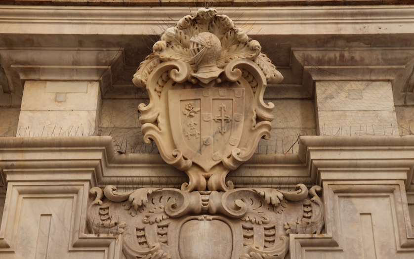
The Luxury Family Emblem: A Mark Made for the Whole House
A surname arrives without ceremony, handed over at birth and rarely examined again.
A luxury family emblem is the examination that surname never received.
It gathers what a household already carries and gives that weight a fixed, visible form.
This publication considers what the undertaking asks of a family, and what it returns.
It also considers where the personal monogram ends and the family emblem begins.
Legacy & Family Heritage
What a Luxury Family Emblem Is, and What It Is Not
Every household already possesses a story that outruns the space a surname provides.
A luxury family emblem exists to give that story a form capable of surviving its first tellers.
It is not a personal monogram enlarged until it seems to cover everyone at the table.
Nor is it a costume borrowed from a lineage no living member of the family could document.
It occupies a considered middle register, built from what is true and drawn with discipline.
The word luxury, used honestly here, describes restraint rather than accumulation.
An emblem crowded with unearned charges is not luxurious; it is merely anxious.
A luxury family emblem says less than a decorated one, and says it with far greater confidence.
On the Word Luxury
Applied to a family mark, luxury describes the discipline to include only what a household’s own history has earned.
That distinction separates a mark built to endure from one built to impress on the day it arrives.
The question I am asked more often than any other concerns scope rather than ornament.
A personal monogram speaks for one bearer, however elegantly its letters have been resolved.
A luxury family emblem speaks for a household across every generation that will carry the name.
That single difference in scope alters nearly every decision made once a commission begins.
A mark intended for one lifetime can afford a certain intimacy in its smaller details.
A mark intended to outlive its commissioner cannot, because it must remain legible to people not yet born.
This is precisely the discipline heraldry perfected centuries before design existed as a profession.
A device had to be understood at a glance, under conditions where hesitation carried real consequence.
A luxury family emblem inherits that requirement even though the stakes today are entirely different.
It borrows the logic of immediate, dignified recognition and directs it toward a household rather than a field.
No family commissioning this work is claiming a formal grant of arms in the legal sense.
Very few actually want one, once the distinction between granted heraldry and private commission is explained plainly.
What most families want is a mark with equivalent gravity, assembled honestly from their own record.
An emblem invented from nothing makes no false claim to a lineage the family does not hold.
It simply borrows the grammar of permanence and points that grammar at a family’s own future.
In this sense every luxury family emblem is new, even when its logic reaches back several centuries.
Families who arrive wanting the fuller heraldic register often begin instead with the atelier’s account of the luxury family crest, which occupies the same territory from a slightly different angle.
The two conversations tend to converge within an hour, and the vocabulary is nearly identical.
What differs is emphasis, and emphasis is something a family should be permitted to choose deliberately.
The Art of Monograms
The Personal Monogram and the Emblem That Outgrows It
Most families arrive at the emblem by way of the personal monogram, and the route is instructive.
A personal monogram is the most economical statement of identity our visual culture has produced.
Two or three letters, resolved into a single form, standing in for an entire person.
It travels beautifully, sits comfortably on a signet or a cuff, and asks nothing of the viewer.
Its limitation is not aesthetic but structural, and the limitation only appears with time.
A personal monogram is built around the initials of one individual, which is exactly its strength.
Those initials do not survive a marriage intact, and they rarely survive a generation at all.
A child inherits a surname reliably and a set of initials almost never.
This is where the classic monogram reaches the edge of what it was designed to do.
A luxury family emblem begins precisely at that edge, and it solves a different problem entirely.
It anchors itself to the house rather than to the individual currently occupying it.
Its central element is chosen so that it remains true of the family after every member has changed.
Where the Monogram Ends
A personal monogram is bound to one set of initials; a family emblem is bound to a house, which is why only one of them survives a generation unaltered.
None of this diminishes the personal monogram, which remains the finer instrument for its own purpose.
A physician’s correspondence, a collector’s bookplate, a traveller’s luggage: these want initials, not lineage.
The two marks are companions rather than competitors, and the strongest households commission both.
A family emblem for the house, a personal monogram for each member who wants one.
When both are drawn by the same hand, they share proportion without ever duplicating one another.
The emblem sets the register; the monogram answers it in a quieter voice.
A well-composed pair can appear on the same sheet of stationery without any sense of crowding.
This coordination is one of the most satisfying problems the atelier is asked to solve.
Three Marks, Compared
| Consideration | Luxury Family Emblem | Personal Monogram | Classic Monogram |
|---|---|---|---|
| Represents | An entire household across generations | One named individual | One bearer, in a traditional letterform |
| Built From | Charge, field, and proportion | Interlaced or stacked initials | Historic typographic convention |
| Survives | Marriage, inheritance, and relocation | One lifetime, usually unchanged | One lifetime, occasionally amended |
| Primary Home | Gates, silver, formal documents, archives | Correspondence, luggage, jewellery | Linen, stationery, engraved objects |
| Chief Risk | Overstating a history the family cannot support | Becoming obsolete after a name change | Reading as period costume if drawn loosely |
| Chief Virtue | Continuity that requires no explanation | Intimacy and immediate personal fit | Proven durability of form |
The comparison above is not a hierarchy, and it should not be read as one.
It is a description of three instruments tuned to three genuinely different tasks.
A family that understands the difference commissions more accurately and revises far less often.
Most disappointment in this field comes from asking one mark to perform the work of another.
Legacy & Family Heritage
Eight Centuries of the Inherited Mark
The family emblem was not invented as a luxury, and everything luxurious about it was earned afterward.
It began as a practical answer to the ordinary problem of being recognised without speaking.
A household needed to mark its property, authenticate its correspondence, and stand behind its word.
The earliest solutions were pressed into wax, carved into lintels, and cut into the face of a ring.
A single device performed the work of a signature in a world where few could read one.
What changed the tradition permanently was the moment these marks became hereditary.
A son bearing his father’s device was no longer describing himself; he was continuing someone.
The mark stopped functioning as a label and began functioning as an obligation.
Labels identify a person, while inheritances quietly commit them to something larger.
This is the moment the family emblem acquired its moral weight, and it has never set that weight down.
Twelfth Century
The Device Becomes Necessary
Households adopt bold, simple devices chosen for recognition rather than beauty.
Legibility at distance governs every early compositional decision.
Thirteenth Century
The Mark Becomes Hereditary
Devices pass from one generation to the next as a visual surname.
Recognition shifts from the individual to the house that stands behind him.
Fourteenth & Fifteenth Centuries
The Grammar Is Codified
Disputes over identical devices force the emergence of formal authorities.
A precise descriptive language allows any device to be rebuilt from words alone.
Sixteenth & Seventeenth Centuries
The Emblem Leaves the Shield
Family devices migrate onto seals, silver, architecture, and the printed bookplate.
Merchant and professional households extend the tradition well beyond the nobility.
Nineteenth Century
The Domestic Fixture
Engraved family marks settle onto stationery, linen, gates, and carriage panels.
The emblem becomes an ordinary feature of considered domestic life.
Present Day
The Commissioned Heirloom
A luxury family emblem is composed deliberately rather than inherited by accident.
Its discipline of hereditary, legible identity is commissioned by households worldwide.
Read the sequence above less as history and more as a demonstration of how patiently a good idea travels.
The battlefield disappeared, the tournament disappeared, and the emblem simply changed surfaces.
That adaptability is the strongest argument anyone can make for the form’s continued relevance.
Surfaces change constantly, while structure, done correctly, changes almost never.
The tradition understood this long before any theory of design existed to state it.
Its makers separated what a mark is from how a mark is rendered, and guarded only the first.
A device could be cut crudely into a barn door or exquisitely into vellum and remain the same device.
This tolerance for imperfect rendering allowed the system to travel across every class and every craft.
A blacksmith, a weaver, and a court painter could each reproduce the same family mark faithfully.
Very few systems of identity since have matched that durability, and none have exceeded it.
On Inheritance
A mark becomes an inheritance the moment it stops describing a person and starts continuing a household.
American families arriving at this tradition often carry a different relationship to it.
Rather than continuing a device across many centuries, most are establishing one for the first time.
The absence of an inherited starting point is not a deficiency; it is an unusual freedom.
A family beginning now chooses every element deliberately rather than accepting what was handed down.
That freedom carries its own responsibility, since deliberate choices are harder to excuse later.
The Art of Monograms
What the Classic Monogram Contributes to the Emblem
The classic monogram is often treated as the emblem’s smaller relative, which understates its influence.
Almost everything an emblem knows about proportion, it learned from the monogram tradition.
Letters were never designed to be merged, and forcing them together demands genuine invention.
Centuries of that invention produced a body of knowledge about balance, weight, and negative space.
A luxury family emblem draws on that knowledge every time a charge is placed beside a letterform.
The atelier’s broader work on the quiet architecture of monograms traces that inheritance in considerably more detail.
Three principles migrate directly from the monogram into the emblem, and none of them are optional.
The first is unity, the requirement that a composition read as one form rather than several.
An emblem assembled from parts that never resolve will always look like an assembly.
The second is hierarchy, the understanding that not every element deserves equal visual weight.
One element must carry the composition while the others offer quiet, deliberate support.
The third is negative space, which is active material rather than whatever the drawing left behind.
The gaps inside an emblem determine whether it breathes or merely fills its allotted area.
There is a moment experienced designers describe as the composition settling into place.
It arrives when a mark stops looking like an arrangement and starts looking inevitable.
The moment cannot be forced, and it rarely appears on the first attempt.
It emerges after several rounds of adjustment, each refining the relationship between elements slightly further.
The harder discipline is recognising the moment and then stopping.
Overworking a composition past that point introduces complexity in the name of improvement.
Restraint, once again, separates the lasting mark from the merely elaborate one.
A classic monogram teaches this lesson at a small scale, where mistakes are cheap and visible.
A luxury family emblem applies the same lesson at a scale where mistakes are expensive and permanent.
This is why the atelier rarely designs an emblem for a family that has never considered a personal mark.
The smaller commission clarifies preferences that the larger commission then depends upon.
A family that has lived with a personal monogram for a year knows things it could not have articulated before.
Royal Traditions
The Discipline the Royal Houses Perfected
No institution applied the family device with more consistency than the royal houses of Europe.
A sovereign’s arms functioned as a visual record of marriage, inheritance, and territory at once.
They appeared on state documents, on regimental colours, and on gates few were permitted to approach.
The royal device was never ornament alone, however elaborate its finished rendering became.
It was an instrument of continuity, recognisable across a kingdom without a word of explanation.
An extraordinary archive of royal residences and their collections documents how proportion, hierarchy, and material were governed at the highest level of craft.
What strikes any careful reader of that material is how rarely excess was used to signal belonging.
Grandeur, in the finest surviving examples, was achieved through proportion rather than accumulation.
The devices found on royal linen, porcelain, and stationery followed strict conventions of scale and placement.
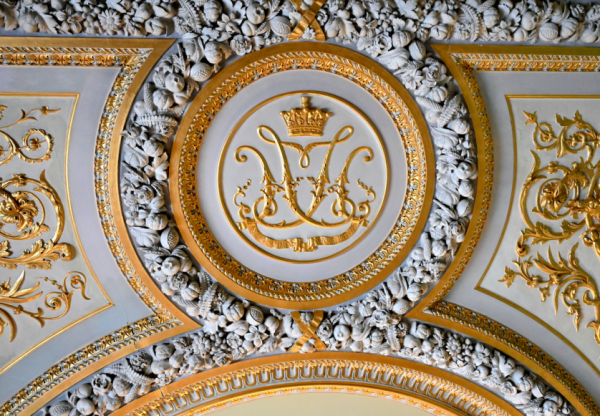
Those conventions were never arbitrary, however decorative they appear to an untrained eye today.
They kept a household’s mark legible and dignified on a ring seal and on a ceremonial gate alike.
The finest family marks were never designed to be impressive. They were designed to be correct.
A luxury family emblem drawing on this tradition inherits more than an aesthetic preference.
It inherits an understanding that a household mark must be built to last rather than merely to please.
Royal households also demonstrated remarkable restraint in their use of colour across an entire reign.
A small, fixed palette, applied consistently, reads as more authoritative than a wide and varied one.
Scarcity of vocabulary is precisely what gave those marks their durability across centuries.
A private family benefits from the same restraint, even without formal rank standing behind it.
Restricting the visual vocabulary of an emblem strengthens it far more often than it limits it.
On Restraint
A small vocabulary used consistently outperforms a large one used freely, which is the single most transferable lesson the royal tradition offers a private household.
There is a further lesson in how deliberately these households managed change to their devices.
An amendment was never undertaken lightly, since it implied a change in what the mark represented.
Officials responsible for these devices worked with a precision modern brand guidelines still aspire to.
Every element, from the weight of a supporting flourish to the angle of a crowning device, followed convention.
This was not bureaucracy for its own sake but an understanding that authority depends on reliability.
A device that shifted unpredictably between applications would have undermined the very authority it carried.
The lesson transfers directly to a private household commissioning its first emblem this year.
Authority accrues through repetition, and repetition requires that the mark stay exactly the same.
The Atelier Journal
The Anatomy of a Luxury Family Emblem
Beneath the surface of any serious family mark lies a set of principles rarely discussed outside the studio.
These are not stylistic preferences but structural requirements for a mark intended to endure.
Each is considered independently before any of them are combined into a single composition.
An emblem that skips one of them tends to fail quietly, over years, rather than immediately.
Field & Division
How the surface is organised before a single charge is placed upon it, and the decision every later choice depends on.
The Charge
The specific symbol chosen to carry the family’s documented history, never selected because it happened to look well.
Tincture
The formal language of colour, governing contrast and hierarchy so that the mark reads at every scale.
Proportion
The relationship between elements, which determines whether a composition feels resolved or merely assembled.
Hierarchy
The decision about which element carries the mark and which elements offer quiet, deliberate support.
Scalability
Whether the emblem performs with equal authority on a signet ring and across a stone gatepost.
A family with a documented history offers more material, though not necessarily an easier problem.
Every additional fact increases the number of decisions that must be individually weighed.
A trained hand recognises which details carry natural authority and which must earn it through proportion.
Some family histories resolve almost effortlessly under the first treatment applied to them.
Others resist every obvious approach, which is a signal to work more slowly rather than to compromise.
None of this discipline is visible in the finished artefact, yet all of it is felt over time.
A mark built without it may look identical to one built with it on the day both are delivered.
The difference reveals itself gradually, which is precisely why the discipline cannot be skipped.
On What Cannot Be Seen
Two emblems can look identical on delivery day and diverge completely a decade later, which is the entire argument for method over instinct.
Families sometimes ask which of these six principles matters most, hoping to shorten the process.
The honest answer is that they are inseparable, and the question usually signals impatience rather than curiosity.
An emblem with a beautiful charge and poor proportion is simply a beautiful charge poorly placed.
An emblem with perfect proportion and a charge chosen at random is elegant and hollow.
Only when all six align does the mark become legible in a single glance.
That immediacy is the quiet signature of a composition that has been properly resolved.
The Atelier Journal
How a Commission Proceeds
The process below has changed very little across the commissions the atelier has undertaken.
Its stability is deliberate, since a process that changes constantly cannot be trusted to produce consistency.
01
Discovery
A private conversation establishes the family’s documented history, its values, and its intention for the mark.
02
Research
Heraldic and typographic precedent relevant to that particular history is studied before anything is drawn.
03
Composition
Early directions explore field, charge, and proportion independently, without committing to any single answer.
04
Refinement
The favoured direction is tested at every scale and material the household is likely to require.
05
Delivery
The completed emblem is prepared for engraving, stationery, textile, architecture, and digital application.