
Wax Seal Design: The Last Ritual of the Letter
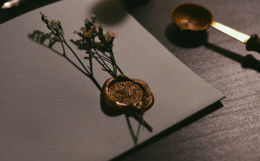
THE ART OF MONOGRAMS
Wax Seal Design: The Enduring Ritual of the Sealed Letter
A meditation on the personal monogram, the classic monogram, and the oldest signature a hand can leave behind.
There are very few gestures left in modern life that cannot be undone.
A message can be recalled, an email can be edited, and a signature on a screen can be erased with a fingertip.
A wax seal cannot.
Once the molten wax receives the die, the impression is permanent, and the letter beneath it is committed.
This is why wax seal design has never truly belonged to the world of decoration.
It belongs instead to the world of intention, where a mark exists to prove that something mattered enough to be closed with ceremony.
Long before logos became commonplace, the most enduring marks of distinction belonged not to companies, but to individuals.
The seal was among the first of those marks, and in many respects it remains the most intimate.
A monogram engraved on stationery can be admired from a polite distance.
A seal must be made, by hand, in the moment, with heat and pressure and a certain unhurried patience.
That small ritual is precisely what discerning correspondents have returned to in recent years.
They are not reviving an antique habit for novelty’s sake.
They are recognizing that a sealed envelope communicates consideration before a single word inside it has been read.
In households where legacy is valued as deeply as accomplishment, the seal has quietly resumed its old position.
It appears on wedding invitations, on letters of consequence, on gifts exchanged at milestones, and on documents a family intends to keep.
At the center of nearly every distinguished example sits the same essential element: a personal monogram, drawn with discipline and engraved in reverse.
This is where the atelier’s work begins.
A seal is only ever as fine as the mark pressed into it, and that mark deserves the same rigor as any classic monogram intended for silver or stone.
What follows is an extended consideration of the wax seal as a design discipline.
It examines the history of the form, the anatomy of a proper die, the grammar inherited from heraldry, and the occasions that still call for sealed correspondence.
It is written for readers who have already sensed that a well-made seal is more than an ornament.
It is written, in other words, for those who intend to leave a mark worth keeping.
Consider it a study in permanence, conducted one impression at a time.
ROYAL TRADITIONS
A History Pressed in Wax
The seal is older than the signature, older than the printed page, and considerably older than the alphabet most of us write in.
Ancient administrators pressed carved stones into wet clay to secure jars, doorways, and correspondence thousands of years before paper reached the West.
The principle was already fully formed: a unique mark, impressed by its rightful owner, proved both origin and integrity.
Rome refined the practice into an instrument of law, where a signet ring carried the full authority of the hand that wore it.
To surrender one’s ring was to surrender one’s power of decision, which is why the gesture appears so often at the turning points of ancient history.
Medieval Europe elevated the seal further still, into the very center of governance.
Kingdoms were bound, charters were granted, and marriages between great houses were confirmed beneath discs of wax bearing carefully guarded matrices.
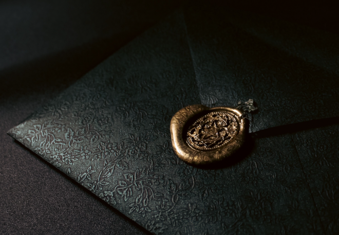
A great seal was considered so consequential that its die was ceremonially destroyed when its authority expired.
Nothing about this was decorative.
The design of the seal was the design of trust itself, rendered in a form that could not be quietly imitated.
By the Renaissance, the seal had migrated from the state to the study.
Merchant princes, scholars, and banking families commissioned personal matrices that condensed an entire reputation into a mark the size of a coin.
The Georgian and Victorian centuries then carried the seal into the private household, where it flourished alongside the golden age of letter writing.
A gentleman’s desk held wax, taper, and seal as naturally as it held ink.
A lady’s correspondence was closed with a monogram she had chosen with the same care as her stationery.
The twentieth century, with its gummed envelopes and its haste, set the ritual aside almost entirely.
The twenty-first, saturated with the instant and the identical, has begun deliberately taking it back up.
The wax seal endures for the same reason the classic monogram endures.
It is anchored to identity rather than to fashion, and identity does not expire on a seasonal schedule.
ANTIQUITY
Carved stones pressed into clay secure the earliest correspondence, establishing the seal as proof of origin.
ROME
The signet ring becomes a legal instrument, carrying the full personal authority of its wearer.
MEDIEVAL EUROPE
Great seals bind kingdoms and charters, their matrices guarded and ceremonially destroyed when retired.
RENAISSANCE
Merchant and banking families adopt personal matrices as marks of private authority and reputation.
GEORGIAN & VICTORIAN ERAS
The seal enters the household desk, flourishing alongside the golden age of the written letter.
PRESENT DAY
The commissioned wax seal returns as a deliberate counterpoint to instant, identical communication.
Seen across this long arc, the modern revival looks less like nostalgia and more like a correction.
A culture that produces so much disposable communication was always going to rediscover the value of a mark that cannot be undone.
THE ART OF MONOGRAMS
The Anatomy of a Wax Seal Design
A finished seal appears effortless, which is precisely the evidence of how much discipline stands behind it.
Every element of a proper wax seal design is decided deliberately, beginning with the die itself.
The die, or matrix, is the engraved face that meets the wax, and it must be cut in mirror image so the impression reads correctly.
This single fact separates seal engraving from nearly every other branch of monogram work.
A designer must compose letterforms that are beautiful in reverse, resolve cleanly under pressure, and remain legible at a diameter rarely larger than an inch.
Within that small circle, hierarchy becomes everything.
The central motif, most often a personal monogram, must command the field without crowding it.
The field itself, the open ground surrounding the letters, is not empty space but active space.
It is what allows the eye to receive the mark in a single glance, the way a face is recognized before a name is spoken.
Around the field sits the border, which may be a plain ring, a fine beaded line, or nothing at all.
The border frames the impression the way a well-cut lapel frames a face, quietly and without announcement.
Depth of engraving is the discipline least visible to the client and most consequential to the result.
A die cut too shallow produces a faint, apologetic impression.
A die cut too deep traps wax, blurs detail, and coarsens the letterforms it was meant to honor.
The correct depth is found the way most correct things are found in this craft, through experience, testing, and restraint.
Scale, likewise, is never an afterthought.
A seal intended for an envelope behaves differently from one intended for a ribbon, a gift box, or the neck of a bottle.
Each application asks the same design to perform under slightly different conditions, and a well-built matrix accounts for all of them before it is ever cut.
What unites these decisions is a single standard.
The impression must look inevitable, as though the letters had always intended to meet inside that circle of wax.
THE DIE
The engraved matrix, cut in mirror image, that gives the impression its authority and its permanence.
THE FIELD
The active open ground around the monogram, allowing the mark to be read in a single glance.
THE BORDER
A plain or beaded ring that frames the composition quietly, without competing with the letters.
THE IMPRESSION
The final meeting of heat, wax, and pressure, where the design either resolves or fails.
ON LEGIBILITY
A seal that cannot be recognized at arm’s length has failed its oldest purpose.
Ornament is always subordinate to clarity, exactly as it was on the matrices of the great houses.
The finest historical impressions remained readable even when the wax itself had worn for a century.
THE ART OF MONOGRAMS
The Personal Monogram at the Center of the Seal
Nearly every seal worth keeping begins with the same question: which letters deserve to live inside it.
A personal monogram is the traditional answer, and it remains the most honest one.
A single initial, or two or three interlaced with care, condenses an identity into a form small enough for wax and durable enough for decades.
The discipline of composing that monogram is explored at length in our study of the initial monogram, and every principle described there applies with even greater force inside a seal.
The seal simply raises the stakes.
On stationery, a monogram enjoys generous space and perfect printing conditions.
In wax, it must survive heat, pressure, and the slight unpredictability of a handmade impression.
This is why letterforms destined for a die are drawn with slightly sturdier strokes than their printed counterparts.
Hairlines that sing on paper can vanish in wax, and a designer who ignores this produces a seal that photographs well and performs poorly.
Letter order follows the same conventions that govern any classic monogram.
A three-letter composition traditionally places the surname initial at the center, larger than its companions, so the family name anchors the mark.
A married couple may interlace two initials as equals, allowing neither letter to dominate the other.
An individual may choose a single initial, which is the oldest and quietest form of the discipline.
None of these choices is made from a catalogue.
Each begins with conversation, because the letters selected must feel essential to the person they represent, not merely available.
Clients are often surprised by how much weight this decision carries once it is taken seriously.
A maiden initial preserved inside a married monogram, or a middle initial honoring a grandparent, changes the meaning of the seal entirely.
The wax records whatever decision was made, faithfully and permanently, which is exactly why the decision deserves patience.
A personal monogram chosen thoughtfully tends to age well regardless of shifts in fashion.
One chosen hastily reveals its haste with every impression it leaves behind.
ON LETTER ORDER
Tradition places the surname initial at the center of a three-letter seal, flanked by the given initials.
Deviating from this convention is permissible, but it should always be a deliberate choice rather than an oversight.
Inside the small circle of a die, hierarchy must be felt instantly or not at all.
ROYAL TRADITIONS
Heraldry and the Authority of the Impressed Mark
No tradition has governed the seal with more rigor than heraldry.
For centuries, the impressed mark was the primary way a coat of arms actually functioned in daily life.
Arms painted on a shield might be seen at a tournament, but arms pressed into wax traveled with every letter, charter, and deed a family issued.
The seal, in other words, was heraldry’s working uniform.
This working role demanded rules, and the rules were taken seriously enough to be administered by formal authority.
The institution long responsible for granting and regulating armorial bearings has maintained those standards for centuries, ensuring that a family’s mark could not simply be assumed by another household that admired it.
That principle of exclusivity remains the quiet foundation of all bespoke seal work today.
A commissioned wax seal design should never closely resemble one already bound to another family’s identity.
Heraldic grammar also supplies the compositional discipline that separates a considered seal from a decorated one.
Balance, hierarchy, symmetry, and the honest use of negative space all descend from armorial convention.
Scholarly societies devoted to the study of this tradition continue to document its rules with remarkable precision, preserving a record of how marks of identity were governed by principle rather than whim.
That record rewards study, because it demonstrates something modern design frequently forgets.
Authority, in the finest historical seals, was achieved through restraint rather than accumulation.
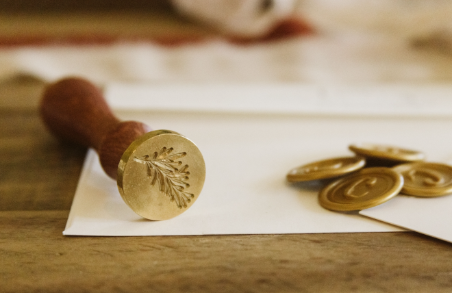
A royal cipher pressed into wax rarely relied on elaborate flourish to communicate importance.
It relied on proportion, on confident spacing, and on the discipline of including nothing that did not belong.
The lesson translates directly to the private commission.
A seal does not become more distinguished by carrying more ornament.
It becomes more distinguished by carrying exactly the right elements, resolved so completely that nothing could be removed without loss.
This is the standard the atelier inherits every time a die is drawn, whether the commission references heraldic history directly or not.
History, approached this way, is not a costume to be borrowed.
It is a set of proven constraints, tested across centuries of wax and metal, that gives a contemporary seal its quiet stability.
The finest symbols are rarely created to follow trends. They are created to outlive them.
THE ART OF MONOGRAMS
The Classic Monogram and the Discipline of the Die
A classic monogram is defined less by its era than by its restraint.
It favors proportion over flourish, permanence over novelty, and letterforms that have already proven their staying power across centuries of engraved silver and printed stationery.
Translating that classicism into a die is its own quiet discipline.
The engraver works in mirror image, which means every judgment about balance must be made twice, once for the matrix and once for the impression it will leave.
Curves that interlace gracefully on paper can collide in reverse, and only careful drafting reveals the difference before metal is cut.
Stroke weight becomes the second great consideration.
Wax is a generous material in some respects and an unforgiving one in others.
It rewards confident, even strokes and punishes delicate hairlines, which soften and disappear under the heat of the pour.
A classic monogram destined for wax is therefore drawn with a measured sturdiness, never heavy, but never fragile.
The third consideration is the relationship between letters and field.
Inside a circle barely an inch across, crowding is the most common failure and the least forgivable one.
The letters must occupy their ground with confidence while leaving enough open wax for the impression to breathe.
This balance cannot be calculated mechanically.
It is adjusted by eye, in fractions of a millimeter, until the composition feels settled rather than arranged.
Different forms of the mark ask different things of the die.
A monogram seal carries interlaced initials and speaks for an individual or a couple.
A crest seal carries pictorial heraldic elements and speaks for a lineage.
A cipher seal carries pure interlaced letterforms, often more architectural in spirit, and suits those who prefer the mark at its most distilled.
Each form is legitimate, and each demands its own compositional judgment.
What they share is the requirement that defines the entire craft.
Whatever enters the circle must be built to be pressed, not merely to be printed.
<td style=”background:#FFFFFF !important;color:#030707 !important;font-family:Georgia,serif
| Seal Form | Carries | Best Suited To |
|---|---|---|
| Monogram Seal | Interlaced personal initials, classically ordered | Individuals and couples marking correspondence and gifts |
| Crest Seal |