
Wedding Logo: An Emblem for a Union
Gustavo Athayde • The Atelier Journal
The Wedding Logo: An Emblem for a Union
A wedding logo is not an invitation embellishment.
It is the first visual sentence of a marriage, composed before a single vow is spoken.
Long before couples exchanged rings before witnesses, they exchanged symbols before families.
Two initials interlaced, a crest quietly reimagined, a single mark meant to outlast the celebration that introduced it — this has always been the quiet ambition behind a well-considered wedding identity.
In this reflection, I want to explore what a wedding logo actually is, where the idea comes from, and why the finest examples resemble heirlooms rather than decorations.
I want to consider what separates a mark that fades quietly into a drawer from one that is still being used, admired, and inherited decades later.
And I want to make the case that this distinction is rarely accidental.
I. A Definition Worth Defending
What a Wedding Logo Truly Represents
A wedding logo is often mistaken for a passing convenience, a stationery flourish assembled in an afternoon.
In truth, it belongs to a much older tradition than the modern wedding industry would suggest.
Its lineage runs through family seals, merchant marks, and the interlaced initials once reserved for nobility.
What distinguishes a wedding logo from ordinary decoration is intention.
It is not selected from a catalogue of shapes; it is composed, letter by letter, until it feels inevitable.
A well-designed wedding logo carries the weight of two family histories folded into a single, quiet mark.
It should read as though it always existed, waiting only to be discovered by the couple it belongs to.
This is the philosophy that guides every commission undertaken within our atelier’s services.
A wedding logo, properly considered, becomes a private language between two people and everyone who loves them.
It appears on the invitation, yes, but it also appears on linens passed to grandchildren.
It is stitched, engraved, embossed, and eventually inherited.
This permanence is precisely why the design process cannot be rushed.
A wedding logo differs from a brand mark in one essential way: it is designed to be loved, not merely recognized.
Consider, for a moment, how differently we regard a symbol we chose ourselves versus one selected for us.
A wedding logo belongs to the first category, which is precisely what gives it emotional gravity.
Every curve, every negative space, every decision about weight and proportion becomes a decision about how a marriage wishes to present itself to the world.
Couples curious about beginning this process are always welcome to reach the atelier directly through a private inquiry before any formal commission begins.
This is not vanity; it is stewardship of a moment that will not repeat itself.
II. A Necessary Distinction
Monogram, Crest, or Wedding Logo
The vocabulary surrounding personal symbols is often used loosely, and clarity serves the couple well.
A monogram, in its classical sense, interlaces initials into a single decorative unit.
A crest carries pictorial elements rooted in heraldic tradition, often inherited across generations.
A wedding logo, by comparison, is a contemporary composition built specifically for the celebration and the life that follows it.
It may borrow the elegance of a monogram or the structure of a crest, yet it answers to different demands.
It must function on a save-the-date and on a linen napkin with equal grace.
It must be legible at the scale of a wax seal and dignified at the scale of a welcome sign.
These are not decorative concerns alone; they are structural design problems that require real craftsmanship to resolve.
A mark that only works at one scale, or in one color, has not yet been fully designed, however attractive the initial concept may appear.
This is often the point at which a promising sketch either matures into a genuine wedding logo or quietly reveals its limitations.
The Monogram
Rooted in interlaced initials.
Often personal rather than shared.
Traditionally used on linens and stationery.
The Crest
Rooted in heraldic pictorial language.
Frequently inherited, rarely invented.
Carries symbolic charges and mottos.
The Wedding Logo
Built specifically for a single union.
Combines both families’ visual language.
Applied across the full wedding identity.
Understanding these distinctions matters because it shapes the brief a couple brings to their designer.
A couple who wants a wedding logo is not simply asking for pretty initials.
They are asking for a visual identity capable of carrying an entire celebration, and often a household beyond it.
This is a different discipline from casual stationery design, closer in spirit to brand identity work than to decorative art.
It requires the same rigor a luxury house would apply to a signature mark, adapted for the intimacy of a wedding.
The best wedding logos borrow the discipline of branding and the sentiment of heraldry, and belong fully to neither.
III. A Longer Memory
The History Behind a Modern Idea
Long before logos became commonplace, the most enduring marks of distinction belonged not to companies, but to individuals.
Interlaced initials appear on manuscripts, on silver, and on the seals used to close private correspondence centuries ago.
Royal households refined this practice into an art form of its own.
Certain royal archival collections preserve gowns, jewels, and correspondence bearing marks designed specifically for a single union, evidence that the idea of a bespoke wedding emblem is far from a modern invention.
Museum holdings dedicated to decorative arts and royal craftsmanship include silverwork, textiles, and personal seals that reveal just how seriously earlier generations treated the visual signature of a marriage.
These objects were rarely anonymous; they were commissioned, considered, and passed down with the same care given to jewelry.
What we now call a wedding logo is, in many ways, the direct descendant of these commissioned marks.
The technology has changed, but the impulse has not.
Couples still want a symbol that feels chosen rather than assigned, personal rather than generic.
Medieval Period
Merchant and noble families adopt personal marks for seals and correspondence.
Renaissance Courts
Interlaced initials appear on textiles, silver, and architectural detailing.
Nineteenth Century
Monogrammed linens and stationery become a hallmark of established households.
Twentieth Century
Wedding stationery begins to incorporate custom initial marks as a formal tradition.
Present Day
The wedding logo emerges as a complete identity system for the modern celebration.
Perhaps the most widely referenced example of a modern royal wedding remains the ceremony held at St Paul’s Cathedral in 1981, an occasion remembered as much for its symbolism as for its scale.
The identity surrounding that day, from engraved invitations to commemorative objects, was treated with the gravity of a state occasion rather than a private celebration.
Institutions dedicated to preserving that history continue to safeguard garments, correspondence, and artifacts connected to the event, a reminder that wedding identity, once created with care, can outlive the couple it was designed for by generations.
Few couples today will have their wedding remembered on this scale, yet the underlying instinct is identical.
A wedding logo, however modest its audience, deserves to be treated as though it, too, might be preserved.
IV. From Concept to Emblem
How a Wedding Logo Is Composed
Every wedding logo begins long before a pencil meets paper.
It begins with listening.
A couple’s names, their families’ histories, and the character of their celebration all inform the earliest sketches.
What follows is a deliberate sequence, refined rather than rushed.
Stage One
Private consultation and narrative discovery.
→
Stage Two
Letterform exploration and initial studies.
→
Stage Three
Refinement of proportion and balance.
→
Stage Four
Application across the full stationery suite.
→
Stage Five
Final delivery in every required format.
Nothing about this sequence is arbitrary.
Rushing the letterform stage produces a mark that looks assembled rather than composed.
Skipping the application stage produces a mark that fails the moment it meets an actual napkin, envelope, or aisle runner.
This is why bespoke work resists the shortcuts often associated with template-based design tools.
A wedding logo is a small piece of architecture, and architecture rewards patience.
The difference between a passable wedding logo and a memorable one is rarely visible at first glance — it reveals itself over years of use.
Couples are often surprised by how many decisions hide inside what looks like a simple mark.
Should the initials sit side by side or overlap.
Should the composition favor symmetry or a more asymmetrical, contemporary balance.
Should the mark include a date, a location, or remain timeless and free of specifics.
Each answer shapes how the finished emblem will age, and aging well is the entire point.
V. Choosing an Approach
Comparing Wedding Identity Styles
Not every couple wants the same visual language, and that is precisely as it should be.
What matters is choosing an approach that reflects the couple rather than a passing trend.
| Style | Character | Best Suited For |
|---|---|---|
| Classic Interlaced Monogram | Elegant, symmetrical, timeless | Formal ceremonies and heirloom stationery |
| Contemporary Minimalist Mark | Restrained, modern, quietly confident | Architectural venues and modern celebrations |
| Heritage-Inspired Emblem | Structured, symbolic, rooted in family history | Couples honoring inherited crests or traditions |
| Script-Led Composition | Romantic, flowing, softly personal | Garden ceremonies and intimate gatherings |
None of these approaches is inherently superior to another.
The correct choice depends entirely on the couple’s history, the venue, and the feeling they wish their guests to carry home.
This is why the earliest conversations in our design process matter more than any software or technique.
A designer’s role is not to impose a style but to recognize which one already belongs to the couple in front of them.
A wedding logo should never feel borrowed from a trend report; it should feel remembered from somewhere personal.
Many couples arrive with images gathered from other weddings, and this is a natural starting point.
Yet the finished mark should ultimately owe very little to any of those references.
Its job is to feel inevitable in hindsight, not familiar in comparison.
VI. A Symbol That Travels
Where a Wedding Logo Appears
A wedding logo earns its place across an entire celebration, not merely a single invitation card.
Its versatility is part of what makes the investment in proper design worthwhile.
Before the Day
Save-the-dates and formal invitations.
Engagement announcements and stationery suites.
During the Celebration
Aisle runners, welcome signage, and menus.
Table linens, favor tags, and place cards.
Long After
Anniversary correspondence and keepsakes.
Household linens and heirloom pieces.
This progression, from announcement to keepsake, is exactly why a wedding logo cannot be designed for a single application.
It must be resilient enough to appear engraved in silver and delicate enough to appear embossed on tissue paper.
Few design challenges demand this range of adaptability while preserving a single, coherent identity.
A wedding logo is successful when it feels equally at home on an invitation and on a christening gown a decade later.
Many of our clients return years after their wedding to ask that the same mark be adapted for a nursery, an anniversary gift, or a family crest project.
This continuity is the clearest evidence that the original design succeeded.
VI-A. A Modern Extension
The Wedding Logo in a Digital Age
Modern weddings unfold across far more surfaces than earlier generations ever anticipated.
A wedding logo today must perform not only on printed stationery but also across wedding websites, digital invitations, and social correspondence shared among guests.
This expanded role has not diminished the importance of craftsmanship; if anything, it has raised the stakes considerably.
A mark that appears slightly pixelated on a phone screen undermines the same sense of quality it was meant to convey on paper.
For this reason, every wedding logo produced within our atelier is delivered in formats suited to both physical production and digital display.
Vector files ensure the mark remains crisp regardless of scale, from a small favicon to a large-format welcome sign.
Digital delivery also allows couples to introduce their mark earlier in the planning process, often well before formal invitations are printed.
A wedding website bearing the couple’s mark from the very beginning creates a sense of continuity that guests notice, even if only subconsciously.
This early introduction also allows the mark to feel familiar by the time formal stationery arrives, rather than appearing for the first time alongside the invitation itself.
A wedding logo built only for print will eventually feel incomplete. A wedding logo built for every surface a couple actually uses will feel inevitable.
None of this diminishes the romance of a well-crafted paper invitation or an engraved keepsake.
It simply acknowledges that a modern wedding identity must live comfortably in both worlds at once.
A designer who understands both the discipline of print production and the technical requirements of digital display is better positioned to protect a mark’s integrity across every context it will encounter.
VII. From Those Who Commissioned Their Mark
Reflections From the Atelier’s Clients
“Our wedding logo now sits on our anniversary correspondence, on a set of linens my mother-in-law gifted us, and eventually, we hope, on our children’s christening gowns.”
A Bride, Charleston, South Carolina“I run a family vineyard, and I wanted our wedding mark to feel like an extension of three generations of work rather than a separate identity.”
A Groom, Napa Valley, California“We were married in a converted carriage house, and the emblem needed to feel as considered as the architecture around it.”
A Bride, Newport, Rhode Island“My family has used the same crest for generations, and I was nervous about introducing something new. What was designed for us managed to honor both without contradiction.”
A Groom, Boston, MassachusettsThese reflections share a common thread that extends beyond satisfaction with a finished product.
Each couple describes their wedding logo as something that continued to matter well after the celebration ended.
This is the standard by which every commission in our portfolio is measured.
VIII. Royal Traditions
What Noble Weddings Teach the Rest of Us
In communities where legacy is valued as deeply as innovation, identity often extends beyond a name.
It becomes a symbol, one capable of representing a family, a celebration, or a personal story for generations.
Royal weddings have always understood this instinctively.
Ceremonial collections dedicated to royal history preserve gowns, correspondence, and commemorative objects that reveal just how deliberately these identities were constructed.
Nothing about a royal wedding identity was left to chance, from the engraving on invitations to the ribbon used on gifts sent by foreign dignitaries.
Independent institutions devoted entirely to preserving the memory of a single royal wedding, including dedicated archival collections built around that day, continue to safeguard dresses, letters, and artifacts connected to the ceremony, treating the occasion’s visual language as historically significant in its own right.
This level of devotion may seem distant from an ordinary couple’s celebration, yet the underlying lesson translates directly.
A wedding identity, when created with genuine care, becomes something worth preserving long after the guests have gone home.
Couples do not need a cathedral or a national holiday to justify treating their wedding logo with this same seriousness.
They need only recognize that the mark they choose will likely outlive the day it was created for.
“The finest symbols are rarely created to follow trends. They are created to outlive them.”
This philosophy shapes every heritage-inspired commission undertaken within the atelier.
Couples drawing inspiration from noble tradition are not attempting to imitate royalty.
They are recognizing that some design instincts, refined over centuries, remain worth honoring.
IX. Luxury Identity
Why Restraint Reads as Distinction
Luxury has never depended on volume.
The most recognizable houses in the world rely on a single mark, used consistently, rather than a rotating collection of decorative flourishes.
A wedding logo benefits from the same discipline.
One well-considered mark, applied with consistency, communicates more confidence than a dozen competing motifs.
1 Mark, Consistently Applied
2 Families Represented
∞ Years of Intended Use
This restraint is not a limitation; it is a discipline that produces clarity.
A wedding logo asked to do too much, carrying dates, locations, taglines, and ornamental flourishes all at once, quickly loses the quiet authority that makes a mark memorable.
The strongest examples resist this temptation entirely.
Luxury identity is not about adding more. It is about knowing precisely what to remove.
This principle guides every recommendation offered during the design process, even when a couple initially requests more elements than the mark can gracefully hold.
Part of the designer’s responsibility is protecting the integrity of the final symbol, sometimes by suggesting less rather than more.
IX-A. Legacy & Family Heritage
Where a Wedding Logo Meets Family Legacy
For some couples, a wedding logo is only the beginning of a much larger conversation about family identity.
Families with long histories in agriculture, finance, or trade often carry an informal visual language of their own, even without a formally documented crest.
A family known for generations as landowners or as stewards of a particular industry tends to develop symbols, colors, and mottos organically, long before anyone thinks to formalize them.
A wedding logo can serve as the first deliberate step toward capturing that informal legacy in a lasting visual form.
This is a different kind of commission than a purely decorative one.
It asks the designer to research family history with genuine curiosity, sometimes uncovering details the couple themselves had never fully considered.
A family with generations of agricultural stewardship, for instance, might find that the visual language most authentic to them draws on the land itself rather than on more conventional decorative motifs.
A family with a history in finance or trade might find that clean, structured geometry speaks to their heritage more honestly than ornamental flourish.
These are not assumptions imposed by a designer; they emerge from careful conversation and research into what a family has always valued.
A wedding logo can be the first chapter of a much longer family legacy project, formalized over time rather than all at once.
Some clients return years after their wedding to expand their original mark into a fuller family crest, incorporating children, milestones, or a formalized motto.
Others prefer to let the original wedding logo stand exactly as it was designed, unchanged for the rest of their lives together.
Both approaches honor the same underlying idea: that a family’s visual identity deserves the same care given to its financial or historical legacy.
This is a responsibility we take seriously with every commission, whether the mark is meant to stand alone or to open the door to something larger.
X. Beyond the Ceremony
A Mark That Continues to Serve
A wedding logo does not retire the day after the reception ends.
Its usefulness extends into the life the couple builds together.
Anniversaries
Reused annually on correspondence and gifts.
Household Identity
Applied to linens, stationery, and correspondence.
Family Milestones
Adapted for christenings and future celebrations.
Legacy Objects
Engraved on silver, glass, and heirloom pieces.
This continued relevance is the clearest test of whether a wedding logo was designed correctly.
A mark created only to satisfy a single afternoon rarely survives contact with real life.
A mark created with restraint, proportion, and genuine meaning tends to follow a couple for decades.
These principles and more are explored further within the studio’s ongoing editorial journal.
XI. The Atelier Journal
On Craftsmanship and Creative Judgment
Designing a wedding logo is, at its core, an exercise in editorial judgment.
Every couple arrives with more ideas than a single mark can hold, and part of the designer’s task is deciding what to leave out.
This process resembles editing a manuscript more than assembling a graphic.
Craftsmanship, in this context, is not about ornamentation.
It is about precision, patience, and a refusal to settle for the first acceptable draft.
A trained eye can recognize the difference between letterforms that merely fit together and letterforms that were built specifically to relate to one another.
This distinction is invisible to most observers and yet it is the entire reason bespoke design exists.
Templates can produce something serviceable.
Only genuine craftsmanship can produce something worth inheriting.
A wedding logo is not judged by how quickly it can be produced, but by how long it continues to feel correct.
This is why our process resists shortcuts, even when they would save considerable time.
A composition rushed to completion tends to reveal its haste years later, when the mark no longer feels as considered as the marriage it represents.
Patience, in this discipline, is simply another form of respect for the couple commissioning the work.
XII. What the Process Requires
The Elements a Wedding Logo Depends On
A finished wedding logo depends on several elements working in balance.
None of these can be skipped without weakening the final result.
Typographic Precision95%
Balance and Proportion90%
Symbolic Meaning85%
Application Versatility92%
Typographic precision ensures the letterforms relate to one another with intention rather than coincidence.
Balance and proportion determine whether the mark feels settled or unresolved at first glance.
Symbolic meaning gives the composition a reason to exist beyond its surface appearance.
Application versatility ensures the mark performs as well engraved as it does printed.
Each of these elements receives dedicated attention throughout the design process, rather than being addressed as an afterthought.
A wedding logo that excels in only one of these areas will always feel unfinished, however attractive it first appears.
XIII. Reading the Symbol
The Quiet Meaning Inside a Wedding Logo
Every element within a wedding logo can carry meaning, even when that meaning is never explained to a single guest.
A shared border might represent the joining of two households.
A single connecting stroke between initials might represent continuity rather than separation.
Negative space, often overlooked, can hold as much significance as the letterforms themselves.
This is where the discipline of heraldry becomes genuinely instructive.
Historic institutions responsible for granting and recording coats of arms have spent centuries developing a visual language where every charge, tincture, and division carries specific meaning.
A wedding logo does not need to follow these formal rules to benefit from their underlying philosophy.
Symbols endure when they mean something, even privately, to the people who chose them.
A wedding logo without meaning is simply decoration. A wedding logo with meaning becomes a family object.
Couples are often encouraged, during the design process, to articulate what they hope their mark will represent before a single sketch is drawn.
This exercise alone frequently changes the direction of the entire composition.
A couple who wants their mark to represent resilience will make different choices than a couple who wants it to represent romance.
Neither instinct is incorrect, but both deserve to be honored deliberately rather than accidentally.
What ultimately matters is that the couple can look at their finished mark years later and still recognize the intention behind it.
That recognition, more than any single design choice, is what separates a meaningful wedding logo from a merely decorative one.
XIII-A. Material Considerations
Color, Material, and the Life of a Mark
A wedding logo is rarely seen in only one medium.
It appears in gold foil on an invitation, in black ink on a program, and in raised thread on a linen napkin.
Each of these materials behaves differently, and a mark that has not been tested across them will inevitably reveal weaknesses somewhere along the way.
A fine line that reads beautifully in digital form may disappear entirely when engraved into silver.
A delicate flourish that photographs well on paper may become illegible when embroidered at a smaller scale.
This is why material testing belongs inside the design process itself, not as an afterthought once the concept has already been approved.
Color carries similar weight.
A palette built entirely around gold foil communicates something different than one built around deep ink black or soft ivory.
Neither choice is inherently correct, yet each shapes the emotional register of the finished celebration.
Restraint tends to serve a wedding logo well in this respect, echoing the same flat, considered palettes favored throughout formal design traditions.
Gradients and overly ornamental color transitions rarely age gracefully, particularly once a mark is engraved or embroidered rather than printed.
A flat, confident color choice, applied consistently, will almost always outperform a more elaborate palette over time.
Material honesty matters. A wedding logo should be designed for how it will actually be produced, not only for how it appears on a screen.
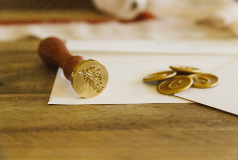
This principle extends to paper stock, thread weight, and even the finish of a wax seal.
A mark intended for embossing requires different considerations than one intended for foil stamping.
Couples rarely need to understand these technical distinctions themselves, but they deserve a designer who does.
Longevity, in the end, is not only about the concept behind a wedding logo.
It is also about whether the mark was built to survive the many physical forms it will eventually take.
XIV. Two Families, One Mark
Honoring Heritage Without Imitation
Many couples arrive already carrying an inherited family crest or an established household identity.
The challenge, in these commissions, is not creating something new but honoring what already exists.
A wedding logo built for these clients must acknowledge two histories without flattening either into the other.
This requires genuine research into both families, not merely their surnames but the traditions attached to them.
A family known for generations of agricultural stewardship will want a different visual register than a family known for maritime trade or civic service.
These details rarely appear explicitly in the finished mark, yet they inform every decision behind it.
The strongest wedding logos feel inherited, even when they were created for the first time.
This is perhaps the highest compliment a design can receive.
When a newly created mark feels as though it has always belonged to a family, the design has succeeded completely.
Achieving this requires restraint, historical sensitivity, and a genuine respect for what came before the couple standing in front of the designer.
XIV-A. Many Traditions, One Discipline
Wedding Logos Across Cultural Traditions
A wedding logo does not belong to a single culture or ceremony style.
Couples arrive from an enormous range of traditions, and each brings its own visual vocabulary worth honoring.
A couple planning a ceremony rooted in Southern hospitality may want a mark that feels warm, generous, and slightly more ornamental than one designed for a minimalist coastal wedding.
A couple honoring Latin American heritage may wish to incorporate typographic influences drawn from their family’s country of origin.
A couple blending two distinct cultural backgrounds within a single marriage faces perhaps the most interesting design challenge of all.
In these commissions, the mark must hold two visual languages in balance without allowing either to overwhelm the other.
This is delicate work, closer to diplomacy than decoration.
It requires genuine curiosity about both traditions, not a superficial gesture toward one while defaulting entirely to the other.
Religious and ceremonial context also shapes these decisions considerably.
A wedding logo intended for use alongside formal religious stationery must respect the conventions of that setting, even while introducing something entirely new.
A more secular celebration allows for greater freedom, though freedom is not the same as license to abandon restraint.
Cultural sensitivity in a wedding logo is not about literal symbols borrowed from a tradition. It is about understanding the spirit behind them.
This is why the earliest conversations in any commission ask about more than aesthetic preference.
They ask about heritage, upbringing, and the traditions each partner hopes to preserve or gently reinterpret.
A wedding logo built without this understanding may still be attractive, but it will rarely feel true.
A wedding logo built with this understanding tends to feel, almost immediately, like it could not have been designed any other way.
XV. Practical Considerations
What a Couple Should Prepare Before Commissioning
Couples often ask what they should bring to their first design conversation.
The answer is rarely a mood board full of borrowed inspiration.
It is, instead, a clear sense of what the celebration and the marriage beyond it are meant to feel like.
Photographs of family heirlooms, existing crests, or meaningful objects can be far more useful than a folder of unrelated wedding logos found online.
A sense of the venue’s architecture also informs the design considerably.
A mark intended for a coastal estate will rarely suit a mountain lodge celebration, and vice versa.
Bring
Family history and meaningful objects.
A sense of the venue and its architecture.
Consider
How the mark will be used beyond the wedding day.
Whether an existing family crest should be honored.
Trust
The designer’s judgment on restraint and proportion.
The process, even when it takes longer than expected.
These conversations, though practical in nature, ultimately shape a deeply personal outcome.
A well-prepared couple tends to receive a more resolved final mark, simply because the designer has more genuine material to draw from.
XV-A. A Question of Trust
What to Look for in a Designer
Commissioning a wedding logo is, in many ways, an act of trust.
A couple is asking someone else to translate their private history into a public symbol.
This trust is best placed with a designer who asks more questions than they answer in the first conversation.
A designer eager to show templates or pre-made options within minutes is rarely the right fit for work meant to last generations.
Instead, look for a process that begins with listening rather than showing.
Look for a portfolio built on genuinely distinct marks, rather than variations on a single recurring formula.
A designer capable of producing dramatically different outcomes for different couples is a designer capable of listening rather than repeating themselves.
It is also worth asking how a mark will be delivered once finalized.
A wedding logo should arrive in every format required for printing, engraving, embroidery, and digital use, not merely as a single flat image.
This attention to delivery is as much a mark of professionalism as the design itself.
The right designer treats a wedding logo as a long-term commission, not a quick transactional deliverable.
Our own process is conducted entirely through a considered, fully digital creative relationship, allowing couples anywhere to commission the same level of personal attention regardless of geography.
Physical delivery of final artwork, when appropriate, remains available for couples who wish to receive their finished mark as a tangible keepsake.
This flexibility does not compromise the intimacy of the process.
If anything, it allows for a more focused, distraction-free collaboration between designer and couple.
Video consultations, careful written correspondence, and iterative review rounds replace the need for in-person meetings without sacrificing the depth of the relationship.
Many couples find this format easier to fit alongside the countless other decisions a wedding requires.
XV-B. A Private Reflection
On the Uncertainty Couples Often Carry
Almost every couple arrives at their first design conversation with a quiet uncertainty they rarely voice directly.
They wonder whether a wedding logo is truly necessary, or whether it might feel indulgent given everything else a wedding demands.
This uncertainty deserves a genuine answer rather than a reflexive reassurance.
A wedding logo is not necessary in the way a marriage license is necessary.
It is necessary only in the way that meaning is necessary to people who care about how they are remembered.
Not every couple needs one, and that is a perfectly reasonable conclusion to reach.
But for couples who sense that their families, their histories, or their celebration deserve a lasting visual expression, the instinct is worth trusting.
A second uncertainty often follows the first.
Couples worry that a bespoke mark will feel excessive, even ostentatious, to guests who may not fully appreciate the craftsmanship behind it.
This concern misunderstands what restraint actually accomplishes.
A well-designed wedding logo rarely announces itself loudly.
It is more often noticed the way fine tailoring is noticed, quietly, and only by those inclined to look closely.
Most guests will never consciously register the craftsmanship behind a well-designed mark.
They will simply feel that the celebration was considered, cohesive, and unmistakably personal, without knowing exactly why.
The couples who benefit most from a wedding logo are rarely those seeking attention. They are those seeking permanence.
A third and final uncertainty tends to surface toward the end of the process, once a direction has been chosen.
Couples sometimes ask whether they will still love the mark in twenty years, long after the wedding itself has faded into memory.
This is, in many ways, the most important question of all, and it is answered not through reassurance but through the design process itself.
A mark built on trend rather than character rarely survives a decade gracefully.
A mark built on genuine restraint, proportion, and personal meaning tends to feel, if anything, more resonant with time rather than less.
This is precisely why the earlier stages of research and reflection matter so much more than the final rendering.
A wedding logo produced quickly might satisfy an immediate need for stationery.
A wedding logo produced carefully tends to become something closer to family property.
Couples who trust this process, even when it asks more of them than expected, are almost always glad they did.
XV-C. A Note on Timing
When to Begin Designing a Wedding Logo
Couples frequently ask how early in the planning process a wedding logo should be commissioned.
The honest answer is earlier than most expect.
A mark intended to appear across save-the-dates, invitations, and the earliest wedding website pages needs to exist well before those materials go to production.
Beginning the design conversation shortly after the engagement, rather than a few months before the ceremony, allows for the kind of unhurried refinement bespoke work requires.
This early start also allows the mark to inform other decisions, from stationery paper stock to venue signage, rather than being retrofitted into choices already made.
A wedding logo designed in isolation, disconnected from the broader visual direction of the celebration, rarely feels as integrated as one considered from the beginning.
This does not mean every detail of the wedding must be finalized before design work begins.
It simply means the mark benefits from being treated as a foundational decision rather than a final flourish.
A wedding logo designed early becomes a compass for other decisions. A wedding logo designed late becomes merely one more task on a long list.
For couples already deep into their planning timeline, it is never too late to begin.
A carefully designed mark, even introduced later in the process, still carries the same potential for lasting meaning.
What matters most is not when the process begins, but the level of care given to it once it does.
XVI. A Closing Reflection
The Wedding Logo as a Beginning
A wedding logo is often commissioned to mark an ending, the conclusion of an engagement and the beginning of a marriage.
Yet its truest purpose is closer to a beginning than an ending.
It is the first shared symbol a couple creates together, before a household, before children, before decades of shared history.
Everything that follows, the linens, the correspondence, the objects quietly inherited by future generations, begins with this single mark.
This is why the process deserves patience, research, and genuine craftsmanship rather than convenience.
A wedding logo, done well, does not merely decorate a celebration.
It gives a marriage its first visual sentence, one that a family may continue reading for generations.
I would be honored to help compose that sentence with you.
Whatever form your celebration takes, whatever traditions you carry forward or gently set aside, the mark you choose deserves the same care you have given to every other decision in this season of your life.
A wedding logo is small in scale but significant in purpose, and that combination is precisely what makes the work worth doing carefully.
“The finest symbols of distinction have always belonged not to companies, but to the individuals and families who chose to be remembered by them.”