The Personalized Initials Logo: Letters Made Legacy
The Personalized Initials Logo: Letters Made Legacy
A name is carried for a lifetime, yet it is rarely given a form worthy of that duration.
The personalized initials logo exists to correct that quiet omission, one commission at a time.
What follows is an editorial account of restraint, precedent, and the discipline behind a lasting mark.
It is written for those who already suspect that two or three letters can hold an entire story.
THE ART OF MONOGRAMS
What a Personalized Initials Logo Actually Is
A personalized initials logo is not a font choice dressed in the language of luxury.
It is the deliberate translation of a name into a single, permanent visual form.
The word personalized has been diluted by modern commerce until it means very little at all.
Applied honestly to an initials logo, the word still carries its original, more demanding weight.
It means composed for one name, one history, and one intention, and for no other.
A mark built this way cannot be resold, reissued, or quietly assigned to a second owner.
That singularity is the entire argument in favor of commissioning one rather than assembling one.
A generic lettermark can be generated for any pair of initials within a matter of minutes.
A personalized initials logo can only be produced for the specific letters it was built to serve.
Clients rarely arrive able to articulate this distinction before their first conversation with the atelier.
They arrive, instead, with the sense that their name deserves more consideration than a template offers.
A commissioned mark answers that instinct directly, without requiring further justification.
ON PERSONALIZATION
Personalization, honestly practiced, is not a setting to be selected; it is a discipline applied to one name alone.
The process begins with a name, a history, and an intention, never with a library of presets.
Every decision that follows, from letterform to proportion, is made in service of that specific name.
This is what separates a considered initials logo from a mark merely produced on request.
The difference is not cosmetic; it governs the entire logic of the commission from its first sketch.
A mark built this way tends to resist the erosion that trend-driven design cannot avoid.
Most identity work today is optimized for speed, not for the permanence a name actually deserves.
A considered initials commission inverts that priority entirely, favoring depth over velocity at every stage.
This publication is not a tutorial, because a mark of this consequence is never assembled from instructions.
It is closer to an editorial account of a discipline that predates the modern idea of branding altogether.
Readers need not be commissioning anything at all to find value in what follows here.
Some arrive simply curious about why a small mark still commands quiet authority in a crowded visual world.
Others arrive already certain they wish to commission one, seeking context before beginning the conversation.
Both readers are welcome here in equal measure, and both will encounter the same underlying argument.
A name, properly rendered into initials, is closer to an heirloom than to a disposable asset.
That is the premise from which every personalized initials logo commissioned here begins.
Consider how rarely a modern purchase is expected to remain unchanged for fifty years or longer.
Wardrobes are refreshed, devices are replaced, and even architecture is periodically renovated.
A personalized initials logo, by contrast, is one of the few assets still expected to resist that turnover.
This expectation is not sentimentality; it is a deliberate design requirement placed on the work from the outset.
It shapes which letterforms are considered acceptable and which are quietly set aside during exploration.
It shapes how much ornamentation is permitted before a mark begins to feel merely decorative.
It shapes, ultimately, how much time the atelier is willing to spend before calling a direction finished.
None of this discipline is visible in the finished mark itself, yet all of it is felt over years of use.
A client who understands this in advance tends to arrive already asking the right questions.
They rarely ask how quickly a mark can be produced, and far more often ask how long it can last.
A personalized initials logo asks to be judged decades from now, not merely on the day it is delivered.
ROYAL TRADITIONS
A Lineage Older Than the Word Logo
The personalized initials logo did not begin in a design studio; it began on coins, seals, and cornerstones.
Ancient rulers pressed their initials into metal long before anyone described the practice as identity design.
The letterform was chosen because it could be recognized instantly, even by those who could not read.
Medieval scribes carried the instinct further, weaving initials into manuscripts as private marks of authorship.
By the Renaissance, merchant families had adopted personal marks to authenticate goods on unfamiliar routes.
An initials mark, in that era, functioned as both signature and guarantee of origin all at once.
Records preserved by an institution devoted to the formal study of this visual language continue to trace how personal marks were once granted, governed, and refined across successive generations.
European courts refined the practice into a formal grammar, governed by proportion rather than whim.
Royal ciphers were treated as instruments of governance, appearing on currency and state seals alike.
This heritage is the quiet foundation beneath every considered initials mark produced today.
Few clients arrive aware of this lineage, though nearly all recognize it once it has been explained.
The instinct to compress identity into a few letters is, in this sense, older than any single commission.
ANTIQUITY
The Struck Letter
Rulers and city-states stamped initials into coins and ceramics as early instruments of trust and recognition.
MEDIEVAL EUROPE
The Illuminated Cipher
Scribes and noble houses wove initials into manuscripts and seals, binding identity to rank and craftsmanship.
RENAISSANCE
The Merchant’s Mark
Trading families interlocked their initials into marks that authenticated goods, ledgers, and correspondence alike.
GEORGIAN & VICTORIAN ERAS
The Engraved Initial
The personal initials mark became a fixture of refined life, engraved onto silver, linen, and stationery.
TWENTIETH CENTURY
The House Letter
Luxury houses translated the individual initials cipher into the very foundation of brand identity.
PRESENT DAY
The Commissioned Logo
The personalized initials logo now serves individuals, families, and enterprises in equal measure.
Each era refined the same underlying principle, namely that a name distilled into letters can carry authority.
A design unaware of this lineage tends to feel merely fashionable rather than genuinely founded.
A design composed with awareness of it tends to feel inevitable, as though no other arrangement were possible.
This is precisely why the atelier studies precedent before beginning any new initials commission.
History, treated this way, is not ornamental context; it is a working design tool applied to a modern mark.
A logo composed without this awareness often repeats mistakes long since resolved by earlier craftsmen.
A logo composed with this awareness tends to feel settled from its very first presentation.
It is worth dwelling briefly on the specific technical hurdles each era solved for personal marks in turn.
Coin dies required forms that could be struck cleanly into metal without losing their essential definition.
This forced early artisans to think in bold, simplified geometry from the very beginning of the craft.
Manuscript illumination, by contrast, rewarded patience and permitted extraordinary intricacy on a static page.
The printing press later changed the equation permanently, demanding forms that could be carved with precision.
A modern initials commission inherits every one of these historical constraints, whether known or not.
A royal cipher was rarely the work of a single hand; it was refined across successive reigns.
That same iterative patience is precisely what the atelier applies to a modern initials commission.
ON PRECEDENT
A mark unaware of its own lineage feels fashionable; a mark composed with awareness of it feels inevitable.
LUXURY IDENTITY
What Separates a Personalized Initials Logo From a Generated Lettermark
The word luxury is applied loosely across the branding world, often without much justification behind it.
A typeface selected from a preset menu is not a personalized initials logo, however it is marketed.
Luxury, properly understood, means built from first principles for one specific name and its history.
A generic logo generator applies the same underlying logic to every set of initials it receives.
It cannot account for the particular geometry of a client’s letters, only an approximation of them.
It cannot account for the story a client wants the mark to carry, because it was never told one.
Major collections such as a museum whose galleries preserve five thousand years of decorative art still preserve engraved initials belonging to merchants and monarchs alike, each a quiet lesson in proportion.
Studying such collections reveals how much thought was once given to something as small as two letters.
A personalized initials logo begins from the opposite direction entirely, starting with conversation rather than a template.
The letters are studied individually before they are ever combined into a single composition.
Some pairings interlace naturally, and others require considerable adjustment to read cleanly at every scale.
A skilled hand recognizes which letters resist combination and compensates through proportion and spacing.
This is largely invisible work, in the sense that a client rarely sees the discarded early attempts.
They see only the final resolution, which is precisely the intended outcome of the entire process.
| Consideration | Personalized Initials Logo | Generated Alternative |
|---|---|---|
| Origin | Composed individually for one name and its story | Applied identically to any initials entered |
| Letterform testing | Tested across scale, material, and application | Rarely tested beyond a single preview screen |
| Exclusivity | Unique to a single owner or household | Available to any purchaser at any time |
| Symbolic depth | Reflects a specific personal narrative | Carries no narrative beyond the letters shown |
| Longevity | Designed to represent a name for decades | Designed to be replaced within a few seasons |
The table above is not a judgment on convenience; it is simply a description of two different intentions.
A mark of this kind is commissioned by those for whom convenience was never the primary objective.
It is commissioned, instead, by those seeking a mark worth carrying rather than a mark worth using briefly.
This is the same logic that has always separated fine bespoke tailoring from ready-to-wear clothing.
A mark drawn once, for one client, cannot appear on someone else’s stationery the following year.
That exclusivity carries genuine weight for anyone building a lasting personal or professional identity.
There is also a practical dimension to this decision that extends well beyond aesthetics alone.
A single, well-composed initials logo is simpler to reproduce, protect, and apply than a sprawling identity system.
Consistency reduces cost over time, even though it requires more investment at the very outset.
A name that changes its mark every few seasons spends considerably more, in aggregate, than one that commissions carefully once.
There is a further distinction worth naming plainly, and it concerns the question of genuine ownership.
A generated lettermark is typically assembled from assets that other buyers may also license freely.
An owner can never be entirely certain that a generated mark is genuinely theirs alone.
A commissioned personalized initials logo carries no such uncertainty, since it was composed for one name only.
This exclusivity is not vanity; it is the practical foundation of a reputation built to last.
A reputation attached to a shared symbol is, in the end, a reputation resting on borrowed ground.
ON OWNERSHIP
Exclusivity here is not a marketing claim; it is a structural fact of how the mark is made.
THE ART OF MONOGRAMS
The Anatomy of a Considered Initials Logo
Beneath the surface of any personalized initials logo lies a set of principles rarely discussed openly.
These principles are not stylistic preferences; they are structural requirements for a mark meant to endure.
Letterform selection determines whether initials feel timeless or merely fashionable within a narrow window.
Proportion determines whether a composition feels resolved or simply assembled from adjacent parts.
Negative space is treated as an active design element rather than empty background around the letters.
Scalability determines whether a mark performs equally well on a signet ring and on a storefront facade.
Hierarchy determines which letter, if any, is permitted to lead the composition without ever dominating it.
Each of these elements is considered independently before they are ever combined into a single mark.
Letterform
Typographic choices are drawn from traditions deep enough to carry genuine authority rather than passing style.
Proportion
Initials are weighted so the most significant letter anchors the composition without ever announcing itself.
Negative Space
The space within and around each letter is composed with the same intention as the letters themselves.
Hierarchy
When multiple initials combine, one is typically permitted to lead without ever dominating its neighbors.
Interlace
The manner in which letters join one another is often the single most defining decision in the mark.
Scalability
A finished mark is tested from the scale of a cufflink to the scale of a building facade.
When these elements align, a personalized initials logo becomes legible in a single glance rather than a studied read.
That immediacy is the quiet signature of a mark that has been properly resolved from the outset.
This same discipline underlies every custom personal monogram composed within the atelier, regardless of its eventual scope or application.
A mark that skips any one of these principles tends to fail quietly, over years, rather than immediately.
This is why the atelier treats all six as inseparable requirements rather than optional considerations.
Compositional integrity, in particular, is where most attempted lettermarks quietly come apart under scrutiny.
Two initials placed side by side are not yet a logo; they remain, at best, an abbreviation of a name.
The work lies in discovering the single relationship that binds two or more letters into one coherent form.
Sometimes that relationship is an interlace, in which the letters genuinely share a stroke between them.
Sometimes it is an enclosure, in which one letter is framed gently by the structure of the other.
The right answer is dictated by the letters themselves, never imposed upon them from the outside.
A mark tested only at one size has not yet been tested at all; a true initials logo performs everywhere.
One of the first decisions in any commission concerns which letters will actually appear in the final mark.
This sounds simple until a full legal name is placed on the table beside a professional title.
A given name, a family name, and occasionally a middle initial all compete quietly for inclusion.
Including everything rarely produces clarity; it produces clutter that undermines the mark’s authority.
The atelier’s role is often to help a client decide what may be respectfully omitted from the final form.
Omission, practiced well, is not a loss; it is the beginning of the composition’s eventual strength.
ON STRUCTURE
Two letters side by side are an abbreviation; two letters bound by one considered relationship are a logo.
LEGACY & FAMILY HERITAGE
When Initials Become an Inheritance
A family crest and a personalized initials logo are close relations, though they are not strictly identical.
A crest typically encodes lineage across generations, governed by formal convention and precedent.
An initials logo typically encodes an individual, though it may become a family’s own inheritance over time.
The distinction matters less than the intention behind it, which remains consistent across both forms.
Both exist to answer the same quiet question, namely what will remain once the original owner has stepped away.
Clients who commission this work rarely think only of the present occasion prompting the conversation.
They think, more often, of a grandchild encountering the same mark decades from now, without context.
A mark intended to function this way must be built with unusual restraint from the outset.
Trend-driven ornamentation dates a mark quickly, while considered proportion does not date at all.
This is why the atelier resists fashionable flourishes in favor of quieter, structural decisions.
In communities where legacy is valued as deeply as innovation, identity often extends beyond a name; it becomes a symbol capable of representing a family, a celebration, or a personal story for generations.
GUSTAVO ATHAYDE · ATELIER PHILOSOPHY
The process typically begins with a conversation about what a person or family actually wishes to preserve.
Sometimes it is a name threatened by the ordinary erosions of time, distance, or marriage.
Sometimes it is a set of values a family has long associated with its own name and standing.
Sometimes it is simply the wish to mark a particular chapter worth remembering with formal weight.
Whatever the motivation, the resulting mark is built to be inherited rather than merely used for a season.
This means avoiding anything overly literal, anything that explains itself completely on first glance.
A truly enduring initials logo rewards a second look, and a third, across an entire lifetime of use.
The same ambition, translated to an enterprise, animates the personalized brand monogram within the atelier’s broader practice.
A founder’s initials, once resolved into a considered mark, can move across decades of change.
Leadership shifts, households grow, and entire industries evolve, yet the mark can remain exactly itself.
This permanence is not incidental; it is the direct result of a mark composed with restraint from the outset.
What unites the clients who commission this work is a shared instinct toward permanence over convenience.
They are not searching for the fastest solution available; they are searching for the correct one.
The first question most ask is almost always about what will happen to the mark several decades from now.
Will it still feel dignified engraved on a great-grandchild’s signet ring, long after this conversation is forgotten.
Will it still feel appropriate on correspondence two generations removed from the one being planned today.
These are unusual questions for an ordinary design brief, yet they arrive constantly within this practice.
Answering them requires resisting anything that feels clever in the moment but shallow across a longer horizon.
A mark accepted too quickly has usually not been tested thoroughly enough against a family’s own story.
The strongest commissions tend to emerge from a small amount of productive friction, not an easy first answer.
A family that has worked toward its mark values it more than one that received an easy answer immediately.
That effort, in retrospect, is almost always remembered fondly once the mark has proven itself in daily use.
ON INHERITANCE
A personalized initials logo, carried well, tends to become a family’s own inheritance without ever being asked to.
THE ATELIER JOURNAL
Inside the Commission: From Conversation to Delivery
Commissioning a personalized initials logo is closer to a private consultation than to an ordinary transaction.
The process begins with conversation rather than with a questionnaire handed across a desk.
Personal history, professional context, and long-term intention are discussed before any sketching begins.
Only once that context is understood does the atelier begin exploring specific letterform directions.
Multiple design directions are typically developed before a single one is ever presented to the client.
Refinement continues until the mark performs correctly at every scale it is likely to encounter.
01
Consultation
A private conversation establishes the history, context, and intention behind the commission.
02
Exploration
Multiple letterform directions are developed, tested, and narrowed before any direction is presented.
03
Refinement
The selected direction is refined for proportion, negative space, and balance across every scale.
04
Validation
The mark is tested across applications, from stationery to signage, to confirm it holds at every size.
05
Delivery
The completed personalized initials logo is delivered alongside guidance for its consistent, lasting use.
Each stage exists to remove uncertainty before a client ever commits to a single final direction.
By the time delivery occurs, the outcome rarely feels like a surprise to the client receiving it.
It feels, instead, like confirmation of something the client already sensed was correct from the beginning.
The same rigor underlies every personalized business monogram the atelier commissions, whether the letters serve a household or an entire firm.
A personalized initials logo is a portrait in miniature, and a portrait requires that its subject be understood.
The atelier wants to know how a name is spoken, how often, and what it is meant to convey.
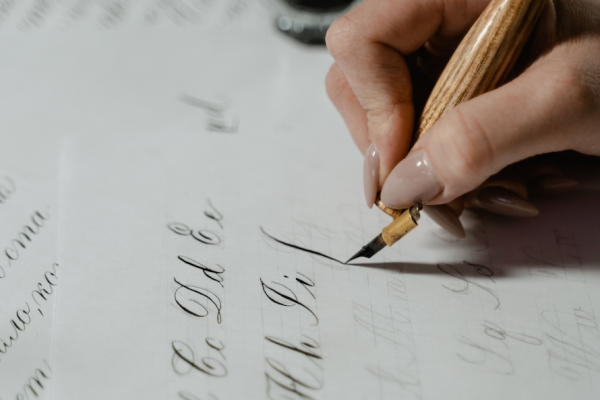
These questions seem tangential until the moment they determine the entire structure of the eventual mark.
The study phase that follows is the least glamorous stage and, in most cases, the most decisive one.
It is where the majority of possible arrangements are quietly eliminated before any real drawing begins.
By the time composition begins, the field of genuine candidates has usually narrowed to a very small number.
The refinement that follows can consume more hours than any other phase of the entire commission.
To an outside observer, the changes made during refinement often appear almost invisible from a distance.
A curve is tightened by a fraction, a join is softened, the weight of a single stroke is reduced slightly.
None of these adjustments would register consciously to a casual viewer encountering the finished logo.
Yet their cumulative effect is the entire difference between a mark that convinces and one that merely resembles a mark.
This is why the atelier resists any temptation to shorten the refinement stage for the sake of a faster delivery.
A client who understands this in advance tends to trust the process even when progress feels slow.
That trust is rarely misplaced, since the pace exists to protect the outcome rather than to delay it.
ON LISTENING
The atelier listens before it draws, since a logo cannot be personalized to a name it has not yet understood.
LUXURY IDENTITY
Craft in Numbers
Craftsmanship resists easy measurement, though certain figures still illuminate what a commission actually involves.
A single personalized initials logo typically explores several distinct design directions before one is chosen.
This range exists because the correct solution for a given pair of letters is rarely obvious immediately.
Multiple scales are tested for every finished mark, from ring-sized engraving to storefront signage.
A logo that only works at a single scale has not, in the fullest sense, been properly finished.
3–5
Design directions explored per commission
40+
Interlace variations typically considered
100+
Years a well-proportioned mark can remain legible
1
Mark, built once, intended to serve a lifetime or longer
The proportions below describe how deliberately each stage of a considered commission is weighted in practice.
Refinement consistently consumes the largest share of total effort, which surprises most first-time clients.
Most clients assume the initial idea is the hard part, and the refinement a mere formality afterward.
In practice, the opposite proves true, and the last small adjustments decide everything that matters.
Consultation & Listening — 20%
Letterform Exploration — 25%
Refinement & Testing — 40%
Delivery & Documentation — 15%
These figures describe restraint rather than scale, which is precisely the underlying point of the exercise.
A personalized initials logo, like true luxury, is not measured by how frequently it changes over time.
It is measured, instead, by how rarely it ever needs to change at all once properly resolved.
Anyone can add ornament to a mark; the discipline lies in recognizing what should be removed instead.
A finished personalized initials logo is one from which nothing further can be taken away without genuine loss.
ON MEASUREMENT
A considered initials logo is not measured by how often it changes, but by how rarely it must.
VOICES OF DISTINCTION
Voices of Distinction
The truest measure of a personalized initials logo is not how it looks on delivery, but how it ages afterward.
Clients rarely describe the process in technical terms when asked to reflect on the experience.
They describe it, instead, in terms of recognition, permanence, and a certain quiet relief.
The reflections below are drawn from individuals and families who have commissioned this particular work.
Names have been abbreviated throughout, to preserve the privacy each client is rightfully owed.
“The logo arrived exactly as it should have, quiet, permanent, and unmistakably mine.”
E. HARRINGTON · PRIVATE CLIENT · CHARLESTON, SOUTH CAROLINA
“I did not expect two letters to change how seriously my practice was regarded, yet they did.”
DR. A. OKONKWO · INDEPENDENT PRACTICE · BOSTON, MASSACHUSETTS
“What struck me most was the restraint. Nothing was added that did not need to be there.”
J. MARSTEN · FOUNDER, BOUTIQUE FIRM · SANTA FE, NEW MEXICO
“Three years on, the mark has not once felt dated. That alone justified the patience the process required.”
THE LINDQVIST FAMILY · FAMILY COMMISSION · MINNEAPOLIS, MINNESOTA
What unites these reflections is a shared surprise at how much a small mark could come to represent.
Most describe the experience less as a transaction and more as a conversation that happened to end in a logo.
Clients frequently report noticing their mark for years afterward, in small and unexpected moments of daily use.
It appears on a signed letter, a wax seal, or a storefront window, and recognition returns quietly each time.
Reading these accounts together, a pattern emerges that no single testimonial could fully capture on its own.
That pattern is one of quiet relief, more than excitement, once the final mark has been delivered.
Excitement fades within a season; relief that a mark still feels correct tends to last considerably longer.
That persistence is, in its own way, the atelier’s clearest form of feedback across many commissions.
LUXURY IDENTITY
The Measure of Restraint
Luxury, properly understood, has very little to do with ornamentation for its own sake.
It has a great deal to do with discretion, precision, and quiet confidence in a design’s own presence.
An initials mark embodies this principle more directly than almost any other commissioned object.
It does not need to shout, because its owner already knows exactly what the mark represents.
This is the quality that separates genuinely luxurious identity work from work that is merely expensive.
A design that strains for attention betrays a certain anxiety about whether it will be noticed at all.
A design that withholds announces, without a single word, that it has nothing left to prove to anyone.
The finest symbols are rarely created to follow trends; they are created to outlive them.
GUSTAVO ATHAYDE · ATELIER PHILOSOPHY
In the vocabulary of luxury, restraint has always been understood as the highest form of confidence available.
The most distinguished individuals and institutions have understood this quietly for many generations.
They do not shout their initials; they compress them into marks so quiet that only the attentive notice.
And precisely because those marks are quiet, they are trusted by everyone who eventually encounters them.
A design that strains to be noticed on delivery is rarely the design that endures decades later.
A design that says almost nothing on delivery is often, eventually, the one that says the most.
This is not a comfortable principle for a branding world addicted to immediate, visible impact.
It is, nonetheless, the principle the atelier has built its entire practice upon, without exception.
A design finalized too quickly tends to reveal that haste within the first few years of ordinary use.
A design finalized with patience tends to remain unremarked upon precisely because nothing about it feels wrong.
This is the paradox at the center of the entire practice, stated plainly rather than left implicit.
The best compliment a finished initials logo can receive is silence, since nothing about it draws unwanted attention.
Every proposed addition to a composition is tested against a simple question before it is ever accepted.
Does this addition earn its place, or does it merely fill space that could otherwise breathe freely.
A viewer’s eye can hold only so much in a single glance before a mark stops reading as a mark.
The most successful initials logos are read in a single visual moment, without the eye laboring to decipher them.
ON RESTRAINT
The most convincing luxury signal is rarely more ornament, but rather the confidence to include only what is necessary.
ROYAL TRADITIONS
Royal Precedent and the Grammar of the Personal Cipher
No account of the personalized initials logo is complete without acknowledging its royal and ceremonial origins.
European monarchs were among the first to formalize personal initials into instruments of governance.
A royal cipher appeared on currency, on state seals, and on the correspondence of an entire court.
These marks were never merely decorative; they functioned as legal and symbolic instruments of authority.
Institutions such as the heraldic authority responsible for granting personal arms in England continue to formalize this tradition under long-established law, treating a personal mark as a matter of recorded identity.
Their archives reveal how carefully proportion, symmetry, and hierarchy were once governed by formal convention.
A royal cipher was rarely the work of a single hand; it was refined across successive reigns.
This iterative refinement is part of why such marks still feel authoritative many centuries later.
Contemporary commissions borrow directly from this discipline, even when the client is not a monarch at all.
The same principles of proportion and restraint apply equally to a family, a practice, or a private individual.
What differs is the scale of consequence, not the underlying rigor of the process itself.
A modern client does not require the historical weight of a crown to deserve this level of care.
They require only a name worth treating with the same seriousness a court once applied to its own.
It is worth noting that royal ciphers were rarely designed in isolation from the broader visual culture of their time.
Architecture, textiles, and ceremonial objects all echoed the same proportions found in a court’s chosen mark.
This coherence across mediums is part of what gave those initials their lasting sense of authority.
A cipher that appeared only on paper would have carried far less weight than one appearing on coinage and stone alike.
Consistency across contexts, rather than novelty within any single one, built the credibility such marks still carry.
The same lesson applies directly to a contemporary personalized initials logo commission of any scale.
A mark used consistently across every application will always read as more authoritative than one used sporadically.
Archives preserving centuries of ceremonial regalia, such as an archive of this exact ceremonial tradition, continue to document how royal initials were refined across successive reigns, a discipline the atelier studies closely.
What emerges from that record is a single, consistent principle worth repeating plainly here.