
The Enduring Language of Bespoke Monograms
Bespoke Monograms: The Grammar of a Personal Symbol
A name reduced to its essential letters becomes something larger than mere identification.
It becomes a mark that a family, a household, or a single life can carry forward with quiet confidence.
Bespoke monograms exist at the intersection of restraint and permanence, where craftsmanship stands in for decoration.
This is an examination of why the practice endures, and what it asks of those who commission it.
It is not a tutorial on letterforms, but a study of what a personal symbol is actually meant to do.
It is written for those who already sense that a name, considered carefully, can carry more weight than it first appears to.
THE ART OF MONOGRAMS
Before the Name, There Was the Mark
Centuries before signatures carried legal weight, individuals relied on marks to declare ownership, authorship, and rank.
A sealed letter, a stamped ingot, a carved lintel — each depended on a symbol that could not easily be imitated.
The monogram descends from this older tradition of the personal seal, refined over generations into something more deliberate.
Its earliest forms interlaced two or three letters so tightly that the symbol read as a single unified shape.
This fusion was not accidental; it was the entire point of the exercise.
A monogram that could be separated back into its component letters at a glance had failed its purpose.
The mark needed to function as an emblem first, and only as an abbreviation second.
Byzantine emperors pressed monograms into coinage long before European nobility adopted the practice for correspondence and heraldry.
Merchant families in Renaissance Italy and Flanders later carried the tradition into trade, stamping bales of cloth and casks of wine with interlaced initials that certified origin and quality.
What began as a practical mark of provenance slowly acquired an aesthetic ambition entirely its own.
Craftsmen began treating the letterforms as design elements, weighing balance, negative space, and the rhythm of curves against straight lines.
By the eighteenth century, a well-drawn monogram was understood as a small work of applied art, commissioned with the same care given to a portrait or a piece of silver.
Museum collections of decorative silver and engraved stationery still preserve the range of ambition that era brought to a symbol most people today would consider almost incidental.
The practice never fully separated from its origins in ownership and authorship.
Even now, a monogram placed on linen, stationery, or a signet ring performs the same essential function it always has.
It tells the world, quietly, to whom something belongs.
What has changed is the context in which that quiet declaration is actually made.
Contemporary life offers fewer natural occasions for personal symbols than the eras that first refined them.
Mass production replaced the handmade object, and with it, much of the occasion for marking something as distinctly one’s own.
Bespoke monograms persist precisely because they resist this flattening of the personal into the generic.
They insist that certain objects — a wedding suite, a family gift, a signature identity — deserve a symbol considered specifically for the person who will carry it.
This is not nostalgia for its own sake, nor is it resistance to modern life.
It is a recognition that some things are better made slowly, by hand, with attention paid to a single client rather than a market.
The monogram survives because the impulse behind it — to mark what matters as distinctly one’s own — has never gone out of style.
It has only become rarer, and rarer things tend to be valued more, not less.
A single well-considered mark now carries more weight than a dozen mass-produced flourishes ever could.
Part of this shift has to do with attention itself, which has become the scarcest resource in most people’s daily lives.
A mark that took months to resolve asks for a kind of attention that a printed template never requires, and that difference is felt even by those who cannot articulate it.
Clients often describe the finished result as feeling more like themselves than anything they had previously owned.
This is a strange thing to say about two or three interlaced letters, and yet it is said often enough to be taken seriously.
A symbol, it turns out, can carry an unusual amount of personal meaning once it has actually been considered with care.
That is the quiet promise behind every serious commission in this discipline, restated in different words by nearly every client who returns for a second piece.
LEGACY & FAMILY HERITAGE
A Shape That Outlives a Single Owner
A family crest and a personal monogram are often discussed as though they belong to entirely different worlds, one formal and inherited, the other private and current.
In practice, the two have always informed one another.
A family that commissions a custom coat of arms is making the same essential decision as a bride selecting initials for her wedding stationery: choosing a shape that will represent something beyond the present moment.
The difference lies mainly in scale and intention, not in the underlying discipline.
A crest is designed to be inherited unchanged, carried by descendants who may never meet its original bearer.
A monogram is more often personal, tied to a single individual’s initials, though it too can pass from a mother’s writing desk to a daughter’s linens within a single generation.
Families who understand this continuity tend to approach the commissioning process differently than those seeking only a quick decorative flourish.
They ask what the symbol will mean in twenty years, not only how it will look on the day it is unveiled.
This is where the discipline of formal heraldry and the intimacy of a personal monogram genuinely meet.
Both require an artist willing to think generationally rather than seasonally.
A well-considered family mark accounts for letters, colors, and forms that will still read clearly to eyes that have not yet been born.
It resists trends that would look dated within a decade of their unveiling.
It favors proportion and clarity over ornament introduced for its own sake.
Many of the families who return to an atelier for a second or third commission do so because the first piece aged well, not because it once seemed fashionable.
That is the quiet test of a successful heritage mark: whether it still feels inevitable long after the initial excitement has faded.
A symbol built to be inherited must be legible to people who were never consulted about its design.
This is a fundamentally different discipline than designing for a single event or a single season.
It asks the artist to design for descendants as much as for the client standing in the room.
England still maintains an official authority responsible for granting and recording new armorial bearings, a reminder that this discipline was never treated as casual decoration.
That level of institutional seriousness may sound distant from a private commission, but the underlying respect for permanence is identical.
A family emblem, once granted or designed, is meant to be handled with the same care a legal document receives.
It is recorded, referenced, and passed along rather than casually redrawn each time fashion shifts.
The families who take this seriously tend to be rewarded with a mark that genuinely gains meaning over time, rather than one that simply accumulates age.
There is a particular satisfaction, rarely discussed openly, in watching a mark commissioned for one generation quietly absorbed into the next without alteration.
A daughter who inherits her mother’s monogrammed linens is not simply inheriting an object; she is inheriting a small, settled decision about identity that she no longer has to make herself.
This is a genuine gift, even if it is rarely described in those terms at the time.
Families who commission with future inheritance in mind often ask a version of the same question: will this still make sense to someone who never met us?
That is precisely the right question to ask, and it is one a skilled designer welcomes rather than deflects.
-
AntiquityPersonal seals and stamped marks establish the earliest precedent for a symbol standing in for a name.
-
Byzantine EraInterlaced imperial monograms appear on coinage, formalizing the fused-letter format still recognized today.
-
RenaissanceMerchant families adopt interlaced initials as marks of provenance on traded goods and correspondence.
-
18th CenturyThe monogram is treated as applied art, commissioned alongside silver, portraiture, and fine stationery.
-
20th CenturyMass production narrows the occasions for personal marks, making handmade commissions increasingly distinct.
-
Present DayBespoke monograms return as a deliberate counterpoint to generic branding and disposable design.
THE ATELIER JOURNAL
The Discipline Behind a Simple Shape
Clients are often surprised to learn how much deliberation goes into a mark that will ultimately consist of two or three letters.
The apparent simplicity of a finished monogram conceals a lengthy process of elimination.
Before a single curve is drawn, the letters themselves must be understood as architecture: their proportions, their historical associations, their behavior when placed beside one another.
Some letter combinations interlock naturally, their curves and counters fitting together as though designed for the purpose from the start.
Others resist combination entirely and require the designer to invent new relationships between forms that were never meant to sit side by side.
This is precisely where technical skill becomes inseparable from taste.
A designer must know calligraphic history well enough to borrow from it selectively, without producing something that reads as a costume rather than an identity.
Restraint is the most difficult skill to teach in this entire discipline.
It is far easier to add flourish than to remove it, and far harder to know when a design is genuinely finished.
The atelier process typically begins with research into the client’s own history: a signature, a family document, an heirloom object that already carries meaning.
These sources are rarely copied directly, but they inform the emotional register of the final mark.
A monogram inspired by a grandmother’s handwriting carries a different weight than one drawn from a corporate wordmark, even when the letters themselves are identical.
Sketches typically pass through several rounds of refinement, each one removing rather than adding detail.
The goal is a symbol that looks as though it could not reasonably have been drawn any other way.
This sense of inevitability is the true measure of successful design, in monograms as in architecture.
Only once the linework is settled does the question of application arise: stationery, textiles, a signet, a cipher for a gate or a door.
Each medium imposes its own constraints, and a mark that reads beautifully engraved on silver may need adjustment before it can be embroidered on linen.
This is why the process rarely concludes with a single flat file handed over to the client.
It concludes with a considered system, tested across the surfaces where the symbol is meant to live for years to come.
Craftsmanship of this kind cannot be rushed without the result eventually showing it.
Clients who have commissioned bespoke monograms before often describe the same feeling upon delivery.
The finished mark, they say, feels less like something new than something quietly recovered.
That impression, more than any single design choice, is what the discipline is ultimately organized to produce.
There is a reason this process resists shortcuts, however tempting automation might appear to an outside observer.
Software can generate an interlace of any two letters in seconds, and the result is rarely wrong in any technical sense.
It is simply unconsidered, produced without reference to the client’s history, without judgment about proportion, without the accumulated instinct a trained hand brings to a familiar problem.
The difference is not always visible at first glance, which is precisely why so many clients assume the two approaches are interchangeable until they have compared them directly.
Once compared, the distinction becomes difficult to unsee.
An unconsidered mark tends to look correct without ever quite looking inevitable, and that missing quality is the entire value of the slower process.
Step 01
Discovery
History, signatures, and heirloom references are gathered to inform the mark’s emotional register.
Step 02
Letterform Study
Each letter is examined individually for proportion, history, and behavior beside the others.
Step 03
Interlace Development
Multiple arrangements are sketched, tested, and reduced through successive rounds of refinement.
Step 04
Application Testing
The finalized linework is proofed across stationery, textile, and engraving contexts.
Step 05
Delivery
A considered system, not a single file, is handed to the client for lasting use.
THE ART OF MONOGRAMS
Classic Monogram, Considered Anew
The phrase classic monogram conjures a familiar image: three block letters, evenly weighted, centered on a handkerchief or a cufflink.
That image is not wrong, but it is incomplete.
A classic monogram is a format, a set of conventions refined over long use, in the same way a well-cut suit follows certain established proportions.
A bespoke monogram begins with those same conventions and then asks a further question.
What does this particular client’s history, taste, and intention require that the standard format does not already provide?
Sometimes the answer is very little, and a beautifully rendered classic form is exactly right for the occasion.
Other times the answer changes everything, calling for an asymmetric arrangement, an unexpected interlace, or a deliberate departure from the expected order of initials.
Understanding the difference between these two outcomes requires an artist who has mastered the classic form well enough to know precisely when and why to depart from it.
This is a subtler skill than pure invention, and considerably rarer.
Novelty is easy to manufacture; considered departure from tradition is not.
The finest bespoke monogram work often looks, at first glance, entirely traditional.
Its distinction reveals itself slowly, in a proportion slightly adjusted, a serif quietly altered, a spacing decision a casual eye would never notice but that changes how the whole mark reads.
This is the quality that separates commissioned symbols from a template filled in with new initials.
A template can produce a competent classic monogram in a matter of minutes.
It cannot produce the specific rightness that comes from an artist studying a single client’s letters until the correct solution becomes evident rather than invented.
That distinction is, in the end, the entire argument for bespoke monogram commissions over anything drawn from a catalogue.
It is not that custom work is always superior to a classic template; it is that custom work considers the classic form seriously enough to know when to honor it and when to depart from it.
Clients rarely arrive with the vocabulary to articulate this distinction, but they recognize it instantly once they see it demonstrated.
A useful test is to place a templated version and a custom version of the same three initials side by side.
At a glance, the two may look deceptively similar, sharing the same general silhouette and the same familiar letters.
Examined closely, the templated version tends to reveal small compromises: spacing slightly uneven, a stroke weight borrowed indiscriminately from an unrelated typeface, proportions that were never actually tested against these specific letters.
The custom version reveals the opposite pattern, with every decision traceable back to a specific choice made for this specific client.
That traceability is, in a sense, the entire product being purchased in a bespoke commission.
| Consideration | Classic Monogram | Bespoke Monogram |
|---|---|---|
| Starting point | Established three-letter format | Client history, taste, and intention |
| Typical timeline | Rendered quickly from a known template | Developed across multiple rounds of refinement |
| Best suited for | Traditional gifts and everyday accessories | Weddings, heirlooms, and signature identities |
| Design goal | Legible, familiar, dependable | Legible, familiar, and unmistakably specific |
| Longevity | Reliable but replaceable | Intended to be inherited unchanged |
ROYAL TRADITIONS
What Monarchies Understood About Symbols
Long before public relations departments existed, royal houses across Europe understood that a symbol, properly designed, could communicate authority more efficiently than any written proclamation.
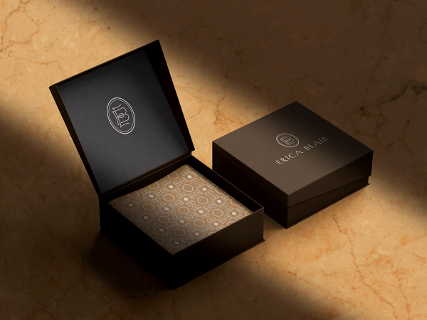
A royal cipher appeared on coinage, on regimental colors, on the gates of palaces that most subjects would never personally enter.
Its repetition across so many surfaces was deliberate: familiarity bred a kind of unconscious trust, long before literacy was widespread enough for written decrees to reach every subject directly.
The rules governing these marks were exacting, not decorative afterthoughts.
Heraldic tradition developed detailed conventions for how initials, crowns, and supporting ornament could be combined, and dedicated institutions were established specifically to record and regulate these designs.
This formality might seem distant from a private individual’s decision to commission initials for a wedding suite, but the underlying logic has not actually changed.
A symbol intended to represent something enduring benefits from the same discipline royal ciphers were once subjected to: proportion governed by rule rather than impulse, ornament earned rather than assumed.
Contemporary clients rarely require the full apparatus of formal heraldry.
What they do benefit from is an artist trained in its logic, able to borrow selectively from centuries of precedent about how a personal mark should be composed to read as authoritative rather than merely decorative.
Royal monograms were rarely improvised in the moment they were needed.
They were the product of deliberate collaboration between the bearer and a trained hand, refined until the symbol felt inevitable rather than assembled.
“Dignity in symbol design is a technique rather than a birthright, and it can be learned, applied, and inherited by anyone willing to commission it seriously.”
The Atelier Journal
This same collaborative discipline defines serious bespoke work today, regardless of whether the client holds any formal title.
What royal tradition offers modern commissions is not decoration to imitate, but a standard of seriousness to meet.
Extensive archives of royal ciphers and ceremonial regalia still demonstrate just how deliberately these marks were once composed.
A crown need not appear in a mark for that mark to carry itself with the same quiet authority a well-designed royal cipher always has.
The lesson is architectural rather than ornamental: build the structure correctly, and the authority follows without needing to be announced.
This is why so many enduring family identities, though never formally titled, borrow instinctively from heraldic proportion and restraint.
They recognize, correctly, that dignity in symbol design is a technique rather than a birthright.
It can be learned, applied, and inherited by anyone willing to commission it with the same seriousness a royal house once brought to its own emblem.
History offers no shortage of cautionary examples of the opposite: emblems assembled hastily, imitating royal grandeur without understanding its underlying discipline.
These attempts rarely age well, precisely because they borrowed the ornament of royal tradition while ignoring the restraint that gave that ornament its meaning.
Restraint, not embellishment, was always the real substance of the tradition being imitated.
A modern client who understands this distinction is already better positioned than most to commission something genuinely lasting.
The point was never to look regal in a literal sense; it was to look considered, deliberate, and built to endure scrutiny across generations.
That standard applies equally whether the commission is intended for a monarch’s court or a private family’s own household.
BESPOKE WEDDINGS
A Union, Rendered in Two Initials
Of all the occasions that call for a personal mark, a wedding remains the most emotionally charged.
Two individual identities are, quite literally, asked to interlock into a single symbol for the first time.
This is a more delicate design problem than it first appears.
The mark must honor both individuals equally, avoid favoring one set of initials over the other in weight or placement, and still read as a unified, harmonious whole rather than two signatures forced together.
Couples often arrive with strong opinions about typography and very little sense of how those opinions will translate into a workable interlace.
Part of the design process involves gently testing which letter combinations actually cooperate visually and which require creative intervention to avoid an awkward, lopsided result.
Once resolved, a wedding monogram tends to appear far beyond the ceremony itself.
It travels onto invitation suites, place cards, and small details guests may not consciously register but would certainly notice in their absence: a wax seal, a ribbon, a menu card.
Many couples choose to extend the mark onto linens or stationery that will remain in use long after the wedding itself has passed into memory.
This afterlife is precisely the point of commissioning the mark in the first place.
A wedding monogram should not read as a temporary decoration for a single event.
It should read as the first artifact of a household that intends to last well beyond the reception.
Some couples request a luxury duogram, a specific interlace format built explicitly around two initials rather than three, which offers a distinct set of compositional advantages for this purpose.
Others prefer a more traditional arrangement, incorporating a shared surname initial once it is legally adopted.
Neither approach is inherently superior; the decision depends entirely on what the couple wants the mark to say about how they understand their new shared identity.
What matters more than the specific format is the seriousness with which it is approached from the outset.
A wedding monogram commissioned with real thought tends to become a quiet fixture of the marriage itself, appearing on anniversary gifts and christening linens years after the invitations have been retired.
It becomes, gradually, a family mark in its own right, independent of the single day that first called it into being.
Few decorative choices made during a wedding carry that kind of compounding significance over the following decades.
That is precisely why the design deserves the same deliberation given to the ceremony it is meant to represent.
Some couples worry, understandably, that commissioning a mark this considered risks feeling overly formal for what is, at its core, a personal celebration.
The opposite tends to be true in practice.
A thoughtfully designed mark rarely reads as stiff; it reads as intentional, which is a very different quality entirely.
Guests may not consciously register the distinction, but they feel its absence immediately when a wedding’s visual details were chosen hastily rather than considered with care.
The monogram, in this sense, functions as a quiet signal of how much thought went into everything else surrounding it.
Wedding Stationery
The mark anchors the invitation suite, place cards, and every printed detail guests encounter.
Linens & Textiles
Embroidered onto linens and monogrammed goods, the symbol enters daily domestic life.
Signet & Jewelry
Engraved at small scale, the mark demands the tightest possible proportion and clarity.
Venue Signage
Applied to a welcome sign or dance floor, the mark must read clearly from a distance.
NOTES FROM THE ATELIER
Field Notes on a Considered Symbol
Certain observations recur often enough across commissions that they are worth recording on their own.
None of them function as rules exactly, but each has proven itself, commission after commission, over many years of practice.
Two Letters, Not Three
A pairing of initials often reads more cleanly than a full triad, particularly at small scale.
Negative Space
The unmarked area inside a monogram carries as much design weight as the letters surrounding it.
Scale Testing
A mark intended for a signet should be proofed at that exact size, never approximated from a larger drawing.
Historical Reference
Borrowing from calligraphic history works best when it informs rather than replaces original design judgment.
Material Behavior
Engraving, embroidery, and print each interpret the same linework differently, and each deserves its own review.
Family Continuity
A mark designed with descendants in mind tends to resist the trends that date lesser symbols within a decade.
Color Discipline
A single considered accent color communicates more distinction than a crowded, competing palette ever could.
The Final Test
A finished mark should feel inevitable, as though no other arrangement of the letters was ever truly possible.
Living With It
The strongest verdict on any mark arrives only after it has been lived with for a full season, not on the day it is unveiled.
LUXURY IDENTITY
How Distinction Is Actually Communicated
The most recognizable luxury institutions rarely rely on elaborate branding to communicate their standing.
Their marks tend toward restraint: a small monogram, consistently applied, allowed to accumulate meaning through repetition and longevity rather than volume.
This is not an accident of taste but a considered strategy, refined across decades of institutional experience with what actually signals quality to a discerning audience.
Loud branding suggests insecurity about whether the underlying product can speak for itself.
Quiet branding suggests the opposite: confidence that the work does not require constant announcement.
A personal identity built on similar principles tends to age far better than one built for immediate impact alone.
The initial impression may be less dramatic, but the long-term impression is considerably stronger, because restraint reads as confidence rather than as absence.
This is the central lesson private clients can take from institutional luxury branding, even when their own needs are entirely personal rather than commercial.
A signature identity does not need to announce itself loudly to be effective.
It needs to be correct, and then it needs to be repeated consistently until repetition itself becomes part of its authority.
Professionals building a personal identity mark, whether for a private practice, a family office, or an individual public profile, benefit enormously from this same discipline.
The mark should be legible at a glance and dignified at close inspection, functioning equally well on a small card and a large surface.
Few personal identity marks fail because they were too simple.
Far more fail because they attempted too much, layering ornament onto a structure that would have been stronger left alone.
The craftsmanship lies as much in what is omitted as in what is included.
This is difficult advice to follow instinctively, which is precisely why it benefits from an outside, trained eye.
An experienced designer has already made, and learned from, the mistakes an anxious first-time client is tempted to repeat.
That accumulated judgment, more than any specific stylistic signature, is what a serious commission genuinely provides.
It is the difference between a symbol that merely exists and one that has been properly considered from every angle.
This principle extends beyond individual marks to entire identity systems built around a single symbol.
A luxury brand’s monogram appears on packaging, on correspondence, on the smallest possible surface and the largest storefront alike, and it must hold its composure in every instance.
Achieving that consistency requires more than a single beautiful drawing; it requires a system of rules governing how the mark behaves at every scale and in every context it might encounter.
Private clients building a personal identity benefit from the same systematic thinking, even when their needs are considerably smaller in scope.
A mark meant to appear on a business card, a gift, and an engraved gate should follow one coherent logic rather than three separate improvisations.
This is precisely the kind of discipline a template cannot offer, because a template was never designed with any particular client’s full range of applications in mind.
LEGACY & FAMILY HERITAGE
Naming the Next Generation
Newborn monograms occupy an unusual position in this discipline: they are commissioned for a client who cannot yet offer any opinion on the result.
This absence of client input is, paradoxically, what makes the process so revealing of the family’s own values.
Parents choosing a mark for a child are really answering a quieter question: what do we want this name, and everything it will come to represent, to look like in the world.
Some families favor a mark closely related to an existing family crest, signaling continuity from the moment a name is first chosen.
Others prefer something entirely new, a fresh mark meant to belong to this child alone rather than inherited wholesale from previous generations.
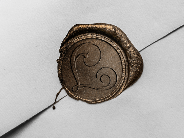
Both choices are legitimate, and the right answer depends entirely on how the family understands its own continuity.
A well-designed newborn monogram tends to have a long working life, appearing first on nursery linens, later on stationery, and eventually, decades on, on objects the child will select for a household of their own.
This longevity places particular demands on the design from the very beginning.
A mark drawn to appeal specifically to infancy, with soft or playful letterforms, risks looking dated within a few short years.
The strongest newborn commissions instead favor timeless proportion from the outset, understanding that the mark is meant to mature alongside the person who carries it.
“Our daughter’s nursery mark now appears on her stationery, and it never once looked like something meant only for a baby.”
A Family in Charleston, South Carolina
“The atelier asked more questions about our grandmother’s handwriting than about fonts, which told us everything we needed to know.”
A Client in Boston, Massachusetts
Anniversary and celebration monograms operate under a related but distinct logic, marking not the beginning of an identity but a milestone within an already established one.
A twenty-fifth or fiftieth anniversary mark often incorporates elements absent from the original wedding monogram: children’s initials, a revised family crest, small adjustments that reflect decades of accumulated history.
These later commissions are, in some ways, more moving to produce than the original ever was.
They arrive already carrying evidence of a life actually lived together, rather than a life only anticipated on a single afternoon.
The artist’s task shifts accordingly, from imagining a future to honoring a past that has already unfolded in full.
Few commissions carry more quiet weight than an anniversary mark requested by a couple who have genuinely stayed the course together.
THE ATELIER JOURNAL
Why Restraint Is the Hardest Craft
Every experienced designer eventually confronts the same paradox: clients often arrive wanting more than the mark actually needs.
More flourish, more color, more obvious signals of expense and effort spent on the commission.
Part of the atelier’s responsibility is gently resisting these instincts, not out of stubbornness but out of accumulated experience about what actually endures over time.
An ornate mark photographs well in the moment of unveiling and often disappoints within a few years, once the initial excitement about novelty has faded.
A restrained mark rarely photographs as dramatically at first, but it rewards long acquaintance in a way ornament simply cannot.
This is a difficult truth to communicate persuasively during an initial consultation, when the client’s instinct naturally runs toward more rather than less.
It becomes far easier to demonstrate once the client has lived with a restrained design for a season or two and noticed how well it continues to suit them.
“A mark should earn its permanence rather than assume it.”
The Atelier Journal
Design philosophy of this kind cannot really be taught through explanation alone.
It has to be demonstrated, commission after commission, until the client begins to trust the process rather than simply the immediate visual result.
This is part of why returning clients tend to grant the atelier more creative latitude with each subsequent project.
Trust, once earned through a successful restrained design, tends to compound steadily over time.
The atelier’s own philosophy could be summarized simply: a mark should earn its permanence rather than assume it from the outset.
Permanence is not granted by expense, and it is not granted by ornament.
It is granted by proportion, by legibility, and by a kind of quiet correctness that becomes more apparent the longer the mark is examined.
This is the standard every commission is ultimately measured against, regardless of the occasion that first prompted it.
Few clients arrive already understanding this standard, but nearly all of them recognize it the moment they see it achieved.
There is a professional humility required to hold this standard consistently, particularly when a client is actively requesting more embellishment than the mark can comfortably carry.
The easier path, in the short term, is simply to agree and deliver whatever is requested.
The more difficult and more valuable path is to explain, patiently and without condescension, why a quieter version will ultimately serve the client better.
Not every client is persuaded immediately, and that is a reasonable position for a first-time client to hold.
What tends to change minds is not argument but evidence: sketches placed side by side, one restrained and one embellished, allowed to speak for themselves.
In nearly every case, the quieter option is the one the client ultimately selects, once the comparison is made directly rather than described in the abstract.
“We requested something quieter than our first instinct, and years later that restraint is exactly why it still looks right.”
A Founder in Savannah, Georgia
“Twenty-five years after our wedding monogram was designed, the updated anniversary mark still felt like the same family, only fuller.”
A Couple in Newport, Rhode Island
LUXURY IDENTITY
A Signature That Functions as Architecture
Professional identity monograms occupy a slightly different register from personal or family marks, though they draw on the same underlying discipline.
A physician, an attorney, or an architect commissioning a personal identity mark is not simply requesting a decorative flourish for letterhead.
They are requesting a visual shorthand for judgment, discretion, and standing, qualities that are otherwise difficult to communicate quickly to a new client.
This is precisely the function heraldry once performed for landed families, translated into a contemporary professional context.
A personalized personal monogram built for this purpose must function across an unusually wide range of applications: a business card, a formal letter, an office door, occasionally a piece of commissioned art for a private study.
Consistency across these surfaces matters more than any single dramatic application on its own.
The mark that appears on a small card must be recognizably the same mark that appears on a large signet, scaled correctly rather than merely shrunk or enlarged without adjustment.
This technical discipline is easy to overlook and difficult to execute well, requiring a designer who understands how linework behaves differently at different scales.
Clients rarely notice this discipline when it is done correctly; they notice its absence almost immediately when it is not.
A mark that looks crisp on a business card but muddy when engraved larger signals a design that was never properly tested across its intended applications.
The atelier process for professional identity work typically includes this kind of scale testing as a standard step, not an optional add-on offered only to certain clients.
It is, in many respects, the least glamorous part of the commission and among the most consequential to its long-term success.
A dignified professional identity, once established correctly, tends to remain in use for decades, changing only in minor ways as a practice grows or a title changes.
This longevity is, again, the entire point of commissioning bespoke work in the first place.
A mark that must be redesigned every few years was never truly built correctly to begin with.
The goal, in professional contexts as in personal ones, is always the same: a symbol solid enough to outlast the trends that surrounded its creation.
This is particularly evident in fields where trust is the entire product being sold, such as law, medicine, or private financial advising.
A client evaluating an unfamiliar professional often has very little to judge beyond a handful of visual signals, and an identity mark is frequently among the first of those signals encountered.
A considered mark suggests, correctly or not, a considered practice behind it.
This is not a fair basis for judgment in any strict sense, but it is a real and consistent pattern in how people form first impressions.
Professionals who understand this dynamic tend to treat their personal identity mark as a serious investment rather than an afterthought handled quickly before a launch date.
That seriousness, once visible in the mark itself, tends to be read back onto the practice it represents.
THE ART OF MONOGRAMS
The Minimalist Case for More Meaning
Minimalist monograms are sometimes mistaken for the easiest category of commission, on the theory that fewer lines require less work.
The opposite is closer to the truth in nearly every case.
A minimalist mark has nowhere to hide an imperfect proportion or an awkward spacing decision.
Every remaining line must justify its presence, because there is no ornament left to distract from a mistake.
This is why the most accomplished minimalist work often takes as long to resolve as a far more elaborate design, sometimes considerably longer.
The designer is not simply removing detail; they are determining exactly how little detail a mark can carry while still functioning as a complete, dignified symbol.
Clients drawn to minimalist marks tend to share a particular sensibility, one that values clarity over display and confidence over embellishment.
This preference is not a rejection of tradition so much as a distillation of it, retaining the underlying discipline of classical monogram design while stripping away the decorative conventions that accumulated around it over centuries.
It is worth noting that minimalism, in this specific context, has nothing to do with the broader design movement that borrowed the same word for very different purposes.
A minimalist monogram is not an exercise in industrial austerity; it is a considered reduction, closer in spirit to a well-tailored garment than to a stripped concrete wall.
Warmth and precision are not opposites here, whatever their reputation might suggest in other design contexts entirely.
A well-executed minimalist monogram still obeys every rule that governs its more ornate counterparts: balanced weight, considered negative space, letterforms that cooperate rather than compete.
It simply applies those rules with far fewer visible tools at its disposal.
This is, in its own way, the most honest test of a designer’s underlying skill.
Ornament can disguise a weak foundation for quite some time.
Minimalism cannot disguise anything at all.
What remains, once every unnecessary element has been removed, is either genuinely well-proportioned or it is not, with nothing left to argue otherwise.
The clients who choose this path are, in effect, asking for the purest possible demonstration of the craft itself.
It is a request the strongest ateliers welcome rather than avoid.
BESPOKE WEDDINGS
Marking an Occasion Larger Than a Single Day
Not every commission is tied to a wedding, a birth, or an anniversary; some mark a single evening meant to be remembered for years.
Event monograms, commissioned for a milestone birthday, a philanthropic gala, or a landmark celebration, follow a compressed version of the same discipline used for more permanent identities.
The mark still needs proportion, restraint, and a considered relationship to whatever letters or dates it represents.
What differs is the runway: an event mark is often designed and finalized in a matter of weeks rather than months.
This compression does not excuse a lower standard; if anything, it demands sharper decision-making from the outset.
A well-designed event mark performs a specific function beyond decoration.
It gives a single evening a visual identity that guests instantly associate with the occasion, from the invitation through the printed program to a small favor taken home afterward.
Philanthropic organizations in particular have come to understand this value, commissioning marks for signature annual galas that guests recognize year after year.
A returning symbol, refined slightly with each iteration, builds the same kind of quiet trust a family crest builds across generations, only compressed into a single annual rhythm.
Family-owned businesses celebrating a founding anniversary often request a similar treatment, pairing an original founding mark with a modest update that signals continuity rather than reinvention.
The instinct to preserve rather than replace is, in every case, the correct one.
A celebration mark that departs too far from an established identity risks looking like an entirely different occasion rather than a continuation of the same one.
The most successful event commissions understand this balance instinctively: enough change to mark the specific occasion, and enough continuity to still feel like the same institution or family everyone already recognizes.
There is also a practical argument for treating even a single-evening commission with full seriousness.
Photographs from a memorable event tend to circulate for years, appearing in anniversary retrospectives, institutional archives, and personal albums long after the evening itself has ended.
A hastily designed mark ages poorly in these photographs in a way few guests notice at the time but nearly everyone notices in retrospect.
A properly considered one holds up exactly as well in a decade-old photograph as it did on the night it was unveiled.
This is, in miniature, the same argument that applies to every other category of commission discussed throughout this discipline.
The occasion may be brief, but the record of it is not, and the mark is what carries that record forward.
4
Fictional Testimonials Featured
6+
Generations a Family Mark May Serve
2–3
Letters in a Typical Interlace
1
Symbol Meant to Outlast Every Trend