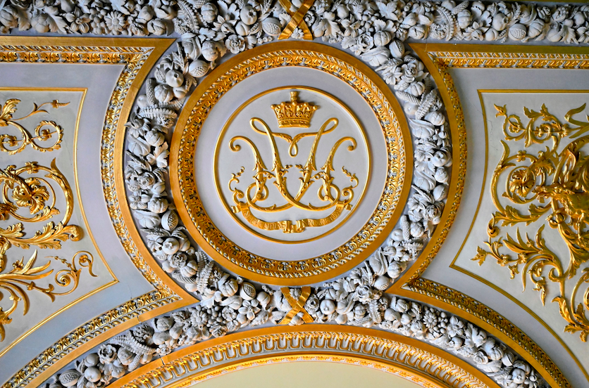
The Initial Monogram: A Family’s Finest Inheritance
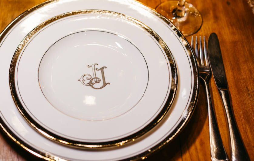
The Initial Monogram: A Language of Legacy
A study in family monogram tradition and the enduring discipline of the classic monogram.
A single letter can hold more history than an entire paragraph.
Long before logos became commonplace, the most enduring marks of distinction belonged not to companies, but to individuals.
The initial monogram is the oldest and quietest form of that distinction.
It asks for nothing beyond a name, and yet it returns something far greater than decoration.
It returns identity, rendered in a single, permanent gesture.
In American households where heritage is treasured alongside ambition, the initial monogram has never gone out of favor.
It appears on silver passed between generations, on linens folded into cedar chests, and on stationery reserved for the most considered correspondence.
This is not a trend to be revisited every few seasons.
It is a constant, the kind of symbol that ages with a family rather than against it.
What follows is an examination of why the initial endures, how it is built, and what it continues to mean to those who choose to wear their own name so simply.
It is a study intended for those who have already sensed this truth, and simply wish to understand it more deeply.
Consider it a meditation on restraint, proportion, and the particular kind of permanence that only a well-made symbol can offer.
The Art of Monograms
The Origins of the Initial as Symbol
Every alphabet begins as an image before it becomes a sound.
The earliest initials were carved, stamped, or woven into fabric long before they were printed on paper.
A single letter served as proof of ownership in a world where few people could read an entire sentence.
Merchants marked their goods, artisans marked their tools, and families marked the objects that mattered most.
The initial was never meant to explain itself.
It was meant to be recognized instantly, the way a face is recognized before a name is spoken.
That instinct has not changed in the centuries since.
A classic monogram still functions as a kind of visual shorthand for everything a family or an individual represents.
Scholars of European ornament have traced the earliest interlaced initials to manuscript traditions, where a single decorated letter could anchor an entire page.
Those illuminated letters were never incidental.
They were considered worthy of as much craftsmanship as the text they introduced.
The same philosophy guides a bespoke atelier today.
A monogram is not an afterthought applied to a finished object.
It is often the first decision made, the seed from which the rest of the design grows.
What separates a true initial monogram from a simple set of letters is intention.
Every curve, every point of contact between strokes, is considered against the character of the person it represents.
A family that values restraint will ask for a monogram that whispers.
A family that values ceremony will ask for one that commands a room.
Both outcomes begin at the same starting point, which is the letter itself.
It is tempting to think of a monogram as a modern convenience, something invented for embossers and engraving machines.
The truth is considerably older.
Long before mechanical reproduction, a single hand-drawn initial required real skill to execute correctly.
A scribe entrusted with a decorated letter was often among the most respected craftsmen in a monastery or workshop.
That same respect for the discipline of letterforms continues to shape how a monogram is designed today.
A single letter, drawn with genuine care, still carries weight that a hurried signature never will.
This is the standard we hold every initial monogram to, regardless of how modest or elaborate the final commission may be.
Personal Monograms
A single identity, rendered with quiet precision.
Wedding Monograms
Two initials joined in lasting balance.
Family Crests
A visual record of lineage and legacy.
Newborn Monograms
A softened mark, built to mature with time.
On Legibility
A monogram that cannot be recognized at a glance has failed its most basic purpose.
Legibility is never sacrificed for the sake of ornament.
Even the most elaborate historical examples remained readable from a respectful distance.
Legacy & Family Heritage
Classic Monogram Traditions Within the Family Home
Few objects travel between generations as gracefully as a well-made monogram.
A set of initials engraved into silver in one decade can still be recognized, and cherished, three decades later.
This is the particular power of a family monogram: it does not need to be explained to be understood.
It simply needs to be seen.
In many American households, the family monogram lives quietly on objects that are used rather than displayed.
Linen napkins, hand towels, leather travel cases, and writing desks all carry the same restrained set of letters.
The repetition is deliberate.
A monogram gains meaning the more often it is encountered in daily life, not the less.
Families who commission a classic monogram often describe the process as an act of preservation rather than decoration.
They are not simply choosing a design.
They are choosing the visual language their descendants will inherit.
This is why the initial monogram is so often paired with a broader family emblem, an evolution explored further within our own work on the family crest.
The two are related but distinct.
A monogram speaks to the individual, while a crest speaks to the lineage.
Together, they form a complete visual record of a family’s identity.
Some of the most distinguished American families, particularly those descended from agricultural and mercantile fortunes, have long used the monogram as a quiet marker of continuity.
A set of initials on a piece of correspondence signals more than authorship.
It signals belonging to something that existed before the letter was written and will continue after it is read.
That sense of continuity is difficult to manufacture and impossible to fake.
It can only be built, letter by letter, across time.
This is one reason a family monogram is rarely commissioned in haste.
The decision tends to arrive after a significant occasion, a marriage, an inheritance, or the simple recognition that a family’s belongings deserve a shared visual identity.
Once chosen, the design is expected to serve every generation that follows, which is a considerable expectation for a handful of letters to meet.
On Letter Order
Traditional convention places the surname initial at the center of a three-letter monogram.
This hierarchy remains the most widely respected format in classic design.
Deviating from it is possible, but should always be a deliberate choice rather than an oversight.
A monogram gains meaning the more often it is encountered in daily life.
Royal Traditions
The Royal Precedent for Personal Initials
No institution has used the personal initial with more discipline than the royal houses of Europe.
A monarch’s cipher, formed from the initials of a given name, has long served as both signature and seal.
It appeared on state documents, on regimental insignia, and on gates that few were permitted to pass through.
The royal cipher was never intended to be ornamental alone.
It was a functional mark of authority, immediately recognizable across an entire kingdom.
The institutions responsible for regulating these marks have preserved centuries of precedent on how a monogram should be constructed to convey legitimacy rather than mere taste.
Their archives remain a quiet reference point for anyone studying the discipline required of a truly considered monogram.
What is striking about these historical ciphers is their restraint.
A royal monogram rarely relies on excessive flourish to communicate importance.
Instead, it relies on proportion, symmetry, and the careful placement of a crown, a laurel, or a single ornamental flourish above the letters themselves.
This restraint is instructive for anyone commissioning a personal initial monogram today.
Grandeur, in the finest examples, is achieved through precision rather than excess.
The interlaced initials found on royal linens and stationery throughout history followed strict conventions regarding scale, weight, and spacing.
Those conventions were not arbitrary.
They ensured that a monogram remained legible and dignified at any size, from a ring seal to a palace gate.
A bespoke atelier drawing on this tradition today inherits more than an aesthetic.
It inherits a discipline: the understanding that a monogram must be built to last, not simply to please.
This is the same discipline applied to every classic monogram we design, regardless of whether it will be embossed on stationery or engraved into silver.
It is worth noting that the royal cipher was never designed for a single audience.
It had to remain dignified whether viewed up close on a formal document or from a distance on a ceremonial gate.
That dual requirement, intimacy and grandeur achieved through the same design, remains the central challenge of any personal monogram commissioned today.
Medieval Era
Illuminated manuscripts introduce the decorated initial as a mark worthy of its own craftsmanship.
Renaissance
Merchant families adopt interlaced initials to mark goods, ledgers, and correspondence.
18th Century
Royal ciphers formalize strict conventions of proportion, symmetry, and ornament.
19th Century
The monogram becomes a fixture of household silver, linen, and personal stationery among distinguished families.
20th Century
Luxury houses adopt interlaced initials as a foundation for personal and commercial identity.
Present Day
The initial monogram continues as a considered, enduring mark of personal and family distinction.
On Restraint
The most distinguished monograms rarely rely on heavy ornament.
Restraint, applied consistently, is what allows a design to remain elegant across decades.
Ornament dates a design far faster than proportion ever does.
Bespoke Weddings
Initials at the Threshold of Marriage
A wedding is one of the few occasions when two individual initials are formally joined into one design.
The resulting monogram becomes the first shared symbol a couple owns together.
It appears on invitations before the ceremony and on household linens long after it.
This makes the wedding monogram unusually consequential.
It must represent two distinct identities without erasing either one.
The most successful designs treat the initials as equal partners in the composition, rather than allowing one letter to dominate the other.
Symmetry, in this context, becomes a quiet metaphor for partnership.
Many couples choose to commission their wedding monogram well before the invitations are printed.
This allows the same design to be carried across the entire celebration, from the ceremony program to the escort cards to the cake.
A monogram introduced this early in the planning process becomes a unifying thread rather than a single decorative flourish.
It is worth noting that a wedding monogram and a personal initial monogram are not always the same commission.
Some couples prefer to preserve their individual initials for personal use while reserving a combined design exclusively for the marriage itself.
Either approach is valid.
What matters is that the choice is made deliberately, with an understanding of how the symbol will be used for decades to come.
A monogram commissioned for a wedding often becomes the household’s primary mark almost immediately.
It replaces two separate identities with a single, shared one, engraved wherever the couple chooses to leave their mark.
Some couples return years later to revisit the same monogram, adding a small refinement as their household has grown or evolved.
This is not a sign of an imperfect original design.
It is simply evidence that the monogram has remained genuinely useful, worth adjusting rather than replacing.
My husband and I wanted our wedding monogram to feel like it belonged to both of us equally.
The final design managed that balance perfectly, and it now appears on nearly everything in our home.
Guests still comment on it years after the wedding itself.
— A Client, Charleston, South Carolina
On Wedding Monograms
A combined monogram should honor both individuals equally.
Neither initial should visually dominate the other.
The strongest examples feel inevitable, as though the two letters were always meant to meet.
Luxury Identity
The Initial as an Instrument of Luxury Identity
Luxury has always relied on symbols that communicate more than they say outright.
The initial monogram is among the most efficient of these symbols.
A single well-drawn letter can suggest craftsmanship, history, and personal standing without a single word of explanation.
This is precisely why the finest luxury houses have historically relied on interlaced initials rather than lengthy names.
A monogram is instantly legible even from a distance, and instantly personal up close.
For an individual, the same principle applies at a smaller scale.
A monogram engraved into a leather portfolio or embossed onto stationery performs a similar function to a house mark.
It signals that the object was made with a specific person in mind, not mass-produced for anyone who might purchase it.
This distinction matters enormously to a certain kind of client.
They are not seeking to display wealth outright.
They are seeking to display consideration, the sense that every object in their possession was chosen or made with intention.
The initial monogram achieves this more elegantly than almost any other design element available.
It does not shout.
It simply confirms, quietly and permanently, that the object belongs to someone who cared enough to have it marked properly.
This philosophy extends naturally into contemporary professional life, where a personal or family monogram increasingly appears on business correspondence and personal branding alongside more traditional applications.
A well-designed monogram can accompany a person from their earliest correspondence to their most significant professional milestones without ever needing to be reconsidered.
That kind of longevity is rare in design, and it is precisely what elevates a monogram from ornament to instrument.
3
Letters, on Average, in a Classic Monogram
100+
Years a Well-Built Monogram May Remain in Use
1
Family Identity, Rendered Across Generations
On Scale
A well-built monogram must remain legible whether engraved on a ring or embroidered across a large linen border.
Scale changes everything about how a letterform is perceived.
Royal Traditions
Heraldry and the Grammar of Letters
Heraldry developed its own strict grammar centuries before typography existed as a discipline.
Every element of a coat of arms, from color to charge to placement, carried specific meaning within a formal system.
The initial monogram borrows from this grammar even when it appears far simpler than a full coat of arms.
Balance, hierarchy, and symmetry all originate from heraldic convention.
A monogram with three initials, for instance, often follows the same hierarchy long used in surname-centered heraldic design, where the family name occupies the visual center regardless of alphabetical order.
This convention persists today in most classic monogram formats used across American households.
Institutions dedicated to preserving heraldic tradition continue to document these conventions with remarkable precision, offering a record of how letterforms have been governed by rule rather than whim for centuries.
That record remains a valuable reference for any atelier committed to historical accuracy rather than invented tradition.
It is easy to design letters that merely look attractive together.
It is far more difficult to design letters that honor the grammar those letters have inherited.
This is the difference between a monogram that feels timeless and one that feels merely fashionable.
The former draws on centuries of established convention.
The latter draws only on the preferences of the present moment, which rarely age well.
A well-trained eye can often identify a monogram’s era simply by how loosely or strictly it follows heraldic grammar.
The most enduring designs tend to sit closer to the strict end of that spectrum.
This does not mean a modern monogram cannot feel fresh.
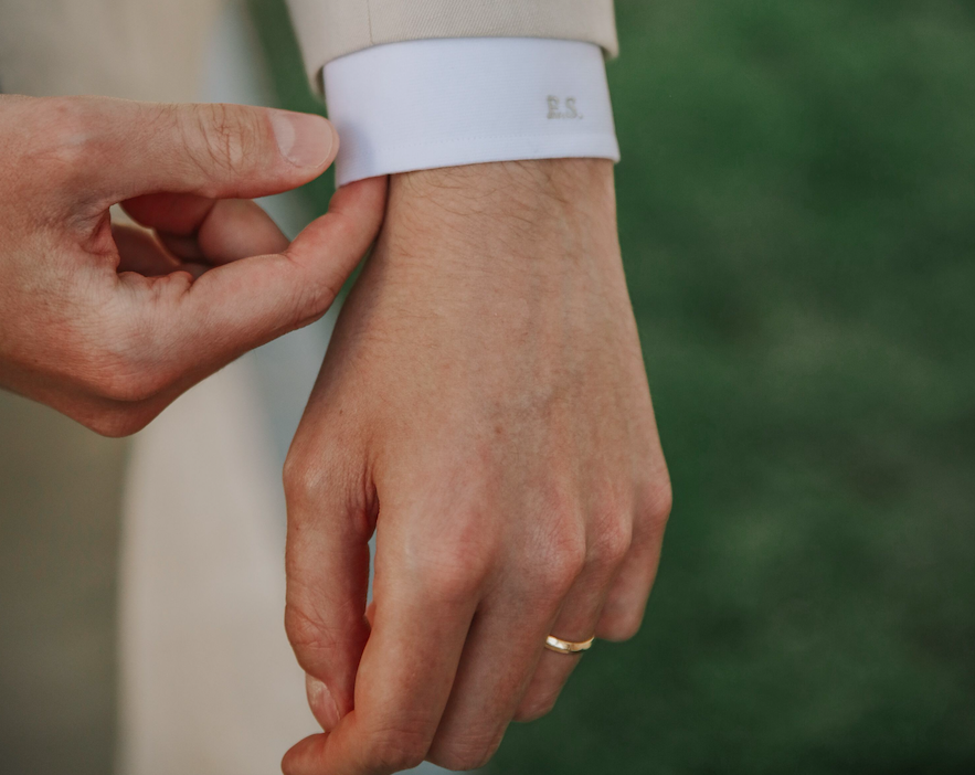
It means that any freshness must be achieved within the grammar, through subtle proportion and craftsmanship, rather than by abandoning the grammar altogether.
A monogram that ignores this grammar entirely rarely reads as innovative.
More often, it simply reads as unfinished.
As someone who built a business from very little, I wanted a personal mark that reflected where my family came from, not simply where I had arrived.
The initial monogram they designed does exactly that.
It has become part of how I present myself professionally.
— A Client, Chicago, Illinois
On Heraldic Grammar
Interlacing, spacing, and hierarchy all descend from centuries of formal heraldic convention.
These rules are respected rather than reinvented.
A modern monogram can feel contemporary while still honoring this inheritance.
The Art of Monograms
From Cipher to Crest: The Anatomy of a Classic Monogram
A classic monogram is built from a small number of decisions, each of which carries significant weight.
The first is letter order, which determines hierarchy among the initials represented.
The second is interlacing, or the degree to which the letters share strokes rather than standing independently.
The third is ornament, which may include a simple hairline border, a small flourish, or nothing at all.
Each of these decisions reflects the character of the person or family being represented.
A monogram intended for daily use, such as one embossed on stationery, typically favors clarity over ornament.
A monogram intended for ceremonial use, such as one engraved into a wedding gift, can support a greater degree of embellishment.
Understanding this distinction is essential to designing a monogram that will still feel appropriate decades from now.
A cipher differs slightly from a crest, though the two are often confused.
A cipher is composed purely of letters, interlaced or arranged without additional heraldic imagery.
A crest may incorporate a cipher but typically surrounds it with symbolic elements specific to a family’s history.
Anyone curious about how a cipher evolves into a fuller emblem can explore the distinction further within our own cipher monogram work.
What remains constant across both formats is the discipline of proportion.
Every letter must occupy its space with confidence, neither crowding its neighbors nor drifting apart from them.
This balance is achieved through careful, often painstaking adjustment, letter by letter, until the composition feels inevitable rather than assembled.
A finished monogram should never appear as though it were assembled from separate parts.
It should read as a single, unified mark, as though the letters were always meant to exist together.
| Format | Primary Use | Character |
|---|---|---|
| Initial Monogram | Personal stationery, daily objects | Restrained, immediate, personal |
| Wedding Monogram | Combined household identity | Balanced, symmetrical, shared |
| Family Crest | Generational, heraldic identity | Layered, symbolic, historical |
| Cipher | Interlaced letterform without imagery | Minimal, architectural, precise |
On Materials
A monogram designed for engraving must be tested against the material long before production begins.
Silver, leather, and linen each demand slightly different proportions.
A design that succeeds in one material cannot simply be transferred to another without adjustment.
Legacy & Family Heritage
The Family Monogram as Inheritance
A family monogram is rarely designed with only the present generation in mind.
The best examples are built to be inherited, which means they must avoid anything overly specific to a single decade’s taste.
This requirement shapes nearly every decision an atelier makes when developing a family’s primary mark.
Trend-driven flourishes are set aside in favor of proportions and forms that have already proven their staying power across centuries.
Families who have built their fortunes across generations, particularly those with roots in agriculture, trade, or finance, often understand this principle instinctively.
They have already watched other assets appreciate or depreciate based on how well they were built to last.
A monogram is no different.
One designed with genuine restraint will still feel correct on a grandchild’s belongings, long after fashions in typography have shifted several times over.
This is why a family crest and a personal monogram are so often developed in tandem.
The crest anchors the family’s broader history, while the monogram allows each individual member to carry a personal variation of that same visual language.
The relationship between the two can be explored in greater depth within our dedicated study of the family crest tradition.
Inheritance, in this context, is not only about the object bearing the monogram.
It is about the design itself being passed down, referenced, and occasionally adapted as new generations add their own initials to the family’s visual record.
A monogram built with this future in mind becomes something closer to an heirloom than a decoration.
This is precisely why so many families choose to formalize their monogram alongside a fuller family crest, ensuring both symbols are developed with the same standard of care and the same expectation of longevity.
On Inheritance
A monogram built for one generation should still feel appropriate to the next.
This is the single greatest test of a design’s success.
Time, more than any critic, is the true judge of a monogram’s quality.
We commissioned our family monogram after my grandmother’s silver was finally divided among her grandchildren.
It felt important that whatever came next would carry forward with the same sense of care she always had.
What we received was more restrained and more beautiful than anything we could have described ourselves.
Every grandchild now has a piece marked with the same letters she once used herself.
— A Client, Boston, Massachusetts
The Atelier Journal
Craftsmanship and the Atelier Process
Designing an initial monogram by hand is a slower process than most people expect.
It begins not with a computer but with a conversation, understanding the history, temperament, and intentions of the person the monogram will represent.
Only once that understanding is established does the drawing begin.
Early sketches typically explore several possible letter arrangements before a single direction is chosen.
This exploration matters because a monogram, unlike most design work, will likely outlive the person who commissioned it.
Every stroke is reviewed for balance at multiple scales, since a monogram must read clearly whether it is the size of a signet ring or the size of a linen border.
Adjustments are often made in fractions of a millimeter, the kind of precision that is invisible individually but unmistakable in the finished composition.
This process draws heavily on the study of historical letterforms preserved within major decorative arts collections, where centuries of engraved silver, embroidered linen, and illuminated manuscripts continue to inform how a modern monogram should be constructed.
That research is never decorative in itself.
It exists to ensure that a contemporary monogram is built on the same disciplined foundation as the finest historical examples.
The final stage of the process is refinement, where the design is tested against the specific material it will inhabit.
A monogram intended for engraving behaves differently than one intended for embroidery, and both differ from one intended for print.
Each material imposes its own constraints, and a well-designed monogram accounts for all of them before it is ever finalized.
Nothing about this process is rushed.
A monogram intended to last for generations deserves a design process willing to take the necessary time.
01
An initial conversation establishes the history and character behind the commission.
02
Early sketches explore several possible letter arrangements and hierarchies.
03
A single direction is refined against strict standards of proportion and balance.
04
The design is tested against its intended material, whether silver, leather, linen, or print.
05
A final composition is delivered, built to remain appropriate for generations.
On Newborn Monograms
A monogram created for a child is often softened in form.
It is still expected to mature gracefully alongside the person who carries it.
The best examples never need to be redesigned as that child grows into adulthood.
Luxury Identity
The Initial Monogram in Contemporary Luxury Life
The initial monogram has adapted comfortably to modern life without losing its original character.
It now appears on personal stationery, professional correspondence, travel accessories, and objects marking significant milestones such as births, anniversaries, and promotions.
Each application carries its own subtle requirements.
A monogram intended for a newborn’s keepsakes is often designed with softer, more rounded forms than one intended for a professional’s business materials.
Both, however, draw from the same underlying discipline of proportion and restraint.
Contemporary clients increasingly request monograms that feel minimalist rather than ornate, favoring clean intersections over heavy flourish.
This preference does not represent a departure from tradition so much as a return to its earliest, most disciplined form.
The earliest monograms, after all, were defined by clarity rather than decoration.
What has changed is the range of contexts in which a monogram now appears.
It travels from a leather passport case to a digital signature, from a wedding invitation to a corporate letterhead, without ever losing its essential legibility.
This versatility is a testament to how well-considered the underlying letterforms are.
A monogram built on sound proportion can move fluidly between contexts that its original designers likely never imagined.
This adaptability is not a departure from tradition.
It is proof that the underlying discipline was sound from the very beginning.
A design built correctly the first time rarely needs to be reconsidered, regardless of how many new contexts it eventually encounters.
We ordered a set of monogrammed keepsakes for our son’s christening, and I was struck by how timeless the design felt immediately.
It does not feel like something we will want to update in ten years.
If anything, I expect he will thank us for it one day.
— A Client, Greenwich, Connecticut
Bespoke Weddings
The Monogram at Life’s Milestones
A monogram rarely arrives only once in a person’s life.
It tends to return, quietly, at each significant milestone worth marking.
A child’s birth is often the first occasion.
Parents commission a set of initials for a nursery keepsake, a christening gown, or a small silver cup meant to be kept rather than used.
These early monograms are frequently designed with softer curves than their adult counterparts.
The intention is not permanence in form, but permanence in meaning.
As that child grows, the same initials may reappear on school trunks, on the spine of a favorite book, or on a leather satchel carried into early adulthood.
Each application reinforces a single, continuous identity.
An anniversary often marks the next major occasion for a personal or family monogram.
Couples celebrating a significant year together sometimes commission an updated rendering of their original wedding monogram, adjusted subtly to reflect years of shared history.
This is not a replacement of the original design.
It is closer to a quiet acknowledgment that the symbol has aged well alongside the marriage it represents.
Professional milestones carry their own version of this tradition.
An individual founding a new venture, accepting a significant promotion, or retiring after decades of work may choose to commission a personal monogram for the first time.
In these instances, the monogram often marks a transition from one chapter of identity into another.
It is worth noting that a milestone monogram need not be elaborate to be meaningful.
Some of the most affecting commissions we have developed consist of only two or three unadorned letters.
Their power lies entirely in timing and intention, not in ornament.
A family that returns to the same atelier across several of these milestones often begins to notice a quiet continuity in the resulting designs.
This continuity is intentional.
It reflects a consistent design philosophy applied across every commission, regardless of the occasion that prompted it.
Over enough years, a family’s collected monograms begin to form their own kind of visual archive.
Every initial, viewed together, tells a fuller story than any single commission could tell alone.
This is why we encourage clients to think of each commission not as an isolated project, but as one entry in a much longer record.
A monogram commissioned today will very likely outlive the occasion that inspired it, appearing on objects and documents that have not yet been imagined.
Approaching the design with that longer view in mind changes the questions worth asking at the outset.
Personal Monograms
A single identity, rendered with quiet precision.
Wedding Monograms
Two initials joined in lasting balance.
Family Crests
A visual record of lineage and legacy.
Newborn Monograms
A softened mark, built to mature with time.
Legacy & Family Heritage
American Heritage and the Personal Emblem
The tradition of the personal monogram did not originate in the United States, yet it found particularly fertile ground here.
American families building fortunes across agriculture, trade, manufacturing, and finance often looked toward European convention when establishing their own visual identity.
The monogram offered a way to signal permanence in a country still defining what permanence meant.
Unlike a title or a peerage, a monogram required no formal recognition from any governing body.