Custom Brand Monogram: The Architecture of a Mark
The Custom Brand Monogram: A Private Language for Distinguished Names
A logo can be purchased.
A custom brand monogram must be composed.
The distinction is not academic; it is the entire premise of this atelier.
Long before corporations adopted the language of branding, individuals had already perfected it.
Kings signed treaties with a cipher; merchants sealed correspondence with an initial pressed into wax.
The modern brand inherited this instinct without always understanding where it began.
A house mark, in its finest form, behaves less like marketing and more like memory.
It is meant to be seen once, and then recognized again, decades later, unchanged.
This is the standard held for every custom brand monogram commissioned through this atelier.
Not a symbol assembled from a template, but one composed the way a signature is composed.
A signature cannot be copied without becoming, immediately, a forgery.
The same should be true of a mark meant to represent a name in commerce.
What follows is an examination of what a custom brand monogram actually is.
Not quite a logo, and not quite a crest — something closer to both, and more than either.
The reader who values permanence over novelty will recognize the distinction almost immediately.
This is not a study written for every brand, and it does not attempt to be.
It is written for the name confident enough to think in decades rather than quarters.
For that name, the questions that follow are not academic at all.
They are the questions a commission must answer before a single line is drawn.
What is worth building slowly, and what is merely worth building quickly?
LUXURY IDENTITY
The Idea of a Brand as a Mark
Every enduring brand begins as an idea before it becomes an image.
The custom brand monogram exists to compress that idea into a single, legible form.
This is a harder task than it sounds, and a rarer skill than most assume.
Reduction is not the same as simplification; one requires judgment, the other requires haste.
A monogram built in haste tends to look like a monogram built in haste.
One built with discipline tends to look as though it had always existed.
Analysts who study brand valuation have long observed that the strongest names outperform the market’s expectations of them, holding their position across shifting consumer moods and economic cycles.
The mark itself is rarely the reason, but it is very often the vessel.
A vessel, to be trusted, must feel inevitable rather than invented.
This is why the finest brand monograms rarely announce themselves loudly.
They are quiet in the way a well-tailored coat is quiet — noticed only by those who understand tailoring.
The atelier’s approach begins from this premise rather than from current visual trends.
A trend, by definition, is temporary; a mark, by design, is not.
The two are frequently confused, and the confusion is expensive.
GUSTAVO ATHAYDE was founded on the conviction that a brand deserves the same rigor as a family crest.
The custom brand monogram, properly built, becomes the family crest of the enterprise it represents.
A name that has taken a decade to build should not be entrusted to a mark built in a weekend.
This sounds like an obvious statement until the alternative is priced and considered.
Speed is inexpensive; correction, once a brand has launched publicly, rarely is.
A mark discovered to be wrong after launch carries a cost far beyond the design fee.
It carries the cost of every surface it has already touched — signage, packaging, correspondence, memory.
This is why the atelier insists on resolving the mark fully before it is ever shown publicly.
A private review process exists precisely to prevent a public correction later.
Few clients think about this risk until it is explained to them plainly.
Once explained, most agree that patience at the outset is the cheaper decision by far.
This is the quiet economics behind an otherwise aesthetic argument.
Restraint, in other words, is not merely a matter of taste.
It is, in the most literal sense, a matter of risk management.
THE ART OF MONOGRAMS
From Personal Cipher to Corporate Mark
The monogram did not begin as a business instrument.
It began as a private mark, one letter or several, interlaced for a single individual.
Byzantine emperors used the form on coinage centuries before any company existed to borrow it.
Medieval scribes used it to sign manuscripts they were forbidden to sign in full.
The organizations devoted to studying this history still catalogue those early ciphers today, treating them as documents of identity rather than mere decoration.
By the Renaissance, the mark had migrated from monarchs to merchant families of considerable means.
A Florentine banking house might stamp its interlaced initials on ledgers, doorframes, and shipping crates alike.
The mark meant the same thing in each context: this belongs to us, and it will still belong to us tomorrow.
That continuity is the entire inheritance a custom brand monogram is built to carry forward.
European nobility refined the discipline further, codifying rules for how initials could be joined, mirrored, or crowned.
Those rules were not decorative preference; they were a form of law, enforced by institutions with the authority to do so.
A cipher improperly composed could be challenged, corrected, or simply refused recognition.
This is a level of scrutiny most corporate logos have never once encountered.
It is also, quietly, the level of scrutiny this atelier still applies to every commission.
The nineteenth century brought the mark into commerce in earnest, as trading houses sought signatures of their own.
What had once distinguished a family began, gradually, to distinguish a firm.
Shipping lines painted interlaced initials onto funnels; department stores pressed them into brass fittings.
The instinct was identical to the one that had guided royal cipher-makers centuries earlier.
A mark, once composed correctly, could travel further and last longer than any single transaction.
The twentieth century accelerated this migration considerably, as mass production demanded a mark that could scale.
Corporate identity, as a discipline, essentially formalized what monogram tradition had already understood.
Somewhere in that formalization, however, something was lost.
Speed replaced patience, and volume replaced singularity.
A mark that once took a master engraver months to perfect could now be drafted in an afternoon.
The result, more often than not, has been forgettable rather than enduring.
The custom brand monogram exists to recover what that acceleration set aside.
Antiquity
Interlaced initials appear on coinage and civic seals as marks of authority rather than ownership.
Medieval Period
Scribes and craftsmen adopt the cipher as a discreet signature within larger works.
Renaissance
Merchant and banking families formalize the monogram as a mark of commercial trust.
Nineteenth Century
Trading houses and early luxury ateliers begin commissioning marks for their own enterprises.
Twentieth Century
The corporate logo emerges, often drawing — knowingly or not — on monogram tradition.
Present Day
The custom brand monogram returns as a deliberate alternative to the disposable logo.
THE ART OF MONOGRAMS
The Meaning Encoded in a Single Mark
A monogram communicates before it is consciously read, and this is precisely its power.
The eye recognizes shape and rhythm well before the mind assigns them a name.
This is why a well-composed mark can feel trustworthy on first encounter, before any claim has been made.
Trust, in commerce, is rarely won through argument; it is won through impression, repeated consistently over time.
A custom brand monogram is, in this sense, an instrument of accumulated impression.
Every correct application adds a small deposit to a much larger account of recognition.
Every inconsistent application withdraws from that same account, often without anyone noticing why.
This is the quiet mathematics behind why consistency has been emphasized so heavily throughout this discussion.
Symbolism operates on a similar principle, though it works through association rather than repetition alone.
A monogram that recalls classical proportion borrows, consciously, from centuries of accumulated authority.
It does not need to explain that authority; the borrowed form does the explaining on its behalf.
This is a considerable advantage over a mark invented from nothing, with no tradition to draw upon.
A brand that understands this advantage tends to commission rather than improvise.
Improvisation can produce something novel, but novelty alone rarely produces trust.
Trust requires a mark to feel as though it has already earned its place, even on the day it is unveiled.
Heritage-inspired composition offers a shortcut to that feeling, provided it is handled with genuine care.
Handled carelessly, the same borrowing reads as costume rather than lineage.
The atelier draws a careful line between the two, and holds every commission to it.
A mark should feel earned, not merely decorated with the trappings of something older.
This distinction is subtle on paper and unmistakable once seen in finished work.
It is, in many respects, the entire craft this atelier has spent years refining.
A name’s meaning, correctly encoded, becomes legible to a stranger within a fraction of a second.
That fraction of a second is where a brand’s reputation is quietly, continuously being built.
Few founders think about their mark in these terms, though most sense the stakes intuitively.
The custom brand monogram exists to serve that intuition with the rigor it deserves.
Nothing about this process is mysterious; it is simply unhurried, in a field that rarely rewards patience.
LUXURY IDENTITY
What Distinguishes the Commissioned Mark
Most brand marks in circulation today were never commissioned; they were selected.
A template is chosen, a typeface is adjusted, and a logo is declared finished.
The custom brand monogram follows an entirely different discipline from the outset.
It begins not with a font library but with a conversation about what the name must carry.
Every letterform is drawn, tested, and refined for that name and no other.
Nothing is borrowed from a catalogue of pre-existing shapes.
This is slower, by design, and the slowness is not incidental to the result.
A mark composed quickly tends to resemble other marks composed quickly.
A mark composed with patience tends to resemble nothing else at all.
That singularity is, in the end, the entire value being commissioned.
It cannot be manufactured through software alone, however capable the software has become.
Software can render a shape; it cannot decide which shape a name deserves.
That decision remains, stubbornly, a matter of trained judgment.
A trained eye can tell within seconds whether a mark was drawn or merely assembled.
Clients rarely have this training, which is precisely why they commission it elsewhere.
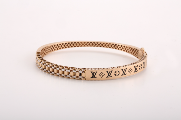
The difference shows up first in the counters — the enclosed spaces within letters.
A template treats a counter as leftover space; a custom mark treats it as composition.
It shows up again in the joinery, where two letters are asked to share a single stroke.
That sharing must feel deliberate, not accidental, or the mark will read as unfinished.
It shows up, finally, in how the mark behaves once reduced to almost nothing.
A template often collapses into an illegible smudge at small scale.
A properly drawn monogram holds its shape even at the size of a coin.
The table below outlines the practical difference between the two approaches.
Consideration
Template Logo
Custom Brand Monogram
Origin
Selected from existing designs
Drawn specifically for one name
Typography
Adjusted from stock fonts
Custom-built letterforms
Longevity
Follows visual trends
Built to outlast trends
Distinction
Shared with other users
Singular to one commission
Symbolism
Decorative only
Rooted in heritage and meaning
Small-Scale Legibility
Often collapses when reduced
Resolved at every scale
Application
Optimized for one medium
Resolved across every surface
“The finest brand marks are rarely invented in an afternoon. They are discovered, slowly, in the space between a name and its meaning.”
THE ATELIER JOURNAL
The Discipline of the Commissioning Process
A custom brand monogram is not delivered; it is arrived at.
The process begins with listening rather than sketching.
What does the name stand for, and what does it refuse to stand for?
These questions matter more, early on, than any question of style.
Only once they are answered does the atelier begin exploring letterforms.
Exploration, at this stage, is deliberately wide before it becomes narrow.
Dozens of interlace variations may be drawn before three are considered worth showing.
Those three are refined, tested at scale, and refined again.
A mark that only works at one size is not yet a finished mark.
It must hold its composure on a business card and on a building facade alike.
The full commissioning approach is detailed further within the atelier’s bespoke process.
Clients are shown the reasoning behind each direction, not simply the final image.
This transparency is intentional, since a commissioned mark should be understood, not merely accepted.
A client who understands why a form was chosen defends that form for decades afterward.
A client who is merely shown a finished image tends to second-guess it within the year.
This difference alone justifies the additional time the process requires.
Revisions, when they occur, happen before presentation rather than after.
By the time a mark is shown, it has already survived its harshest internal critic.
That critic is not the client; it is the atelier itself, applying its own standard first.
The result, when the process is honored, rarely requires revision after delivery.
It has already been tested against every objection worth raising.
What remains is a mark ready to represent a name for a very long time.
This is not a guarantee offered lightly, nor is it offered to every commission.
It is offered because the process, followed correctly, tends to produce exactly this outcome.
A shortcut anywhere along this sequence tends to surface later, usually at the worst possible moment.
The atelier would rather lose a week early than lose a client’s confidence later.
01
Discovery
A private conversation establishes what the name must communicate.
→
02
Exploration
Multiple interlace directions are drawn without early commitment to one.
→
03
Refinement
Selected directions are tested at scale and resolved letter by letter.
→
04
Presentation
The reasoning behind the final composition is shared alongside the artwork.
→
05
Delivery
Finished files are prepared for every application the brand requires.
LUXURY IDENTITY
Where the Mark Is Asked to Live
A brand monogram rarely stays confined to a single surface for long.
It travels from letterhead to packaging to signage within its first year alone.
Each surface asks something different of the same set of letterforms.
A monogram resolved for architecture must also resolve for a digital favicon.
Few marks are built with that range in mind from the outset.
This is precisely why the range must be considered from the outset.
The atelier tests every commission across the surfaces most likely to carry it.
A version optimized for embossing behaves differently from a version optimized for a screen.
The letterforms remain consistent; only their weight and spacing are permitted to adapt.
This discipline is documented further within the atelier’s logo monogram commissions.
Consistency across surfaces is, in practice, what allows recognition to compound over time.
A client who sees the mark on a door and later on a passport case should feel no discontinuity.
That continuity is not an aesthetic preference; it is the mechanism by which trust accumulates.
Few brand owners describe it in these terms, but they feel its absence immediately when it is missing.
A mark that looks like five different marks across five surfaces has, in effect, failed at its one job.
Its one job is to be recognized instantly, regardless of where it appears.
This is a harder standard than most brand owners initially expect.
It requires testing the mark against surfaces that do not yet exist at the time of commission.
A brand founded today may still be operating a century from now, on media not yet invented.
The mark should be built with enough structural integrity to make that leap without alteration.
This is, admittedly, an ambitious standard to hold for a single set of letterforms.
It is also, in the atelier’s experience, the only standard worth holding.
Anything less simply defers the redesign rather than avoiding it.
Stationery
Letterhead, correspondence cards, and private notation carrying a single consistent mark.
Packaging
Boxes, ribbon, and tissue treated as an extension of the brand’s private language.
Signage & Architecture
Facades, doorways, and interior millwork resolved at true physical scale.
Digital Presence
Favicons, social avatars, and app icons legible even at their smallest rendering.
Leather & Objects
Embossed or debossed applications across cases, ledgers, and presentation folios.
LUXURY IDENTITY
The Principles That Govern Restraint
Restraint is often mistaken for simplicity, and the two are not the same.
A restrained mark can be intricate; it simply refuses to be excessive.
Excess, in brand design, usually signals uncertainty rather than confidence.
A confident name rarely needs more than a few well-considered lines to be recognized.
This is a lesson borrowed directly from heraldic tradition, where clarity was never optional.
A coat of arms had to be legible at a gallop, from a distance, in poor light.
That same legibility is now asked of a brand mark rendered at sixteen pixels.
The constraint has changed context, but the underlying discipline has not changed at all.
Below are several principles the atelier holds central to every custom brand monogram.
Each has been tested against decades of commissions, not merely theorized in the abstract.
None of them are difficult to state; all of them are difficult to execute well.
That gap between statement and execution is, in the end, the reason commissions are worth commissioning.
A principle repeated without discipline becomes decoration rather than design.
The atelier exists specifically to hold that line.
Consider hierarchy first, since it is the principle most often ignored under deadline pressure.
Not every letter in a name carries the same visual weight, and a mark should say so plainly.
The surname initial, or the most phonetically prominent letter, typically anchors the composition.
This anchoring should be felt in the proportions rather than announced through obvious size difference.
Consider negative space next, since it is the principle most often left to chance.
The space within and around a monogram is not empty; it is structurally active.
A composition that ignores this space tends to feel cramped no matter how elegant its letters.
A composition that respects it tends to breathe, even at very small scale.
Hierarchy of Letters
Not every initial carries equal visual weight. The composition should say so plainly.
Negative Space
The space within and around a monogram is treated as active. It is never incidental.
Scale Integrity
A mark must remain legible from a favicon to a facade. No redesign should be required between them.
Singular Composition
No element is borrowed from a stock library. Nothing repeats from a prior commission.
Timeless Proportion
Proportions are drawn from classical reference. Passing trend is deliberately set aside.
LUXURY IDENTITY
On Trust, Signaling, and the Economics of Restraint
A brand mark functions, whether intended or not, as a signal to everyone who encounters it.
The signal is read instantly, long before a client reads a single word of copy.
A cluttered mark signals uncertainty; a restrained one signals confidence, whether or not confidence is deserved.
This is an uncomfortable truth for any brand still finding its footing.
It is also precisely why restraint carries an economic value beyond its aesthetic one.
A confident signal, sustained consistently, tends to attract clients who value the same qualities.
This is not marketing folklore; it is a pattern observed across decades of commissioned work.
Clients drawn to a restrained mark tend to be drawn, more broadly, to restraint as a value.
They are, in the atelier’s experience, precisely the clients most brands hope to attract.
A mark cannot manufacture this alignment on its own, but it can either support or undermine it.
An overworked mark tends to attract clients seeking spectacle rather than substance.
A quiet, well-considered mark tends to filter for the opposite instinct.
This filtering effect is rarely discussed openly, though every experienced brand owner has felt it at work.
It is one more reason the atelier resists the temptation to add complexity where none is needed.
Every additional flourish risks attracting exactly the attention a distinguished brand does not want.
Attention sought for its own sake tends to be fickle, arriving quickly and departing just as fast.
Attention earned through consistency and restraint tends to compound instead, slowly, over years.
This compounding is the real economic argument beneath an otherwise aesthetic conversation.
A brand mark, properly restrained, becomes an asset that appreciates rather than one that depreciates on schedule.
Few founders consider their visual identity in these terms, though the logic holds regardless.
The custom brand monogram is, in this light, less an expense than a long-term holding.
It behaves the way a well-chosen piece of property behaves: quietly, and increasingly valuable with time.
LUXURY IDENTITY
Measuring What Permanence Requires
Permanence is difficult to quantify, though its absence is easy to notice.
A brand that redesigns its mark every few years rarely inspires the confidence permanence requires.
Institutions devoted to art and material culture preserve monograms centuries after their commission, a fact worth sitting with.
Few contemporary logos will be legible, let alone preserved, a century from now.
This is not a criticism of contemporary design so much as a description of its priorities.
Most commercial logos are built for a quarterly campaign, not for a grandchild’s inheritance.
A custom brand monogram is built with the opposite horizon in mind.
The measures below are approximate, but they describe a real and consistent pattern.
Clients who commission with permanence in mind rarely return within a decade to commission again.
That is not a loss of business; it is the entire point of the exercise.
A mark that must be replaced was never truly finished in the first place.
The atelier considers a low rate of revision to be its clearest measure of success.
Few metrics in branding are this straightforward, and fewer still are this honest.
The numbers exist to make a qualitative argument in quantitative terms.
Legibility at small scale is measured deliberately, since it is where most marks fail first.
A mark that cannot survive reduction to a sixteen-pixel icon will eventually embarrass the brand it represents.
Consistency across applications is measured next, since fragmentation erodes recognition over time.
A mark that looks different on every surface is, functionally, several different marks.
Distinction from existing marks is measured last, and perhaps most carefully of all.
A mark too similar to another risks confusion, dilution, or worse, legal contest.
The atelier checks every composition against the broader field before it is ever finalized.
This is unglamorous work, but it is precisely the work that protects a client’s investment.
10+
Years typical before a well-composed mark needs revisiting
3
Core interlace directions refined per commission, on average
100%
Of letterforms drawn specifically for the commissioning name
1
Mark, built once, intended to serve for generations
Legibility at Small Scale — 96%
Consistency Across Applications — 94%
Distinction from Existing Marks — 98%
THE ATELIER JOURNAL
The Discipline of Craftsmanship
Craftsmanship, in this context, has little to do with material and everything to do with attention.
A digital file can be crafted with the same rigor once given to a hand-engraved seal.
The tools have changed; the standard for what counts as finished has not.
A monogram is not finished when it looks acceptable on a screen at midnight.
It is finished when it survives scrutiny at every scale, in every application, under close inspection.
This standard is documented further within the atelier’s monogram logo commissions.
Few clients ask to see the drafts that were rejected along the way.
Those drafts, however, are where the discipline actually happens.
A mark that survives ten rounds of rejection tends to be sturdier than one accepted on the first.
This is uncomfortable to hear and true regardless of comfort.
The atelier does not shorten this process to accommodate convenience.
A brand mark meant to last a generation should not be rushed to meet a launch date.
Launch dates pass; the mark, if built correctly, does not.
This is the trade the atelier asks every client to make, and it is rarely regretted.
Attention, in practice, means checking a curve against its mirror a dozen times before approving it.
It means confirming that a stroke width reads consistently whether embossed, printed, or displayed on glass.
It means asking whether a form still feels correct after it has been away from the eye for a week.
Fatigue is a real risk in any design process, and distance is the only reliable cure for it.
The atelier deliberately builds pauses into its schedule for exactly this reason.
A mark approved too quickly has often simply not yet been looked at critically enough.
This is why patience, here, is treated as a professional discipline rather than a personal virtue.
It is trained, practiced, and applied the same way any other craft skill is applied.
Craft Over Speed
A commission is paced by what the mark requires. It is never paced by a launch calendar.
Tested Rejection
Early directions are deliberately set aside. Only the strongest survives to be refined further.
Material Neutrality
The same discipline applies whether the final use is digital or engraved in metal.
Private Reasoning
Clients are shown why a direction was chosen. The finished result is only half the presentation.
No Borrowed Forms
Every curve and counter is original to its commission. Nothing is carried over from prior work.
One Clear Idea
A composition earns its strength from a single idea, carried with confidence rather than diluted.
THE ATELIER JOURNAL
Voices from the Atelier
Every commission ends with a private handoff rather than a public unveiling.
What clients say afterward tends to be more candid as a result.
A selection of those reflections is included here, lightly edited for length.
Each belongs to a distinguished name that chose discretion over disclosure.
Identifying details have been altered accordingly, though the sentiment has not.
What recurs, again and again, is a sense of relief rather than excitement.
Relief, it turns out, is the more honest reaction to work done properly.
Excitement fades within a season; relief tends to persist for years.
That persistence is, in its own way, the atelier’s clearest form of feedback.
Several clients mention the same detail unprompted: how few revisions the process required.
This is not an accident, and it is not a boast made lightly.
It is the direct result of a process built to prevent revision rather than accommodate it.
“I had expected a logo. What arrived felt closer to an heirloom, and I have treated it that way ever since.”
R. Sinclair, Founder, Private Wealth Advisory
“Every agency before this one gave me options. This atelier gave me one mark, and it was the correct one.”
M. Delacroix, Principal, Architecture Practice
“The reasoning behind the final composition mattered as much to me as the artwork itself. I understood every decision.”
A. Whitfield, Founder, Hospitality Group
“Three years on, the mark has not once felt dated. That alone justified the process and the patience it required.”
T. Nakamura, Principal, Family Investment Office
“A brand does not need a mark that is admired for a season. It needs a mark that is trusted for a generation.”
ROYAL TRADITIONS
Royal and Institutional Precedent
Royal households have commissioned personal ciphers for centuries, long before commerce required them.
Those ciphers followed rules no less exacting than the ones a serious brand mark demands today.
Institutions have preserved decades of royal correspondence bearing exactly this kind of mark.
The rules governing such compositions were never arbitrary; they were a form of visual law.
A body still exists whose sole purpose is adjudicating and recording marks of this kind.
Its continued existence suggests the discipline was never treated as a passing formality.
A brand borrowing from this tradition inherits more than an aesthetic; it inherits an expectation.
The expectation is simple: the mark must be composed correctly, or it should not be composed at all.
Few commercial studios operate under a standard this exacting, though the atelier does.
This is documented further within the atelier’s business monogram commissions.
The through-line from royal cipher to modern brand monogram is more direct than most assume.
Both exist to answer the same question: who does this represent, and for how long?
The answer, historically, was measured in generations rather than fiscal quarters.
There is no reason a brand today should accept a shorter horizon.
The tools have modernized; the ambition, at this atelier, has not.
A mark composed under this standard tends to age the way a well-kept house ages — slowly, and with dignity.
Royal heraldry offers a useful discipline here: nothing is added to a composition without a reason.
Every charge, every tincture, every line carried specific meaning and was accountable to scrutiny.
A brand monogram benefits from the same accountability, even without a formal body to enforce it.
The atelier, in effect, holds itself to that standard voluntarily, commission after commission.
This is a harder discipline to maintain without external enforcement, and a more meaningful one because of it.
It is chosen, not imposed, and that distinction matters more than it might first appear.
THE ATELIER JOURNAL
Common Missteps in Commissioning a Mark
Most missteps in this process happen long before a single letterform is drawn.
The first is treating the commission as a design task rather than a strategic one.
A brand mark is asked to carry decades of intention; it deserves the same seriousness given to any long-term decision.
The second misstep is inviting too many voices into the early stages of the process.
A mark composed by committee tends to compromise its way toward blandness.
Strong marks, almost without exception, trace back to a single clear point of view held with conviction.
The third misstep is confusing personal preference with the requirements of the name itself.
A founder’s favorite color is not always the color a mark actually needs.
The atelier’s task, in part, is separating what a founder wants from what a name requires.
These are not always the same thing, and a good commission is honest about the difference.
The fourth misstep is rushing toward a launch date at the expense of the process itself.
A date on a calendar has no bearing on how long a mark should reasonably take to resolve.
Brands that force the timeline tend to live with the consequences far longer than the timeline saved.
The fifth misstep is neglecting how a mark will behave once reduced to its smallest application.
A composition tested only at presentation size often fails quietly once it reaches a phone screen.
The sixth misstep, and perhaps the most common, is mistaking complexity for craftsmanship.
A mark with many components is not automatically more crafted than one with few.
Often, the opposite proves true once both are tested under real conditions.
Avoiding these missteps is less about talent and more about patience applied consistently.
The atelier’s process is built, in large part, as a structural defense against each of them.
This is why the sequence of discovery, exploration, and refinement is never shortened, regardless of pressure.
A brand that respects this sequence tends to arrive at a mark it will not need to revisit.
LUXURY IDENTITY
The Language of Restraint in Practice
Restraint is easier to admire than to practice, particularly under commercial pressure.
A founder eager to launch often wants more from a mark than a mark can honestly give.
More color, more ornament, more explicit meaning packed into a single small form.
The atelier’s role, frequently, is to counsel against these instincts rather than indulge them.
A mark asked to say everything usually ends up saying very little at all.
The strongest compositions tend to carry one clear idea, expressed with total confidence.
Everything else is set aside, however tempting it may have seemed in an early sketch.