Custom Duogram: A Mark Composed for Two
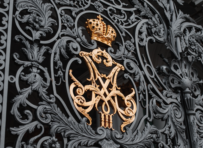
Custom Duogram: A Mark Composed Entirely Around Two People
THE ART OF MONOGRAMS
What “Custom” Actually Means for a Duogram
A distinction worth making before a single letter is sketched.
A custom duogram is not simply a duogram that happens to belong to someone.
It is a mark built from a specific decision, made by a specific person, for a specific reason.
The word custom carries weight that is easy to overlook in casual conversation.
It does not mean personalized in the thin sense that a monogrammed towel is personalized.
It means composed, from the first sketch, around choices only one couple or one client could make.
A generated pairing of initials can be produced in seconds by any number of automated tools.
A custom duogram cannot be produced this way, because the decisions it requires are not generic ones.
Which letter leads, which letter follows, how far the two forms lean toward one another.
These are not settings on a dial; they are judgments, made in conversation, refined by hand.
I am often asked what separates a custom duogram from an off-the-shelf pairing of initials.
The honest answer is that almost everything separates them, though very little of it shows on the surface.
A well-composed custom duogram should look inevitable, as though no other arrangement were ever possible.
That sense of inevitability is manufactured through dozens of small, deliberate decisions.
None of those decisions are visible individually once the mark is finished.
Their absence is what a client notices first when a generic pairing feels wrong without knowing why.
This article exists to walk through exactly those decisions, one at a time.
Not as a technical manual, but as an honest account of what a genuine commission actually involves.
Readers who have already commissioned a mark will recognize much of what follows.
Readers considering one for the first time will, I hope, understand what they are actually asking for.
A custom duogram, properly understood, is less a product than a considered agreement between two names.
I have watched the word custom lose meaning in recent years, applied loosely to nearly anything adjustable.
A dropdown menu offering three fonts and four colors is not, in any meaningful sense, a custom process.
It is a limited menu dressed in the language of personalization, and clients increasingly sense the difference.
A genuine custom process has no menu at all until the client’s own answers begin to shape one.
This distinction matters more for a duogram than it might for a larger, more forgiving composition.
A duogram has almost nowhere to hide an imprecise decision, given how few elements it actually contains.
Two letters and the space between them are, quite literally, the entire visual argument being made.
There is no border, no crest, no supporting ornament available to compensate for an unresolved relationship between them.
This is precisely why the custom process matters more here than it might for a more elaborate mark.
A flaw invisible in a fifteen-element family crest becomes the entire subject of a two-letter duogram.
I tell prospective clients this directly, because it explains why the process asks more questions than they expect.
It is not bureaucracy for its own sake; it is the only way to remove every visible seam.
A seamless mark, once finished, should give no indication of how many directions were quietly set aside.
That invisibility is, in fact, the clearest evidence that a genuine custom process was actually followed.
Restraint
A custom duogram earns distinction through calibrated restraint, never through visible ornament.
THE ATELIER JOURNAL
The First Conversation, Before Any Letter Is Drawn
Every custom commission begins with questions, not with a sketch.
Every custom duogram I have composed began with a conversation rather than a brief.
A brief tells me what a client thinks they want; a conversation tells me what they actually need.
I begin by asking which two letters are involved, and I resist assuming the obvious answer.
Some couples want their given names represented; others prefer a shared surname initial paired with a given one.
Some professional partners want the letters of their practice, not their individual names, represented equally.
None of these choices is more correct than another, though each changes the entire commission.
I ask, next, what occasion the mark is meant to serve, since occasion shapes register considerably.
An engagement duogram behaves differently from one commissioned for an established medical or legal practice.
The engagement mark can afford romance; the professional mark generally cannot, and should not try to.
I ask where the mark will first appear, since that answer shapes scale considerations early.
A duogram destined first for a save-the-date behaves differently from one destined first for office signage.
I ask, too, whether the client has a preference for symmetry, or for a more asymmetrical treatment.
Some clients arrive with a strong opinion already formed; others have never considered the question at all.
Both starting points are equally workable, though they lead to different early conversations.
A client without a formed opinion is not indecisive; they are simply trusting the process appropriately.
I try to earn that trust quickly, by asking questions rather than presenting a finished template.
This is the essential difference between a custom commission and a generated alternative.
A generator cannot ask a follow-up question, and a follow-up question is usually where the real answer lives.
By the end of this first conversation, I generally know far more than the two letters involved.
I know the occasion, the register, the intended application, and something of the story behind the request.
That accumulated understanding is what allows the sketches that follow to feel considered rather than generic.
Nothing about a custom duogram begins with a template, however elegant that template might otherwise appear.
Some clients arrive already fluent in design language, having researched interlace and letterform extensively beforehand.
Others arrive knowing only that they want something that feels like them, without a single technical term to offer.
Both types of client receive the same depth of conversation, though the vocabulary of that conversation differs.
I am wary of clients who arrive with a finished mockup already commissioned from an automated tool.
Not because the instinct behind it was wrong, but because it often narrows the conversation prematurely.
A mockup can anchor a client’s expectations before we have properly discussed what the mark actually needs to do.
I ask, gently, that we set the mockup aside for the first conversation and return to it only later.
Most clients find this request reasonable once I explain the reasoning behind it plainly.
The mockup, if it still seems relevant afterward, can inform a direction rather than dictate one outright.
I also ask about names that will not appear in the mark but shape it nonetheless.
A maiden name a client intends to keep privately, even while adopting a married name publicly, matters here.
A middle name carried for family reasons, even if it will not be visually represented, matters as context.
These details rarely change the final letters chosen, but they often change how confidently a client approves a direction.
A client who feels fully understood approves a direction differently than one who feels merely served.
This difference in confidence is, in my experience, one of the quieter benefits of a genuine conversation.
BESPOKE WEDDINGS
Choosing and Ordering the Two Letters
A decision that seems small and rarely is.
Once the letters themselves are settled, a second and less obvious decision remains: their order.
Some clients follow strict alphabetical convention, placing whichever initial comes first in the alphabet on the left.
Others prefer the order that simply composes more gracefully once the two forms are interlaced.
There is no universally correct answer, and I distrust any process that pretends otherwise.
What matters far more than order is the discipline of genuine visual balance between the two letters.
A custom duogram that favors one initial, even subtly, tends to dissatisfy at least one half of a pairing.
I test every direction against this single standard before any other consideration is allowed to intrude.
Does either letter read as the dominant partner in the composition, even faintly.
If the answer is yes, the direction is set aside, regardless of how elegant it appears in isolation.
This is a design principle, though it is also, quietly, a statement about the relationship the mark represents.
Clients rarely ask me to articulate this explicitly, yet most understand it immediately once it is named.
A few clients specifically request a subtle asymmetry, wanting one initial to lead by clear intention.
This is a legitimate custom request, and I execute it gladly when it reflects a genuine, considered choice.
The distinction that matters is between an asymmetry that is chosen and one that is simply unresolved.
A chosen asymmetry has a logic a viewer can sense, even without naming it precisely.
An unresolved asymmetry simply looks like an error that was never corrected.
I explore both symmetrical and intentionally asymmetrical directions during most custom commissions.
Clients are asked to respond not to which option looks more appealing at a glance.
They are asked, instead, which option feels more honestly like the relationship the mark is meant to represent.
This distinction between appeal and honesty is, in my experience, where the strongest custom work is found.
Order is complicated further when the two letters involved are visually similar to one another.
Two rounded letters, or two letters sharing a dominant vertical stroke, compete for the same visual territory.
Resolving that competition sometimes requires adjusting scale slightly, so one letter recedes just enough to let the other breathe.
This adjustment is subtle enough that most viewers never consciously register it, though they feel its absence when it is missing.
A client rarely asks for this adjustment explicitly; they simply notice, correctly, when an early draft feels crowded.
I have learned to anticipate this crowding before a client has to name it, simply from studying the two letterforms together.
Certain letter pairings interlace naturally, sharing a stroke or a curve without any forced adjustment at all.
Other pairings resist interlace entirely, and forcing them together produces a mark that looks strained under scrutiny.
In those cases, I recommend a composition that places the letters side by side rather than truly interlaced.
This is not a lesser solution; it is simply the correct one for that particular pair of letters.
A custom process should never insist on interlace for its own sake, at the expense of genuine legibility.
Clients occasionally request interlace specifically because they associate it with tradition, without understanding its structural cost.
I explain, honestly, when a requested interlace will compromise legibility more than it will add meaningful character.
Most clients, once shown the comparison directly, choose legibility over an association they had not fully examined.
Balance
Neither letter should read as the dominant partner in a genuinely custom composition.
THE ART OF MONOGRAMS
Classic Restraint or Contemporary Line: Style Directions Compared
Two temperaments, both legitimate, rarely identical in outcome.
A custom duogram can be composed in a number of registers, and clients often arrive uncertain which suits them.
The two most common directions I am asked to reconcile are the classic monogram tradition and a more contemporary line.
Neither direction is more legitimate than the other, though each communicates a different temperament.
A classic treatment favors symmetry, enclosure, and a visible debt to historical letterform convention.
A contemporary treatment favors openness, asymmetry, and a more architectural sense of proportion.
The table that follows reflects how I explain this distinction during an early consultation.
I encourage every client to read it before we discuss a single sketch or letterform.
Consideration
Classic Direction
Contemporary Direction
Composition
Symmetrical, often enclosed
Asymmetrical, often open
Reference point
Historical letterform precedent
Architectural minimalism
Typical occasion
Ceremonial, multi-generational use
Engagement, new professional identity
Enclosure
Circle, shield, or seal
Unbounded or linear frame
Governing discipline
Heraldic restraint
Structural reduction
Most custom duograms, in practice, land somewhere between these two poles rather than at either extreme.
A classic composition can absorb a contemporary sense of proportion without abandoning its historical debt.
A contemporary composition can absorb a measure of classical interlace without becoming ornate.
This blending is not compromise; it is frequently where the most interesting custom work happens.
I do not treat these categories as fixed rules so much as useful starting orientations for conversation.
A client who requests contemporary minimalism sometimes describes, in the same conversation, a deeply classical intention.
Recognizing that gap, gently, is part of what a genuine commission offers that a template cannot.
I have noticed a pattern across many custom commissions worth naming directly here.
Clients drawn to an established family history often request contemporary minimalism, assuming it signals modernity.
Yet the story they tell about their own families is, almost without exception, a deeply classical one.
In these cases, I gently propose a direction that honors the classical instinct their own words reveal.
Most clients, upon seeing both directions side by side, recognize immediately which one actually represents them.
The reverse pattern occurs too, though somewhat less frequently in my own experience.
A founder or new couple sometimes requests ornate, historical detailing, assuming it signals seriousness or permanence.
Yet nothing in their actual story calls for that ornament, and the mark ends up feeling borrowed rather than earned.
Here, too, I raise the observation plainly, trusting the client to recognize the mismatch once it is named aloud.
This is, perhaps, the least glamorous part of a genuinely custom process, and also one of the most valuable.
A designer willing to question a client’s stated preference, respectfully, often produces a more honest mark than one who simply executes instructions.
ROYAL TRADITIONS
The Discipline Behind Customization: What Courts Understood First
Long before the word custom applied to a monogram, courts practiced its discipline.
It is tempting to assume that customization is a contemporary preoccupation, invented by modern taste.
The historical record suggests otherwise, and rather firmly.
European courts were composing paired initials to exacting, individual specification centuries before the word duogram existed.
A royal cipher was never assembled from a fixed template, regardless of how consistent its general grammar appeared.
Each monarch’s cipher was custom in every meaningful sense, adjusted to reign, alliance, and occasion.
The rules governing heraldic authority in England, still active today, preserve much of that individualized discipline.
Institutions such as the heraldic authority responsible for granting personal arms in England continue to formalize and grant personal marks under precisely this logic.
A cipher granted to one sovereign was never simply copied for the next; each was composed anew.
This individualized composition is the direct ancestor of what a custom duogram commission still asks for today.
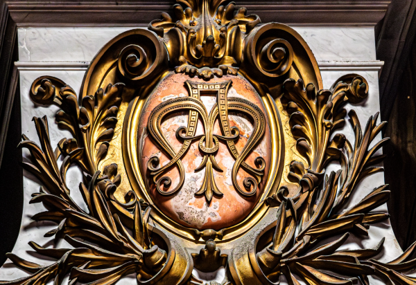
The symmetry between two interlaced letters mattered as much then as it does in a contemporary commission.
Engravers were instructed, in numerous recorded commissions, to give equal visual weight to both initials involved.
This is precisely the discipline a custom duogram still asks of its designer, regardless of century.
Scholarship devoted to heraldic tradition, maintained by institutions such as those affiliated with a society devoted to the study of heraldry, documents this individualized discipline across centuries of European practice.
What that scholarship shows, consistently, is that customization and tradition were never in tension.
A custom mark, properly composed, does not abandon tradition; it applies tradition to a specific case.
This is the same principle that governs a custom duogram commissioned for a couple today.
Sixteenth & Seventeenth Century
Bespoke Royal Ciphers
Courts commission individually specified paired ciphers for marriages, alliances, and successions.
Eighteenth Century
Formalized Customization
Master engravers develop conventions for adjusting interlace to each commission’s specific letters.
Nineteenth Century
Customization Migrates to Households
Aristocratic and merchant families commission individually specified paired-initial marks for stationery and linens.
Twentieth Century
The Custom Wedding Mark
Individually commissioned two-letter forms become an established, expected part of engagement stationery.
Contemporary Practice
The Custom Duogram, Named
Ateliers formalize the custom duogram as a distinct, individually specified commission rather than a generic pairing.
I return to this history not out of nostalgia, but because it clarifies what a custom commission is actually for.
A custom duogram is not an indulgence invented by contemporary branding culture.
It is the continuation of a discipline courts practiced for centuries, applied now to two private individuals.
Archives held within one of Europe’s principal royal collections preserve numerous examples of these individually specified ciphers, cut for one occasion alone.
Objects bearing them range from private correspondence seals to formal court invitations, each resolved for its specific case.
That continuity is, to me, one of the more reassuring aspects of this particular craft.
The rules were not invented recently to sound impressive; they were tested against real use for a very long time.
It is worth pausing on why courts insisted on this individualized discipline rather than adopting a single fixed cipher style.
A fixed style, reused across every royal marriage, would have flattened distinct unions into visual indistinction.
Each alliance carried its own political weight, its own history, and its own claim to specific representation.
A cipher custom-built for that specific alliance communicated something a generic royal mark simply could not.
This same logic, translated into a contemporary register, is exactly why a custom duogram matters for a private couple today.
A generic pairing of initials communicates only that two people exist; it does not communicate who they specifically are.
A custom duogram, built through genuine conversation, carries the particular weight of one specific relationship.
This is not a difference of degree; it is a difference of kind, however similar the two marks might look at a glance.
I find this parallel with royal practice clarifying rather than grandiose, and I offer it to clients for exactly that reason.
It is not a claim to aristocratic pretension; it is a claim about what customization has always actually accomplished.
BESPOKE WEDDINGS
Where a Custom Duogram Will Actually Live
Customization is decided differently once the destination is known.
A custom duogram is only ever finished once its intended destination has been considered directly.
A mark destined for engraving behaves differently from one destined for embroidery or letterpress.
This is not a minor technical footnote; it is central to what makes a commission genuinely custom.
I ask, early in every consultation, where the mark will first and most frequently be seen.
The answer changes decisions about line weight, negative space, and permissible intricacy considerably.
A save-the-date can tolerate a slightly finer interlace than a signet ring intended for daily wear.
A signet ring, by contrast, demands a composition that survives contact, wear, and years of handling.
Custom, in this context, means the mark is built for its specific destination rather than assumed to travel everywhere unchanged.
Engagement Stationery
A custom duogram introduces a couple’s shared identity before any wedding detail has been finalized.
The Signet Ring
A mark carried daily demands a composition resolved for wear, contact, and years of quiet use.
Personal Correspondence
Thank-you notes and early acknowledgments carry a shared visual identity before any registry closes.
Professional Signage
A partnership’s shared initials, custom-fitted to office entrances, nameplates, and correspondence alike.
Keepsake Objects
An engraved case or frame becomes an early artifact of a relationship’s particular, custom history.
Architectural Presence
A gate, a facade, or a threshold, carrying a mark resolved for scale rather than assumed at it.
None of these applications share identical requirements, which is precisely the point of a custom process.
A generic pairing, generated once, is typically asked to serve every one of these contexts unchanged.
It rarely performs equally well across all of them, because it was never built with any one of them in mind.
A custom duogram is built with its primary destination in mind from the very first sketch.
Later applications are then tested against that original resolution, rather than treated as an afterthought.
This sequencing, more than any single stylistic choice, is what separates custom work from a generated shortcut.
Consider the specific demands of a signet ring, which I test more rigorously than almost any other application.
A ring is viewed at close range, but it is also viewed upside down, sideways, and in poor light.
A composition that assumes a single fixed viewing angle will disappoint the moment the ring is actually worn.
I test every ring-bound custom duogram from multiple angles before considering the direction finished.
Architectural application introduces a nearly opposite set of demands, worth naming for contrast.
A mark carved into stone or cast in bronze must be resolved with tolerances considerably tighter than paper allows.
Correction after installation is rarely possible, which means every proportion must be confirmed well before fabrication begins.
I have, on occasion, asked a client to wait an additional week specifically to confirm architectural proportions.
That patience is never wasted, given how costly a correction becomes once stone or bronze has already been cut.
Digital application, meanwhile, introduces its own constraint, one that barely existed a generation ago.
A custom duogram may need to remain legible at the scale of a favicon, smaller than a fingernail.
This constraint has little patience for fine interlace, regardless of how elegant that interlace appears on a full letterhead.
I develop a simplified variant alongside the primary mark whenever digital application is a genuine likelihood.
Both variants share identical underlying proportions, even though their level of visible detail differs considerably.
Destination
A mark is not finished until it has been tested against where it will actually live.
THE ATELIER JOURNAL
Inside the Atelier: How a Custom Duogram Is Actually Built
A sequence resistant to shortcuts, by design.
Clients occasionally ask why two letters require several distinct stages to resolve properly.
The honest answer is that most of the time is spent narrowing options, not generating them.
Generating a competent pairing of two letters is, comparatively, quick work for an experienced hand.
Recognizing which competent pairing is the correct one for this specific client takes considerably longer.
That recognition often benefits from stepping away from a direction and returning to it with fresh eyes.
A composition that looked resolved on a Tuesday can reveal a flaw by the following week.
I build this reflective distance directly into every custom commission, rather than treating it as an inconvenience.
01
Consultation
I learn the two letters, the occasion, and the register the mark is meant to serve.
02
Letterform Study
Each initial is studied independently for its natural weight, before either is asked to share space.
03
Interlace Exploration
Multiple ways of joining the two letters are sketched and compared side by side.
04
Balance Review
Every direction is tested against strict symmetry, so neither letter overwhelms the other.
05
Application Testing
The strongest direction is tested against its intended destination, from ring to linen.
06
Refinement
Fine adjustments to weight, spacing, and proportion are made until the mark feels inevitable.
07
Delivery
The finished custom duogram is prepared across every application the client intends to use.
7
Distinct Stages in Every Custom Commission
40+
Interlace Variations Typically Explored
2
Letters, Balanced as a Single Composed Mark
Generations
The Intended Lifespan of a Well-Resolved Mark
A custom duogram commission typically moves at a deliberate, unhurried pace, and I make no apology for that.
Two letters require fewer structural decisions than a full family crest built from multiple symbolic elements.
This narrower scope does not mean the work demands less care; only that fewer variables are under consideration.
Every custom duogram still passes through the same disciplined sequence as a considerably larger commission.
I mention this so that clients understand efficiency here is never a shortcut taken at the expense of quality.
It is simply the natural result of a smaller, more precisely defined design problem.
Clients sometimes ask whether the process can be compressed to accommodate a printing deadline.
I answer honestly: some stages can be run in parallel, but none can be skipped entirely without visible cost.
A composition rushed through balance review tends to reveal its imbalance only after it has already been printed.
This is a far more expensive mistake than a modestly extended timeline at the outset of the commission.
I would rather deliver a custom duogram two weeks later than deliver one that requires correction after delivery.
Most clients, once this tradeoff is explained plainly, choose the honest timeline over the compressed one.
I keep a working file open on every commission until the client has approved every intended application.
This means a save-the-date approval does not close the file if a signet ring is still to come.
Revisiting the same working file for each new application preserves consistency that a fragmented process would risk losing.
A mark approved once for paper and redrawn separately for metal invites small, accumulating inconsistencies over time.
The atelier’s process resists this fragmentation by design, not by accident.
Patience
The most enduring custom marks are rarely the fastest to produce.
LUXURY IDENTITY
Customizing a Duogram for Partnership and Professional Practice
Two names sharing authority, rendered with equal weight.
A custom duogram is not reserved exclusively for couples approaching a wedding.
Two founders, two physicians sharing a practice, two architects with a joint studio, all share the same need.
Each of these partnerships wants a mark that represents both names equally, without ambiguity about seniority.
A brand monogram built from a business name serves many enterprises perfectly well.
For a genuine partnership of two people, a custom duogram often communicates something closer to the truth.
It signals, without a single written word, that authority in this practice is shared rather than singular.
Clients notice this distinction even when they cannot immediately articulate why it reads correctly.
A mark with two balanced letters simply reads differently than a mark dominated by one initial.
This is precisely why law partnerships and medical practices have long favored this particular form.
An initials logo built for a solo founder answers a different question than a custom duogram built for a genuine pair.
A solo mark communicates individual authorship; a custom duogram communicates shared authority from the outset.
I ask every professional pair a version of the same question before any sketch begins.
Does this partnership deserve, and genuinely reflect, equal visual representation between its two names.
Where the honest answer is yes, a custom duogram is often the most accurate available solution.
Where one partner holds clear and acknowledged seniority, a different structure usually serves the practice better.
I say this plainly because a duogram misapplied can create confusion rather than the clarity it is meant to provide.
A custom duogram built for professional use carries slightly more geometric discipline than a wedding mark typically does.
The romantic curves suited to an engagement program often read as too soft for a boardroom or a nameplate.
I adjust the interlace accordingly, without abandoning the underlying principle of genuinely shared weight.
The letters remain equal in every case; only the visual register around them changes with context.
This adjustment is itself a form of customization, distinct from the letters and their order alone.
I have designed custom duograms for physicians who share a single practice built around both of their names.
I have designed them for architects, for attorneys, and for a handful of independent boutique studios.
Each case begins with the same honest question: does this partnership deserve equal visual representation.
A practice founded by one partner but later joined by an equal second partner presents a particular case.
The mark must now represent a present reality that did not exist when the practice first opened its doors.
I treat this as a genuine redesign rather than a minor update, since the underlying claim has actually changed.
Clients occasionally resist this, hoping a small adjustment to an existing mark will suffice.
I explain, as plainly as I can, that a mark claiming equal partnership must actually be built for equal partnership.
A retrofit rarely achieves the same balance as a composition built with that equality in mind from its first sketch.
This is, admittedly, a more exacting standard than some branding studios apply to comparable requests.
I remain comfortable holding that standard, because durability has always mattered more to me than convenience.
Partnership, Rendered Visually
A balanced custom duogram can communicate shared authority between two professional partners.
THE ATELIER JOURNAL
Voices of the Atelier
Clients who commissioned a mark built entirely around their own decisions.
“We had seen dozens of generated pairings online, and none of them felt like us. What we received felt considered from the very first sketch.”
E. Marchetti · Providence, Rhode Island
“I did not expect the process to involve so many questions before a single letter was drawn. Looking back, that is exactly why the finished mark still feels correct.”
R. Okafor · Minneapolis, Minnesota
“Our practice needed a mark that represented both of us equally, and most templates simply could not manage that. This one did, on the first considered direction.”
Dr. L. Whitfield & Dr. A. Chen · Denver, Colorado
“It arrived on our wedding programs, and years later it is engraved on the gate of our first home. Very few small decisions age this gracefully.”
The Fontaine Family · Portland, Oregon
THE ART OF MONOGRAMS
A Custom Duogram, Set Beside the Duogram and the Monogram
Related forms, each answering a slightly different question.
Clients occasionally ask how a custom duogram differs from a duogram in the more general sense.
I have written elsewhere, in the duogram, about the form itself: its history, its etymology, its traditional occasions.
That earlier account explains what a duogram is; this account explains how one is actually built for a specific client.
The difference is not academic, and it matters considerably once a commission is underway.
A duogram, generally, is any two-letter mark representing a shared identity before a marriage or a partnership.
A custom duogram is the same form, resolved entirely around one client’s letters, occasion, and intended use.
Every custom duogram is a duogram; not every duogram is meaningfully custom.
A related question concerns the relationship between a custom duogram and a full monogram.
A monogram traditionally speaks for a single name, built from one to three initials belonging to one individual.
A duogram speaks for two, and its letters are composed to share prominence rather than compete for it.
Many of the finest custom duograms I have composed became the seed of a later, fuller family monogram.
The two-letter form matures, gathers a third initial with marriage or family growth, and becomes something else entirely.
This progression is itself a kind of quiet tradition, rarely written down but frequently lived by the families I serve.
A well-restrained custom duogram leaves exactly the right amount of visual room for that later development.