Initials Logo: A Signature Distilled to Its Essence

Initials Logo: A Signature Distilled to Its Essence
There is a particular kind of confidence in reducing an identity to two or three letters.
An initials logo asks nothing of ornament and everything of proportion.
It is the shortest sentence a name can speak, and often the most memorable.
Long before logos became commonplace, the most enduring marks of distinction belonged not to companies, but to individuals.
The initials logo inherits this lineage directly, carrying the discipline of the personal cipher into a contemporary register.
Where a full monogram often gathers ornament, an initials logo strips the mark to its architecture.
This restraint is not a limitation; it is the entire argument.
A well-composed set of initials can outlast a decade of visual trends without appearing dated.
That permanence is precisely what distinguishes a commissioned mark from a generated one.
In the pages that follow, we consider the initials logo not as a design trend but as a continuation of a much older practice.
The word logo suggests something manufactured, produced quickly for a market that will move on within a season.
An initials logo, properly composed, resists that association entirely.
It behaves less like a marketing asset and more like a signature carved into stone.
This distinction matters because the two objects are asked to do very different work.
A marketing asset is expected to be replaced; a signature is expected to remain.
GUSTAVO ATHAYDE approaches every initials logo commission with the latter expectation in mind.
What follows is not a technical manual but an editorial account of why this discipline still matters.
Readers who value permanence over novelty will recognize the argument immediately.
Restraint
An initials logo succeeds by saying less, not more.
A Lineage Older Than Branding
Every initials logo carries an inheritance, whether its owner recognizes it or not.
The instinct to compress a name into its first letters did not begin with branding agencies.
It began with individuals who needed a mark that could travel faster than a signature.
Merchants, sovereigns, and artisans each arrived at the same solution through different necessities.
What united them was a shared understanding that a name, properly distilled, becomes a symbol.
A merchant needed a mark that a buyer could recognize across an ocean, without any need for translation.
A sovereign needed a mark that could assert authority on a coin, a seal, or a palace gate.
An artisan needed a mark that could be pressed into silver or leather without losing its clarity.
In each case, the solution converged on the same principle: fewer elements, held to a higher standard.
Antiquity
Personal marks pressed into wax and clay served as early instruments of authorship and ownership.
Medieval Europe
Interlaced initials appeared on seals and manuscripts as instruments of both faith and lineage.
Renaissance Courts
Wealthy families adopted initial-based marks to identify correspondence, textiles, and commissioned objects.
Georgian & Victorian Era
Engraved initials became a fixture of stationery, silver, and personal linen among the aristocracy.
Twentieth Century
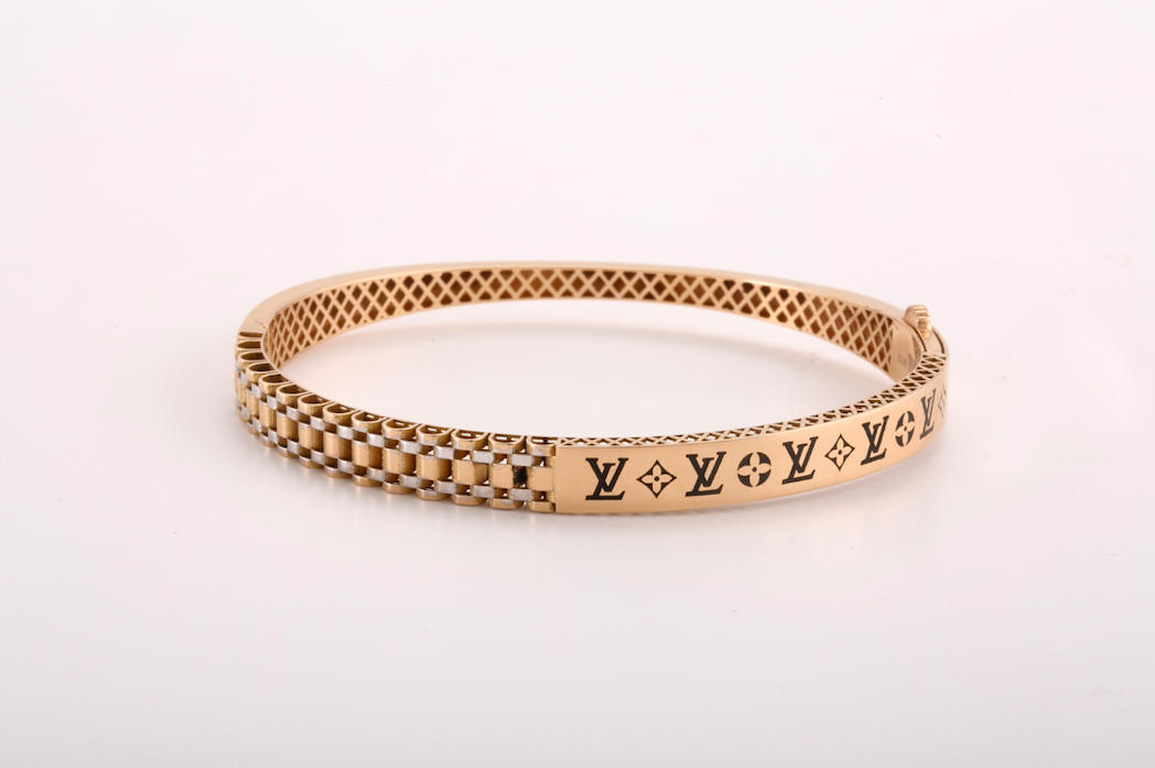
Luxury houses translated the personal initial into a repeatable brand mark, applied at industrial scale.
Contemporary Practice
The initials logo re-emerges as a deliberate counterpoint to generic, template-driven visual identity.
The through-line across each of these periods is restraint rather than embellishment.
An initial did not need decoration to communicate authority; it needed precision.
That principle has not changed, even as the applications have multiplied.
What has changed is the speed at which a mark must now be recognized.
A modern audience encounters a mark for a fraction of a second, often on a small screen.
This compressed attention span makes the historical discipline of restraint more relevant, not less.
From Cipher to Signature
It is worth pausing on the differences between related terms that are often used interchangeably.
A cipher, a monogram, and an initials logo share ancestry but serve distinct purposes.
Understanding the distinction clarifies which form best serves a given commission.
Clients frequently arrive requesting one term while actually describing the needs of another.
Part of the atelier’s first conversation with any client is simply establishing which of these forms the situation calls for.
Classic Monogram
Personal Cipher
Initials Logo
Often ornamental, favoring interlace and decorative flourish across two or three letters.
Deeply personal, frequently reserved for private correspondence, linens, and heirloom objects.
Built for repetition and legibility across small and large applications alike.
Rooted in tradition, drawing on established letterform conventions from earlier centuries.
Often unique to a single individual and rarely intended for public brand use.
Designed to function as a recognizable mark across stationery, signage, and digital contexts.
Best suited to weddings, family objects, and ceremonial applications.
Best suited to intimate, private commissions such as engraved keepsakes.
Best suited to professional identities, ventures, and public-facing brand contexts.
None of these forms is superior to another; each answers a different question.
The task of the atelier is to determine which question the client is actually asking.
A family seeking a heraldic emblem is not asking the same question as an entrepreneur seeking a durable brand mark.
A private individual seeking a keepsake cipher is asking a still different question, one centered on intimacy rather than repetition.
Misreading this question at the outset is the most common cause of an unsatisfying commission.
For this reason, the atelier treats the initial conversation with as much care as the design work itself.
A conversation that clarifies purpose early tends to shorten every stage that follows, rather than lengthen it.
This is one further reason patience at the outset is rarely wasted time.
Legibility
A mark that cannot be read at a glance has not yet been resolved.
The Anatomy of Composition
The composition of an initials logo is governed by a small number of exacting principles.
Each principle appears simple in isolation, yet their interaction is where the discipline lives.
A designer who understands only one or two of these principles will produce a mark that looks correct at first glance and fails under scrutiny.
The atelier treats all six as inseparable requirements rather than optional considerations.
Letterform
The chosen typographic register determines whether the mark reads as classical, modern, or somewhere between the two.
Proportion
The relationship between letter widths and heights must remain balanced at every scale of reproduction.
Negative Space
The space within and around the letters is treated as an active design element rather than an afterthought.
Hierarchy
When multiple initials are combined, one letter is typically permitted to lead without dominating the others.
Enclosure
A frame, circle, or shield can unify the initials, though restraint should govern its use.
Scalability
A mark that performs only at one size has not yet been resolved.
These principles are not decorative preferences; they are structural requirements.
A mark that ignores any one of them tends to fail quietly, over time, rather than immediately.
This is why an initials logo commissioned with care differs so markedly from one generated in minutes.
A generated mark can satisfy a checklist; it cannot satisfy an eye trained to notice imbalance.
That trained eye is precisely what a client is commissioning when they choose a considered process over a shortcut.
Years later, it is this trained eye, not any single stylistic flourish, that clients say they are grateful for.
The finest symbols are rarely created to follow trends. They are created to outlive them.
Royal Precedent
Nowhere is the discipline of initial-based identity more evident than in royal tradition.
European monarchs codified the royal cipher as an instrument of governance long before branding existed as a discipline.
The cypher of a sovereign appeared on regalia, correspondence, and state architecture as a projection of authority.
Institutions such as the heraldic authority responsible for granting personal arms in England continue to formalize these traditions today, granting and recording personal marks under long-established law.
Collections preserved within a royal collection safeguarding centuries of ceremonial objects document how these ciphers evolved across successive reigns without abandoning their essential legibility.
What is instructive here is not the ornament surrounding these marks, but their underlying restraint.
A royal cipher rarely exceeds two or three letters, regardless of how elaborate its setting becomes.
This same restraint is what separates a commissioned initials logo from an over-designed one.
A crown, a wreath, or an interlace pattern may surround the letters, but the letters themselves remain uncluttered.
This hierarchy of emphasis is precisely what allows a royal cipher to remain legible across centuries.
A family or a founder need not claim royal lineage to borrow this discipline.
The lesson is structural, not aristocratic: fewer letters, held to a higher standard, communicate more.
This is a lesson the atelier applies regardless of whether a commission is ceremonial or entirely contemporary.
Permanence
The goal of a commissioned mark is to remain unchanged for a generation or longer.
The Luxury Brand Logic
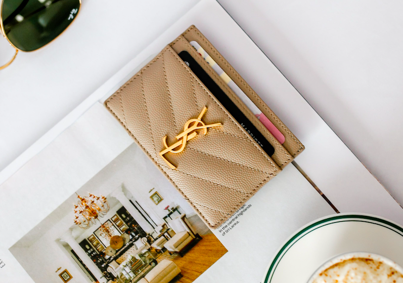
As luxury houses rose across Paris, London, and Vienna, the personal monogram evolved into the house mark.
The individual cipher became the foundation of brand identity, and the logic of the monogram became the logic of luxury itself.
The same discipline applies today to a founder commissioning a mark meant to represent a venture rather than a person alone.
A venture’s first visual decision often outlasts several rounds of product lines, offices, and even leadership.
This is precisely why the mark deserves more deliberation than most founders initially expect to give it.
Consultation
The atelier begins by understanding the client’s name, intent, and the contexts in which the mark must perform.
Research & Concept
Historical and typographic research inform an initial set of directions, each rooted in a distinct rationale.
Refinement
A single direction is developed with attention to proportion, spacing, and behavior at varying scale.
Delivery & Application
The finished mark is prepared for stationery, signage, digital, and archival use.
This sequence resists shortcuts because each stage informs the next.
A mark rushed through research rarely survives contact with real-world application.
Clients who attempt to skip directly to refinement often discover, months later, that the foundation was never properly laid.
Where the Mark Must Live
An initials logo is only as valuable as its ability to travel across contexts without losing coherence.
The same mark that appears on a business card must perform equally well on a building facade.
This range of application is precisely what separates a considered identity from a decorative flourish.
Few clients request every application at once; most discover the need for each one gradually, over years.
Personal Stationery
Correspondence, cards, and personal documents carry the mark as a quiet signature of authorship.
Professional Signage
Office entrances, nameplates, and studio facades benefit from a mark built to hold its clarity at scale.
Digital Presence
A favicon or profile mark must remain legible even when reduced to a few pixels.
Engraved & Woven Objects
Silver, leather, and linen each impose their own constraints on how a mark must be rendered.
Architectural Presence
A mark carved or cast into a physical structure must be resolved with unusual precision, since correction afterward is rarely possible.
Few clients anticipate how many contexts a single mark will eventually inhabit.
This is why the atelier tests a mark against multiple applications before any commission is considered complete.
A mark that looks resolved only in a single mockup has not actually been tested at all.
Testing across contexts often surfaces a small flaw that a single application would never have revealed.
Correcting that flaw before delivery is far less costly than correcting it after a mark has already been engraved or built.
Continuity
A mark inherited by a family is not redesigned; it is carried forward with care.
Common Client Profiles
The clients who commission an initials logo arrive from remarkably different circumstances.
What unites them is not profession or background but a shared preference for permanence over novelty.
Understanding these profiles helps clarify why no two commissions unfold in quite the same way.
A bride approaches the mark with an eye toward ceremony and shared memory.
A founder approaches the same discipline with an eye toward longevity and professional authority.
An attorney or physician often seeks a mark that signals discretion as much as distinction.
The Bride or Groom
Seeking a mark that will outlast the wedding itself, carried into a shared household for decades.
The Family
Seeking to translate an inherited identity into a form suited to present-day correspondence and use.
The Founder
Seeking a durable first decision for a venture that may eventually outgrow its founder entirely.
The Professional
An attorney, physician, or architect seeking a quiet mark for stationery, signage, and correspondence.
The Collector
Seeking a personal mark for archives, bookplates, and correspondence tied to a private collection.
The Estate
Seeking a mark to unify a property, its correspondence, and its eventual inheritance under one identity.
Each of these profiles arrives with a different emotional register, though the underlying discipline never changes.
The atelier adjusts its questions accordingly, without ever compromising on the structural principles already discussed.
A mark for a bride and a mark for a founder may look nothing alike, yet both are held to the same standard of proportion.
On Letter Count: One, Two, or Three
One of the first decisions in any commission concerns how many letters the mark should carry.
A single letter is the most demanding composition, since there is nowhere at all to distribute visual weight.
Two letters introduce a relationship, and that relationship must be resolved with real care.
Three letters, the most traditional configuration, allow for a central letter to anchor the composition.
There is no universally correct answer; the right count depends entirely on the name and its intended use.
A founder with a short, distinctive name may find that a single letter says everything required.
A couple joining two family names may find that two letters, interlaced, best represents the union.
A family with a long-standing surname may prefer three letters, honoring first, middle, and family initials together.
Each configuration carries its own historical precedent, and none is more legitimate than another.
What matters is that the chosen count is resolved with the same rigor regardless of how many letters are involved.
A single-letter mark that has not been given adequate proportion will always look unfinished, no matter how simple it appears.
A three-letter mark that has not resolved its hierarchy will always look crowded, no matter how much space surrounds it.
This is why the atelier tests multiple letter counts during concept development before settling on a final direction.
Clients are often surprised to discover that the count they initially requested is not, in the end, the one that serves them best.
This discovery is not a failure of the initial request; it is simply what thorough exploration tends to reveal.
A Single Letter
The most demanding composition, requiring exceptional proportion to avoid appearing incomplete.
Two Letters
Introduces a relationship between initials that must be balanced with particular care.
Three Letters
The most traditional configuration, allowing a central letter to anchor the composition.
None of these choices is inherently superior; each simply serves a different kind of name and intention.
The atelier’s task is to identify which configuration will serve the client for decades, not merely for the current season.
This is a question best answered through exploration rather than assumption.
That exploration is precisely what distinguishes a commissioned process from a template selected from a catalog.
Symmetry and Asymmetry
A related decision concerns whether a mark should be built on strict symmetry or on a more deliberate asymmetry.
Symmetrical compositions carry an immediate sense of order, which can read as formal, ceremonial, or classical.
Asymmetrical compositions can feel more contemporary, provided the imbalance is intentional rather than accidental.
Neither approach is inherently superior; each communicates a different temperament.
A family crest translated into an initials logo often benefits from symmetry, echoing its heraldic origin.
A founder’s mark, by contrast, may benefit from a controlled asymmetry that feels more forward-looking.
The danger with asymmetry lies in mistaking carelessness for intention.
An asymmetrical mark must still obey an underlying logic, even if that logic is not immediately obvious to the eye.
Without that logic, an asymmetrical composition simply reads as unresolved.
This is a subtle distinction, and one that separates a deliberate design decision from an unfinished one.
The atelier tests both symmetrical and asymmetrical directions during concept development whenever the name allows for it.
Some names lend themselves naturally to one approach over the other, based purely on their letterforms.
Other names offer genuine flexibility, and the choice becomes a matter of temperament rather than necessity.
In those cases, the client’s own preference is given considerable weight.
After all, the mark must feel correct to the person who will carry it, not only to the eye of the designer.
Strict Symmetry
Communicates order, formality, and a connection to classical or heraldic tradition.
Controlled Asymmetry
Communicates a more contemporary temperament, provided the imbalance follows a clear internal logic.
Radial Balance
Distributes weight around a central point, often suited to circular or shield-based enclosures.
Linear Balance
Aligns letters along a single axis, favored for stationery and horizontal signage applications.
Whichever approach is chosen, the underlying discipline of proportion remains unchanged.
Symmetry does not excuse imprecision, and asymmetry does not excuse carelessness.
Both are simply different routes toward the same destination: a mark that feels inevitable once finished.
That sense of inevitability, more than any single stylistic choice, is the true marker of a resolved composition.
Voices of Distinction
When I first saw the completed initials, I understood immediately why the process took the time it did.
It was not what I had imagined; it was something better, and it has not needed a single revision since.
— Margaret L., Architect and Collector, San Francisco
I commissioned the mark for my practice stationery and later for the entrance of my new office.
It reads identically well at both scales, which is the only proof that matters to me.
It has aged better than anything I designed on my own.
— Thomas R., Principal Architect, Chicago
Our family had used a crest for generations, but we had never had a personal mark that could travel with us in a contemporary sense.
This did exactly that, and it now appears on everything from our correspondence to our front gate.
— The Whitmore Family, Charleston, South Carolina
A single letter, properly composed, carried more authority than the crowded logo I had used for years.
I wish I had commissioned this sooner, and I now recommend the same patience to every colleague who asks.
— R. Beaumont, Principal, Architecture Studio
Family Legacy and the Personal Mark
Not every initials logo is destined for a business card.
Many are commissioned to mark a family’s continuity rather than a founder’s ambition.
A family preserving a longstanding heritage commission often arrives at the atelier already holding decades of correspondence, silver, and photographs bearing an earlier version of their mark.
The task, in these cases, is not invention but translation.
The atelier’s role is to carry an inherited identity into present-day use without severing it from its origin.
Some families choose to commission a full family crest alongside a simplified initials logo intended for daily use.
The two marks are related but serve different registers of formality.
A crest may appear on ceremonial objects, while the initials logo appears on everyday correspondence and digital contexts.
This kind of commission requires listening as much as designing, since the family often already knows what it wants to preserve.
The atelier’s task is to give that instinct a precise visual form rather than to override it.
This dual approach allows a family to maintain ceremony and practicality within the same visual language.
Neither mark competes with the other; each occupies its proper place.
Generations later, both marks tend to be read as a single coherent inheritance rather than two separate decisions.
Translation
Carrying an inherited identity forward requires more discipline than inventing a new one.