Custom Monogram Logo: The Art of Quiet Distinction
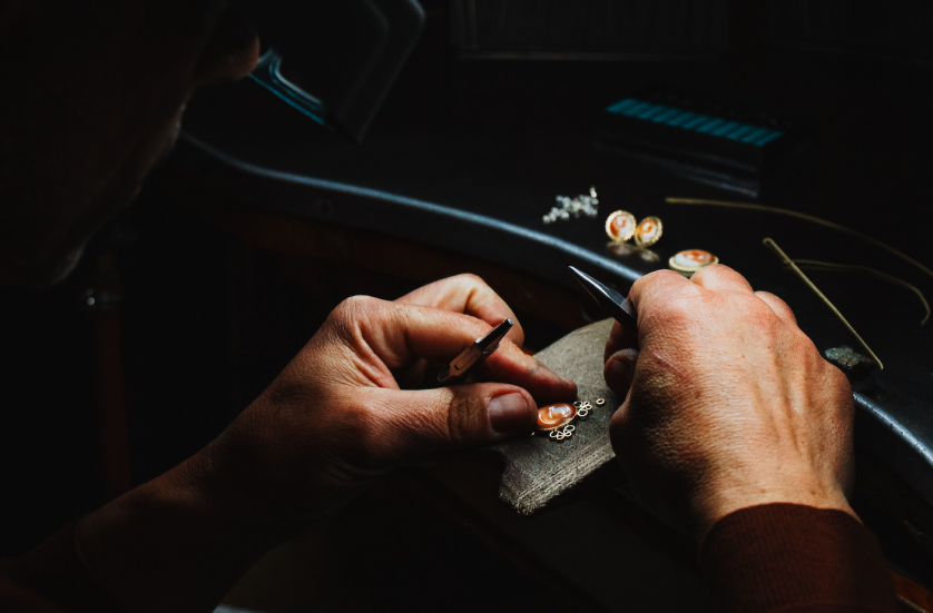
The Custom Monogram Logo as an Heirloom of Identity
The Art of Monograms
What a Custom Monogram Logo Actually Is
A custom monogram logo begins not as a design exercise but as a question of identity.
Long before the word branding existed, individuals understood that a name could be compressed into a single, permanent mark.
That compression is the entire discipline, reducing a name to its essential letters without reducing its meaning.
A custom monogram logo is not a shortcut for a name considered too long to use in full.
It is a deliberate act of translation, converting a personal or professional identity into a visual language.
The finest examples do not compete for attention; they earn it through proportion, restraint, and permanence.
Where a conventional logo often chases relevance, a custom monogram logo is built to remain unchanged for decades.
This is the distinction between decoration and identity, and it is a distinction the atelier takes seriously.
Every commission begins with listening rather than sketching.
A name carries history, and that history must be understood before a single letterform is drawn.
The atelier’s process treats each initial as an architectural element rather than a typographic accident.
Interlace, negative space, and hierarchy among letters are considered with the same rigor once reserved for heraldic charges.
A monogram logo, once approved, is rarely revisited, because it was never designed around a passing trend.
This permanence is precisely what distinguishes a custom monogram logo from a generic template purchased online.
Clients who commission this work are rarely seeking convenience; they are seeking a mark worth inheriting.
Some commissions serve individuals, others serve family legacies, and still others serve distinguished professional practices.
In every case, the underlying question remains the same, namely what a given name deserves to become.
A custom monogram logo answers that question through discipline rather than through decoration.
The pages that follow examine the history, symbolism, and craft behind this particular form of identity.
They are not intended as a tutorial, because a mark of this significance is never assembled from a template.
Instead, they are intended as an invitation into a tradition that predates modern branding by centuries.
Readers will encounter the royal courts, the merchant houses, and the ateliers that shaped this visual language.
They will also encounter the contemporary families, professionals, and institutions who continue to commission it today.
A name, properly rendered, becomes something closer to an heirloom than an asset.
That is the ambition behind every custom monogram logo produced within these walls.
What follows is less a guide than a meditation on why letters, given sufficient care, endure.
The reader need not be designing anything at all to find meaning in what follows.
Many arrive simply curious about why a monogram still commands such quiet authority.
Others arrive already certain they wish to commission one, and are seeking context before doing so.
Both readers are welcome here in equal measure.
A monogram is, after all, one of the few forms of identity that predates the individual wearing it.
It belongs as much to the family or institution that will inherit it as to the person who commissions it first.
This is a weight worth understanding before any design conversation begins.
Few decisions made in a single lifetime are expected to outlive that lifetime by a century or more.
A custom monogram logo is one of them.
It deserves, accordingly, a process equal to that expectation.
Consider how rarely a modern purchase is expected to remain unchanged for fifty years.
Furniture is replaced, wardrobes are refreshed, and even architecture is periodically renovated.
A monogram, by contrast, is one of the few objects still expected to resist all of that turnover.
This expectation is not nostalgia; it is a deliberate design requirement placed on the work from the outset.
It shapes which letterforms are considered acceptable and which are quietly set aside.
It shapes how much ornamentation is permitted before a mark begins to feel merely decorative.
It shapes, ultimately, how much time the atelier is willing to spend before calling a direction finished.
None of this is visible in the finished artifact itself, yet all of it is felt in how the mark ages.
A mark built without this discipline may look identical to one built with it, at least initially.
The difference reveals itself only with time, which is precisely why the discipline cannot be skipped.
This is the quiet standard against which every custom monogram logo produced here is measured.
Legacy & Family Heritage
A Brief History of the Personal Mark
The custom monogram logo did not originate in a design studio; it originated on coins, seals, and cornerstones.
Ancient rulers pressed initials into metal long before anyone described the practice as branding.
The letterform was chosen precisely because it could be recognized at a glance, even by those who could not read.
Medieval scribes carried this logic further, weaving initials into illuminated manuscripts as marks of authorship and devotion alike.
By the Renaissance, merchant families had adopted similar marks to authenticate goods traveling across unfamiliar borders.
A monogram, in this era, functioned as both signature and guarantee.
European courts refined the practice into a formal visual language, governed by proportion and precedent rather than whim.
Royal monograms in particular were treated as instruments of governance, appearing on currency, correspondence, and state seals.
This heritage is the quiet foundation beneath every custom monogram logo produced today.
Few clients arrive aware of this lineage, yet nearly all recognize it once it is explained.
The instinct to compress identity into a mark is, in this sense, far older than any individual client.
It is a human instinct, not a marketing invention.
What follows is a condensed timeline of that lineage.
A Lineage of Personal Marks
Antiquity
Rulers and city-states stamped initials into coins and ceramics as early instruments of recognition and trust.
Medieval Europe
Scribes and noble houses wove initials into manuscripts and seals, binding identity to craftsmanship and rank.
Renaissance
Merchant families adopted personal marks to authenticate goods and correspondence across distant trading routes.
Georgian & Victorian Eras
The personal monogram became a fixture of aristocratic life, engraved onto silver, linen, and stationery.
Twentieth Century
Luxury houses transformed the individual cipher into the foundation of brand identity itself.
Present Day
A custom monogram logo now serves individuals, families, and institutions seeking that same permanence in a digital age.
Each era refined the same principle, that a name distilled into letters could carry authority across generations.
The atelier’s approach to a a bespoke monogram commission draws directly from this lineage rather than departing from it.
History, in this sense, is not decoration; it is the discipline that keeps a mark from aging.
A design unaware of this lineage tends to feel fashionable rather than founded.
A design aware of it tends to feel inevitable, as though it could not have been composed any other way.
That sense of inevitability is difficult to manufacture and impossible to fake.
It can only be earned through familiarity with everything that came before.
The Art of Monograms
Why a Custom Monogram Logo Outlasts a Template
A generic logo template can be purchased, downloaded, and applied within minutes.
A custom monogram logo cannot, because its value depends entirely on the absence of that shortcut.
Templates are designed to be reused; a monogram logo is designed to be irreplaceable.
The difference becomes visible the moment a mark is placed beside others of its kind.
A template, however well produced, is instantly recognizable as one among many.
A commissioned mark is recognizable as belonging to exactly one name.
This distinction matters most to those whose identity is inseparable from their reputation.
Physicians, attorneys, architects, and family estates rarely wish to share a visual identity with strangers.
A shared identity, however elegant, undermines the very permanence such clients are seeking.
Permanence requires exclusivity, and exclusivity cannot be manufactured at scale.
This is precisely why templated services and bespoke commissions serve fundamentally different purposes.
One serves speed; the other serves legacy.
Neither is wrong, but only one produces a mark meant to be inherited.
The atelier exists specifically for clients who require the latter.
That requirement is rarely stated outright, though it is almost always present beneath the surface of the request.
It surfaces in questions about longevity, about how the mark will read in twenty years, not two.
The comparison below outlines what separates these two approaches in practical terms.
A Comparison of Approach
| Consideration | Custom Monogram Logo | Generic Template |
|---|---|---|
| Origin | Designed once, for one name | Mass-produced for resale |
| Longevity | Built to remain unchanged for generations | Revised as trends shift |
| Exclusivity | Never duplicated elsewhere | Available to any purchaser |
| Symbolic Depth | Rooted in heraldic and typographic tradition | Assembled from stock elements |
| Application | Engineered for scale, from seal to signage | Optimized primarily for a screen |
The table above is not a judgment on convenience; it is simply a description of two different intentions.
A custom monogram logo is commissioned by those for whom convenience was never the objective.
The Atelier Journal
The Anatomy of a Distinguished Mark
Beneath the surface of any custom monogram logo lies a set of design principles rarely discussed outside the atelier.
These principles are not stylistic preferences; they are structural requirements for a mark meant to last.
Letterform selection determines whether initials feel timeless or merely fashionable.
Proportion determines whether a mark feels composed or simply assembled.
Negative space is treated as an active design element rather than empty background.
Scalability determines whether the mark performs equally well on a ring and on a facade.
Each of these elements is considered independently before they are ever combined.
The overview below outlines how each principle functions within a completed commission.
Elements of the Composition
Letterform
Typographic choices are drawn from traditions deep enough to carry genuine authority rather than passing style.
Proportion
Initials are weighted so the most significant letter anchors the composition without announcing itself.
Negative Space
The space within and around each letter is composed with the same intention as the letters themselves.
Scalability
A finished mark is tested from the scale of a cufflink to the scale of a building facade.
When these elements align, a custom monogram logo becomes legible in a single glance rather than a studied read.
That immediacy is the quiet signature of a mark that has been properly resolved.
This same discipline underlies every monogram logo produced within the atelier, regardless of scope.
The Art of Monograms
The Question of Which Initials to Use
One of the first decisions in any commission concerns which letters will actually appear.
This sounds simple until a client’s full name is placed on the table.
A given name, a family name, a middle name, and occasionally a title all compete for inclusion.
Including everything rarely produces clarity; it produces clutter.
The atelier’s role is often to help a client decide what may be respectfully omitted.
This is a delicate conversation, because every omitted letter still carries meaning to someone.
A family name is rarely dropped without careful discussion of what that choice signals.
A middle name, by contrast, is more often set aside in favor of clarity.
There is no universal formula, only a set of questions applied consistently to every case.
Which letter is spoken first when the name is said aloud.
Which letter carries the most historical or emotional weight for the client.
Which combination of letters produces the most balanced visual composition.
These questions rarely have a single obvious answer.
They require judgment, informed by both design training and careful listening.
A married couple commissioning a joint mark faces a related but distinct challenge.
Two full names must somehow resolve into a single, unified form.

This often means each partner’s initial is treated with equal visual weight.
Equal weight, however, does not mean identical treatment.
Subtle variations in scale or placement can preserve balance without erasing individuality.
A family crest commission introduces yet another layer, since a single mark may need to represent several generations at once.
In these cases, the atelier frequently favors a single unifying initial over a crowded arrangement of many.
Restraint, once again, proves more durable than inclusion for its own sake.
Every one of these decisions is made in service of the same underlying goal.
A mark should feel inevitable in hindsight, as though no other configuration of letters was ever truly possible.
The Art of Monograms
Symbolism: What Initials Communicate
A name reduced to its initials does not lose meaning; it concentrates it.
The custom monogram logo functions as shorthand for an identity too layered to summarize in words alone.
Consider how a single interlocked pair of letters can carry the weight of a founding family.
Or how a single stylized initial can stand in for an entire professional reputation.
This concentration of meaning is precisely why the discipline demands such restraint.
Every additional flourish risks diluting the very clarity the mark is meant to provide.
Symbolism, in this context, is not ornamental; it is functional.
A monogram tells the viewer, without a single word, that permanence was intended from the outset.
It signals continuity in a way that a wordmark or slogan rarely can.
Families have long understood this, which is why crests and initials so often appear together.
Professionals understand it as well, engraving initials onto instruments meant to outlast a single career.
Couples understand it too, joining two names into a single mark meant to represent a shared future.
In each case, the letters themselves become a form of testimony.
They testify to lineage, to achievement, or to a partnership meant to endure.
This is why a custom monogram logo is rarely treated as a marketing asset alone.
It is treated, instead, as a personal artifact that happens to also function as an identity system.
The symbolism is strongest when it is least explained.
A mark that requires a paragraph of justification has likely failed at its primary task.
The best examples communicate instantly, then reward closer study with additional layers of meaning.
A hidden initial, a subtle asymmetry, or a historical reference may only be noticed after years of use.
This is by design, since a mark meant to last decades should still offer discoveries after the first.
Symbolism of this kind cannot be rushed, which is why the commissioning process itself is unhurried.
Every detail is weighed against the question of what the mark will still mean in twenty years.
That question, more than any trend, guides every decision made within the atelier.
It is worth noting that symbolism differs from sentimentality, though the two are often confused.
Sentimentality attaches meaning after the fact; symbolism is designed into the mark from the beginning.
A monogram built on symbolism will still mean something even after the client who commissioned it has passed it on.
A monogram built only on sentiment tends to lose meaning once the original context fades.
This is one reason family commissions are treated with particular care.
A mark intended for a grandchild not yet born must communicate without relying on shared memory.
It must instead rely on composition, proportion, and restraint, the same tools available to any commission.
This is a demanding standard, and it is precisely the standard the atelier holds itself to.
Symbolism, done properly, does not require an explanation at all.
It simply requires enough discipline in the design process that meaning survives the passage of time.
There is also a quieter form of symbolism at work in what a mark chooses not to include.
Restraint itself communicates something, namely confidence that the letters alone are sufficient.
A mark crowded with additional symbols often signals the opposite, an uncertainty about whether the initials can stand on their own.
The strongest custom monogram logo commissions trust the letters completely.
They resist the temptation to add a crest, a motto, or an emblem simply because more feels safer.
More rarely feels safer in this discipline; it typically feels like hesitation.
Hesitation is precisely what the atelier works to remove from every commission before it is finalized.
By the time a mark is delivered, every element remaining has earned its place through repeated scrutiny.
Nothing survives the process by accident, and nothing is included merely out of habit.
This is what allows a finished mark to feel both minimal and complete at the same time.
The Atelier Journal
Inside the Atelier: The Commissioning Process
Commissioning a custom monogram logo is closer to a private consultation than a transaction.
The process begins with conversation rather than a questionnaire.
Family history, professional context, and personal preference are discussed before any sketching begins.
Only once that context is understood does the atelier begin exploring letterform direction.
Multiple design directions are typically developed before a single one is presented.
Refinement continues until the mark performs correctly at every scale it will encounter.
The final stage is not delivery alone, but guidance on how the mark should be applied.
This structure exists to protect the client from a common risk, namely settling too quickly on the wrong direction.
A rushed process tends to produce a mark that looks correct today and dated within a few years.
An unhurried process tends to produce the opposite.
Clients are rarely asked to compare many finished options side by side.
Instead, they are guided steadily toward the single direction that best serves their name.
This is a deliberate departure from templated design services, where volume so often replaces judgment.
Volume can produce variety, but it rarely produces conviction.
Conviction is what allows a client to stop second-guessing a mark once it has been delivered.
The stages below outline this process in broad terms.
The Atelier Process
01
Consultation
A private conversation establishes the history, context, and intention behind the commission.
02
Exploration
Multiple letterform directions are developed, tested, and narrowed before any direction is presented.
03
Refinement
The selected direction is refined for proportion, negative space, and balance across scales.
04
Validation
The mark is tested across applications, from stationery to signage, to confirm it holds at every size.
05
Delivery
The completed custom monogram logo is delivered alongside guidance for its consistent, lasting use.
Each stage exists to remove uncertainty before the client ever commits to a final direction.
By the time delivery occurs, the outcome rarely feels like a surprise.
It feels, instead, like a confirmation of something the client already sensed was correct.
Luxury Identity
Luxury Identity and the Economics of Distinction
Luxury has always depended on distinction rather than volume, and identity is no exception to that rule.
Recent analysis of how affluent households allocate discretionary spending suggests that meaning and craftsmanship increasingly outweigh mere novelty in purchasing decisions.
The same body of research, presented in a deeper study of luxury consumption patterns, points to durability and personal significance as recurring priorities among discerning buyers.
A custom monogram logo fits naturally within this pattern, because its value is measured in decades rather than seasons.
Distinction, in this context, is not about visibility; it is about permanence.
The families and professionals who commission this work are rarely motivated by display.
They are motivated by continuity, wanting a mark that will still feel correct to their grandchildren.
This is a fundamentally different economic logic than the one governing disposable branding trends.
A monogram commissioned today is not expected to be revised in five years.
It is expected to still be relevant in fifty.
That expectation shapes every decision made during the design process.
It also shapes how the atelier prices, schedules, and structures its commissions, favoring depth over speed.
A rushed engagement rarely produces a mark capable of meeting a fifty-year expectation.
This is why so few commissions are completed in a single sitting.
The patience required mirrors the patience associated with other enduring luxury categories, from timepieces to fine jewelry.
In each of these categories, permanence commands more respect than novelty ever could.
A custom monogram logo belongs firmly within that same category of thinking.
It is not purchased so much as it is entrusted with a name.
That distinction, subtle as it may sound, changes how the entire process is approached.
It changes the pace, the level of consultation, and the standard of final approval.
The figures below offer a brief sense of how this discipline is regarded among clients who commission it.
A Measure of Permanence
96%
of commissions remain unrevised after initial delivery
3
average generations a family crest-derived mark is expected to serve
40+
interlace variations typically explored per commission
1
final direction ultimately delivered, regardless of how many are explored
These figures describe restraint rather than scale, which is precisely the point.
A custom monogram logo, like true luxury, is not measured by how often it changes.
Luxury Identity
Presence Across Applications
A finished custom monogram logo is expected to perform across a wide range of contexts.
It may appear on personal stationery one day and on a storefront facade the next.
It may be engraved into silver, embossed into leather, or rendered as a small digital favicon.
Each of these contexts places different demands on legibility and proportion.
A mark that only works at one scale has not yet been fully resolved.
The atelier tests every commission across the applications most relevant to the client’s life.
This testing phase is rarely visible to the client, though its absence would be immediately obvious.
A mark that blurs at small sizes or feels sparse at large ones has failed a basic requirement.
Basic requirements of this kind are non-negotiable, regardless of how elegant a design may appear on a single screen.
Some clients require only a handful of applications; others require dozens.
A private individual may need the mark only for stationery and a small collection of personal objects.
A business owner may need it across signage, packaging, uniforms, and a full digital presence.
Both cases receive the same underlying rigor, adjusted only in scope rather than in standard.
The chart below illustrates how thoroughly a typical mark is tested before delivery.
Tested Applications
Personal Stationery
Engraved Objects
Digital Presence
Architectural Signage
Wedding & Ceremonial Use
This range of testing is what allows a single mark to travel confidently across an entire life.
It is also what separates a considered identity from a mark designed for one context and applied everywhere else by accident.
The Atelier Journal
Materials, Scale, and Physical Presence
A custom monogram logo is rarely experienced only on a screen.
It is felt in the weight of engraved silver, the texture of pressed leather, and the crispness of letterpress stationery.
Each material imposes its own constraints, and those constraints shape the design long before production begins.
A mark intended for embroidery must tolerate thread width in a way a printed mark never has to.
A mark intended for deep engraving must account for how metal catches and holds light.
A mark intended for glass or crystal must consider how etching behaves differently from ink.
These are not afterthoughts; they are considered during the earliest stages of composition.
A design that ignores its eventual material often fails the moment it leaves the screen.
This is one reason the atelier resists finalizing a mark before understanding its intended applications.
A monogram destined primarily for a family seal is treated differently from one destined primarily for digital use.
Both may share the same underlying letterforms, yet their execution details will differ meaningfully.
Scale introduces a related set of considerations.
A mark that reads clearly at the size of a signet ring must still read clearly at the size of a storefront.
This range, from smallest to largest application, is deliberately tested rather than assumed.
Assumptions are where templated design typically fails, since a template is rarely tested beyond its original context.
A commissioned mark, by contrast, is stress-tested against every application the client is likely to require.
This attentiveness to material and scale is part of what separates a graphic exercise from a genuine identity system.
It is a slower process, though the difference is rarely subtle once the finished mark is in hand.
Clients frequently note that a mark feels different once engraved rather than merely viewed on a screen.
That difference in feeling is not incidental; it is the entire reason material consideration matters this much.
Luxury Identity
Voices of Distinction
The truest measure of a custom monogram logo is not how it looks on delivery, but how it is used years later.
Clients rarely describe the process in technical terms.
They describe it, instead, in terms of recognition and relief.