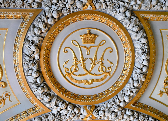
Custom Monogram: A Name Rendered as Inheritance
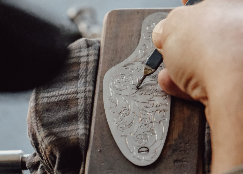
Custom Monogram: A Private Grammar of Identity
A name is the first inheritance any of us receives, long before a house, a title, or a fortune.
A custom monogram takes that inheritance and gives it a shape the eye can hold.
It is neither a logo in the commercial sense nor a signature in the casual one.
It occupies a narrower, older category: the personal mark, made once and carried for life.
Every civilization that valued permanence eventually arrived at the same idea.
Initials, interlaced with sufficient care, could stand in for the person who bore them.
What separates a custom monogram from an ornament is the discipline behind its construction.
Nothing in a properly composed mark is arbitrary, however effortless it may appear.
Each curve answers to the letter beside it, and each letter answers to the whole composition.
This is why a true custom monogram cannot be assembled from a menu of fonts.
It must be drawn, tested, and refined until the initials stop looking like initials.
At that point, they begin to look like something closer to a private crest.
This journal entry considers what that transformation requires, and why it endures across generations.
It also considers the difference between a personal monogram and a classic monogram, a distinction worth making precisely.
The two terms are frequently used as synonyms, and the confusion costs clients something real.
A personal monogram describes an intention. A classic monogram describes a vocabulary.
Understanding both, before a single sketch is made, changes the quality of everything that follows.
What follows is an attempt to describe a discipline that rarely explains itself in public.
Most of what happens inside an atelier is deliberately invisible in the finished work.
This entry exists, in part, to make a little of that invisible work legible.
It is written for anyone who has ever looked at a family crest and wondered how it was made.
It is written, too, for anyone weighing whether their own name deserves that same attention.
The short answer is that most names do, once someone takes the time to look closely.
A name carries accent, rhythm, and history long before any of that becomes visible on paper.
A custom monogram simply makes that hidden structure available to the eye.
Few clients arrive already knowing this. Most discover it partway through the process.
That discovery, more than the finished artwork, is often what a commission is really about.
A Longer Memory
The custom monogram did not begin as decoration. It began as proof.
Ancient artisans stamped combined letters onto coinage and ceramics to certify origin.
A viewer who could not read a full name could still recognize a familiar mark.
That principle, recognition without explanation, has never really left the practice.
By the medieval period, the mark had migrated from commerce to lineage.
Noble houses encoded rank and allegiance into forms governed by strict visual law.
Scholarship devoted to preserving that law continues today, a fact worth pausing on.
Institutions built around centuries of formal heraldic study still catalogue and interpret those early conventions.
The Renaissance widened the circle of who could commission such a mark.
Merchant families in Florence and Venice adopted interlaced initials as instruments of trust.
A monogram on a ledger or a bale of cloth signified accountability across distances.
European courts, meanwhile, formalized the sovereign cipher as an instrument of governance.
A monarch’s initials on porcelain, regalia, or correspondence projected authority without a single word.
By the Georgian and Victorian eras, the mark had entered ordinary aristocratic life.
Linen, silver, and stationery all carried the same quiet signal of belonging.
The Baroque period added a layer of ornamental complexity that later generations would deliberately strip away.
Heavy flourishes gave way, over time, to a leaner, more legible interlace.
That correction, from excess back toward restraint, recurs throughout the mark’s entire history.
The twentieth century introduced an unexpected new client for the custom monogram: the corporation.
Luxury houses recognized that a personal cipher, applied consistently, behaved exactly like a brand mark.
What changed across every century was the audience. What never changed was the intent.
Antiquity
Combined letters appear on coins and ceramics as marks of maker and owner.
Medieval Europe
Heraldic law formalizes lineage into governed visual symbols carried by noble houses.
Renaissance
Merchant families adopt monograms as instruments of commercial trust and identity.
Baroque Period
Ornamental complexity peaks, later prompting a deliberate return to restraint.
Georgian & Victorian Eras
The custom monogram enters domestic life through linen, silver, and correspondence.
Twentieth Century
Luxury houses translate the personal cipher into the logic of brand identity.
Contemporary Practice
The custom monogram re-emerges as a deliberate rejection of the mass-produced mark.
It is worth pausing, too, on why the mark survived at all across so many disruptions.
Wars, revolutions, and shifting fashions each had reason to make the personal cipher obsolete.
None of them succeeded, which suggests the underlying need is more durable than any single era’s taste.
People have always wanted a way to say this is mine, or this is ours, without saying it aloud.
A custom monogram remains one of the few visual tools built entirely for that purpose.
It is not advertising. It is not branding in the commercial sense. It is closer to a signature carved in stone.
That distinction is easy to lose sight of in a culture saturated with commercial logos of every kind.
The atelier’s task, in every commission, is to keep that distinction intact.
Seen this way, the modern commission is not an invention. It is a continuation.
What a client requests today echoes what a merchant or monarch once required.
A mark that certifies. A mark that endures. A mark that cannot be mistaken for another’s.
History, in this discipline, is not a decorative reference. It is a working method.
Every convention described above still shows up, in some quiet form, in a present-day commission.
A modern client rarely asks for a coat of arms, yet the same discipline of certification applies.
The mark must still say, unmistakably, that this belongs to this person and no other.
That continuity across centuries is part of why the practice resists fashion so effectively.
A trend-driven mark ages within a few years. A historically literate one rarely does.
This is the argument, stated plainly, for why the atelier studies the past as closely as it does.
What Custom Truly Means
The word custom has been diluted by a decade of instant design tools.
A monogram assembled from a drag-and-drop template is custom only in the loosest sense.
Genuine custom work begins with a blank page and ends with a singular form.
Nothing is repurposed from an existing library of interlocking letterforms.
The difference is not aesthetic preference. It is structural, from the very first sketch.
A templated mark is built to accommodate any pair of initials that might be entered.
A custom monogram is built to accommodate exactly one identity, and no other.
This is why two clients with the same initials never receive the same mark.
Their names carry different weight distributions, different phonetic emphasis, different family histories.
A disciplined atelier accounts for all of it before a single curve is drawn.
The result looks inevitable, as though no other arrangement were ever possible.
That sense of inevitability is, paradoxically, the most difficult effect to engineer honestly.
It requires discarding dozens of technically correct compositions in favor of the singular right one.
Clients rarely see this discarded work, which is precisely the point of a disciplined process.
A finished custom monogram should never show its own effort, however considerable that effort was.
This is also where a related discipline, the bespoke monogram, shares almost every principle described here.
The two terms overlap closely, though bespoke work often implies an even narrower brief.
What a custom monogram is not matters just as much as what it is.
It is not a typeface pairing chosen for pleasant contrast between two letterforms.
It is not a clip-art flourish borrowed from an unrelated decorative tradition.
It is not an effect applied uniformly regardless of the name it is meant to serve.
Each of those shortcuts produces something that resembles a monogram without behaving like one.
A resemblance is not the same thing as a working mark, however convincing it looks at first glance.
The test is always the same: does it hold up once removed from its original, flattering context.
A templated mark rarely does. Placed on a different surface, at a different scale, it falters.
A custom monogram, tested properly during development, does not share that fragility.
This is the quiet, practical argument for custom work, apart from any question of taste.
It simply performs more reliably across the many contexts a personal mark eventually encounters.
The comparison below outlines where the two paths, custom and templated, genuinely diverge.
Consideration
Custom Monogram
Templated Alternative
Letterform origin
Drawn specifically for the client’s initials
Selected from a pre-existing font library
Compositional weight
Balanced to the client’s own name and phonetics
Applied uniformly regardless of the letters entered
Historical grounding
Informed by heraldic and typographic precedent
Rarely informed by precedent at all
Application testing
Verified across scale, from favicon to façade
Assumed to work at a single intended size
Client involvement
Shaped through consultation and iterative refinement
Limited to selecting among fixed preset options
Longevity
Designed to remain legible for generations
Designed to satisfy an immediate, momentary need
The Anatomy of a Personal Cipher
A custom monogram is easiest to understand once it is taken apart.
Every mark, however elegant, is the sum of a small set of deliberate decisions.
The first decision concerns hierarchy: which letter carries the most visual authority.
In most traditions, the surname initial anchors the composition, though never by force.
The hierarchy should be felt rather than announced through obvious differences in size.
The second decision concerns interlace: how the letters meet, overlap, or share a stroke.
Interlace is where a monogram either becomes unified or remains three separate letters.
This is the same structural language studied within the decorative arts, including work reflected in a decorative arts collection spanning continents.
The third decision concerns negative space, the quiet architecture around the letterforms.
Space is not emptiness here. It is an active structural element in its own right.
The fourth decision concerns proportion, the relationship between height, width, and stroke weight.
A monogram with poor proportion looks correct only at one specific, accidental size.
The fifth decision concerns enclosure, whether the mark sits within a border, a shield, or nothing at all.
An enclosure changes how formal a mark reads, sometimes quite dramatically.
The sixth decision concerns scalability, whether the mark survives reduction to a single centimeter.
A mark that only works at one scale has not yet finished its design process.
A seventh, quieter decision concerns material application: how the mark behaves once engraved, embossed, or printed.
A form that reads cleanly on paper may need slight adjustment before it is cut into silver.
A commission that satisfies all seven considerations tends to be described, quite simply, as timeless.
None of these decisions are made in isolation from one another.
Adjusting one, the interlace, for instance, almost always requires revisiting proportion and negative space in turn.
Clients researching this discipline further can review the atelier’s logo monogram commissions for reference.
A related but distinct approach is documented within our monogram logo work.
Both paths share the same seven-part anatomy, applied to different intentions and outcomes.
Clients sometimes ask which decision matters most, expecting a single, simple answer.
There isn’t one. Each decision only makes sense in relation to the other six.
A perfect letterform with poor proportion still reads as unresolved, however beautifully drawn.
A perfect proportion with careless interlace still reads as three letters rather than one.
This interdependence is what separates a considered composition from a merely decorative one.
It is also why the refinement stage, discussed further in the next section, takes as long as it does.
A junior designer often tries to fix one flaw by adjusting only the element that seems broken.
An experienced eye knows that a flaw in one element is frequently a symptom of imbalance elsewhere.
This is why refinement in this atelier proceeds slowly, revisiting the whole composition after every change.
Letterform
Drawn rather than selected, so the mark answers to no typeface but its own.
Proportion
Height, width, and stroke weight calibrated to the specific initials at hand.
Interlace
The point where separate letters resolve into a single, unified gesture.
Negative Space
Treated as structure, not absence, so the composition breathes without dispersing.
Enclosure
A deliberate choice between an open cipher and a bordered, shield-like form.
Scalability
Verified from the scale of a signet to the scale of an architectural facade.
Material Application
Refined for the specific behavior of paper, metal, stone, or thread.
The Atelier Process
A custom monogram is not sketched once and delivered the following morning.
The process resembles fine tailoring more than graphic design in the conventional sense.
It begins with a conversation, not a brief in the corporate sense of the word.
I want to understand the story behind a name before I ever touch a pencil.
That story informs every subsequent decision, from letterform to enclosure to material.
Research follows, drawing on typographic history and, where relevant, heraldic precedent.
Multiple directions are then explored side by side, deliberately, before any is favored.
This parallel exploration prevents the process from settling too early on a convenient answer.
Refinement is the longest stage, and the least visible from the outside.
A single stroke may be adjusted dozens of times before it earns its place.
Only once the mark performs at every required scale does it move toward approval.
Approval is not the end of the relationship. It is the beginning of the mark’s working life.
Delivery includes guidance on application, so the monogram is used with the same care it was designed.
That guidance covers everything from stationery weight to the correct depth of an embossed impression.
The process below outlines the five stages in sequence, though the boundaries between them blur in practice.
None of the five stages can be shortened without compromising what follows it.