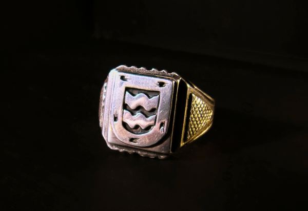
Personalized Signet Design: A Mark Worth Sealing

Personalized Signet Design and the Quiet Authority of a Sealed Mark
A seal is a small thing to be asked to carry so much.
Yet a single impression in wax can hold a name, a lineage, and a private conviction all at once.
This is the particular discipline behind every personalized signet design this atelier undertakes.
What follows is a study of why that discipline still matters, and why it has never truly lapsed.
It is written for those who already sense the answer and simply wish to understand it more precisely.
THE ART OF MONOGRAMS
What a Personalized Signet Design Actually Is
A personalized signet design is often mistaken for jewelry, when in truth it functions closer to a private instrument.
It exists to be pressed, and everything about its construction follows from that single fact.
A mark intended for wax must survive being reversed, reduced, and driven into a soft surface under real pressure.
Very few decorative forms are asked to endure that, and fewer still are asked to endure it for a century.
This is the first distinction worth drawing between a signet and an ornament.
An ornament is judged by how it appears on the hand that wears it.
A signet is judged by what it leaves behind on paper.
That difference in accountability changes nearly every decision made during the design process.
It also explains why the form has resisted fashion so successfully across so many centuries.
A mark that must remain legible in wax cannot afford the flourishes that date a design within a decade.
A WORKING INSTRUMENT
A signet is designed to be used rather than displayed, and that use is what gives the mark its authority.
Every element within it must survive the compression of the seal without becoming ambiguous.
The second distinction is one of audience, and it is the more interesting of the two.
A commercial logo is built to be recognized by strangers who have never met the person behind it.
A personalized signet design is built to be recognized by a much smaller circle, and often by descendants who are not yet born.
It does not need to persuade anyone.
It needs only to be unmistakably correct to the people who already know what it means.
This is a genuinely different design problem, and it produces genuinely different results.
Marks made to persuade tend toward volume, contrast, and immediate legibility at speed.
Marks made to be recognized tend toward restraint, proportion, and a legibility that rewards attention rather than demanding it.
The finest signets in circulation belong emphatically to the second category.
They do not announce themselves in a room, and they were never intended to.
There is a third quality that separates a signet from almost every other form of personal identity design.
It is singular in the most literal sense available.
A carved seal exists as one object, and its impression cannot be produced without it.
A digital file can be copied without loss an unlimited number of times.
A carved stone cannot, which is precisely why it once carried legal weight across entire empires.
That legal function has largely receded in contemporary life.
The symbolic function has not receded at all, and may in fact have deepened.
In an era where nearly every mark of identity can be duplicated, the one that cannot acquires a different kind of value.
Scarcity of this sort is not manufactured through limited editions or artificial constraint.
It is simply a property of the object, present from the moment the stone is cut.
Families approaching this work for the first time frequently ask whether a signet is still practical.
The honest answer is that practicality was never quite the point, even at the height of the tradition.
A merchant in the seventeenth century could have signed his name.
He pressed a seal instead because the seal said something his signature could not.
It said that the document had passed through his hands rather than merely bearing his name.
That distinction between attestation and presence remains the essential argument for the form.
A sealed letter carries evidence of a physical moment in a way that no other closure does.
Someone was present, deliberate, and unhurried enough to melt wax and press it.
In a culture of instantaneous transmission, that evidence has become genuinely uncommon.
Uncommon things, handled with care, tend to accumulate meaning rather than lose it.
LEGACY & FAMILY HERITAGE
The Long Inheritance Behind the Sealed Mark
The impulse to press a personal mark into a soft surface is older than the alphabet that mark now usually carries.
Cylinder seals rolled into wet clay served Mesopotamian administration long before any recognizable letterform existed.
Those early seals were not decorative objects that happened to be useful.
They were instruments of governance that happened to be beautiful.
The distinction matters, because the tradition has never fully abandoned its instrumental character.
Even a signet commissioned today inherits a form shaped by function rather than by taste.
The circular field, the shallow relief, the reversed carving: none of these were aesthetic preferences.
Each was a solution to the problem of leaving a clear impression in a resistant material.
That the solutions turned out to be elegant is a fortunate accident of good engineering.
It is also, arguably, the reason the form has aged so gracefully across five thousand years.
Roman practice refined the seal into something closer to what a contemporary client would recognize.
The ring form consolidated the mark and its owner into a single inseparable object.
A seal kept in a drawer can be borrowed, misplaced, or quietly used by someone else.
A seal worn on the hand cannot, at least not without the owner noticing.
This is why the signet ring, rather than the loose matrix, became the dominant form for personal authority.
Convenience and security arrived at the same answer, which is usually a sign that the answer is a good one.
The Roman signet also introduced a convention that still governs the form today.
The design was expected to be personal without being explanatory.
A profile, a device, a pair of interlaced letters: enough to identify, never enough to narrate.
That restraint has proved remarkably durable across every subsequent tradition.
FUNCTION BEFORE ORNAMENT
Nearly every convention of signet design began as a practical solution to the mechanics of sealing.
The elegance of the form is a consequence of that discipline rather than a decorative addition to it.
Medieval Europe added a layer that the ancient world had not required, which was regulation.
As seals acquired legal force across increasingly complex jurisdictions, the question of who might bear which mark became urgent.
A seal that could be confused with another seal was worse than no seal at all.
Institutions arose to record, adjudicate, and protect the distinction between one family’s mark and another’s.
This is the point at which heraldic discipline and sealing practice become effectively inseparable.
The vocabulary a signet uses today descends directly from that period of formalization.
It is worth understanding this lineage before commissioning anything, because it clarifies what is being inherited.
A personalized signet design is not a free composition constrained only by taste.
It is a composition working within a grammar that has been refined, tested, and defended for the better part of a millennium.
Working within that grammar is not a limitation, and treating it as one produces predictably weaker results.
The Renaissance elevated the seal from an instrument of administration to an object of genuine artistic ambition.
Engraved gems commissioned during this period sit comfortably alongside the finest sculpture of their moment.
Merchant families in particular understood the seal as a statement of arrival and standing.
A well-cut intaglio announced that a household had reached a point where its correspondence required authentication.
That announcement was made quietly, through the quality of the carving rather than through any explicit claim.
Collections held within one of the world’s great encyclopedic museums preserve extraordinary examples of this discipline across several civilizations and many centuries.
Studying such objects, even at a distance, offers a clear lesson in what restraint applied at the highest level actually looks like.
The finest surviving seals are almost never the busiest ones.
They are the ones where a single well-judged device has been given enough space to hold the entire field.
That principle has not changed, and it governs every commission this atelier undertakes.
ROYAL TRADITIONS
The Heraldic Grammar a Signet Inherits
Heraldry is frequently described as a decorative tradition, which understates it considerably.
It is better understood as a formal language with its own syntax, hierarchy, and rules of precedence.
Every tincture, charge, and arrangement within a shield carries a defined meaning rather than a suggested one.
This precision was not an aesthetic indulgence but a practical necessity in a world of illiterate battlefields and contested inheritance.
A shield had to be read accurately at distance, in motion, and under conditions of considerable stress.
Signet design inherits this requirement almost unchanged, simply at a much smaller scale.
A seal must be read accurately in wax, at perhaps fifteen millimetres, under the distortion of an imperfect impression.
The constraints differ in magnitude but not in kind.
This shared discipline is why heraldic literacy remains the single most useful qualification in a signet engraver.
A designer who understands the grammar can bend it intelligently; one who does not can only imitate its surface.
The rules governing tincture illustrate the point with unusual clarity.
Heraldic convention holds that metal should not be placed directly upon metal, nor colour directly upon colour.
This sounds arbitrary until one considers the practical consequence, which is contrast.
A rule framed in the language of symbolism turns out to be a rule about legibility at distance.
Signet design faces an equivalent constraint in the relationship between raised and recessed surfaces.
Too little differentiation and the impression reads as a smudge rather than a mark.
Too much and the seal becomes fragile, catching and chipping through ordinary daily wear.
The correct answer lies within a fairly narrow band, and finding it requires experience rather than calculation.
This is the sort of judgment that cannot be delegated to a template or a preset.
It is arrived at through repetition, and through having been wrong often enough to recognize the right answer quickly.
The Formalization of the Sealed Mark
Ancient Mesopotamia
Cylinder seals rolled into wet clay establish the impressed personal mark as an instrument of administration and authority.
Classical Rome
The signet ring consolidates seal and owner into a single worn object, establishing conventions of scale and restraint still observed today.
Medieval Europe
Formal institutions arise to regulate armorial identity, ensuring that no two households may lawfully bear the same mark.
Renaissance Italy
Engraved gems reach the standing of major sculpture, and merchant households adopt the seal as a marker of established position.
18th–19th Century
The signet becomes a fixture of correspondence among professional and landed families across Europe and North America.
Present Day
Personalized signet design continues as a considered, documented mark of individual and family identity, commissioned rather than purchased.
Heraldic tradition also contributes something less technical but equally valuable, which is a sense of proportion about ambition.
The system was built to distinguish between degrees of standing without requiring anyone to overstate their own.
A household two generations into its own story was never expected to display the apparatus of a ducal house.
This is a useful corrective in contemporary commissioning, where the temptation toward elaboration is constant.
A signet built to suggest a history that does not exist reads, to anyone with a trained eye, exactly as it is.
A signet built honestly around a genuine and modest history reads as entirely convincing.
The scholarly bodies devoted to preserving this tradition, among them the independent societies devoted to armorial scholarship, continue to document these distinctions with real precision.
That record remains the most reliable guard against invented tradition dressed as inherited tradition.
It is consulted at the outset of every heraldic commission this atelier accepts.
The research is never decorative, and it is never skipped for the sake of speed.
A mark built to suggest a history that does not exist reads, to a trained eye, exactly as it is.
THE ART OF MONOGRAMS
Signet, Classic Monogram, and Personal Emblem Compared
Clients frequently arrive certain they want a signet when what they actually want is a monogram, and occasionally the reverse.
The confusion is entirely understandable, since the forms overlap in both origin and application.
They are nonetheless distinct commissions with distinct expectations, and conflating them weakens the result.
A classic monogram arranges letters into a balanced composition intended primarily for reproduction.
It appears on stationery, on linen, on silver, and increasingly on correspondence that never touches paper at all.
Its purpose is to identify with elegance across a wide range of contexts and materials.
A signet, by contrast, is built around a single reproduction method that imposes severe constraints.
Everything about it is subordinated to the demands of the impression.
A personal emblem sits between the two, borrowing pictorial elements from heraldry while retaining the flexibility of a monogram.
Understanding where a commission sits along this spectrum is the first genuinely useful conversation to have.
Distinguishing the Three Principal Marks
Mark
Primary Purpose
Governing Constraint
Typical Lifespan
Personalized Signet
Authentication and ceremonial sealing
Legibility when reversed and impressed in wax
Generational, often inherited intact
Classic Monogram
Identification across objects and correspondence
Balance and clarity across varied materials
Lifetime, frequently extended to descendants
Personal Emblem
Symbolic representation of values or lineage
Coherence of pictorial and lettered elements
Generational, adapted with deliberate care
Wedding Cipher
Marking a single celebration and the household it begins
Equality of weight between two initials
Occasion-anchored, often retained afterward
Heraldic Crest
Representation of an entire documented lineage
Fidelity to formal armorial convention
Permanent, altered only with formal cause
The most common error is asking a single mark to perform all of these functions at once.
A signet asked to double as a full letterhead device usually looks overbuilt in one context and underbuilt in the other.
A monogram asked to serve as a seal frequently loses its finest strokes the moment it enters wax.
Many households eventually commission more than one mark, using each for the work it was actually designed to do.
This is not extravagance but simple appropriateness, and it produces a more coherent identity overall.
Anyone weighing a lettered mark against a fully pictorial one will find the distinction developed further in our study of the initial monogram.
The relationship between the two forms is genuinely close, and each informs the other.
A household that understands both tends to make faster and more confident decisions during a commission.
It also tends to be more comfortable leaving elements out, which is usually where the difficulty lies.

Restraint is far easier to practice when one knows precisely what each mark is for.
There is also a question of register, which is difficult to quantify but immediately perceptible.
A signet carries a formality that a monogram does not, simply by virtue of its ceremonial associations.
Pressing wax is an unmistakably deliberate act, and the mark inherits that deliberateness.
This makes a signet slightly less suited to casual daily use than a well-drawn set of initials.
It also makes it considerably better suited to the small number of occasions that genuinely warrant formality.
A letter of condolence, a formal introduction, an instrument of gift: these are the natural habitats of the seal.
A signet used indiscriminately loses something, in the way that any ceremonial gesture loses force through repetition.
Households that understand this instinctively tend to use their seals sparingly and to greater effect.
This is worth considering before commissioning, since it shapes how the mark should be designed.
A seal intended for six impressions a year is a different object from one intended for six a week.
ONE MARK, ONE TASK
Asking a single mark to serve as seal, letterhead device, and household emblem produces something that performs none of the three convincingly.
Commissioning separate marks for separate registers is appropriateness rather than excess.
ROYAL TRADITIONS
Royal and Institutional Precedent
The most instructive surviving examples of personalized signet design come from institutions that never abandoned the practice.
Royal households, ecclesiastical offices, and formal courts maintained continuous sealing traditions when private use had largely lapsed.
This continuity is genuinely valuable, because it produced an unbroken record of decisions made under real constraints.
A private collector may commission a seal and never press it.
An institution that seals thousands of documents annually cannot afford a design that performs poorly.
The result is a body of work refined by use rather than by preference, which is the more reliable filter.
Royal ciphers in particular repay close attention from anyone contemplating a commission.
They are constrained in almost exactly the ways a private signet is constrained, at a comparable scale.
They must remain legible across metal, wax, textile, and architectural stone.
Almost nothing survives that test without having been designed with unusual care.
What emerges from any sustained study of these marks is a consistent preference for confidence over complexity.
A sovereign’s cipher rarely relies on ornament to communicate standing, because ornament was never what communicated it.
Standing was communicated through the certainty of the proportions and the assurance of the line.
This is a difficult lesson to accept, because ornament is visible and proportion is not.
A client reviewing early concepts can point to a flourish and say that it pleases them.
They cannot as easily point to the spacing between two strokes, though that spacing does far more work.
Part of the atelier’s role is to hold the line on decisions that are felt rather than seen.
The archives held by one of the most storied royal collections in Europe document centuries of these decisions in remarkable detail across many reigns.
The record shows, with unusual clarity, how consistently restraint outperformed elaboration over long periods.
It is a lesson worth absorbing before a single line is drawn on a private commission.
CONFIDENCE OVER COMPLEXITY
The most authoritative historical seals rely on proportion and line quality rather than on accumulated ornament.
This preference has proved durable across every tradition in which sealing was practiced seriously.
Institutional practice also offers a useful model for how a mark should be governed once it exists.
A royal cipher is not redrawn casually, and its reproduction is specified rather than improvised.
Households commissioning a personalized signet design benefit enormously from adopting the same posture.
A seal reproduced slightly differently on stationery than on the ring itself begins to lose its authority quietly.
The remedy is unglamorous and entirely effective, which is simply to document the specification once.
Proportions, weights, permitted applications, and prohibited alterations all belong in that record.
This is the same discipline that has allowed the oldest institutional marks to remain recognizable across centuries.
It costs very little at the outset and is nearly impossible to reconstruct later.
Families who keep such a record almost never regret having done so.
Families who do not tend to discover the omission at precisely the moment it becomes expensive.
THE ATELIER JOURNAL
The Anatomy of a Personalized Signet Design
A signet is built from a small number of elements, each of which carries disproportionate weight.
The field is the shaped surface on which everything else is arranged, and its proportions govern the entire composition.
An oval field reads differently from a round one, and a cushion differently again from either.
These are not interchangeable preferences, since each shape distributes visual weight in a distinct manner.
A device that sits comfortably within an oval frequently looks cramped within a circle of equivalent area.
The choice of field is therefore among the first decisions rather than among the last.
The device is whatever occupies the field, whether lettered, pictorial, or a considered combination of both.
Its scale relative to the field determines whether the seal reads as assured or as tentative.
A device set too small within its field always looks uncertain, regardless of how well it is drawn.
A device set too large loses the margin that gives an impression its definition.
The Elements of a Signet
The Field
The shaped surface that holds the entire composition, whose proportions govern how visual weight is distributed across the impression.
The Device
The lettered or pictorial mark itself, scaled against the field so that it reads as assured rather than tentative.
The Relief
The depth differential between raised and recessed surfaces, calibrated for clean impression without fragility in daily wear.
The Margin
The narrow band of clear space around the device that gives the finished impression its definition and edge.
The Stone
The carved material, chosen for hardness, colour, and its behaviour under repeated contact with warm wax.
The Setting
The metal band that carries the stone, sized and shouldered so that the seal presses square rather than at an angle.
Relief depth is the element most often underestimated by clients and most often decisive in the finished result.
A shallow cut produces a soft, low-contrast impression that some households find genuinely beautiful.
A deeper cut produces crisp definition at the cost of fragility along the finest edges.
Neither is correct in the abstract, and the right answer depends entirely on intended use.
A seal pressed a few times each year can afford depth that a daily instrument cannot.
This is one of several reasons the conversation about use precedes the conversation about appearance.
The margin performs a similar quiet function that is rarely noticed until it is absent.
A device carried too close to the edge of the field produces impressions that read as clipped.
The eye registers this as carelessness even when it cannot identify the cause.
Half a millimetre of clear space is frequently the difference between a finished mark and an unfinished one.
The setting deserves more attention than it typically receives during commissioning conversations.
A stone mounted even slightly proud of its shoulders will press at an angle under ordinary hand pressure.
The resulting impression is heavier on one edge and lighter on the other, which reads immediately as poor workmanship.
Correcting this after the fact is possible but rarely elegant, and it is far cheaper to specify correctly at the outset.
Metal choice contributes to this as well, since softer alloys deform gradually under repeated sealing.
Gold in higher purities is beautiful and comparatively soft, which matters for an instrument that will be pressed thousands of times.
Platinum resists deformation admirably and carries a weight that many clients find satisfying in use.
Silver sits between the two and remains the most historically representative choice for the form.
Each material communicates something slightly different about how the seal is intended to be understood.
None is inherently superior, and the decision should follow use rather than expense.
THE MARGIN NOBODY NOTICES
The narrow band of clear space around a device is invisible until it is absent, at which point every impression reads as clipped.
Half a millimetre is frequently the difference between a finished mark and an unfinished one.
THE ATELIER JOURNAL
How a Commission Actually Proceeds
The commissioning of a personalized signet design begins with listening rather than with drawing.
This is not a courtesy extended to clients but the only reliable method of avoiding a generic result.
A designer who sketches before understanding is designing for an imagined household rather than a real one.
The resulting seal may be technically accomplished and still feel strangely unclaimed by the family that receives it.
Households recognize this immediately, even when they cannot articulate what has gone wrong.
The earliest conversation therefore concerns history, temperament, and intended use rather than aesthetics.
What has this family actually done across its documented generations?
What does it protect, and what has it consistently declined to pursue?
These questions sound abstract and turn out to be surprisingly practical in their consequences.
A household shaped by stewardship gravitates toward different devices than one shaped by enterprise.
The Commission Sequence
01
Discovery
Extended conversation establishing family history, temperament, intended use, and the register in which the seal is expected to operate.
02
Research
Verification of any heraldic or symbolic elements against documented precedent, ensuring nothing is invented where inheritance is claimed.
03
Composition
Development of the device against the chosen field, drawn by hand before any digital refinement is introduced.
04
Reduction Testing
The composition is reduced to final sealing scale and assessed for legibility, since a mark that survives reduction survives everything.
05
Reversal & Proofing
The design is mirrored and proofed as an impression, confirming that it reads correctly in wax rather than only on screen.
06
Specification
Delivery of the finished design with documented proportions, relief depths, and permitted applications for consistent reproduction.
Reduction testing is the stage clients find most surprising and the stage that most improves the result.
A composition assessed at comfortable viewing scale is being assessed under conditions it will never actually face.
Reduced to sealing scale, elements that read as refinement frequently read instead as noise.
Strokes that seemed distinct merge, and counters that seemed generous close entirely.
The remedy is almost always subtraction, which clients find harder to accept than addition.
A designer’s most valuable contribution at this stage is the willingness to remove what has already been approved.
Reversal and proofing performs a related function that no amount of screen work can substitute for.
A design that reads confidently on a monitor can read awkwardly when mirrored and pressed.
The eye is remarkably sensitive to asymmetries that only become visible under reversal.
Proofing in actual wax remains the only reliable way to catch them before the stone is cut.
The specification stage closes the commission and is the one most frequently omitted elsewhere.
A finished seal without documented proportions is an asset that begins degrading the moment it changes hands.
The next generation, lacking the record, reproduces the mark approximately rather than exactly.
Three or four approximations later, the mark has drifted meaningfully from its original form.
This drift is entirely preventable and almost never prevented, which is why the atelier treats specification as part of the commission rather than an extra.
The document itself is short and unglamorous, running to perhaps two pages.
It records what the seal is, how it may be reproduced, and what may not be altered without cause.
Households that keep it find the mark still crisp three generations later.
Those who do not find themselves reconstructing it from impressions, which is possible but imperfect.
The broader philosophy behind this approach is set out at greater length in the atelier’s wider writing on the discipline of the seal.
LUXURY IDENTITY
Material, Hardness, and the Behaviour of Wax
The material of a signet is not a decorative choice, and treating it as one produces predictable disappointment.
A seal is an instrument subjected to heat, pressure, and repeated contact with a substance that adheres readily.
Its material must resist all three without degrading, ideally across a working life measured in decades.
Hardness is the first consideration and the one most easily quantified.
Softer stones carve beautifully and wear visibly, losing definition along their finest edges within years of regular use.
Harder stones resist wear admirably and demand considerably more skill and time to cut correctly.
The traditional preference for chalcedony varieties reflects a sensible compromise between the two.
Carnelian, sard, and bloodstone all sit in a workable range, which is precisely why they dominate surviving collections.
Contemporary commissions occasionally reach for harder materials, with corresponding implications for cost and timeline.
The decision should follow expected frequency of use more than any other single factor.
Thermal behaviour is the second consideration and the one clients almost never anticipate.
Wax adheres readily to a warm seal and releases cleanly from a cool one.
Materials that retain heat therefore produce progressively worse impressions across a sequence of sealings.
This is why experienced correspondents keep a seal cool between impressions rather than working continuously.
Stone performs considerably better than metal in this respect, which is one reason stone-faced signets persisted.
A metal-faced seal is entirely workable, but it requires more attention to timing across any long sequence.
Surface finish contributes as well, since a highly polished face releases more cleanly than a matte one.
These are small operational details that materially affect how satisfying a seal is to use.
A signet that frustrates its owner in use will eventually stop being used at all.
That outcome represents a complete failure of the commission, however handsome the object may be.
Considerations in Material Selection
6–7
Typical Mohs hardness of traditional seal stones
3
Principal stresses a working seal must resist
15mm
Common field diameter at sealing scale
50+
Years of expected working life
Colour carries symbolic weight within this tradition, though it operates differently than clients often expect.
The stone’s colour does not appear in the impression at all, since wax records only form.
It is therefore a decision about the object rather than about the mark it produces.
This makes it one of the few genuinely free choices available within an otherwise heavily constrained commission.
Households frequently use it to encode something personal that the seal itself does not display.
A stone chosen for its resemblance to a family’s armorial tincture is a quiet and entirely appropriate gesture.
A stone chosen for its connection to a place, a profession, or an anniversary works equally well.
None of this is visible to a recipient, which is arguably the point.
The signet tradition has always accommodated meanings intended for the owner rather than for the audience.
That privacy is among the more appealing characteristics of the form.
THE ATELIER JOURNAL
Legibility, Reduction, and the Discipline of Scale
Every serious constraint in signet design ultimately reduces to a question of legibility at small scale.
This is the single test a personalized signet design must pass, and passing it forgives a great deal.
Failing it forgives nothing, since a seal that cannot be read has failed at its only genuine function.
Legibility at fifteen millimetres is a substantially different problem than legibility at fifty.
Detail that reads as refinement at the larger size reads as texture at the smaller.
Counters close, junctions merge, and fine strokes disappear entirely under the compression of the impression.
None of this is predictable by intuition, which is why it must be tested rather than assumed.
The most experienced designers still proof their work rather than trusting their judgment at scale.
This is not a lack of confidence but a realistic assessment of how the eye behaves.
Wax is an unforgiving medium, and it reveals every optimistic assumption made during composition.
Stroke weight consistency is the quietest of these disciplines and among the most consequential.
A composition with uneven weights looks unresolved even to viewers who cannot name the problem.
In wax the effect is amplified, since heavier strokes impress more deeply and catch light differently.
Achieving consistency requires checking every curve against every other curve, which is slow and unglamorous work.
It is also the stage at which a competent design becomes a genuinely accomplished one.
Clients rarely see this stage and almost always perceive its results.
The finished seal simply feels settled, and the reasons are difficult to articulate without technical vocabulary.
That feeling of settledness is the entire objective of the exercise.
It cannot be added at the end, and it cannot be achieved through ornament.
It is produced through accumulated small corrections, none of which is individually visible.
A seal that cannot be read has failed at its only genuine function, however beautiful it may be on the hand.
There is a related question about how much a signet should attempt to say.
Households arriving with a long and genuinely interesting history often wish to encode all of it.
A field of fifteen millimetres cannot hold a lineage, and attempting it produces an illegible mark.
The discipline of choosing which single element matters most is frequently the hardest part of the process.
It is also, reliably, the most clarifying conversation a family has during the commission.
Deciding what a household is fundamentally about tends to be valuable irrespective of the seal that results.
Families who reach that clarity produce better commissions and generally enjoy the process considerably more.
Those who resist it tend to accumulate elements and then wonder why the impression reads as busy.
The mathematics are unforgiving, and no amount of skill in execution can overcome them.
A seal holds one idea well, two adequately, and three almost never.
THE ARITHMETIC OF A SMALL FIELD
A field of roughly fifteen millimetres holds one idea well, two adequately, and three almost never.
No degree of skill in execution can overcome that arithmetic, and attempting it produces an illegible mark.
LEGACY & FAMILY HERITAGE
The American Inheritance of a European Discipline
The sealing tradition arrived in North America as working practice rather than as ceremonial decoration.
Colonial merchants sealed correspondence that crossed an ocean and could not be verified by any other means.
A seal was, under those conditions, genuinely load-bearing rather than symbolic.
Trust across three thousand miles and several months required something more durable than a signature.
This practical origin gave American sealing practice a character noticeably distinct from its European parent.
It was less concerned with rank and considerably more concerned with reliability.