Personalized Initial Monogram: One Letter’s Legacy
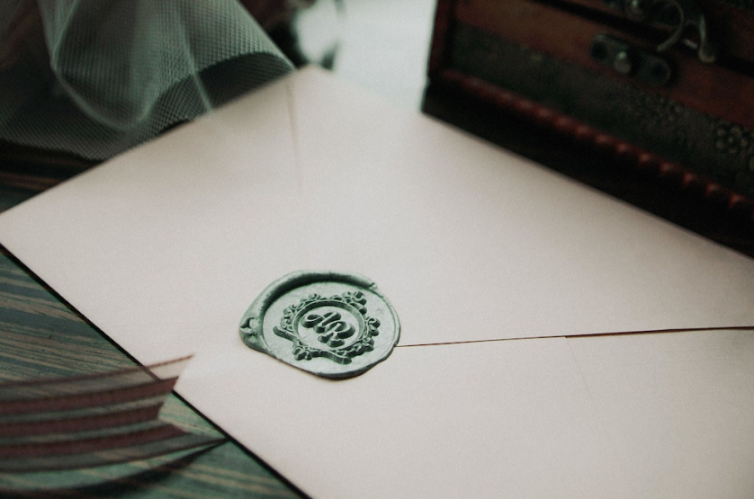
The Personalized Initial Monogram: A Single Letter, Fully Considered
On the discipline of reducing a name to its first letter — and the patience required to make that letter permanent.
A single initial is the shortest sentence a name can speak.
This publication considers what happens when that sentence is finally given a considered form.
It is offered as an editorial reflection, in the tradition of the atelier, rather than a tutorial of any kind.
It examines the personalized initial monogram as an object of craft, of heritage, and of quiet personal authority.
Readers planning a commission, and readers merely curious about the form, will find the same argument waiting for them here.
The Art of Monograms
The Personalized Initial Monogram, Considered
Every name begins with a letter, and most people never once consider what that letter actually looks like.
A personalized initial monogram exists to correct that oversight, slowly and with deliberate intention.
It is the most reduced form the monogram tradition permits, and therefore the most exposed.
One letter must carry, alone, everything that three interlaced initials are ordinarily allowed to share.
There is no second character to soften an uncertain curve, and no third to disguise an unresolved proportion.
This exposure is precisely what gives the single-letter form its particular and enduring authority.
A well-drawn initial does not read as an abbreviation of a name; it reads as a distillation of one.
The distinction between those two ideas governs everything the atelier does with this commission.
An abbreviation shortens for convenience, while a distillation concentrates for permanence.
A personalized initial monogram belongs entirely to the second category, or it does not deserve the name.
The word personalized carries genuine weight here, and it is not applied as decoration.
It means the letter was studied, drawn, and resolved for one person specifically, and for no one else.
A letter pulled from a font menu can be assigned to anyone whose name happens to begin with it.
A commissioned initial can only ever belong to the person whose story shaped its final form.
Clients rarely arrive able to articulate this difference before the first real conversation takes place.
They arrive, instead, with a quiet sense that their initial deserves more consideration than it has yet received.
That instinct is older than any of us, and it is entirely correct.
Long before logos became commonplace, the most enduring marks of distinction belonged not to companies, but to individuals.
Many of those marks were built from a single letter, struck into metal or pressed into wax.
The instinct to compress an identity into one character is among the oldest habits of visual culture.
A personalized initial monogram simply continues that habit with the care it has always deserved.
Consider how rarely a modern purchase is expected to remain unchanged for fifty years or longer.
Wardrobes are refreshed, interiors are renovated, and even signatures drift over a lifetime of use.
A commissioned initial is one of the few objects still expected to resist that turnover entirely.
This expectation is not nostalgia; it is a design requirement placed on the work from its first sketch.
It governs which letterforms are considered acceptable and which are quietly set aside during exploration.
It governs how much ornament is permitted before a mark begins to feel decorated rather than considered.
None of this discipline is visible in the finished artifact, yet all of it is felt across the decades that follow.
On Reduction
A personalized initial monogram is not a name made smaller; it is a name made concentrated, and the difference is the entire craft.
Royal Traditions
A Living History of the Single Letter
The single-letter mark did not begin in a design studio; it began on coins, seals, and standards.
Ancient rulers pressed one initial into metal long before anyone described the practice as identity design.
The letter was chosen because it could be recognized instantly, even by those who could not read.
Recognition, not legibility in the literary sense, was always the first purpose of the form.
Medieval scribes carried the instinct further, opening manuscripts with initials so elaborate they became architecture.
The illuminated capital was, in its way, the first personalized initial monogram the West produced at scale.
It announced authorship, patronage, and rank in a single character, before a word of text was read.
European courts later refined the practice into a formal grammar, governed by proportion rather than whim.
Institutions devoted to the formal study of this visual grammar continue to document how carefully that grammar was once established and enforced.
A royal cipher built on one crowned letter was treated as an instrument of governance, not decoration.
It appeared on currency, on regimental colors, and on the correspondence of an entire court.
One of Europe’s principal royal archives preserves centuries of these single-letter ciphers across silver, porcelain, and state papers.
What survives in that record is a consistent refusal to let the letter carry more ornament than it could bear.
Restraint, more than any crown or flourish, is the real inheritance the form passes down to us.
Antiquity
The Struck Letter
Rulers and city-states stamped a single initial into coins and seals as the earliest instrument of recognition.
Medieval Europe
The Illuminated Capital
Scribes elevated the opening letter of a manuscript into a work of art, binding one character to authorship and rank.
Renaissance
The Merchant’s Initial
Trading families adopted refined single-letter marks to authenticate goods and correspondence across unfamiliar routes.
17th–19th Century
The Crowned Cipher
European courts codified the royal initial as an instrument of state, applied from currency to palace ironwork.
Gilded Age
The Domestic Initial
The single letter entered refined private life, engraved onto silver, stitched into linen, and pressed into stationery.
Present Day
The Commissioned Initial
The personalized initial monogram is recognized as a distinct commission, composed with the rigor once reserved for courts.
It would be a mistake to treat this history as ornamental trivia unrelated to a contemporary commission.
The conventions established across those centuries still govern how a single letter is composed correctly today.
Legibility at a distance, balance within the character, and restraint were never merely aesthetic preferences.
They were practical requirements for marks meant to be recognized instantly, often at considerable distance.
A crowned cipher had to be identifiable on a passing carriage, a distant banner, or a state seal.
That same demand applies to a personalized initial monogram engraved onto a small signet ring today.
Only the materials, the client, and the occasion have changed; the underlying grammar has stayed the same.
Working within these inherited constraints is less a limitation than an inheritance worth accepting gladly.
A court engraver centuries ago and an atelier today are, in this narrow sense, solving the same problem.
How does one letter become one legible, permanent mark, without borrowing authority from anything beside it.
There is a further lesson in how these single-letter ciphers handled the passage of time itself.
A crowned initial was rarely redesigned wholesale, even as circumstances around it changed considerably.
Careful adjustments were layered onto a stable foundation, reign after reign, without erasing what came before.
This approach preserved recognition while still allowing the mark to register genuine historical change.
It is a considerably more disciplined instinct than simply starting over with each new generation.
A private client today can apply the same principle without any royal precedent required to justify it.
The letter is drawn once, drawn correctly, and then trusted to do its work for decades without interference.
Interference, in this craft, is nearly always the greater risk; patience is nearly always the safer one.
On Precedent
A single letter has carried crowns, banks, and family houses for centuries; a personalized initial monogram inherits that weight whether or not its owner ever names it.
Luxury Identity
What Personalization Actually Means
The word personalized has been used loosely enough across the design world to lose most of its meaning.
A letter selected from a preset menu and stamped onto a product is not a personalized initial monogram.
Personalization, properly understood, means the character was composed from first principles for one person alone.
That distinction matters more than most clients initially assume when they begin searching for a mark.
A generic initial generator applies the same underlying template to every letter it receives.
It cannot account for the particular geometry of a given character, only an approximation of it.
It cannot account for the story the letter is meant to carry, because it was never told one.
The same discipline that governs the custom personal monogram built around a full name applies with even greater force to a single character.
When a whole name is reduced to one letter, every decision inside that letter becomes visible.
The weight of a stem, the taper of a terminal, the angle of a single serif all become load-bearing.
A trained hand studies the letter itself before deciding what tradition it should be drawn from.
Some characters carry natural authority, and others must earn it through proportion and weight alone.
An R offers a designer diagonal energy that an O must achieve through tension in its curve instead.
No template can weigh these differences, because no template was ever asked to.
The Commissioned Initial Compared
| Consideration | Personalized Initial Monogram | Generic Single Letter |
|---|---|---|
| Origin | Composed from first principles for one person and one story | Applied identically to any name beginning with the letter |
| Letterform study | The character is drawn, weighed, and tested across scale and material | Rarely tested beyond a single on-screen preview |
| Exclusivity | Unique to a single owner, never repeated for another client | Available to any purchaser at any time |
| Symbolic depth | Carries a specific personal narrative within one character | Carries no narrative beyond the letter shown |
| Longevity | Designed to be kept, engraved, and eventually inherited | Designed to be replaced within a season or two |
The comparison above is not a judgment on convenience, which serves many purposes well elsewhere.
It is simply a description of two different intentions, each suited to a different kind of decision.
A personalized initial monogram is commissioned by those for whom convenience was never the objective.
It is commissioned, instead, by those seeking a mark worth keeping rather than one worth using briefly.
Permanence and haste rarely serve the same commission at once, and this form tolerates no haste at all.
This is the same logic that has always separated fine bespoke tailoring from ready-to-wear clothing.
The finished garment may look similar from across a room, yet up close the difference is unmistakable.
A commissioned initial behaves the same way under close and sustained attention over many years.
On the day of delivery, a templated letter and a composed one can appear equally polished.
A decade later, one has aged into familiarity and the other has simply aged.
That delayed reveal is why so many clients underestimate the value of the process at the outset.
By the time they understand it fully, the argument no longer needs to be made on their behalf.
In communities where legacy is valued as deeply as innovation, identity often extends beyond a name. It becomes a symbol — one capable of representing a family, a celebration, or a personal story for generations.
The Art of Monograms
The Anatomy of a Single-Letter Composition
Beneath the surface of any personalized initial monogram lies a set of principles rarely discussed outside the atelier.
These principles are not stylistic preferences; they are structural requirements for a mark meant to endure.
Each is considered independently before any of them is permitted to shape the final character.
The same rigor underlies the bespoke monogram tradition this atelier was founded upon, applied here to the most exacting case the tradition offers.
A single letter grants the designer nowhere to hide, which is exactly why the discipline matters most here.
Everything rests on remarkably few decisions, and each of them must therefore be beyond reproach.
Letterform
The typographic tradition behind the character is chosen for depth and authority, never for passing style.
Proportion
Height, width, and stroke weight are balanced so the letter feels resolved rather than merely enlarged.
Negative Space
The space within and around the character is composed with the same intention as the strokes themselves.
Ornament
Any flourish must earn its place structurally; nothing is added that the letter cannot carry for a lifetime.
Scalability
The finished initial is tested from the scale of a cufflink to the scale of a framed print.
Singularity
The final form must be unmistakable for any other rendering of the same letter, anywhere.
When these elements align, a personalized initial monogram becomes legible in a single glance rather than a studied read.
That immediacy is the quiet signature of a mark that has been properly resolved from the outset.
A mark that skips any one of these principles tends to fail quietly, over years, rather than immediately.
This is why the atelier treats all six as inseparable requirements rather than optional considerations.
The classic monogram of two or three letters distributes its risk across multiple characters at once.
The single initial concentrates all of that risk into one form, and rewards the discipline accordingly.
A viewer’s eye can hold only so much information in one glance before it stops reading a mark as a mark.
With one letter, the eye holds everything at once, which is either the form’s triumph or its failure.
There is no middle outcome available to a single character, and the atelier would not want one.
Every proposed addition is tested against a simple question before it is ever accepted into the composition.
Does this addition earn its place, or does it merely fill space that could otherwise breathe freely.
The most convincing luxury signal is rarely more ornament, but the confidence to include only what is necessary.
On Exposure
A single letter offers nowhere to hide an imprecise curve, which is precisely why a resolved one is so quietly satisfying to encounter.
Legacy & Family Heritage
The Crest Monogram and the Question of Inheritance
A personalized initial monogram and a full family crest are close relations, though not identical ones.
A crest typically encodes lineage across generations, governed by formal heraldic convention and precedent.
A single initial typically encodes an individual, though it frequently becomes a family’s inheritance over time.
Between the two sits a hybrid worth naming directly: the crest monogram, a letter carried with heraldic formality.
The crest monogram places the personal specificity of an initial within the institutional weight of a shield.
It answers a question many families eventually arrive at on their own, without any prompting.
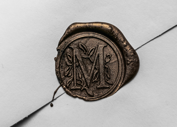
How does one honor both a living individual and a documented lineage within a single mark.
The heraldic authority responsible for granting personal arms in England has governed the granting of personal arms under formal law for more than five centuries.
A private commission operates outside that formal system, yet it borrows the same underlying discipline.
Nothing enters a heraldic composition without a reason, and nothing should enter a commissioned initial either.
Every element must be accountable, even when no formal authority exists to demand the accounting.
This accountability is what separates a crest monogram from a decoration that merely resembles one.
It is worth addressing a common misconception directly at this point in the argument.
A commissioned mark is not, by itself, evidence of noble descent or any formal title held by its owner.
Commissioning one does not confer a rank the family did not already hold before the work began.
This confusion occasionally deters families who assume the entire practice is reserved for the aristocratic.
It is not, and it never has been, confined to that narrow a population across its long history.
Merchant and professional families have carried single-letter marks for centuries, apart from any noble claim.
What unites these families is not pedigree but intention: the wish to leave something legible behind.
Every family with a long documented history was, at some point, simply one person beginning something.
The initial that person carried is often the earliest surviving artifact of the entire story.
A personalized initial monogram commissioned today is, in that sense, a first chapter rather than a footnote.
Families who understand this tend to make calmer, more confident decisions throughout the process.
They are not solving for every future contingency within a single piece of artwork.
They are asking for a mark that tells the truth about where the story stands today.
That honesty, more than any assumption about the future, is what gives the mark its lasting integrity.
There is also a practical dimension to the crest monogram worth stating plainly for those weighing it.
A single composed letter is simpler to engrave, reproduce, and protect than a sprawling armorial design.
It moves gracefully from a signet ring to a bookplate to a gate without any loss of identity.
A fuller crest reserved for formal occasions can then sit alongside it, each form serving its own register.
Families rarely need to choose between the two; they need only to understand what each was built to do.
The initial serves the everyday, the crest serves the ceremonial, and both serve the same continuing name.
This division of labor is itself an old convention, practiced quietly by households for generations.
The atelier simply restores the deliberateness that convention always assumed but rarely wrote down.
On the Crest Monogram
A crest monogram does not claim a lineage; it prepares one, by giving a single letter the discipline heraldry has always demanded of its symbols.
The Atelier Journal
Inside the Atelier: Composing One Letter
Commissioning a personalized initial monogram is closer to a private consultation than to a design transaction.
The process begins with conversation, never with a questionnaire handed across a desk without context.
The name, its history, and the occasion the mark must serve are discussed before any sketching begins.
Only once that context is understood does the atelier begin exploring specific letterform directions.
The consultation matters more than most clients expect it to, going into that first conversation.
A single initial is a portrait in miniature, and a portrait requires that its subject be genuinely understood.
The atelier wants to know how the name is spoken, how often it is written, and what it should convey.
These questions seem tangential until the moment they quietly determine the structure of the letter itself.
01
Consultation
A private conversation establishes the name, the occasion, and the register the single letter must hold.
02
Letterform Study
The character is studied across typographic traditions before any single direction is pursued.
03
Exploration
Multiple treatments of the letter are drawn and compared, most of them destined to be set aside.
04
Refinement
The strongest direction is refined for proportion, negative space, and balance at every scale.
05
Validation
The mark is tested across applications, from a signet ring to framed print, to confirm it holds everywhere.
06
Delivery
The finished initial is prepared across every application its owner intends, with guidance for consistent use.
Each stage exists to remove uncertainty before a client ever commits to a single final direction.
By the time delivery occurs, the outcome rarely feels like a surprise to the person receiving it.
It feels, instead, like confirmation of something the client already sensed was correct from the beginning.
Clients are shown the reasoning behind each direction, not simply the final image presented at the end.
This transparency is intentional, since a commissioned mark should be understood, not accepted on faith.
I was trained first as a graphic designer, long before specializing in personal emblems of this kind.
That early discipline still governs how I approach every single-letter commission accepted at the atelier.
The hand provides what the screen cannot: the accident of discovery and the pressure that suggests character.
The screen provides what the hand cannot: precision, scalability, and faithful reproduction across formats.
A personalized initial monogram of genuine quality makes deliberate use of both, in that order.
Exploration is deliberately generous at this stage, because certainty cannot be rushed into existence.
Most directions drawn during exploration are set aside, and setting them aside is not wasted effort.
Each discarded treatment teaches something about what the letter refuses to become, which narrows the truth.
By the time a direction is presented, it has already survived every quiet objection the atelier could raise.
What remains is not the cleverest option that was drawn, but the one that stopped asking to be revised.
That stillness, more than any flourish, is what a client recognizes in the first presentation.
On Listening
The letter can only be drawn correctly once the person it represents has been genuinely understood; sketching before listening is merely lettering.
The Atelier Journal
Craft in Numbers
Craftsmanship resists easy measurement, though certain figures still illuminate what a commission involves.
A single personalized initial monogram typically explores several distinct directions before one is chosen.
This range exists because the correct treatment of a given letter is rarely obvious immediately.
Multiple scales are tested for every finished mark, from ring-sized engraving to stationery-sized print.
An initial that only performs at a single scale has not, in the fullest sense, been properly finished.
Most clients assume the first idea is the hard part, and refinement a mere formality afterward.
In practice the opposite proves true, and the last small adjustments decide everything that matters.
4–6
Distinct treatments of the letter explored per commission
30+
Refinements typically weighed before a final form is resolved
100+
Years a well-proportioned initial can remain legible on silver
1
Letter, composed once, intended to serve a lifetime and beyond
These figures describe restraint rather than scale, which is precisely the underlying point of the exercise.
A commissioned initial, like true luxury, is not measured by how frequently it changes over time.
It is measured, instead, by how rarely it ever needs to change at all.
Research and study often account for a larger share of the total effort than the drawing itself.
This is unusual in an industry that increasingly favors speed over sustained consideration.
The atelier has made a deliberate choice to resist that pressure across every commission it accepts.
A mark rushed through production rarely survives serious scrutiny a decade after its delivery.
The additional patience invested at the outset prevents costly regret much later in the mark’s life.
On Measure
A personalized initial monogram is finished not when nothing more could be added, but when nothing more could be removed without loss.
Luxury Identity
The Measure of Restraint
Luxury, properly understood, has very little to do with ornamentation for its own sake.
It has a great deal to do with discretion, precision, and quiet confidence in a mark’s own presence.
A single composed letter embodies this principle more directly than almost any object one might commission.
It does not need to announce itself, because its owner already knows exactly what it means.
The proportions below reflect how deliberately each stage of a commission is weighted in practice.
Refinement consistently consumes the largest share of total effort, which surprises most first-time clients.
This ratio is precisely inverted from how most people imagine the design process actually working.
Consultation & Listening — 20%
Letterform Exploration — 25%
Refinement & Testing — 40%
Final Delivery & Handoff — 15%
A composition that looks effortless at first glance has usually been quietly revised a dozen times before delivery.
None of that revision is visible in the final mark, which is precisely the intended effect.
The client sees only the resolved letter, never the discarded attempts that made it possible.
This is, in a sense, the entire discipline of the craft, condensed into a single working principle.
The most successful marks are read in one visual moment, without the eye laboring to decipher them.
That immediacy is the result of careful resolution between richness and clarity, never an accident of taste.
A classic monogram earns its permanence through the same invisible labor, multiplied across its letters.
The single initial simply concentrates that labor where it can least afford to be absent.
Restraint also governs what the atelier declines to do, which is as much a part of the craft as the drawing.
A request for ornament the letter cannot structurally carry is answered with a quieter alternative, and a reason.
Clients rarely resent this candor; most commissioned this work precisely to be told the truth about their letter.
Flattery produces marks that please for a season, while candor produces marks that satisfy for a lifetime.
The atelier considers that trade settled, and it has never once regretted the terms.
Nothing about this philosophy is fashionable, which is exactly why it continues to work.
On Invisible Work
Most of the effort behind a personalized initial monogram is spent on refinements the owner will feel for decades before ever consciously noticing them.
The Atelier Journal
Voices of Distinction
The truest measure of a personalized initial monogram is not how it looks on delivery, but how it ages.
Clients rarely describe the process in technical terms when asked to reflect on the experience.
They describe it, instead, in terms of recognition, permanence, and a certain quiet relief.
The reflections below are drawn from clients across the country who have commissioned this particular work.
Names have been abbreviated throughout, to preserve the privacy each client is rightfully owed.
What recurs across these accounts, again and again, is relief rather than excitement.
Excitement tends to fade within a season; relief tends to persist for years afterward instead.
“The single letter arrived exactly as it should have — quiet, permanent, and unmistakably mine. It has anchored my correspondence for three years without once feeling dated.”
E. Vandermeer · Private Client · Charleston, South Carolina
“I practice law under a name my grandfather carried before me. Reducing it to one composed letter somehow made the inheritance feel heavier, not lighter.”
R. Castellanos · Attorney · Santa Fe, New Mexico
“We commissioned the initial for our daughter the month she was born. It is already on her silver cup, and one day it will be on much more.”
The Okafor Family · Family Commission · Chicago, Illinois
“As an architect, I expected to argue about proportion. Instead I watched someone treat one letter with the seriousness I reserve for a building.”
M. Lindqvist · Architect · Portland, Oregon
Luxury Identity
Where a Personalized Initial Monogram Lives
A finished personalized initial monogram is expected to perform across a wide range of contexts and materials.
It may appear on personal stationery one day and on a small leather case the very next.
It may be engraved into silver, embossed into leather, or rendered as a small digital mark.
Each of these contexts places different demands on legibility, weight, and overall proportion.
A letter that only works at one scale has not yet been fully resolved by its designer.
The atelier tests every commission across the applications most relevant to a given client’s actual life.
One of the world’s foremost collections of decorative and applied art still preserves engraved initials belonging to monarchs, merchants, and private households alike.
Studying centuries-old engraved letters teaches proportion in a way no modern template can replicate.