
Custom Wax Seal Design and the Return of the Pressed Mark
Custom Wax Seal Design and the Return of the Pressed Mark
A seal is the only mark in the history of personal identity that must be felt before it is read.
Ink lies on paper, but wax rises from it, holding a small shadow at every edge.
That shadow is the whole argument for the form, and it has never quite been replaced.
A custom wax seal design is therefore not a decorative afterthought applied at the end of a stationery suite.
It is a personal monogram asked to survive translation into three dimensions, heat, and pressure.
Very few marks survive that translation without revealing exactly how carefully they were composed.
What follows is a reflection on why the sealed impression endures, and what it demands of anyone who commissions one.
THE ART OF MONOGRAMS
What a Custom Wax Seal Design Actually Is
A custom wax seal design is a single mark cut in reverse so that it may be read correctly in relief.
That sentence contains the entire discipline, and almost everyone underestimates it on first hearing.
The mark is not drawn onto a surface; it is carved into a matrix and then pressed into softened wax.
Every line therefore exists twice, once as a recess in metal and once as a ridge in the finished impression.
A designer who forgets the second existence produces something attractive on screen and disappointing in hand.
I have watched beautiful monograms collapse the moment they met warm wax for the very first time.
Hairlines vanish, counters fill, and a composition that photographed elegantly becomes an indistinct blur.
This is not a failure of the wax, which behaves exactly as wax has always behaved.
It is a failure of the drawing, which was never asked to answer for its own physical consequences.
A custom wax seal design begins, then, with a question no digital mark is ever forced to face.
What will remain of this composition once it has been reduced to depth, edge, and shadow alone?
Colour disappears entirely, since a seal carries only one tone across its full surface.
Fine gradation disappears, since molten wax will not hold detail below a certain physical threshold.
What survives is silhouette, weight, and the relationship between raised form and recessed ground.
This is a severe editing process, and severity is precisely what gives the finished object its authority.
The seals that have survived eight centuries in archives are rarely the most intricate ones ever cut.
They are the ones whose makers understood which three or four decisions actually carried the mark.
A personal monogram destined for wax must therefore be composed with that reduction anticipated from the outset.
It cannot be drawn first and adapted afterwards, because adaptation at that stage is merely damage control.
The atelier treats the seal as the governing constraint and lets every other application follow from it.
A mark that survives wax will survive engraving, embossing, embroidery, and every digital surface after that.
The reverse is almost never true, and that asymmetry is worth understanding before any commission begins.
A Working Definition
A custom wax seal design is a personal monogram resolved for relief rather than for reproduction.
Its success is measured in shadow and edge, never in the amount of detail it manages to contain.
ROYAL TRADITIONS
The Long Memory of the Sealed Letter
The sealed impression is older than the signature, and considerably older than the idea of private handwriting.
Long before anyone signed a name, they pressed a device into clay, lead, or eventually wax.
The device stood in for the person entirely, which is a remarkable amount of trust to place in a small object.
A seal did not claim that its bearer had approved a document; it claimed that its bearer was present.
This distinction sounds subtle until one considers how differently we treat a signature today.
A signature is evidence of a hand, while a seal was evidence of an office, a household, or a lineage.
The Mesopotamian cylinder seal rolled across damp clay is among the earliest identity systems we can still read.
Its owner carried it on a cord, and losing it was closer to losing a passport than losing a pen.
Roman signet rings carried the same authority in a form small enough to wear across an entire lifetime.
The ring was buried with its owner or destroyed at death, precisely so that no one else could speak in his voice.
Medieval Europe then formalised the practice into something approaching an administrative infrastructure.
Charters, grants, writs, and treaties were validated not by handwriting but by the pendant seal hanging beneath them.
Great collections of decorative and applied arts preserve thousands of these matrices, rings, and impressions.
Museum holdings devoted to five thousand years of decorative and applied art include seal dies whose cutting still repays close and patient study.
What strikes me in those objects is never their ornament, which is often surprisingly restrained.
It is their confidence, the willingness to let a single form carry an entire identity without hedging.
The wax itself was rarely the fragile decorative substance we now imagine it to be.
Early sealing wax was a resinous compound, tough enough to survive centuries hanging from a document by a cord.
It cracked, certainly, and it darkened, but it held its impression with genuine stubbornness.
Archives across Europe still hold seals whose devices remain perfectly legible after seven or eight hundred years.
Very little else made in the twelfth century remains as readable today as those small discs of pressed resin.
That durability was engineered rather than accidental, and it followed directly from the discipline of the cutting.
The timeline below traces how the sealed mark moved between authority, correspondence, and finally private intention.
Third Millennium BC
The Rolled Device
Cylinder seals are rolled across damp clay to authenticate goods, contracts, and consignments.
Ownership of the matrix, rather than any written name, establishes the identity of the party.
Roman Antiquity
The Signet on the Hand
Intaglio signet rings compress an entire personal identity into a stone small enough to wear daily.
The ring is destroyed or interred at death so no other hand may speak with its authority.
Twelfth Century
The Pendant Seal
Charters and grants hang their authority from wax discs suspended on cords of silk or parchment.
Legibility across generations becomes a legal requirement rather than an aesthetic preference.
Sixteenth Century
The Sealed Letter
Sealing wax closes private correspondence, making the impression both a signature and a lock.
A broken seal announces interference long before the letter itself has been read by anyone.
Nineteenth Century
The Household Standard
Engraved desk seals and monogrammed dies become fixtures of established households and their stationery.
The crest, the cipher, and the initial settle into their familiar domestic hierarchy of use.
Present Day
The Considered Impression
A custom wax seal design is commissioned by choice rather than obligation, which changes its meaning entirely.
Chosen freely, the mark now signals intention and permanence instead of mere administrative necessity.
THE ATELIER JOURNAL
The Matrix: Where the Design Truly Lives
Clients often speak of commissioning a seal, but what is actually commissioned is a matrix.
The matrix is the cut die, and the wax impression is merely its most visible consequence.
This distinction matters because the matrix is the object that will be inherited, not the wax.
A brass die, properly cut and properly kept, will outlive several generations without complaint.
The impressions it produces are consumed constantly, one per envelope, and nobody mourns them individually.
So the real commission is a tool, and tools are judged by different criteria than pictures.
A tool must be repairable, reproducible, and honest about the physical limits of its own material.
Depth of relief is the first of those limits, and it governs far more than most clients expect.
Cut too shallow and the impression reads as a faint bruise rather than a confident form.
Cut too deep and the wax tears as the die is lifted, leaving ragged edges around every stroke.
The correct depth sits within a narrow band, and it varies with the width of the surrounding elements.
A broad field can afford depth, while a slender stroke beside it cannot, and the two must be reconciled.
This reconciliation is the quiet technical heart of any serious custom wax seal design.
It is invisible in the finished impression, which is exactly how one knows it has been done well.
Draft angle is the second limit, and it is the one most often overlooked in contemporary work.
Every wall inside the die must lean very slightly outward so the wax releases cleanly on lifting.
A perfectly vertical wall grips the wax and drags it, blurring the crispness the whole exercise exists to produce.
The lean is minute, invisible to the eye, and entirely decisive in the finished object.
The third limit is the ground itself, the flat field from which the raised elements rise.
A crowded ground gives the eye nowhere to rest and flattens the impression into visual noise.
Generous ground gives every raised element its own shadow, and shadow is what makes a seal legible.
I have never regretted removing an element from a die, and I have frequently regretted keeping one.
On Depth
A seal is read almost entirely by the shadows its edges cast across the wax beneath them.
Depth, draft, and clear ground therefore matter more to legibility than any decorative flourish ever will.
THE ATELIER JOURNAL
Relief, Not Drawing: The Reversed Discipline
There is a specific mental adjustment required by relief work, and it never becomes entirely automatic.
The designer must hold two images simultaneously, the recessed die and the raised impression it will produce.
What is cut away becomes what stands proud, and what is left standing becomes the background.
Letterforms reverse laterally as well, so every asymmetry must be checked twice before any metal is touched.
This is straightforward to describe and consistently humbling to practise across a working week.
The counters inside letters are the first casualty of inattention in almost every rushed commission.
A lowercase e has a small enclosed space that must survive as a recess in the finished wax.
If the surrounding strokes are too heavy, the wax simply bridges that space and the letter becomes a blot.
The same fate awaits the eye of an a, the bowl of a p, and the crossing of an intricate interlace.
Serifs present a related problem, since their delicate brackets are precisely where wax tends to round over.
A serif that reads crisply in print will often soften into a bulb once pressed into a warm surface.
The remedy is not to abandon serifs, which would impoverish the tradition considerably.
The remedy is to cut them with slightly more decision than the printed original would ever require.
This is why a seal drawn from an existing letterpress monogram so often disappoints its owner.
The proportions were resolved for ink on paper, and ink has no thickness worth speaking of.
Wax has thickness, and thickness introduces a physics that the original drawing never had to consider.
Bodies devoted to the formal study of heraldic form have documented these constraints for generations.
Societies devoted to the formal study of heraldic design have documented how strictly earlier engravers once policed weight and spacing.
Their rules were not aesthetic preferences imposed by taste; they were physical necessities discovered by failure.
A tradition that has been failing and correcting for eight centuries knows things a new drawing cannot.
This is why the atelier begins every seal commission by studying impressions rather than illustrations.
An illustration shows what someone intended, while an impression shows what the material actually permitted.
A seal is not a drawing that happens to be pressed. It is a shadow that happens to be designed.
THE ART OF MONOGRAMS
The Personal Monogram Rendered in Relief
A personal monogram is the most common subject of a custom wax seal design, and the most demanding.
Two or three letters must resolve into a single form that reads instantly at roughly one inch across.
That constraint is severe, and it eliminates most of what passes for monogram design elsewhere.
Interlace, the traditional weaving of strokes over and under one another, is particularly unforgiving in wax.
Each crossing point requires a change of depth, and depth changes are where impressions most often fail.
A single crossing is usually manageable, three are demanding, and seven are almost always a mistake.
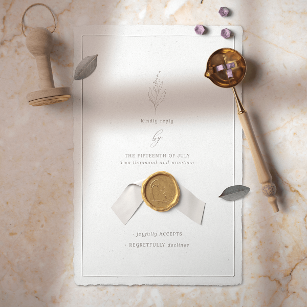
The atelier therefore favours interlace that is implied by overlap rather than executed as literal weaving.
The eye reads the relationship without the wax being asked to hold an impossible number of levels.
Ligature offers a gentler route to the same end, joining two letters through a genuinely shared stroke.
A shared stroke costs nothing in depth and reads as intimacy rather than as ornamental complication.
This is the approach most often taken for a private bespoke monogram intended for lifelong personal use.
Enclosure is the third structural option, ringing the letters within a border, an oval, or a plain circle.
The border does considerable work, since it defines the edge of the impression and steadies the composition.
It also protects the letters, giving the die a clean outer wall against which the wax can settle.
A monogram without enclosure must generate its own silhouette, which is a much harder assignment.
Some marks manage it beautifully, and those are usually the ones built from broad, confident strokes.
Letter count is the final variable, and clients consistently want more letters than the format will carry.
Two letters is comfortable, three is standard, four is possible with real discipline, and five is rarely wise.
Beyond four, the individual letterforms shrink below the threshold at which wax reliably holds their edges.
The card grid below sets out the four structural approaches the atelier most often proposes.
The Ligature
Two letters joined through one genuinely shared stroke.
Reads as intimacy rather than as decorative complication.
The most forgiving structure at small impression sizes.
The Interlace
Strokes pass over and under in a woven relationship.
Requires strict control of depth at every crossing point.
Best limited to three crossings or fewer in wax.
The Enclosure
Letters are set within a border, oval, or plain ring.
The border defines the silhouette and steadies the whole form.
Gives the wax a clean outer wall on which to settle.
The Cipher
Letters are mirrored or repeated into a symmetrical device.
Reads as pattern first and as initials only on closer inspection.
Historically the preferred structure of royal households.
THE ART OF MONOGRAMS
The Classic Monogram and Its Translation to Wax
A classic monogram carries expectations that a contemporary mark does not have to satisfy.
It is expected to look inherited, to feel settled, and to avoid any suggestion of a particular decade.
These expectations are useful, because they push the composition toward proportions that have already been tested.
The classical letterform tradition is, among other things, an enormous archive of solved problems.
Roman capitals resolved the relationship between stem and hairline nearly two thousand years ago.
Renaissance engravers resolved how those capitals behave when compressed into a circular field.
Victorian die-sinkers resolved how much ornament a one-inch impression can carry before it collapses.
A designer who ignores that archive is not being original; he is simply repeating old failures slowly.
The translation of a classic monogram to wax nonetheless requires specific and deliberate adjustments.
Stroke contrast, the difference between thick and thin, must be reduced from its printed proportions.
A hairline that measures a fraction of a millimetre on paper will not survive as a raised ridge in wax.
The atelier typically thickens hairlines by a controlled percentage while holding the stems unchanged.
The result reads as the same monogram, because the eye judges contrast relatively rather than absolutely.
Spacing requires the opposite adjustment, opening rather than tightening as the mark is reduced.
Letters set comfortably at engraving scale will crowd one another once wax begins to spread between them.
Wax spreads, ink does not, and that single physical fact governs a great deal of the final spacing.
Ornament, where it appears at all, must be structural rather than incidental to the composition.
A flourish that terminates a stroke is defensible, while a flourish added beside a stroke rarely is.
The comparison below sets out how the same monogram behaves across the surfaces it will eventually meet.
How One Mark Behaves Across Surfaces
| Surface | What It Rewards | What It Punishes |
|---|---|---|
| Wax Impression | Broad strokes, generous ground, decisive edges | Hairlines, dense interlace, crowded counters |
| Engraved Silver | Fine detail, controlled contrast, precise terminals | Very heavy solids that read as flat and dull |
| Blind Emboss | Clear silhouette and simple internal structure | Small enclosed counters that flatten under pressure |
| Embroidery | Continuous strokes of even, predictable weight | Abrupt changes of direction and isolated fine marks |
| Foil Stamping | Confident weight with clean, uninterrupted edges | Very fine lines that break along the foil boundary |
| Digital Display | Almost anything at large sizes | Nothing much, which is why it misleads designers |
THE ATELIER JOURNAL
How a Custom Wax Seal Design Is Composed
The sequence below is not a tutorial, and it would be of very little use to anyone attempting one.
It is offered instead as an account of where the difficulty actually sits within a commission.
Clients are frequently surprised that drawing occupies the smallest share of the total effort.
The largest share belongs to reduction, which is the patient removal of everything the wax will not carry.
I
Conversation
The name, the household, and the intended use are examined before any mark is proposed.
→
II
Structure
Ligature, interlace, enclosure, or cipher is chosen and tested against the letter count.
→
III
Reduction
Contrast, spacing, and ornament are adjusted specifically for the behaviour of warm wax.
→
IV
Proofing
Impressions are studied at true size to confirm that shadow and edge read correctly.
→
V
Delivery
Files are prepared for die-cutting alongside every other surface the mark will meet.
The conversation stage is longer than most clients anticipate, and it rarely concerns visual preference.
It concerns the household, the correspondence habits, and what the mark is genuinely expected to do.
A seal intended solely for wedding invitations is a different object from one intended for forty years of letters.
The first can afford a little occasion-specific character, while the second must remain entirely neutral.
Structure follows, and this is where the majority of irreversible decisions are quietly made.
Choosing enclosure over open silhouette changes every subsequent decision about weight and spacing.
Reduction is the longest stage, and it is where a promising composition either matures or reveals its limits.
Elements are removed one at a time, and after each removal the mark is assessed at true size.
The correct stopping point is the moment before removal would begin to cost the mark its meaning.
Proofing is conducted at one inch, never at presentation scale, because presentation scale flatters everything.
A mark reviewed at six inches will always look resolved, and that reassurance is entirely worthless.
Delivery then prepares the composition for the die-cutter alongside every other surface it will encounter.
A single mark, one structure, many materials, and no separate versions competing quietly with one another.
LUXURY IDENTITY
The Grammar of Legibility at a Small Scale
Legibility in wax is not the same quality as legibility in print, and confusing the two causes most failures.
Printed legibility depends on contrast between ink and paper, which is a matter of tone alone.
Sealed legibility depends on contrast between raised and recessed form, which is a matter of light.
Move the envelope and the shadows move with it, which means the mark is read differently at every angle.
A composition must therefore hold together under raking light and under flat light equally well.
Under raking light every edge casts a long shadow, and crowded elements merge into an unreadable mass.
Under flat light the shadows almost disappear, and only the outer silhouette continues to carry the mark.
A seal that reads well in both conditions has been genuinely designed rather than merely decorated.
This is why silhouette receives so much attention during the reduction stage of every commission.
The silhouette is the only element guaranteed to survive whatever lighting the envelope eventually meets.
Internal detail is a bonus, offered generously when the light is kind and forgiven entirely when it is not.
Designing for the unkind case is the discipline; designing for the kind case is merely optimism.
Scale compounds the problem, since most seals finish somewhere between twenty-two and thirty millimetres.
At that size the eye receives the impression as a single shape before it resolves any letters at all.
Recognition therefore precedes reading, and a mark that cannot be recognised will never be read.
This ordering explains why the most successful seals are often the least ambitious in their detail.
They present one strong shape, and only reward closer attention once the viewer has already been convinced.
The highlight boxes throughout this reflection isolate the constraints that most often decide the outcome.
The Raking Light Test
Every proof is examined under low, angled light before it is examined under any other condition.
If the mark survives its own longest shadows, the remaining lighting conditions will look after themselves.
Recognition Before Reading
At true impression size the eye receives one shape long before it resolves a single letterform.
A composition that fails as a shape has already failed, whatever its internal detail may promise.
THE ATELIER JOURNAL
Wax, Temperature, and the Question of Material
Material choice shapes a custom wax seal design far more than clients generally expect at the outset.
Traditional sealing wax is brittle by design, and its brittleness was originally a security feature.
A seal that shatters when disturbed announces tampering, which was the entire point of sealing a letter.
That brittleness is charming in a display piece and genuinely inconvenient in anything sent through the post.
Flexible sealing compounds solve the problem by accepting a small amount of deformation without fracture.
They survive sorting machinery, which conventional wax reliably does not, and that matters for invitations.
The trade is a very slight loss of crispness at the finest edges of the impression.
A mark composed with generous edges absorbs that loss invisibly, while a delicate mark does not.
This is a further argument for resolving the seal first and every other application afterwards.
Temperature is the second variable, and it is the one most frequently mishandled in practice.
Wax poured too hot spreads thin and floods the finer recesses of the die before it can set.
Wax applied too cool refuses to fill the deepest cuts, leaving the mark hollow at its centre.
The workable window is narrower than most people assume and wider than nervousness suggests.
A chilled die shortens the setting time considerably and produces noticeably sharper edges.
Metal choice matters less than clients expect, though it is not entirely without consequence.
Brass holds a fine cut well and remains the atelier’s usual recommendation for a lifetime object.
Softer alloys cut more easily and wear more quickly, which shows after some hundreds of impressions.
Colour is the final material decision, and here restraint pays a return that is difficult to overstate.
Deep oxblood, ivory, charcoal, and a muted antique gold cover very nearly every occasion worth sealing.
Bright modern colours photograph well and age poorly, which is the reverse of what an heirloom requires.
A seal is one of the few objects where the conservative choice is also the more interesting one.
On Sealing Compounds
Traditional wax is brittle by intention, since a shattered seal was itself evidence of interference.
Flexible compounds trade a fraction of edge crispness for the ability to survive the modern post.
LEGACY & FAMILY HERITAGE
The Family Emblem Pressed into Wax
A family emblem asks more of a seal than a personal monogram does, and it asks for longer.
It must remain correct as the family changes, which no purely personal mark is ever required to do.
This is the oldest function of the sealed impression, and it has barely altered in eight hundred years.
A household seal was never about the individual pressing it; it was about the line standing behind him.
Families approaching the atelier with an inherited coat of arms face a particular translation problem.
A full armorial achievement contains a shield, a helm, a wreath, mantling, a crest, and often a motto.
None of that survives at twenty-five millimetres, and pretending otherwise produces an illegible smear.
The traditional and correct solution is to seal with the crest alone rather than the whole achievement.
The crest is the element that sat above the helm, and it was designed from the outset to be seen in isolation.
This is why crested silver, crested stationery, and crested seals have always looked so settled.
They are not abbreviations of the arms; they are a component that was always intended to stand alone.
Families without a documented grant occupy a different and equally legitimate position.
In England the granting of armorial bearings continues under an authority founded in the fifteenth century.
Its published procedures for petition and grant remain open, formal, and considerably older than most of the nations that consult them.
For families outside that jurisdiction, the honest path is a personal emblem rather than an invented coat of arms.
An emblem borrows the discipline of heraldry without claiming an authority that was never granted.
This distinction matters, and the atelier states it plainly at the beginning of every heritage commission.
A mark that quietly overclaims will eventually embarrass the family it was meant to dignify.
A mark that claims exactly what it is entitled to claim carries a confidence that requires no explanation.
The figures below reflect the shape of a typical heritage seal commission as it actually unfolds.
25mm
The typical finished diameter of a household seal impression
1
Crest, sealed alone, rather than a full armorial achievement
3
Structural directions explored before any die is cut
100+
Years a well-cut brass matrix can remain in working service
BESPOKE WEDDINGS
The Wedding Seal and the Weight of an Envelope
A wedding invitation is the one piece of correspondence most guests will handle before they read it.
It arrives among ordinary post, and its difference is registered by the hand before the eye is involved.
A wax seal is the most efficient means ever devised of communicating that difference without a word.
The envelope gains thickness, a small asymmetry, and a reason to be opened carefully rather than torn.
This is not sentiment; it is a measurable change in how the object is physically treated on arrival.
Guests keep sealed invitations at a noticeably higher rate than they keep unsealed ones.
The seal has given the envelope a reason to survive its own delivery, which is a considerable achievement.
A couple commissioning a wedding monogram for their celebration should consider the seal early rather than late.
Late consideration is where most disappointment originates, since the mark has usually been resolved for print already.
A composition refined for engraved invitations will need real adjustment before it can be cut as a die.
Beginning with the seal inverts that sequence and produces a mark that satisfies both without compromise.
The wedding seal also raises a question of duration that couples do not always anticipate.
A mark carrying a date, a year, or a venue is complete on the day and slightly awkward afterwards.
A mark carrying only two interlaced initials remains correct for the whole of a shared life.
The atelier consistently recommends the second, and couples consistently agree once the point is made plainly.
The same die then closes anniversary correspondence, christening announcements, and eventually family letters.
One object, cut once, used for decades, which is a far better proposition than a beautiful single-use ornament.
Practical planning matters here more than it does in almost any other commission the atelier undertakes.
Sealing two hundred envelopes by hand is a genuine undertaking, and it is best rehearsed well in advance.
A wider die is easier to apply consistently than a narrow one, and consistency is what guests actually notice.
Considerations of this kind sit at the centre of every luxury wedding monogram the atelier prepares for a celebration.
The finest symbols are rarely created to follow trends. They are created to outlive them.
LUXURY IDENTITY
The Professional Seal and Quiet Authority
Professional practices have used seals for as long as professions have needed to be trusted.
The notary, the architect, the attorney, and the physician all carried marks that closed a document.
In several jurisdictions a professional seal still carries genuine legal weight rather than decorative significance.
Even where it does not, the gesture communicates something that a printed letterhead cannot quite manage.
A sealed letter asserts that a person, rather than a system, has attended to the matter personally.
This assertion has become considerably more valuable as ordinary correspondence has become entirely automatic.
A physical seal is now, among other things, evidence that a human being touched the object.
Architects have understood this instinctively, sealing drawings and specifications long after digital delivery arrived.
The mark on a drawing set is a signature of responsibility rather than a piece of graphic decoration.
Attorneys use seals for the same reason, closing engagement letters and formal opinions with a pressed device.
Physicians in long-established practices often carry marks inherited from a predecessor or a founding partner.
In each case the seal is doing identity work that a logo would perform badly or not at all.
A logo announces a business, while a seal quietly asserts the presence of a responsible individual.
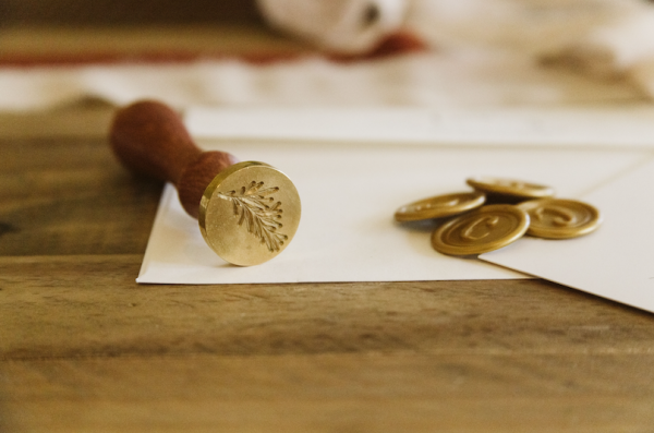
The professional seal must therefore be more restrained than almost any other application of the form.
Ornament reads as vanity in this context, and vanity undermines the authority the mark exists to convey.
Initials, a clean enclosure, and occasionally a founding year are usually the entire vocabulary required.
Anything beyond that begins to look like marketing, and marketing is precisely the wrong register here.
The proportions below reflect how effort is actually distributed across a professional seal commission.
THE ATELIER JOURNAL
Where a Custom Wax Seal Design Falls Short
It would be dishonest to write at this length about seals without stating plainly where they fail.
The first failure is volume, since sealing is slow and remains slow regardless of any preparation.
A practised hand manages perhaps sixty impressions in an hour, and the sixtieth is rarely the best.
Correspondence programmes running into the thousands are not well served by a hand-applied seal.
The honest recommendation in those cases is a blind emboss, which carries similar weight at genuine scale.
The second failure is durability under postal handling, which remains an unsolved problem in part.
Flexible compounds have improved matters considerably, but no seal is entirely indifferent to a sorting machine.
The traditional protection is an outer envelope, which is elegant, effective, and undeniably expensive.
The third failure is legibility at genuinely small sizes, and this one has no satisfactory workaround.
Below roughly eighteen millimetres a three-letter monogram begins to lose its internal structure entirely.
The mark becomes a texture rather than a form, which is pleasant enough but is no longer identification.
Clients wanting a very small seal should reduce the letter count rather than reduce the letterforms.
A single initial at fifteen millimetres reads beautifully, while three initials at that size read as nothing.
The fourth failure is the temptation toward novelty, which afflicts this form more than most others.
A seal is unusual enough already, and it does not require additional distinguishing gestures to be noticed.
Botanical borders, elaborate rules, and dated ornament all age far faster than the letters they surround.
The seals that still look correct after a century are almost always the ones that risked the least.
Stating these limits early tends to produce better commissions and considerably fewer disappointments.
A client who understands what the form cannot do will ask far sharper questions about what it can.
On Volume
A practised hand produces roughly sixty impressions an hour, and the last is rarely the finest.
Correspondence programmes at real scale are better served by a blind emboss than by pressed wax.
On Small Sizes
Below roughly eighteen millimetres a three-letter monogram surrenders its internal structure entirely.
The correct response is to reduce the letter count, never to reduce the weight of the letterforms.
ROYAL TRADITIONS
What Sovereign Seals Still Teach the Rest of Us
Royal seals are worth studying not for their grandeur but for their extraordinary technical discipline.
A great seal of state had to be legible on documents that would be consulted for several centuries.
That requirement produced design decisions of a severity that decorative work would never tolerate.
Ornament was permitted only where it did not compete with the elements carrying the actual identification.
Royal archives and collections hold matrices, impressions, and correspondence documenting this discipline closely.
The holdings of the royal collection held in trust illustrate how consistently sovereign marks were governed across successive reigns.
The royal cipher is the most instructive form for anyone considering a personal seal today.
It compresses a name and a title into a single device that is symmetrical, memorable, and instantly recognised.
It carries no illustration whatsoever, relying entirely on letterform, proportion, and enclosure.
This is exactly the vocabulary available to a private client, and it is available without any grant.
A cipher does not require a shield, a helm, or a heraldic authority to be entirely legitimate.
It requires only initials, a considered structure, and the restraint to leave the composition alone afterwards.
Royal ciphers were also revised carefully across a reign rather than fixed in a single afternoon.
Weight was adjusted, spacing corrected, and enclosure refined as the mark met each new application.
This iterative patience is the single quality most absent from contemporary identity work of any kind.
A mark is now expected to be finished on presentation, which is a strange demand to place on an heirloom.
The atelier resists that expectation quietly, and clients are almost always relieved when it is named aloud.
A seal cut too quickly will be corrected eventually, either by its owner or by the generation after.
A seal cut patiently is simply used, year after year, without anyone thinking about it at all.
That absence of thought is the highest compliment a personal mark can ever receive.
VOICES OF DISTINCTION
Reflections From the Atelier’s Clients
Clients rarely describe a seal in technical terms once they have lived with one for a while.
They describe it, instead, in terms of habit, and habit is the truest measure of a personal mark.
The reflections gathered below come from clients who commissioned a seal of their own.
Names have been abbreviated throughout, preserving the privacy each client is rightly owed.
“The die has closed every letter I have written for six years now, and I have stopped noticing it entirely. That, I have come to understand, was always the intention behind it.”
H. Alderton
Private Client, Charleston, South Carolina
“We sealed two hundred and forty invitations across three evenings at the kitchen table. Guests still mention the envelopes, which was never something we expected to hear about at all.”
C. & M. Rasmussen
Wedding Commission, Newport, Rhode Island
“Our family crest had been reproduced badly for two generations before this. Seeing it cut properly, at the size it was always meant for, settled something none of us had managed to articulate.”
The Vandermeer Family
Family Emblem Commission, Hudson Valley, New York
“I seal every set of drawings that leaves the practice. It is a small gesture, and it changes how the work is received in a way that no printed letterhead ever managed.”
R. Beaumont
Principal Architect, Portland, Oregon
These reflections share a common thread that extends well beyond satisfaction with an object.
Each client describes the seal as something that quietly entered daily use and then stayed there.
That is the standard against which every commission leaving the atelier is measured.
A mark that is admired once has succeeded modestly; a mark that is used weekly has succeeded entirely.
LUXURY IDENTITY
Restraint as the Governing Instinct
Luxury has never depended on the quantity of visible effort, whatever the surrounding market suggests.
The most enduring houses in the world rely on one mark, used consistently, across very long periods.
A seal benefits from the same discipline, applied at a considerably more intimate scale.
One well-cut die, used for decades, communicates more confidence than any amount of variation could.
This is not merely a matter of taste, since the physical constraints of wax enforce it independently.
A crowded die produces a poor impression, and a poor impression undermines the whole gesture immediately.
The material therefore agrees with the aesthetic, which happens far less often than designers pretend.
Restraint in this context is not the absence of ambition but the concentration of it into fewer decisions.
Three decisions made extremely well will always outperform fifteen decisions made adequately.
The finished die should be an object from which nothing further can be removed without a felt loss.
That standard is demanding, and it is the only standard that produces marks worth inheriting.
A design straining for attention betrays a quiet anxiety about whether it will be noticed at all.
A design that withholds announces, without a single word, that it has nothing left to prove.
Most guests, clients, and correspondents will never consciously register the craftsmanship behind a good seal.
They will simply feel that the correspondence was considered, without knowing precisely why they feel it.
That unexamined feeling is the entire commercial and emotional value of the form.
It cannot be manufactured through ornament, and it cannot be accelerated through effort applied late.
The Test of Removal
A finished die should be an object from which nothing further can be taken away without a felt loss.
Reaching that point requires patience rather than talent, which is why it is so frequently skipped.
THE ATELIER JOURNAL
On the Hesitation Clients Rarely Voice
Almost every client arrives carrying a hesitation they do not quite say aloud in the first conversation.
They wonder whether a seal is an affectation, and whether commissioning one says something unflattering.
The hesitation deserves a genuine answer rather than a reflexive reassurance offered without thought.
A seal is not necessary in any practical sense, and pretending otherwise would be plainly dishonest.
Correspondence arrives perfectly well without one, and has done so for the whole of the last century.
It is necessary only in the way that meaning is necessary to people who care how they are remembered.
Not everyone needs one, and reaching that conclusion honestly is a perfectly respectable outcome.
For those who sense that a household or a celebration deserves a lasting mark, the instinct is worth trusting.
A second hesitation usually follows, concerning whether the gesture will read as excessive to others.
This misunderstands what restraint accomplishes, and it misunderstands how such objects are actually received.
A well-composed seal does not announce itself to anyone glancing at an envelope in passing.
It is noticed the way good tailoring is noticed, quietly, and only by those inclined to look closely.
Nobody has ever accused a plain oval containing two initials of showing off, and nobody ever will.
The third hesitation surfaces late, once a direction has been chosen and the die is nearly ready.
Clients ask whether they will still be content with the mark in twenty or thirty years.
This is the most important question of the entire commission, and it is answered by process rather than promise.
A mark built on current preference rarely survives a decade with any real grace.
A mark built on proportion, restraint, and genuine personal meaning tends to grow more resonant instead.
This is precisely why the reduction stage matters more than the drawing that preceded it.
A seal produced quickly might satisfy an immediate need for handsome stationery.
A seal produced carefully tends to become something much closer to family property over time.
Clients who trust that process, even when it asks more of them than expected, are almost always glad they did.
LEGACY & FAMILY HERITAGE