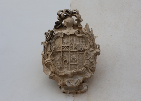
The Luxury Heraldic Crest: A Name Given Permanent Form
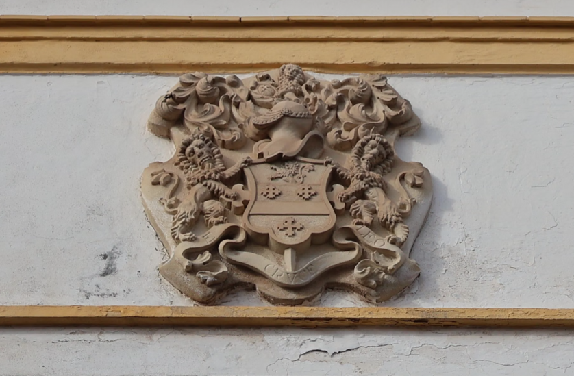
The Art of Monograms · GUSTAVO ATHAYDE Atelier
The Luxury Heraldic Crest: A Name Given Permanent Form
A surname is inherited without ceremony, arriving through paperwork and repetition rather than through any deliberate act.
A luxury heraldic crest is the ceremony that surname was never given.
It takes the weight a family already carries and renders that weight in permanent visual form.
This publication considers what such an undertaking actually asks of the household that commissions it.
The heraldic crest is among the oldest continuously used systems of personal identity in Western culture.
It predates the printing press, the corporation, and every modern theory of visual communication.
Eight centuries after its invention it remains legible to nearly anyone who encounters it.
Very few things made by human hands can make that claim honestly.
I have spent more than a decade composing personal emblems, and heraldry remains my constant reference.
Not because my clients require recognition on a battlefield, but because the discipline behind the form has never expired.
A crest solved a problem that every family, founder, and couple still faces today.
How does a name become visible without being spelled out, and recognizable without being explained?
The medieval answer proved so durable that we are still working inside its logic.
Every personal monogram composed at the atelier descends, directly or obliquely, from that answer.
Every classic monogram engraved onto silver borrows its confidence from the same centuries of testing.
What follows is not a tutorial, and it was never intended to become one.
The Journal publishes appreciation rather than instruction, and the distinction matters here more than usual.
A crest cannot be assembled from a sequence of steps any more than a lineage can.
It can only be understood, and then, if the occasion genuinely warrants it, commissioned with care.
We will trace the form from its origins in necessity, long before it acquired any reputation for grandeur.
We will examine the strict visual grammar that governed its composition across the courts of Europe.
We will consider how it differs from the personal monogram and the classic monogram it now sits beside.
And we will follow it into the present, where it survives as a privately commissioned mark.
Along the way a quieter argument will emerge about what families actually inherit from one another.
They inherit stories, certainly, and property, occasionally, and temperament, whether they wish to or not.
The families who think in generations also inherit symbols, and symbols behave differently than stories.
A story shifts slightly with every telling, softened or sharpened by whoever carries it forward.
A symbol, properly made, does not shift at all.
Legacy & Family Heritage
What a Luxury Heraldic Crest Actually Is
A luxury heraldic crest is often mistaken for decoration, and the mistake is entirely understandable.
Its shields, charges, and interlaced ornament photograph beautifully, and photographs flatten meaning into style.
But the crest was never conceived as ornament, and it has never truly behaved like one.
It was conceived as a statement, written in color and form, declaring exactly who stood behind it.
That statement could be read across a field, across a hall, and across a century.
The word luxury, applied honestly in this context, describes restraint rather than abundance.
A crest crowded with unearned charges and unnecessary flourish is not luxurious; it is merely loud.
A luxury heraldic crest says less, with greater confidence, than a decorated one ever could.
This distinction separates a mark built to endure from one built only to impress on delivery day.
I am asked, more often than any other question, what actually separates a crest from a monogram.
The honest answer begins with scope rather than with ornament.
A personal monogram speaks for one bearer, however elegantly that bearer’s initials are composed.
A luxury heraldic crest speaks for a household across every generation that will carry the name.
That single difference in scope changes nearly every decision made once a commission begins.
A mark intended for one lifetime can afford a certain intimacy in its detail.
A mark intended to outlive its commissioner cannot; it must remain legible to people not yet born.
On the Word Luxury
Applied to a heraldic crest, luxury describes restraint earned through discipline, never ornament added for its own sake.
This is precisely the discipline heraldry perfected centuries before graphic design existed as a formal practice.
No family commissioning private work is entitled to arms in the formal, granted sense.
Few actually want them, once the distinction between granted heraldry and private commission has been properly explained.
What most families want instead is a mark with equivalent gravity, built honestly from their own history.
A luxury heraldic crest invented from nothing carries no false claim to a lineage it does not possess.
It simply borrows the visual grammar of permanence and directs that grammar toward a family’s own future.
In this sense every private crest is new, even when its logic draws on many centuries of precedent.
A closer study of the broader discipline of the household emblem develops this same argument from an adjacent angle.
The oldest personal marks were never decorative in their first intended use.
They identified a bearer at a distance, under circumstances where confusion carried genuine consequence.
That requirement for instant recognition has not left the craft, even though the battlefield certainly has.
Today the mark is read on a gate, on a piece of silver, or at the head of a formal document.
The distance has shrunk considerably, but the demand for immediate recognition has not changed at all.
A luxury heraldic crest that requires explanation has already failed at its primary task.
The best marks are understood before they are ever analyzed by the person encountering them.
A well-composed crest becomes shorthand for an entire household rather than a decoration placed upon it.
It replaces a great deal of explanation with a single considered symbol, set exactly where it belongs.
This is a more efficient form of communication than most families expect when they first begin.
Clients new to bespoke identity often ask which register their own family history actually warrants.
A modest, well-documented history rarely calls for an elaborate composition, and the atelier says so plainly.
An eventful, layered history can support more complexity, though never more than the story itself justifies.
This honesty at the outset prevents a family from commissioning a mark that overstates its own past.
It also prevents the opposite failure, a mark too timid to carry the weight a family’s story deserves.
Calibrating that balance correctly is, in many respects, the hardest judgment the atelier makes.
Royal Traditions
Mud, Iron, and the Origin of the Heraldic Crest
The heraldic crest was born on the twelfth-century battlefield, where recognition was a matter of survival.
A knight sealed inside a helmet was anonymous, and anonymity in combat proved lethal in both directions.
Allies could not rally to a man they could not identify, and chroniclers could not credit his deeds.
So knights began painting bold, simple devices onto their shields, devices visible through dust and distance.
A red chevron on gold, a silver lion on blue: forms chosen for legibility long before beauty.
The surcoat worn over armor carried the same device, and that garment gave the tradition its familiar name.
What began as battlefield signage became hereditary within roughly two generations, and that shift changed everything.
A son bearing his father’s device was no longer describing himself; he was continuing someone.
The mark stopped being a label and started being an inheritance, which is a profound difference.
Labels identify, while inheritances oblige.
A knight who bore his grandfather’s arms carried his grandfather’s reputation onto the field with him.
Disgrace the arms, and you disgraced every man who had worn them before you.
This is the moment the heraldic crest acquired its moral weight, and it has never set that weight down.
By the thirteenth century the system had grown crowded enough to require formal adjudication.
Two families claiming the same device was no longer an inconvenience; it had become a legal dispute.
Heralds, once mere announcers at tournaments, became the registrars and referees of this visual language.
Eight Centuries of the Heraldic Crest
Twelfth Century
Recognition Before Beauty
Knights paint bold devices onto shields and surcoats, seeking recognition through closed helmets and battlefield dust.
Legibility at distance, not ornament, governs every early compositional choice.
Thirteenth Century
The Mark Becomes Inheritance
Arms become hereditary, passing from father to son as a visual surname carried into every engagement.
Heralds begin recording bearings, transforming battlefield custom into an administered system.
Fourteenth & Fifteenth Centuries
The Grammar Is Codified
Disputes over identical arms reach the courts, and formal heraldic authorities emerge to settle them.
Blazon is standardized, allowing any crest to be described precisely in words alone.
Sixteenth & Seventeenth Centuries
From Armor to Household
The crest migrates from armor onto seals, silver, architecture, and the printed bookplate.
Merchant and professional families petition for grants, extending the tradition beyond the nobility.
Nineteenth Century
The Heraldic Revival
Armorial taste spreads through prosperous households across Europe and the United States.
Engraved crests appear on stationery, linen, and carriage doors as marks of considered identity.
Present Day
The Commissioned Heirloom
The crest persists through granting bodies, family archives, and the privately commissioned emblem.
Its discipline of hereditary, legible identity now informs personal marks composed worldwide.
They recorded who bore what, ruled on conflicts, and slowly codified the grammar of the entire tradition.
That codification survives, remarkably, into the present day without meaningful interruption.
In England, the body that has granted and recorded armorial bearings since 1484 still exercises the same authority its medieval predecessors established.
Arms there are not designed; they are granted, following procedures older than the printing press.
Few institutions on earth have administered a single visual system with such unbroken continuity.
I find this continuity genuinely moving, and not for sentimental reasons alone.
It proves that a well-made system of identity can outlive every circumstance that created it.
The battlefield vanished, the tournament vanished, the knight himself vanished, and the crest remained.
It migrated onto seals, then silver, then bookplates, then gateposts, adapting its surface without altering its logic.
That is the pattern every enduring personal symbol follows, and it is worth stating plainly.
Surfaces change constantly, while structure, done correctly, changes almost never.
The heraldic tradition understood this before any theory of design existed to articulate it.
Its makers separated what a mark is from how a mark is rendered, and guarded only the former.
A lion could be drawn crudely on a barn door or exquisitely on vellum, and it remained the same lion.
This tolerance for imperfect rendering allowed the system to travel across every class and every craft.
A blacksmith, a weaver, and a court painter could all reproduce the same arms faithfully.
Very few identity systems since have matched that democratic durability, and none have exceeded it.
The timeline above compresses eight centuries of migration into its essential movements.
Read it less as history than as a demonstration of how patiently a good idea travels.
Readers who wish to follow that migration more slowly will find the oldest grammar of personal identity traced at length elsewhere in the Journal.
On Origins
The crest was not invented as a luxury; it was invented as a necessity.
Everything luxurious about it was earned afterward, across eight centuries of faithful use.
The Atelier Journal
The Grammar That Still Governs Every Crest
Every heraldic crest can be written down in words, and this fact astonishes most people who learn it.
The words belong to a technical language called blazon, half Norman French and half pure geometry.
Azure, a lion rampant argent: three terms, and a trained reader sees the shield exactly.
A blue field, a silver lion rearing upright, with no ambiguity and no room for private interpretation.
Blazon is the reason a crest could survive centuries before photography existed to record it.
The image did not need to travel, because the sentence traveled and the image could be rebuilt anywhere.
I know of no other design tradition that achieved lossless transmission seven hundred years before the digital file.
The grammar rests on a small set of elements, combined according to strict and well-tested rules.
The field is the background of the shield, and it is named first in every description.
The charges are the figures placed upon it: lions, eagles, chevrons, stars, crosses, and hundreds more.
The tinctures are the permitted colors, and their governance is where the discipline truly shows itself.
Heraldry recognizes two metals, gold and silver, alongside a handful of rich and saturated colors.
The famous rule of tincture forbids placing color upon color or metal upon metal.
A blue charge may not sit on a black field, nor a gold star upon a silver one.
The rule exists for a single reason, and that reason is contrast.
A shield had to be read in an instant, in poor light, at a hostile distance.
Low-contrast heraldry was not ugly; it was useless, and medieval designers refused to produce it.
Eight hundred years later I hold every emblem leaving the atelier to precisely that standard.
If a mark cannot be read at a glance it has failed, whatever its other virtues may be.
The rule of tincture is, in this sense, the oldest accessibility guideline in Western design.
The Working Elements of a Crest
| Element | What It Is | Why It Matters |
|---|---|---|
| The Field | The background surface of the shield itself. | Named first in every blazon; the ground on which all other meaning is placed. |
| The Charge | Any figure placed upon the field, from a lion to a simple chevron. | Carries the family’s chosen meaning; every charge must earn its place in the composition. |
| Tincture | The governed palette of two metals and a small set of colors. | Guarantees contrast and legibility at any distance, in any light, on any material. |
| Division | The geometric partition of the field into halves, quarters, or bands. | Organizes the composition before a single charge is placed, establishing visual order. |
| The Crest Proper | The device borne above the helm, distinct from the shield below it. | Often the element that survives alone on silver, signet rings, and stationery. |
| The Motto | A short line of text carried on a scroll beneath or above the arms. | Supplies the sentence a symbol cannot speak, and anchors the family’s stated intention. |
The table above sets out the working parts, though the parts matter less than their relationship.
A crest is not an inventory of elements; it is a resolved composition in which each element supports the rest.
This is the point at which heraldry stops being a system and starts being a craft.
Independent scholarship devoted to preserving that grammar continues to record its rules with real precision.
The work of an educational society devoted entirely to its study remains a valuable reference for any atelier committed to accuracy over invented tradition.
It is easy to design a crest that merely looks attractive to a passing eye.
It is considerably more difficult to design one that honors the grammar it has inherited.
This is the difference between a crest that feels timeless and one that feels merely fashionable.
The former draws on centuries of established and documented convention.
The latter draws only on the preferences of the present moment, which rarely age particularly well.
A well-trained eye can often identify a crest’s era simply by how loosely it follows the grammar.
The most enduring designs tend to sit closer to the disciplined end of that spectrum.
This does not mean a contemporary crest cannot feel genuinely fresh to the family commissioning it.
It means that freshness must be achieved within the grammar, through proportion, rather than by abandoning it.
A crest that ignores the grammar entirely rarely reads as innovative; more often it simply reads as unfinished.
The same principle governs the letterform, and the quiet architecture of the letterform follows an almost identical logic of restraint.
Knowing the rules, in other words, is what makes departing from them thoughtfully possible at all.
This grammar traveled well beyond the British Isles, adopted with regional variation across the continent.
Households in Scandinavia, the Iberian peninsula, and the German states each developed their own dialect.
What remained constant across every variation was the underlying seriousness of the exercise.
A crest was never treated as casual decoration in any of these traditions, whatever the household’s rank.
It was treated as a record, and records were expected to be accurate, consistent, and durable.
The Art of Monograms
Crest, Personal Monogram, or Classic Monogram
Families rarely arrive at the atelier certain of which mark they actually require.
They arrive certain only that they want something permanent, which is the correct place to begin.
Three related forms sit within reach of that instinct, and each answers a different question.
A luxury heraldic crest answers the question of what a household is.
A personal monogram answers the question of who an individual is.
A classic monogram answers the question of how a name should look when reduced to its initials.
These are not competing options so much as different registers of the same underlying discipline.
A household may eventually commission all three, and many do so over the course of a decade.
What matters is that each mark is composed with an honest understanding of its own scope.
A crest asked to behave like a monogram becomes fussy at small scale.
A monogram asked to behave like a crest becomes pretentious at large scale.
The failure is almost never a failure of drawing; it is a failure of assignment.
The atelier therefore spends the first conversation establishing scope rather than discussing style.
Style follows scope naturally once scope has been settled honestly.
Where Each Mark Belongs
The Luxury Heraldic Crest
Represents an entire household across generations. Built from documented history and the formal grammar of heraldry, it belongs on gates, architecture, formal documents, and objects intended for inheritance.
The Personal Monogram
Represents a single bearer with precision and economy. Composed from initials rather than charges, it travels naturally onto correspondence, luggage, jewelry, and the daily objects of a considered life.
The Classic Monogram
The most restrained register of all, built on historic typographic proportion rather than invention. It performs quietly on linen, silver, and stationery, and it ages more slowly than any other form.
The Crest Monogram
A hybrid built for one bearer, elevating a personal mark with a single chosen charge. It suits signet rings and formal stationery where a full achievement would be excessive but initials alone insufficient.
The card grid above describes territory rather than ranking, since none of these marks outranks another.
A classic monogram composed with real discipline will outlast a careless crest by generations.
The register matters far less than the seriousness applied within it.
Families sometimes assume the crest is simply the grandest of the available options.
In practice it is the most demanding, because it must satisfy people who have not yet been born.
A personal monogram answers only to its bearer, who can be consulted directly at every stage.
A crest answers to a household, and households are not available for consultation across time.
This is why the atelier treats crest commissions with a distinct kind of caution.
Every element proposed is tested against a single question before it is accepted.
Does this charge earn its place, or does it merely fill space that could otherwise breathe?
The same question applies equally to a crest, a personal monogram, and a classic monogram.
Only the tolerance for complexity changes as the scope of the mark expands.
A household with an eventful documented history can carry a quartered field without strain.
A household establishing its first mark is usually better served by a single confident charge.
Neither approach is more correct; both carry long and entirely legitimate precedent behind them.
What matters is the honesty of the assessment made before any drawing begins.
On Assignment
Most failed commissions fail at assignment rather than at execution.
A mark asked to do work outside its register will never feel settled, however beautifully it is drawn.
Royal Traditions
Royal Precedent and the Discipline of Restraint
No institution in European history applied the heraldic device with more discipline than the royal court.
A monarch’s arms, quartered and amended across generations, served as a visual record of marriage and inheritance.
They appeared on state documents, on regimental colors, and on gates few outsiders were permitted to approach.
The royal device was never intended as ornament alone, however elaborate its final rendering became.
It functioned as an instrument of continuity, recognizable across a kingdom without a word of explanation.
What is striking about these historical marks is how rarely they relied on excess to communicate belonging.
Grandeur, in the finest surviving examples, was achieved through proportion rather than accumulation.
The devices found on royal linens, porcelain, and stationery followed strict conventions of scale and placement.
Those conventions were never arbitrary, however decorative they may appear to an untrained eye today.
They ensured a mark remained dignified whether viewed on a ring seal or across a ceremonial gate.
A luxury heraldic crest drawing on this tradition inherits far more than a passing aesthetic preference.
It inherits a discipline: the understanding that a family mark must be built to last, never simply to please.
The finest marks were never designed to be impressive. They were designed to be correct.
Studying an archive of ceremonial regalia assembled across successive reigns makes plain how thoroughly proportion, tincture, and hierarchy were once governed.
Cutlery, drapery, carriage panels, and architectural stonework all carried the same governed device.
This was visual identity centuries before the vocabulary existed to describe it as such.
A royal achievement was never designed for a single audience, however private its most intimate applications.
It had to remain dignified whether examined on a document or observed from across a facade.
That dual requirement, intimacy and grandeur through one restrained form, remains the central challenge today.
A private household rarely requires anything so elaborate as a full royal achievement.
The underlying discipline, however, still applies in full and without discount.

Royal households also demonstrated remarkable restraint in their use of color and material across a reign.
A small fixed palette, used consistently, reads as considerably more authoritative than a wide and varied one.
This is a lesson the atelier applies directly to every commission it undertakes, regardless of scale.
A family willing to apply that discipline privately inherits an authority no expenditure could purchase.
Royal households also understood the device as a tool of continuity across successive generations.
A family’s core arrangement might persist even as individual heirs amended small details to mark their era.
This layered approach, honoring the past while making room for the present, offers a useful model today.
A crest commissioned for a contemporary household can draw on ancestral elements while reflecting its living members.
The result is a mark that feels inherited rather than invented, even when it is entirely new.
Working within this tradition requires genuine study, not merely aesthetic borrowing from images encountered online.
The nuances of historical composition reward close looking in a way photographs alone rarely capture.
Certain forms, colors, and arrangements were reserved for specific ranks and purposes across the court.
That scarcity is precisely what gave those marks their enduring authority across so many centuries.
A luxury heraldic crest benefits from a similar discipline, even without formal rank standing behind it.
Restricting the visual vocabulary of a crest strengthens rather than limits its overall impact.
There is a lesson here for any family tempted to add one more decorative flourish to the design.
The strongest historical marks nearly always resisted that temptation, whatever the era in question.
Their makers understood that restraint, not addition, was the harder and more valuable skill.
Luxury Identity
Where a Luxury Heraldic Crest Lives
A crest does not exist as an image alone; it exists as a mark applied to material.
Its intelligence must therefore account for every surface it will eventually inhabit.
Correspondence remains the most common application, and the most demanding typographically.
Engraved or embossed onto formal stationery, a crest anchors a household’s written voice for decades.
The signet ring presents an entirely different test, reducing the mark to the scale of a fingernail.
At that size every hairline either survives or disappears, and there is no negotiating the outcome.
Architecture pushes the same composition in the opposite direction entirely.
Worked into a gate, a mantel, or a stair rail, the crest roots a residence in visible continuity.
A mark legible at both extremes has proven something a mark legible at one extreme has not.
The archive is the quietest application and, in the long run, perhaps the most consequential.
Recorded formally, with its proportions documented, the crest becomes a reference a family can extend.
Households that skip this step frequently find the mark drifting within a single generation.
A crest reproduced slightly differently on a gate than on stationery begins to forfeit its authority.
Consistency is not pedantry in this context; it is the entire mechanism by which authority accumulates.
Craft in Numbers
3–6
Design directions explored per household commission
5
Material contexts every finished crest is tested against
100+
Years a well-proportioned crest can remain legible on stone or silver
∞
Generations a properly commissioned crest is built to serve
The figures above are not marketing claims; they describe the working conditions of the commission.
Five material contexts sounds modest until each one is actually tested with a proof in hand.
Paper, metal, stone, fabric, and screen each punish a different weakness in a composition.
A design that satisfies all five was built by someone who understood the full system from the outset.
Families who commission thoughtfully at the beginning rarely need to reconsider the mark later.
Families who commission hastily often return within a few years, dissatisfied with a rushed decision.
Patience at the outset saves considerable expense and disappointment further down the line.
This is among the least glamorous arguments for careful work, and among the most persuasive.
A crest is also unusual among commissioned objects in that it never depreciates.
A house can be sold, and a fortune can shift considerably with the market over a single lifetime.
A well-maintained crest does not behave that way at all.
Its value is entirely symbolic, which paradoxically makes it more durable than anything with a market price.
Few decisions a household makes carry consequences quite this far into the future.
Fewer still require so little maintenance once the initial care has been properly taken.
On Consistency
A crest gains authority the way a royal cipher once did, through unvaried repetition across every surface it touches.
The Atelier Journal
The Anatomy of a Luxury Heraldic Crest
Beneath the surface of any serious crest lies a set of principles rarely discussed outside the atelier.
These are not stylistic preferences; they are structural requirements for a mark meant to endure.
Field and division determine how the composition is organized before a single charge is placed.
Charge selection determines what the household has chosen to represent, drawn from documented history.
Tincture governs contrast, hierarchy, and legibility at every scale the mark will eventually occupy.
Proportion determines whether a composition feels resolved or merely assembled from adjacent parts.
Hierarchy determines which element carries the mark and which elements offer quiet support.
Scalability determines whether the crest performs equally well on a ring and on a building facade.
Each of these is considered independently before any of them are combined into a single form.
A crest that skips one of them tends to fail quietly, over years, rather than immediately.
This is why the atelier treats all six as inseparable requirements rather than optional considerations.
The distribution above surprises most families, who expect drawing to dominate the process.
In practice, listening and research together consume as much time as composition itself.
A household with a documented history offers more material, though not necessarily an easier problem.
Every additional fact increases the number of decisions that must be individually weighed and tested.
A skilled hand recognizes which details carry natural authority and which must earn it through proportion.
Some family histories resolve almost effortlessly, and others resist every obvious treatment at first.
This resistance is not a failure of the family’s story; it is a signal that more care is required.
The atelier treats a resistant history as an invitation to work more slowly, never as a reason to compromise.
When these principles align, a luxury heraldic crest becomes legible in a single unhurried glance.
That immediacy is the quiet signature of a mark that has been properly resolved from the outset.
A design unaware of these principles often repeats mistakes long since settled by earlier craftsmen.
A design composed with awareness of them tends to feel settled from its very first presentation.
None of this discipline is visible in the finished artifact, and yet all of it is felt over time.
A mark built without it may look identical to one built with it, at least on the day of delivery.
The difference reveals itself only with time, which is precisely why the discipline cannot be skipped.
Restraint, understood this way, is less a stylistic preference than a working design constraint.
The atelier resists elaboration regardless of how enthusiastically a family initially requests more detail.
A crest overloaded with charges reads as insecure rather than distinguished, whatever its formal ambition.
A crest reduced to one confident element often reads as more authoritative than one crowded with detail.
Both temptations are resisted equally, regardless of which direction a particular family leans toward.
On Negative Space
The space within and around a crest is an active element of the composition, never a leftover.
A mark that ignores it will feel cramped however elegant its individual parts may be.
The Atelier Journal
How a Commission Proceeds
Every commission follows the same sequence, though no two commissions move at the same pace.
The stages below describe structure rather than schedule, and the structure is never abbreviated.
A family that feels rushed through any stage rarely arrives at a crest they trust completely.
This is the single most reliable predictor of satisfaction the atelier has observed.
The Five Stages of a Crest Commission
01
Discovery
A private conversation establishes the household’s documented history, its values, and its long-term intention. Nothing is drawn at this stage, and nothing needs to be.
02
Research
Heraldic and typographic precedent relevant to the family’s specific story is studied in depth, so that the composition is rooted in genuine convention rather than passing style.
03
Composition
Early concepts explore field, charge, division, and proportion. Several directions are developed in parallel before any single direction is chosen for refinement.
04
Refinement
The favored direction is tested at every scale the household is likely to require, from a signet impression to an architectural application, and adjusted until it holds at both extremes.
05
Delivery
A complete crest is prepared for engraving, stationery, textile, and architectural use, accompanied by documentation of its proportions for consistent future reproduction.
The first stage is treated as consultation rather than as an intake form, and the distinction is deliberate.
A family arriving curious rather than certain often ends the process more clearly defined than expected.
That clarity tends to outlast the occasion that first prompted the commission by a considerable margin.
It becomes, instead, simply how a household understands its own name from that point forward.
Research is the stage families most often assume can be shortened, and it is the stage that most rewards patience.
Precedent is not decoration; it is the accumulated testing of many centuries, freely available to anyone who studies it.
Composition proceeds in parallel rather than in sequence, because comparison reveals more than iteration alone.
Three resolved directions teach a family more about its own preferences than thirty variations ever could.
Refinement is where most of the hours are spent, and where the least visible progress appears to occur.
A composition can look finished for weeks before it actually settles into its final proportions.
Experienced designers describe that moment as the point where the mark stops looking assembled.
It cannot be forced, and it rarely arrives on the first attempt or even the fifth.
Overworking a composition past that point introduces complexity in the name of improvement.
Recognizing when to stop is among the least discussed and most decisive skills in the discipline.
Delivery includes documentation because a mark without a specification will drift as it is reproduced.
The specification is what allows a printer, an engraver, and a stonemason to produce the same crest.
Without it, three faithful craftsmen will produce three slightly different marks in complete good faith.
This is not bureaucracy practiced for its own sake, however formal the record may sound in description.
On Pace
A crest hurried into existence rarely earns the trust required to last a lifetime, let alone several.
Luxury Identity
The Material Tests a Crest Must Pass
A composition that reads beautifully in ink on cream stationery may lose definition entirely when engraved.
A design with subtle hairline detail may disappear when translated into single-color embroidery.
These are not problems that can be resolved after the fact; they must be anticipated from the first sketch.
On paper, whether correspondence stock or heavier formal sheets, the mark must perform with typographic precision.
Ink spreads slightly into fiber, and a composition too tightly spaced will close up under that spread.
On metal, cut into a signet or engraved onto flatware, the mark must hold its integrity at minimal scale.
Engraving removes material rather than adding it, which behaves differently than any printed line.
On stone, worked into a gate or a lintel, the mark must survive weathering and oblique light.