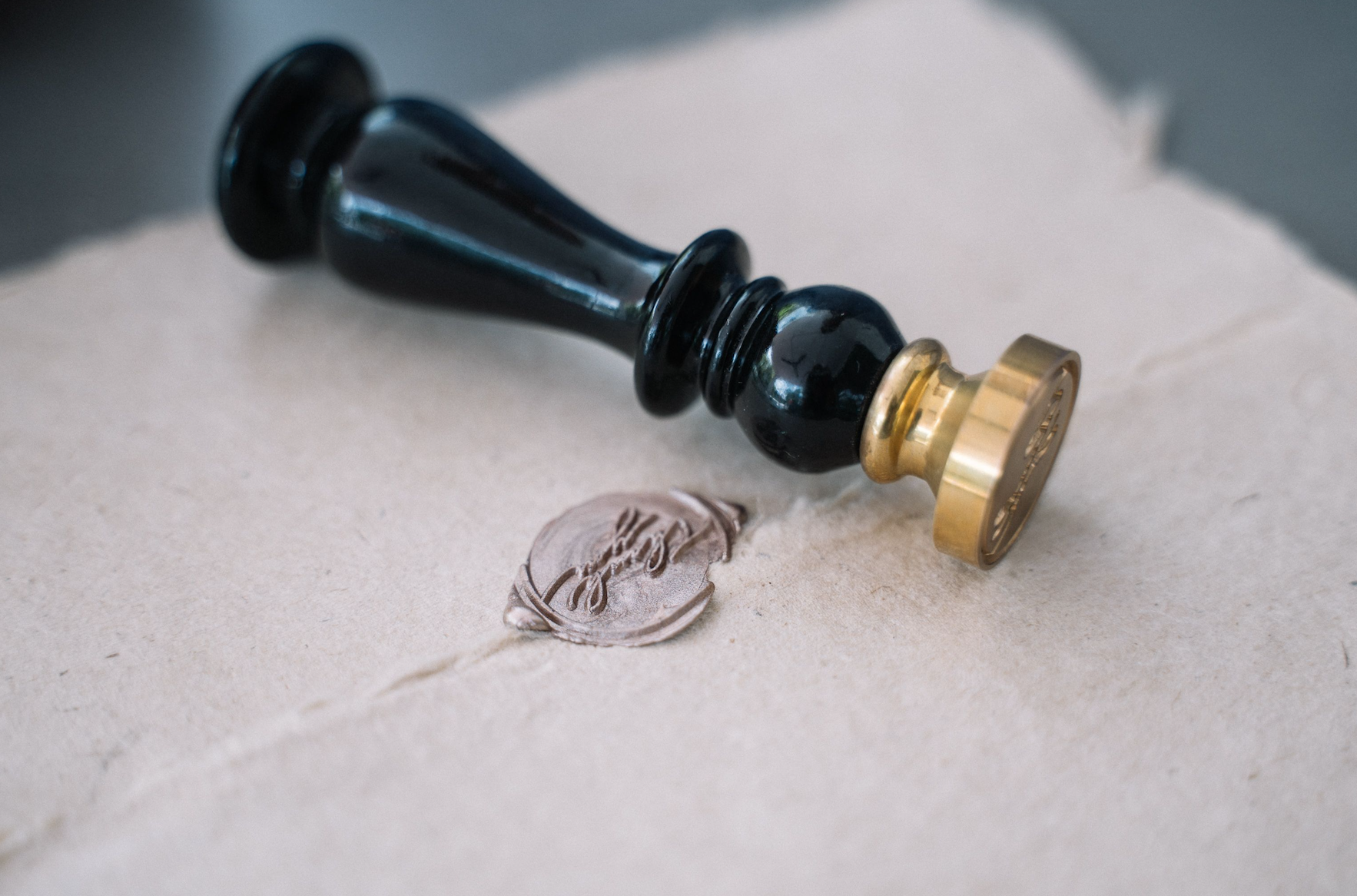
Monograms: The Quiet Architecture of Identity
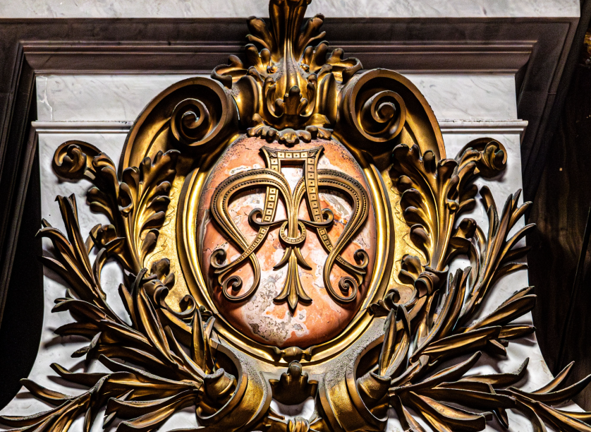
Monograms: The Quiet Architecture of Identity
Monograms occupy a peculiar place among the objects we choose to carry through a lifetime.
They are neither purely decorative nor purely functional, and this is precisely their power.
A well-composed monogram does not announce itself the way a logo does.
It waits to be noticed by those who already understand its significance.
This quality of quiet authority has kept monograms relevant across centuries of shifting taste.
Long before branding existed as a discipline, individuals were already marking their possessions with initials transformed into art.
The practice began as a matter of ownership and evolved into something closer to philosophy.
A monogram asks a simple question of its owner: what do you wish to be remembered by?
Few objects answer that question with as much elegance or as little noise.
This is an exploration of how monograms came to hold that position, and why they continue to hold it today.
We will move through royal courts, family archives, wedding traditions, and the ateliers where these marks are still composed with historical rigor and contemporary discipline alike.
Throughout, one theme will recur: the finest monograms are built to outlast the moment of their creation.
There is something instructive in how differently a monogram behaves compared to almost every other visual mark we encounter.
A billboard is designed to be seen once and remembered briefly.
A monogram, by contrast, is designed to be seen thousands of times across a lifetime and to feel exactly the same on the thousandth viewing as it did on the first.
This is an entirely different design problem, and it demands an entirely different discipline.
Where advertising rewards novelty, a personal mark rewards consistency.
Where a passing trend rewards immediate impact, a monogram rewards patience.
These are not merely stylistic preferences; they are the structural requirements of an object meant to be inherited.
It is worth noting, too, that the monogram has survived every major shift in visual culture over the last two millennia.
It survived the transition from parchment to print, from print to photography, and now from photography to the digital screen.
Few visual forms can claim this kind of continuity, and fewer still have done so without sacrificing their essential character along the way.
This resilience is not accidental.
It reflects a form so tightly bound to the fundamentals of human identity, ownership, and memory that changes in medium simply cannot dislodge it.
A monogram composed a century ago and one composed this year share more in common than most objects separated by so much time.
Both rely on the same essential grammar: proportion, hierarchy, and restraint applied to a small number of letters.
What follows is an attempt to make that grammar visible, section by section, tradition by tradition.
Monograms and the Origin of a Personal Mark
The earliest monograms were not created for beauty but for authentication.
Coins struck in ancient Greek city-states carried combined initials as a guarantee of origin.
A merchant or a ruler needed a way to stamp authorship onto an object that could travel far beyond their sight.
The solution was to compress a name into a single, recognizable form.
This impulse toward compression is the seed from which every later monogram tradition grew.
Roman artisans expanded the practice, weaving initials into seals, rings, and ceremonial objects.
By the early medieval period, monograms had become instruments of governance as much as identity.
Christian rulers adopted combined ciphers to signify both faith and authority in a single mark.
A monogram in this era did more than identify a person; it projected legitimacy across an empire.
One of the most studied imperial ciphers of this period authenticated documents across an entire continent.
It combined the letters of a ruler’s name into a lattice that could be traced even by those unable to read.
This was monogram design at its most consequential, where a wrong stroke could call a document’s authority into question.
What is remarkable, looking back, is how quickly the form matured.
Within a few centuries, the monogram moved from a purely administrative tool to a genuine art form.
Scribes and goldsmiths began treating the interlacing of letters as a compositional problem worth solving elegantly.
Negative space, symmetry, and balance entered the vocabulary of monogram design long before anyone used those words.
The result was a visual language capable of expressing both function and refinement at once.
That dual capacity, practical and beautiful, is what distinguishes the monogram from the simple signature.
A signature identifies; a monogram represents.
It is this representational quality that carried monograms out of administrative use and into the world of personal adornment.
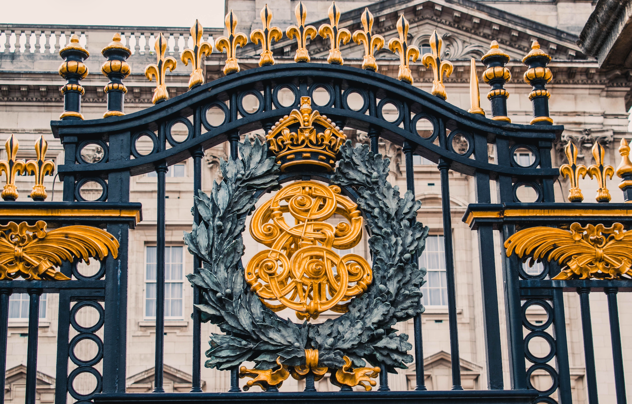
By the time monograms reached the height of their administrative importance, a genuine visual discipline had already begun to form around them.
Craftsmen working in metal, wax, and parchment developed distinct conventions for how letters should be joined.
Some traditions favored strict symmetry, mirroring one letter against another along a central axis.
Others favored an asymmetrical interlace, allowing one letter to dominate while others receded into supporting roles.
Neither approach was inherently superior; each served different purposes depending on the letters involved and the context of use.
What mattered, across every tradition, was that the resulting mark could be read as a single coherent unit rather than a pile of separate letters.
This single requirement, unity of composition, remains the defining test of a successful monogram today.
It is easy to underestimate how difficult this requirement actually is to satisfy.
Letters were never designed to be merged; they were designed to stand independently within a word.
Forcing two or three of them into a single composition requires genuine invention, not mere placement.
The most accomplished monogram designers throughout history understood this and treated the challenge with the seriousness it deserved.
Their solutions, refined over centuries, form the foundation of the discipline as it exists today.
It is also worth noting how differently various cultures approached this same fundamental problem.
Byzantine artisans favored dense, circular interlace, compressing letters into a form that resembled a seal more than a signature.
Western European traditions, by contrast, often favored a more linear arrangement, letters standing shoulder to shoulder within a shared frame.
Neither tradition was more advanced than the other; each simply reflected different priorities regarding legibility, ornament, and material.
Studying these variations reveals just how flexible the underlying grammar of monogram design has always been.
The same basic principles, unity, hierarchy, and negative space, can produce remarkably different results depending on which tradition a designer draws upon.
This flexibility is one of the reasons the discipline has never gone stale, even after two thousand years of continuous practice.
Antiquity
Combined initials appear on coins and ceramics as an early guarantee of origin and authorship.
Early Medieval Period
Rulers adopt ciphers to authenticate imperial documents, merging faith, governance, and identity.
Renaissance
Merchant families and banking houses adopt monograms as marks of commercial authority and trust.
The Age of Royal Courts
Sovereign ciphers extend across regalia, correspondence, porcelain, and architecture alike.
Nineteenth Century
Luxury houses in Paris, London, and Vienna build entire brand identities upon a founder’s personal cipher.
The Present Day
Individuals, families, and couples commission personal marks as a deliberate alternative to disposable design.
On Restraint
The strongest monograms communicate through omission as much as through form, saying only what is necessary and no more.
On Negative Space
The gaps within a monogram are active design elements, not empty space left over after the letters are drawn.
Monograms in the Language of Royal Tradition
No institution shaped the monogram more decisively than the European royal court.
A sovereign’s cipher appeared on everything from military regalia to porcelain services.
It was a way of extending the monarch’s presence into rooms and territories the ruler would never personally visit.
Every fold of state correspondence, every uniform button, every ceremonial flag carried the same intertwined letters.
This repetition was deliberate, a visual constancy meant to reinforce the permanence of the throne itself.
The systems that governed how these marks could be composed grew remarkably precise over time.
Rules concerning proportion, crowning elements, and the arrangement of supporting ornamentation became a discipline in their own right.
Institutions were established specifically to record and regulate this visual language, and their archives remain extraordinary today.
Anyone curious about the formal grammar behind royal ciphers can trace it through the officers charged with heraldic oversight in England, whose work continues uninterrupted since the fifteenth century.
What these records reveal is not rigidity but rigor.
Precision, in this context, was never the enemy of beauty.
It was the very thing that gave royal monograms their unmistakable authority.
Consider the reigns during which monogrammed porcelain, silver, and linens reached their highest expression.
A visit to the assembled holdings of royal residences open to the public makes plain how thoroughly the monogram permeated daily and ceremonial life alike.
Cutlery, drapery, carriage panels, and even architectural stonework carried the same cipher, unifying an entire household under one visual signature.
This was branding centuries before the word existed, executed with a level of craft that modern design studios still study.
What made the royal monogram so effective was its restraint.
A single cipher, applied consistently, communicated more authority than an ever-changing catalogue of symbols ever could.
This lesson, arguably the most important one royal tradition offers, remains just as relevant to a private individual composing a personal mark today.
The throne understood something that every serious commission still depends upon: consistency is what allows a symbol to become a legacy.
It is worth considering how deliberately royal households managed the visual consistency of their ciphers.
A change to the monogram was never undertaken lightly, since it implied a change in the authority the mark represented.
Court officials responsible for these marks operated with a precision that modern brand guidelines still strive to match.
Every element, from the width of a supporting flourish to the angle of a crowning device, was governed by established convention.
This was not bureaucratic excess; it was an understanding that a symbol’s power depends entirely on its reliability.
A cipher that shifted unpredictably from one application to the next would have undermined the very authority it was meant to project.
The lesson carries forward directly into private commissions today.
A personal or family monogram gains authority through the same mechanism a royal cipher once did: unwavering consistency across every surface it touches.
This is why the atelier insists on documenting a finished monogram’s precise proportions, so that every future application, whether engraved or printed, remains faithful to the original composition.
Anything less would dilute the very permanence the mark is meant to represent.
Long before logos became commonplace, the most enduring marks of distinction belonged not to companies, but to individuals.
2,000+
Years of documented monogram tradition
500+
Years of recorded heraldic practice
3
Design directions typically explored per commission
∞
Generations a well-composed mark is built to serve
Monograms as the Grammar of Family Heritage
Where royal monograms projected the authority of a single ruler, family emblems told a longer, quieter story.
A family crest was never meant to be replaced with each generation.
It was meant to accumulate meaning, the way a well-worn table accumulates the marks of every meal shared upon it.
Heraldic tradition developed an entire vocabulary for describing lineage, achievement, and alliance through symbol alone.
Color, charge, and division each carried specific meaning, readable to those trained in the discipline.
Organizations devoted to preserving this knowledge still operate today, and a society dedicated entirely to the study of these traditions continues to document how families across generations have used emblems to record their histories.
A family that commissions a crest today is participating in a tradition far older than most modern institutions.
This is worth pausing on, because it changes the nature of the commission itself.
A crest is not simply a design exercise; it is an act of continuity.
For families building a new tradition rather than continuing an old one, the process of establishing a family crest becomes an opportunity to encode values, origins, and aspirations into a single lasting symbol.
The choices made in that process, which colors, which charges, which mottoes, become part of the family’s permanent visual record.
Future generations inherit not just the object but the reasoning behind it.
This is why family heritage commissions differ so fundamentally from ordinary design projects.
They are undertaken with the understanding that they will be seen by people not yet born.
That single fact disciplines every decision in the process, from letterform to composition.
A monogram intended to represent a family cannot indulge in trend or novelty for its own sake.
It must be legible to a great-grandchild in the same way it is legible today.
This demand for permanence is, paradoxically, what gives family monograms their contemporary relevance.
In an era saturated with disposable design, a mark built to last three generations feels almost radical.
It communicates a kind of confidence that trend-driven identities simply cannot replicate.
There is also a quieter, more personal function that family emblems serve.
They give scattered relatives, spread across cities or even continents, a shared visual language they can each recognize instantly.
A cousin who has never met another branch of the family can still recognize the crest on an old piece of silver and understand, immediately, that they are looking at something that belongs to them too.
This is a form of connection that few other objects can provide.
It does not depend on memory or introduction; it depends entirely on the mark itself.
Families who have commissioned crests often describe this recognition effect as one of the most meaningful outcomes of the process.
A symbol, once established, becomes a kind of shorthand for belonging.
It allows a family’s story to be carried forward even as individual memories inevitably fade with each passing generation.
This is, in the end, the deepest purpose a family emblem can serve.
It is worth adding that this purpose has grown, rather than diminished, as families have become more geographically dispersed.
A century ago, most family members lived within a short distance of one another, sharing daily life and constant reminders of shared identity.
Today, a single family might span several countries and multiple generations who have never occupied the same room.
In this context, a shared visual mark becomes even more valuable, offering a point of connection that does not depend on proximity or frequent contact.
A crest engraved on an heirloom, sent across an ocean, still communicates belonging instantly and without translation.
Few other objects can perform this function quite so efficiently.
On Legacy
Family emblems are designed to be explained to someone not yet born, which disciplines every decision made in their creation.
“Our family has used a crest for three generations, but we had never commissioned a personal mark that could travel with us in a contemporary sense. What resulted honors that heritage while speaking with real authority today.”
— The Whitfield Family, Charleston, South Carolina
On Permanence
A personal mark intended for inheritance cannot be designed around a passing aesthetic trend.
Classic Monograms Compared to the Trends They Outlive
It is worth pausing to consider what separates a classic monogram from the passing fashions that surround it.
The distinction is not a matter of ornamentation but of intention.
A classic monogram is designed to be read the same way in fifty years as it is today.
A trend-driven mark, however striking, is designed to feel current, which by definition means it will eventually feel dated.
The comparison below sets these two approaches side by side.
Classic vs. Trend-Driven Monograms
| Consideration | Classic Monograms | Trend-Driven Marks |
|---|---|---|
| Design Lifespan | Multiple generations | A few fashion cycles |
| Letterform Basis | Historic typographic traditions | Current stylistic novelty |
| Primary Goal | Permanence and dignity | Immediate visual impact |
| Material Application | Silver, linen, stone, stationery | Primarily digital surfaces |
| Emotional Register | Restraint and quiet authority | Attention-seeking distinctiveness |
| Suitability for Legacy | Built for inheritance | Rarely intended to be inherited |
None of this suggests that trend-driven design lacks value in its own context.
A seasonal campaign or a temporary event may benefit from exactly the kind of novelty that a classic monogram deliberately avoids.
But a personal mark, a family emblem, or a wedding cipher belongs to a different category entirely.
These are objects meant to be lived with, inherited, and eventually explained to someone who was not present at their creation.
For this reason, clients whose intention is legacy are consistently steered toward the classic register, regardless of what currently appears fashionable.
A cipher monogram built on historic proportion will still feel appropriate on a christening gift decades from now.
A mark built entirely around a current aesthetic trend rarely survives contact with the following decade.
It is worth asking why trend-driven marks fail so consistently at the task of permanence.
The answer lies in what such marks are actually optimized for.
A trend-driven design borrows its visual energy from a specific cultural moment, a particular typographic fashion, or a color palette currently in favor.
Once that moment passes, the mark inherits all the same associations of datedness that the moment itself eventually acquires.
A classic monogram avoids this trap by refusing to borrow energy from any single moment at all.
Instead, it draws on typographic and compositional principles that have already proven their durability across many decades, sometimes centuries.
This is a slower, less flashy strategy, and it rarely produces the kind of immediate visual excitement that a trend-driven mark can generate.
But excitement was never the goal of a family emblem or a wedding cipher in the first place.
Dignity was, and dignity ages very differently than excitement does.
The Craft Behind Every Bespoke Monogram
The composition of a monogram is deceptively simple in appearance and genuinely demanding in execution.
Two or three letters must be resolved into a single visual unit without losing the identity of any one of them.
This requires a designer to think simultaneously about typography, symmetry, and legibility at radically different scales.
A monogram destined for a signet ring must remain legible at the size of a fingernail.
The same composition, applied to a gate or a facade, must hold its proportion across many feet of stone or iron.
Few design problems demand this range of scale fidelity from a single composition.
The process typically begins with an understanding of the letters themselves, their natural proportions, ascenders, and descenders.
Some letter combinations interlock with obvious grace; others require significant compositional invention to feel resolved.
A skilled designer treats this not as an obstacle but as the central creative challenge of the commission.
Negative space receives as much attention as the letterforms themselves.
The gaps within and around a monogram are not empty; they are active compositional elements that determine how the mark breathes.
A composition that ignores negative space will feel cramped no matter how elegant its individual letters may be.
Hierarchy matters as well, particularly in monograms built from three or more initials.
Not every letter deserves equal visual weight, and the strongest compositions make this hierarchy feel inevitable rather than arbitrary.
Typically, the surname initial or the most phonetically prominent letter anchors the composition, with supporting letters arranged around it.
This is a decision made through iteration, not formula, and it is where the discipline resembles architecture more than illustration.
Multiple design directions are usually explored before a final composition is approved.
Scale testing follows, ensuring the chosen composition performs equally well whether embossed on a book cover or reduced to a digital favicon.
Only once this range has been proven does a mark move toward final delivery.
This entire discipline is what separates a bespoke monogram from a template assembled in minutes.
The former is engineered to endure scrutiny at any scale and in any material.
The latter, however pleasant at first glance, rarely survives the demands that a genuine commission places upon it.
There is a particular moment in the design process that experienced designers describe as the composition settling.
It is the point at which a monogram stops looking like an arrangement of letters and starts looking like a single, inevitable form.
This moment cannot be forced, and it rarely arrives on the first attempt.
It typically emerges only after several rounds of adjustment, each one refining the relationship between the letters slightly further.
A designer with genuine experience learns to recognize this moment when it arrives, and to resist the temptation to keep adjusting once it does.
Overworking a composition past this point is a common mistake, one that introduces unnecessary complexity in the name of improvement.
Restraint, once again, proves to be the discipline that separates a lasting monogram from an overwrought one.
This is why the atelier treats the refinement stage of a commission with particular care, testing each candidate composition against demanding conditions before considering it finished.
A mark that survives this scrutiny tends to survive everything that follows.
It is worth noting that this scrutiny extends beyond the visual composition itself to how the mark will be produced.
A design that looks flawless on screen can behave very differently once translated into engraving, embossing, or foil stamping.
Fine details that read clearly in a vector file can disappear entirely once pressed into leather or cut into stone at a small scale.