The Personalized Monogram: A Study in Identity
THE ART OF MONOGRAMS
The Personalized Monogram: An Heirloom of Identity
A name is given to us before we have any say in the matter.
A personalized monogram is the moment we take that name and make it ours.
It is not decoration applied after the fact, but identity distilled to its essential lines.
I have spent more than a decade watching initials become something closer to architecture.
Two or three letters, arranged with intention, can carry the weight of an entire biography.
This is the quiet ambition behind every personalized monogram I design.
The word personalized is often used carelessly, applied to anything with a name stitched onto it.
At the atelier, personalization means something more exacting than that.
It means a mark built from a single person’s proportions, history, and sensibility.
No template precedes it, and no template follows it.
An exclusive monogram is one that could not be transferred to another client without losing its meaning.
A classic monogram, by contrast, draws its authority from centuries of typographic discipline.
The finest personalized commissions hold both qualities at once.
They are exclusive in origin and classic in bearing.
This balance is difficult to achieve, and it cannot be rushed.
It requires listening to a client long before a single letterform is drawn.
What follows is an examination of what personalization actually requires.
I want to walk through the history, the craft, and the judgment involved.
Readers who value permanence over novelty will recognize much of what follows.
They are, after all, the reason this work continues to matter.
I did not arrive at this discipline overnight, and I doubt anyone truly does.
It came gradually, through years of watching which marks aged well and which did not.
The ones that endured were rarely the most elaborate on the page.
They were the ones built with a clear sense of hierarchy and restraint.
A personalized monogram, done properly, resists the temptation to explain itself.
It simply presents a name, resolved into its most essential form.
This is a harder task than it appears, precisely because so little is added.
Every decision left in the final design has to justify its presence.
Nothing survives the process by accident or by convenience.
That level of scrutiny is unusual in a design culture built for speed.
It is, however, the only approach that produces work worth keeping.
I think of each commission as a small act of preservation.
A name, a history, and a sensibility are given a form that can outlast all three.
This is not a metaphor I use lightly, and I do not use it often.
It reflects, as plainly as I can state it, what this work is actually for.
A reader unfamiliar with this discipline might assume a monogram is a minor detail.
In practice, it is often the single most durable decision a client ever makes about their identity.
Furniture is replaced, wardrobes change, and even homes are eventually sold.
A well-built personal mark tends to remain, quietly, across all of it.
That permanence is rare enough today that it deserves to be treated with real seriousness.
I try to honor that seriousness in every conversation I have with a new client.
It shapes how I listen, how I question, and how I eventually draw.
None of that changes from client to client, even as every mark itself does.
A Brief History of Personal Distinction
Long before logos became commonplace, the most enduring marks belonged to individuals rather than companies.
Ancient artisans stamped initials into clay and metal to claim authorship of their work.
Those early marks were functional, but they carried an unmistakable trace of pride.
By the medieval period, personal marks had become instruments of law as much as art.
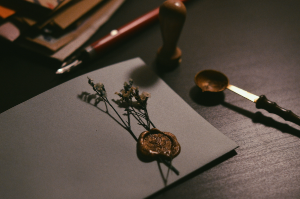
A sealing wax impression could authenticate a letter, a contract, or a claim to land.
Heraldic tradition formalized this impulse into a strict visual grammar.
Every line, tincture, and charge on a family’s arms carried specific, codified meaning.
Personalization, in this era, was inseparable from responsibility.
A mark represented not only a person, but everyone who depended on that person’s word.
The Renaissance brought monograms into a more intimate, domestic register.
Merchant families began commissioning marks for ledgers, correspondence, and household linens.
The monogram moved from the battlefield and the court into daily life.
By the nineteenth century, a personalized monogram had become an expected feature of refined living.
Silver services, stationery, and traveling cases were rarely left unmarked.
The twentieth century introduced mass production, and with it, a quiet erosion of meaning.
Initials became decorative shorthand rather than considered identity.
The personalized monogram we practice today is, in many ways, a deliberate correction.
It restores the discipline of heraldry to the intimacy of a single name.
Ancient guilds required marks of authorship long before signatures were standardized.
A craftsman’s initials on a finished object carried real legal and commercial weight.
If the work was flawed, the mark made accountability unavoidable.
If the work endured, the mark made recognition possible for generations afterward.
This dual function, accountability paired with recognition, shaped the earliest personal marks.
Royal courts throughout Europe elevated this practice into formal ceremonial art.
A sovereign’s cipher appeared on coinage, correspondence, and state architecture alike.
The mark had to function convincingly at every one of those different scales.
This requirement has not disappeared; it has simply changed its context.
A personalized monogram today faces the same test, applied to digital and physical surfaces alike.
What has changed is the speed at which marks are now expected to be produced.
Historical craftsmen worked over months, sometimes years, refining a single design.
That timeline is difficult to replicate fully in a contemporary commercial culture.
Yet the atelier tries to preserve as much of that patience as a modern commission allows.
Slowness, in this particular craft, is not inefficiency; it is simply the cost of permanence.
It is worth remembering that none of these historical marks were designed for trend cycles.
They were designed for descendants who had not yet been born.
That horizon, spanning generations rather than seasons, remains the correct one for this work.
I find it clarifying, honestly, to measure a design decision against a century rather than a season.
That simple shift in measurement changes almost every choice that follows from it.
Antiquity
Initials stamped into clay and coinage to claim authorship.
Medieval Period
Seals and heraldic marks formalize personal identity under law.
Renaissance
Monograms migrate into ledgers, linens, and private correspondence.
Nineteenth Century
The personalized monogram becomes a fixture of refined domestic life.
Present Day
A deliberate return to considered, singular personal identity.
Personalization Beyond Customization
The word customization suggests choosing from a set of predetermined options.
A client selects a font, a color, and an arrangement, and the process ends there.
Personalization begins somewhere else entirely.
It begins with a conversation about a person’s history, temperament, and aspirations.
Institutions devoted to the study of heraldic tradition still preserve the discipline this distinction depends on.
Their scholarship reminds us that a personal mark was never meant to be interchangeable.
A personalized monogram considers the shape of a name before considering its style.
Some names are top-heavy, others are balanced, and each demands a different structural solution.
A generic monogram maker cannot account for this, because it does not know the name in advance.
It builds a system and asks every name to fit inside it.
The atelier approach reverses that order entirely.
The name arrives first, and the system is built around it.
This is slower, and it resists easy scale.
But it is the only method that produces a mark worth calling personalized.
The difference is subtle on the surface and profound underneath.
One approach produces a label, and the other produces an heirloom.
Consider how each method treats a name with unusual letter proportions.
A template system will compress or stretch that name until it fits the grid.
A personalized approach adjusts the grid until it honors the name instead.
This reversal sounds minor, but it changes almost everything about the outcome.
It changes how the letters interlock, how the composition breathes, and how it reads.
It changes whether the mark feels inevitable or merely assembled.
Clients rarely articulate this distinction in technical terms, and they do not need to.
They recognize it instinctively, the same way one recognizes a well-tailored garment.
Something about the proportions simply feels correct, even without being able to say why.
That instinct is, in fact, a reliable guide, and I trust it as much as any technical rule.
A personalized monogram should pass this instinctive test before it passes any formal one.
If a mark requires justification to feel right, it likely is not yet finished.
This is why the atelier resists shortcuts, even when a faster method exists.
Speed and personalization are, in most cases, simply incompatible goals.
A generic system optimizes for how many marks it can produce in a day.
A personalized process optimizes for how long a single mark will remain meaningful.
These are fundamentally different goals, and they rarely produce comparable results.
I would rather work slowly toward the second goal than quickly toward the first.
Most clients who commission a personalized monogram share that same preference.
They have usually tried the faster route before, and found it unsatisfying in ways hard to articulate.
Personalized Monogram vs. Generic Monogram
| Aspect | Generic Monogram | Personalized Monogram |
|---|---|---|
| Starting Point | A pre-built template library | The client’s name and history |
| Letterform Origin | Stock typefaces, unaltered | Custom-drawn or carefully adapted forms |
| Structural Hierarchy | Uniform sizing across letters | Weighted to the name’s phonetic anchor |
| Longevity | Follows current design trends | Built to remain legible for generations |
| Exclusivity | Reusable across many clients | Singular to one person or family |
| Application Testing | Rarely tested across materials | Verified at every scale, from favicon to façade |
The Anatomy of a Personal Mark
Every personalized monogram begins with a single question.
Which letter, when spoken aloud, carries the most weight in this name?
That letter typically becomes the anchor of the entire composition.
The remaining initials are arranged to support it, never to compete with it.
Negative space is treated as an active material, not an empty gap.
The eye should move through a personalized monogram without hesitation.
Any confusion in reading order signals an unresolved design.
Proportion matters as much as ornament, and often matters more.
A mark that looks correct at three inches must still look correct at three centimeters.
This scalability requirement shapes nearly every decision in the drawing process.
Interlace, the overlapping of letterforms, must be resolved with structural logic.
It cannot be applied decoratively without regard for legibility.
A well-built personalized monogram survives being engraved, embossed, and printed alike.
Each surface behaves differently, and the design must anticipate all of them.
This is why the process cannot be rushed into a single sitting.
Multiple design directions are explored before any one is approved.
Letterform selection begins with careful study of the name’s individual characters.
Some letters, like the initial of a surname, tend to carry more visual authority naturally.
Others recede more easily, offering support rather than presence.
A skilled hand recognizes this balance almost immediately upon seeing a name in full.
Enclosure, the use of a surrounding shape such as a circle or shield, is applied selectively.
It can unify a composition, but it can also crowd letters that need room to breathe.
Deciding whether to use enclosure at all is itself a significant design judgment.
Typographic authority matters as much as originality in this part of the process.
A mark that ignores centuries of letterform tradition often looks unresolved rather than bold.
This is why historical reference remains part of every structural drawing stage.
Nothing here is invented from nothing; it is drawn from a long lineage of precedent.
That lineage is what allows a personalized monogram to feel timeless rather than trendy.
Even small details, such as terminal strokes on a letter, are considered deliberately.
A slightly rounded terminal reads differently than a sharply cut one, even at a glance.
These decisions accumulate into a composition that feels either considered or arbitrary.
A client rarely notices any single decision, but they notice the cumulative result immediately.
01
Consultation
A private conversation establishes name, history, and intended use.
→
02
Research
Historical and typographic references are gathered for the specific letters involved.
→
03
Structural Drawing
The anchor letter and supporting initials are drafted in raw form.
→
04
Refinement
Proportion, interlace, and negative space are resolved across several passes.
→
05
Scale Testing
The mark is tested at multiple sizes and across intended materials.
→
06
Delivery
The final personalized monogram is prepared for its intended applications.
Classic Restraint, Exclusive Expression
Clients often arrive with one of two instincts in mind.
Some want a classic monogram, rooted firmly in typographic tradition.
Others want an exclusive monogram, something unmistakably their own.
These instincts are not opposites, though they are often described that way.
A classic monogram draws confidence from restraint and historical precedent.
It borrows the authority of centuries without needing to announce it.
An exclusive monogram, meanwhile, draws confidence from specificity.
It could belong to no one else, because it was built around no one else.
The finest personalized monogram commissions merge both instincts into a single mark.
Classic structure provides the mark with quiet legitimacy.
Exclusive detail provides the mark with unmistakable ownership.
Neither quality should overwhelm the other.
A mark that is only classic risks feeling borrowed rather than personal.
A mark that is only exclusive risks feeling unstable or trend-driven.
Restraint is what allows both qualities to coexist without conflict.
This is the quiet discipline that separates lasting work from passing fashion.
Some clients describe wanting something timeless, without being able to define the word further.
In practice, timelessness is less a style than a set of proportional decisions.
It comes from letterforms drawn with historical authority rather than momentary preference.
It comes from negative space treated with the same care as the letters themselves.
It comes from a willingness to remove ornament rather than continually add it.
An exclusive monogram achieves distinction through specificity rather than novelty.
The mark belongs to one name, one history, and one intended purpose.
This specificity is what prevents it from feeling interchangeable with another client’s mark.
A classic monogram, meanwhile, achieves distinction through disciplined restraint.
It does not need embellishment to feel significant, because its structure already carries weight.
When these two instincts are balanced correctly, the result feels both personal and permanent.
That combination is, in my experience, what most discerning clients are actually seeking.
Few clients arrive able to name this balance outright, and that is perfectly natural.
Recognizing it is my responsibility, not theirs, and I take that responsibility seriously.
It is one of the quieter forms of service this practice depends on.
Naming the balance a client is already reaching for, before they can name it themselves, builds real trust.
Two Instincts, One Discipline
The Classic Approach
Rooted in typographic tradition, favoring proportion, symmetry, and historical restraint.
The Exclusive Approach
Built entirely around one name, one history, and one intended legacy.
Where They Meet
A personalized monogram that borrows classic authority while remaining singular in origin.
What Neither Allows
Trend-driven ornament, borrowed templates, or forms untested across scale.
What a Personalized Monogram Communicates
A monogram speaks before a single word is exchanged.
It communicates permanence, in a culture increasingly defined by disposability.
It communicates discretion, offering identity without requiring explanation.
It communicates continuity, particularly when passed between generations.
A well-considered mark does not need a caption to be understood.
This is precisely why restraint matters so deeply in its design.
Symbolism weakened by excess ornament loses its capacity to communicate anything at all.
The most articulate personalized monograms are often the quietest ones in the room.
They do not compete for attention; they simply endure it.
This quality cannot be manufactured quickly, and it cannot be faked convincingly.
It emerges only from careful proportion and disciplined restraint.
In communities where legacy is valued as deeply as innovation, this distinction matters enormously.
A name becomes a symbol capable of representing a family for generations.
That transformation is the entire purpose of this work.
Symbolism, properly handled, does not require an audience to be understood.
A monogram engraved inside a case, unseen by anyone but its owner, still carries its full meaning.
This private register of symbolism is often overlooked in favor of public display.
Yet many clients value the private meaning of a mark more than its visibility.
A personalized monogram can serve as a quiet reminder of identity, entirely for its owner’s benefit.
This is a different kind of communication than branding, which depends on an audience.
A personal mark can succeed in complete privacy, which a brand mark rarely can.
That distinction shapes how I approach every commission from the very first conversation.
I ask not only where the mark will be seen, but who it is truly meant to speak to.
Sometimes the honest answer is simply the client themselves, and nothing more.
That answer is entirely sufficient, and it often produces the most restrained, personal work.
A mark made for an audience of one still deserves the same discipline as one made for many.
In some respects, it deserves even more, since there is nowhere for weak design to hide.
Privacy removes every excuse a design might otherwise lean on for its shortcomings.
“The finest symbols are rarely created to follow trends. They are created to outlive them.”
Where the Personalized Monogram Lives
A personalized monogram is only as valuable as its ability to travel across contexts.
Personal stationery remains its most traditional home.
A letterhead marked with a considered monogram signals care before a single word is read.
Engraved objects extend the mark into daily ritual.
Cufflinks, cases, and writing instruments all carry a monogram with quiet dignity.
Textiles offer a softer application, from linens to leather goods.
Here, the mark must remain legible even when the material shifts and folds.
Digital identity has become an unavoidable application in recent years.
A personalized monogram must resolve cleanly even at favicon scale.
Architectural presence is the most demanding application of all.
A mark intended for a gate, a door, or a façade must hold its structure at enormous scale.
Few monograms are built with this range of application in mind from the outset.
This is precisely why scale testing occurs early in the atelier process.
A mark that only works in one context has not yet been fully resolved.
The strongest personalized monograms move fluidly between all of these settings.
That fluency is what separates a considered commission from a decorative afterthought.
Correspondence remains an underrated application in a digital age.
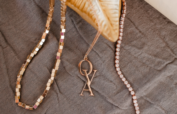
A handwritten note, marked with a considered monogram, communicates a degree of care few emails can match.
Keepsakes and gifts represent another quiet but meaningful application.
A monogrammed object given to mark a milestone often outlives the occasion itself by decades.
Professional contexts increasingly welcome a personal mark alongside institutional branding.
An attorney, physician, or architect may use a personalized monogram on private stationery.
This use signals individual authority within a larger professional structure.
It distinguishes the person from the institution without competing with it.
Each of these applications imposes its own constraints on the design.
A mark for correspondence can afford more delicacy than a mark for architecture.
A mark for architecture must sacrifice some delicacy in favor of structural clarity at scale.
Balancing these competing demands is part of what makes this craft genuinely difficult.
It is also what makes a successfully personalized monogram so satisfying to deliver.
Few design disciplines demand this range of application from a single, unchanging form.
Meeting that demand is, in many ways, the true test of a mark’s quality.
A mark that passes this test earns the right to be called truly personalized.
One that fails it, however elegant on paper, remains an unfinished design.
I would rather delay delivery than hand over a mark that has not yet passed this test.
3
Design Directions Explored Per Commission
40+
Interlace Variations Typically Considered
100%
Bespoke — No Two Marks Alike
∞
Generations a Considered Mark Is Built to Serve
Structural Precision
96%
Cross-Material Legibility
93%
Historical Resonance
90%
Personal Specificity
98%
ROYAL TRADITIONS
Lessons From Royal and Heraldic Tradition
Royal houses across Europe understood personalization long before the word existed.
A monarch’s cipher was never chosen casually or altered without cause.
It represented reign, lineage, and the authority of an entire institution.
Collections devoted to royal ceremonial objects preserve countless examples of this discipline.
Sovereigns’ monograms appear on state silver, correspondence, and architecture alike.
Each application required the mark to remain legible across an enormous range of scale.
This is the same requirement we apply to a personalized monogram today.
Heraldic authorities historically governed how personal marks could be granted and displayed.
Institutions responsible for maintaining these records still operate with the same rigor centuries later.
Their continued existence reflects how seriously personal identity was once regarded.
A family’s arms were not decorative; they were legally and socially binding.
That level of intention is difficult to recover in an age of instant customization.
Yet it remains the standard against which the finest personalized monograms are measured.
Restraint, hierarchy, and permanence are not stylistic choices in this tradition.
They are the entire foundation of what a personal mark is meant to achieve.
Modern clients rarely require the legal weight of a royal cipher.
They do, however, still want a mark that carries the same quiet authority.
European monarchies developed elaborate rules governing exactly how a cipher could be displayed.
Size, placement, and context were all dictated by protocol rather than personal taste.
This may sound restrictive, but it produced marks of extraordinary consistency and clarity.
A viewer instantly understood what they were looking at, without needing an explanation.
Contemporary personalized monograms rarely operate under such formal protocol.
Even so, the underlying principle of consistency remains just as valuable today.
A mark that changes meaning depending on context has failed at its most basic task.
Royal heraldry also demonstrates the value of a limited, disciplined visual vocabulary.
Certain forms, colors, and arrangements were reserved for specific ranks and purposes.
This scarcity is precisely what gave those marks their enduring authority.
A personalized monogram benefits from a similar discipline, even without formal rank behind it.
Restricting the visual vocabulary of a mark often strengthens rather than limits its impact.
There is a lesson here for any client tempted to add just one more decorative flourish.
The strongest historical marks nearly always resisted that particular temptation.
Their makers understood that restraint, not addition, was the harder and more valuable skill.
LUXURY IDENTITY
Restraint as the Language of Luxury
Luxury has often been mistaken for abundance.
In truth, the most enduring luxury communicates through absence rather than excess.
A personalized monogram succeeds when it says less, not more.
Every unnecessary flourish is an opportunity for the mark to age poorly.
This is the same philosophy that governs a well-considered bespoke monogram commission.
The discipline required to remove rather than add is often underestimated.
It is far easier to decorate a letterform than to simplify one.
A logo monogram built for a distinguished professional practice follows this same restraint.
The letters must function as identity first and ornament second, if at all.
Clients sometimes arrive expecting elaborate detail and leave appreciating quiet precision instead.
This shift in expectation is, in many ways, the atelier’s most important service.
It teaches a client to recognize the difference between decoration and distinction.
A personalized monogram, done correctly, requires very little explanation.
It simply looks correct, the way a well-tailored garment simply fits.
That sense of rightness cannot be rushed, and it cannot be manufactured cheaply.
It is earned through careful proportion, patient revision, and disciplined restraint.
I often tell clients that the best compliment a mark can receive is silence.
No one should need to ask what it is, or why it looks the way it does.
It should simply register as correct, the way a well-proportioned room registers as calm.
This is a difficult standard to meet, and an even harder one to describe in advance.
Clients rarely arrive already speaking this language, and that is entirely expected.
Part of my role is helping them recognize restraint when they see it on the page.
Once recognized, it becomes very difficult to accept anything less considered.
This shift in perception is, in many ways, the most valuable outcome of the process.
It changes how a client evaluates not only their mark, but their broader visual choices.
Luxury, understood this way, is less a category of object than a way of deciding.
A personalized monogram is simply one expression of that broader discipline.
Clients who internalize this idea often find it changes other decisions as well.
They begin favoring fewer, better choices across many parts of their lives, not only design.
That shift, more than the mark itself, is sometimes the most lasting outcome of a commission.
It is not one I set out to produce, but I have come to expect it.
It has, more than once, quietly changed how a client approaches decisions well beyond design.
LEGACY & FAMILY HERITAGE
A Mark That Extends Beyond the Self
A personalized monogram rarely stays confined to a single generation.
Children inherit initials, and often inherit the marks built around them.
This transition from individual to family symbol happens gradually, almost unnoticed.
A mark built with enough restraint can absorb this shift without alteration.
One built around a passing trend cannot survive the same transition.
Cipher-based marks, built around the private architecture of a name, age particularly well in this regard.
They resolve individual letters into a single, considered form rather than a decorative arrangement.
This structural discipline is precisely what allows a mark to be inherited gracefully.
A personalized monogram, in this sense, is never fully finished at delivery.
It continues to accrue meaning with every year it remains in use.
Families who commission this kind of work rarely think in terms of seasons or trends.
They think instead in terms of decades, and often in terms of generations.
This long horizon changes how the mark must be designed from the very beginning.
It must be built to outlast the person who first commissioned it.
I have worked with families who wanted to update an inherited mark for a new generation.
In the best cases, very little needs to change beyond small, respectful refinements.
This is a sign that the original mark was built with genuine foresight.
In other cases, an inherited mark requires more substantial reconsideration.
Tastes shift, applications change, and a mark built for one era may strain under new demands.
Even then, the goal is continuity rather than replacement.
A family’s visual identity should evolve the way a well-kept house evolves, not the way fashion does.
Small, considered updates preserve recognition while allowing necessary adaptation.
This approach respects both the original commission and the family’s present moment.
It is, in many respects, the most delicate work the atelier undertakes.
Few tasks require balancing respect for the past with responsibility to the present quite so directly.
I approach every inherited-mark commission with a degree of caution I reserve for little else.
The goal is never to impose a new vision, but to extend an existing one thoughtfully.
That distinction guides every choice I make once a family’s inherited mark is on my desk.
Voices of Distinction
“I wanted a mark that felt like mine and no one else’s. What arrived was more restrained than I expected, and far more permanent.”
Margaret L.
Private Client
“Our family had used the same crest for three generations, but never a personal mark that could travel with each of us individually.”
The Ashworth Family
Family Commission
“I commissioned my mark for stationery and later for the door of my practice. It reads correctly at both scales, which surprised me.”
Dr. R. Solano
Private Practice
“The process took longer than I expected, and I understood why the moment I saw the final result. It looked as though it had always existed.”
Catherine A.
Private Client
On Restraint and Permanence
A personalized monogram begins with a name, never with a template.
Restraint is not a limitation; it is the discipline that ensures longevity.
The anchor letter carries the composition, and every other letter supports it.
Scalability is tested from the size of a favicon to the size of a façade.
A classic monogram borrows authority from history without needing to explain it.
An exclusive monogram could not be transferred to another client without losing meaning.
Negative space is treated as an active material, not an empty gap.
Interlace must be resolved structurally, never applied only for decoration.
A mark inherited by the next generation must still feel entirely intentional.
The strongest personalized monograms are often the quietest ones in the room.
The Atelier’s Approach to Personalization
Every commission begins with a conversation rather than a questionnaire.
I want to understand a client’s history before I ask about aesthetic preference.
This sequence matters more than it might initially seem.
A name arrives with its own natural proportions, and I begin by studying those.
Only after that structural study begins does stylistic direction enter the conversation.
A distinguished monogram logo commission often takes several weeks to resolve properly.
Multiple directions are explored, and most are set aside before one is refined further.
This process of elimination is where a personalized monogram truly takes shape.
Clients are shown the reasoning behind each direction, not simply the final result.
I find that clients trust the outcome more when they understand the process behind it.
Revision continues until the mark reads correctly at every intended scale.
Only then is a personalized monogram considered ready for delivery.
This pace is deliberate, and I have never found a way to shorten it responsibly.
A mark built to last generations deserves the time such permanence requires.
Early conversations often cover far more than aesthetic preference.
I ask about a client’s profession, their family, and the occasions that matter most to them.
This context shapes decisions long before any letterform reaches the page.
A mark intended primarily for private stationery behaves differently than one meant for architecture.
Both may share a structural foundation, but their final proportions diverge considerably.
I present each client with a small number of genuinely distinct directions, never dozens.
Too many options tend to produce indecision rather than clarity.
A smaller, carefully curated set respects both the client’s time and the design’s integrity.
From there, revision proceeds through careful, incremental adjustment rather than wholesale change.
This measured pace allows small errors to be caught before they compound into larger ones.
By the time a personalized monogram reaches final delivery, it has been tested extensively.
Nothing arrives at a client’s hands without having earned its place there.
This is not a marketing claim; it is simply how the process has always worked here.
I would rather a commission take longer than deliver something I cannot stand behind fully.
Clients tend to sense this conviction early, and it shapes their trust in the process.
That trust, once established, makes every subsequent revision easier for both sides.
It also makes it easier to say no to a direction that simply is not working yet.
“Long before logos became commonplace, the most enduring marks of distinction belonged not to companies, but to individuals.”
THE ATELIER JOURNAL
Personal Marks in the Historical Record
Museums devoted to decorative arts preserve countless examples of personalized identity.
Silver, porcelain, and textile collections reveal how seriously earlier generations treated their marks.
A single engraved monogram can reveal a great deal about the person who commissioned it.
Curators studying these objects often note the restraint present in the finest historical examples.
Ornament, when present, tends to support the letterforms rather than obscure them.
This historical record offers a useful discipline for contemporary commissions.
It reminds us that a personalized monogram was never meant to be temporary.
The objects that survive centuries are rarely the most elaborate ones.
They are, more often, the most carefully proportioned and restrained.
This lesson shapes how I approach every personalized monogram I design today.
Permanence is not an accident of good materials alone.
It is the result of disciplined design decisions made at the very beginning.