
Personalized Logo Monogram: A Mark Built to Endure
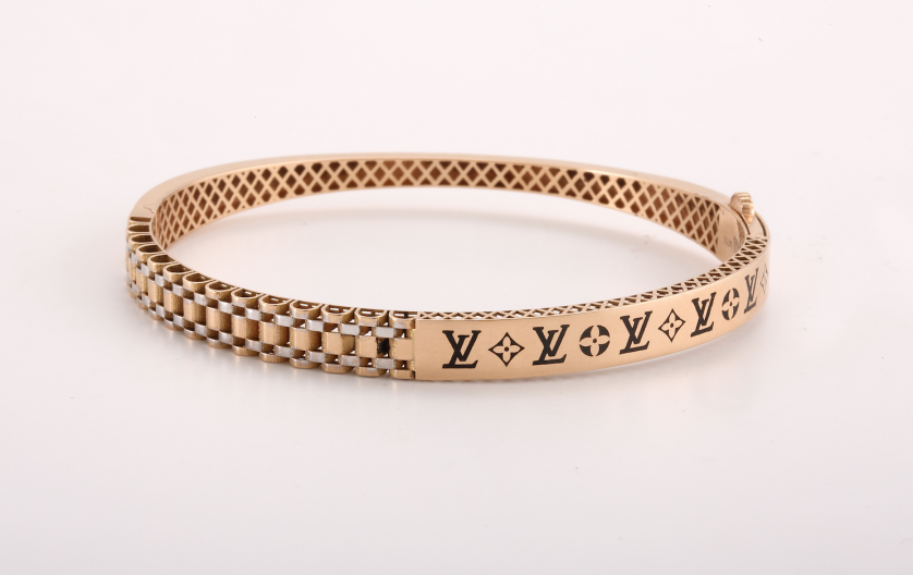
The Personalized Logo Monogram: When a Private Mark Learns to Perform in Public
A name commissioned as a keepsake and a name commissioned as a logo answer to different disciplines, even when the letters are identical.
A personalized logo monogram is asked to satisfy both at once, remaining intimate enough to belong to a single person while performing with the consistency a logo requires.
This publication considers what that dual demand actually asks of a designer, and why so few marks manage to satisfy it convincingly.
It is not a technical guide, but an account of a discipline that treats repetition as a design problem rather than an inconvenience to be tolerated.
THE ART OF MONOGRAMS
A Mark Asked to Do Two Things at Once
Most personal marks are commissioned to be seen rarely, by a small circle who already understand what they mean.
A logo, by definition, is commissioned for the opposite reason, appearing constantly, often before an audience that has never met the name it represents.
A personalized logo monogram sits directly between these two expectations, and reconciling them is the entire difficulty of the form.
It must feel as considered and specific as a private cipher, yet behave as reliably as a mark meant to appear on a hundred surfaces.
Most attempts at this reconciliation fail in one direction or the other, rarely in both at once.
A mark built purely for intimacy often collapses the moment it is asked to scale, print consistently, or survive a low-resolution screen.
A mark built purely for repetition often reads as generic, competent but unmemorable, indistinguishable from countless similar logos.
The atelier’s task is to hold both requirements in view from the very first sketch, refusing to sacrifice one for the sake of the other.
This is a considerably harder brief than either extreme, and it rewards a different kind of patience than either alone would require.
A private cipher can afford a flourish that only resolves at a particular scale, because it is rarely asked to perform anywhere else.
A personalized logo monogram cannot afford that same flourish if it disappears on a business card or blurs on a small digital avatar.
Every decision, from letterform to negative space, is therefore tested against a wider range of conditions than a purely private mark would ever face.
This does not mean the mark becomes less personal in the process, only that its personality must be built to survive translation.
A name distilled this way begins to resemble both a signature and an institution, which is precisely the paradox the form is meant to hold.
Clients rarely arrive describing the brief in these exact terms, though nearly all of them are describing some version of it.
They want a mark that feels like them, not like a category, yet they also need it to represent them consistently across a career or an enterprise.
Long before logos became commonplace, the most enduring marks of distinction belonged not to companies, but to individuals.
A personalized logo monogram simply asks that older tradition to survive contact with a considerably more public, more repeated present.
This is not a compromise of the tradition, but its natural extension into a world where a name is now expected to appear everywhere at once.
What follows is an examination of how that extension is achieved without diluting the very quality that made the tradition worth preserving.
It is not a tutorial on logo design, since the atelier does not build marks from software presets or template libraries.
It is closer to an editorial account of a discipline that insists a repeated mark can still remain entirely singular.
Readers curious about the distinction, whether or not they intend to commission anything themselves, will find the argument developed in full below.
The word logo tends to suggest something manufactured quickly, produced for a market that will move on again within a season.
A personalized logo monogram resists that association from its very first sketch, behaving less like a marketing asset and more like a signature carved into stone.
This distinction matters, because a marketing asset is expected to be replaced eventually, while a signature is expected to remain unchanged.
GUSTAVO ATHAYDE approaches every commission of this kind with that latter expectation held firmly in view throughout the process.
A client who understands this distinction in advance tends to arrive at the atelier already asking the right questions.
They rarely ask how quickly a mark can be produced, and far more often ask how long it can reasonably be expected to last.
ON THE DUAL BRIEF
A personalized logo monogram must satisfy the intimacy of a private mark and the consistency a public one requires, at the same time.
LUXURY IDENTITY
What Personalization Means Once Repetition Enters the Brief
The word personalized is used loosely across the design world, often without much justification behind it.
A font selected from a preset menu and recolored is not a personalized logo monogram, regardless of how it is marketed to a buyer.
Personalization, properly understood, means built from first principles for one specific name and the specific contexts it must inhabit.
A generic monogram generator applies identical underlying logic to every name it receives, adjusting only the letters themselves.
It cannot account for how a given pair or trio of letters actually behaves when interlaced, only an approximation drawn from a limited library.
It certainly cannot account for the professional context a mark must eventually perform within, since it was never told what that context is.
A personalized logo monogram begins from the opposite direction, starting with a conversation rather than a dropdown of available styles.
The letters are studied individually, then studied again in combination, before a single direction is proposed to the client.
Only once that combination has been resolved does the atelier begin testing it against the specific applications a client actually requires.
This ordering matters, because a mark resolved for beauty alone often fails the moment repetition and scale are introduced.
A mark resolved with repetition already in view tends to remain beautiful precisely because nothing in it was left untested.
The comparison below outlines what separates this considered process from a generated alternative in practical terms.
Personalized Logo Monogram vs. a Generated Alternative
| Consideration | Personalized Logo Monogram | Generated Alternative |
|---|---|---|
| Origin | Composed for one name and its intended use | Applied identically to any name entered |
| Testing | Verified across scale, medium, and application | Rarely tested beyond a single preview screen |
| Exclusivity | Unique to a single owner or enterprise | Available to any purchaser at any time |
| Consistency | Engineered to reproduce identically everywhere | Assumed to reproduce, rarely confirmed |
| Longevity | Designed to represent a name for decades | Designed to be replaced within a few seasons |
None of this is an argument against speed as a value elsewhere in design, since speed serves many honest purposes well.
It is simply an acknowledgment that a mark meant to represent a name publicly for years rarely benefits from being rushed.
A closer look at what distinguishes a truly considered mark from a generic one only deepens this same argument, whichever form the mark eventually takes.
Whether the result is closer to a private cipher built for a single name or something built for wider public use, the underlying discipline does not change.
There is also a practical dimension to this decision that extends well beyond aesthetics alone.
A single, well-composed mark is simpler to license, reproduce, and protect than a sprawling, inconsistent identity system built piecemeal over time.
Consistency reduces cost across years, even though it typically requires more investment and patience at the very outset of the commission.
This is a trade many growing practices eventually come to appreciate, often only after learning the opposite lesson the hard way.
A practice that redesigns its mark every few years spends considerably more, in the aggregate, than one commissioned carefully a single time.
It also risks confusing long-term clients and partners who had grown genuinely accustomed to an earlier version of the mark.
ON THE WORD PERSONALIZED
Personalization is not a style applied afterward; it is the entire starting point of the composition.
ROYAL TRADITIONS
The Cypher as the Original Public Mark
Long before the modern logo existed, the royal cypher had already solved a version of the same problem.
A sovereign’s initials needed to feel unmistakably personal, since they represented one specific reign and no other.
They also needed to appear identically across coinage, regalia, and state documents traveling to every corner of a kingdom.
This is, in essence, the original personalized logo monogram, centuries before branding existed as a named discipline.
European monarchs understood that a mark meant to govern could not be redrawn casually each time it was reproduced.
A cypher struck into one coin needed to match a cypher struck into another, regardless of who was holding the tool.
This requirement forced early designers toward a discipline that feels remarkably contemporary, namely a fixed, documented system of proportion.
Institutions devoted to the study of this formal design language continue to document how personal marks were once granted and governed.
Records preserved by institutions devoted to the study of heraldic and typographic tradition trace how these systems evolved without ever losing their essential legibility across successive reigns.
A royal cypher was rarely the work of a single hand, refined instead across the length of an entire reign and beyond it.
That iterative refinement is precisely why such marks still feel authoritative many generations after the sovereign they represented has passed.
Contemporary commissions borrow directly from this discipline, even when the client governs a practice rather than a kingdom.
The scale of consequence differs considerably, though the underlying rigor demanded of the process does not change at all.
A modern founder does not require the historical weight of a crown to deserve this same level of consideration.
They require only a name, and the intention to be recognized by it, treated with the seriousness a court once applied to its own.
This is the tradition a personalized logo monogram inherits, whether or not the client commissioning it is aware of the lineage.
a royal collection safeguarding centuries of ceremonial regalia and archival record preserves one of the most revealing records of how personal marks once functioned as instruments of public identity.
What emerges from any sustained engagement with that material is a single, consistent principle worth repeating here.
The finest cyphers were never designed to be impressive on first glance; they were designed to remain correct across every subsequent one.
It is worth noting that royal cyphers were rarely designed in isolation from the broader visual culture surrounding them.
Architecture, textiles, and ceremonial objects all echoed the same underlying proportions found in a court’s chosen mark.
This coherence across mediums is part of what gave these marks their lasting sense of authority across so many centuries.
A cypher that appeared only on paper would have carried far less weight than one appearing on coinage and stone alike.
Consistency across contexts, rather than novelty within any single one, built the credibility these marks still carry today.
The same lesson applies directly to a contemporary personalized logo monogram, regardless of the scale or ambition of the commission.
A mark used consistently across every application will always read as more authoritative than one used only sporadically or inconsistently.
Antiquity
The Struck Mark
Rulers pressed initials into coins and seals, establishing the earliest instances of a mark required to reproduce identically.
Medieval Europe
The Governed Cypher
Formal rules of proportion began governing how a personal mark could be rendered across manuscripts, seals, and regalia.
Renaissance
The Merchant’s Public Mark
Trading families adopted personal marks that needed to be recognized instantly across unfamiliar ports and routes.
Royal Courts, 17th-19th c.
The Sovereign’s Cypher
European monarchs codified the royal cypher as an instrument of governance, fixed and reproduced across an entire realm.
The Gilded Age
The House Mark
Personal marks migrated from court to commerce, becoming the foundation of the earliest luxury house identities.
Present Day
The Personalized Logo Monogram
A single considered mark now serves an individual, a practice, or a venture across every public application at once.
ON PRECEDENT
A royal cypher solved the same problem a personalized logo monogram solves today: intimacy that must also reproduce without variation.
THE ART OF MONOGRAMS
The Anatomy of a Mark Built to Repeat
Beneath the surface of any personalized logo monogram lies a set of principles rarely discussed outside the atelier.
These principles are not stylistic preferences, but structural requirements for a mark meant to reproduce without drifting from itself.
Letterform selection determines whether a mark feels timeless or merely fashionable within a narrow, forgettable window.
Proportion determines whether a composition feels resolved once, or resolved identically at every scale it will ever be asked to occupy.
Negative space is treated as an active design element, since a mark meant to shrink to a favicon cannot survive careless spacing.
Hierarchy determines which letter, if any, is permitted to lead the composition without ever overwhelming its neighbors.
Interlace, where letters share a stroke, is often the single most defining decision a personalized logo monogram will ever make.
Scalability is not a finishing touch here; it is a design constraint present from the very first exploratory sketch.
Each of these elements is considered independently before they are ever combined into a single, reproducible mark.
A mark that skips any one of these principles tends to fail quietly, revealing itself only after months of real-world use.
This is why the atelier treats all six as inseparable requirements rather than optional considerations to be addressed later.
A private cipher can occasionally survive a small inconsistency between applications, since it is rarely compared side by side.
A personalized logo monogram cannot survive that same inconsistency, since it is precisely the kind of mark placed side by side constantly.
This is the quiet reason the process for a logo-facing mark takes noticeably longer than a purely private commission.
Every proportion must be documented, not merely felt, so that the mark can be reproduced faithfully by anyone applying it later.
This documentation is, in a very real sense, part of the finished deliverable, not an afterthought appended once the design work concludes.
A mark without this documentation drifts slowly across reprintings, signage updates, and digital migrations, however small each individual drift may be.
A mark delivered with clear proportions resists that drift for decades, remaining recognizably itself no matter who applies it next.
a museum whose decorative arts collection preserves centuries of engraved personal marks still preserves engraved silver and personal stationery bearing initials that belonged to monarchs and merchants alike, each one a lesson in proportion.
Studying such collections reveals how much thought was once given to something as small and as seemingly modest as two or three letters.
A private individual may need a mark only for correspondence and a handful of personal objects encountered occasionally throughout a lifetime.
A growing practice may need the same underlying mark across signage, packaging, uniforms, and an entire public-facing digital presence at once.
Scale introduces a related set of considerations that cannot be resolved through assumption alone, however confident the initial sketch may look.
This same rigor underlies an initials logo built for repetition and legibility alike, and the atelier applies it with equal seriousness whether a mark serves a person or a growing practice.
Letterform
Typographic choices drawn from traditions deep enough to carry authority across any application.
Proportion
Weighted so the mark reads identically whether small or large, printed or displayed.
Negative Space
Treated as active structure, since it is the first thing lost at reduced scale.
Hierarchy
One letter may lead the composition, though it must never dominate its neighbors.
Interlace
The manner letters join often decides whether the mark reads as one form or two.
Scalability
Tested from the width of a favicon to the width of a storefront sign.
ON DOCUMENTATION
A mark’s proportions must be recorded, not merely felt, so it can be reproduced identically by anyone who applies it next.
LEGACY & FAMILY HERITAGE
When a Founder’s Initial Becomes a Household Name
A particular kind of commission arrives when a founder’s personal mark is asked to represent an entire growing enterprise.
What began as a private monogram, used quietly on correspondence, is suddenly required to appear on signage, packaging, and a public storefront.
This transition is more delicate than it first appears, since the mark must gain public consistency without losing its original, personal warmth.
Families who have carried a surname across generations understand this tension especially well, having lived a version of it long before any logo existed.
A family crest encodes lineage across generations, governed by formal convention and precedent rather than by contemporary preference.
A personalized logo monogram encodes something narrower, typically an individual or a single enterprise, though it may become an inheritance in its own right over time.
The distinction matters less than the intention behind it, which remains remarkably consistent across both forms.
Both exist to answer the same quiet question, namely what will remain recognizable once the original founder has stepped away.
A mark built for this kind of longevity must be composed with unusual restraint from its very first sketch.
Trend-driven ornamentation dates a mark quickly, while considered proportion tends not to date in any meaningful sense at all.
This is why the atelier resists fashionable flourishes in favor of quieter, more structural decisions that age without apology.
A founder’s initials, once resolved into a considered mark, can move across decades of leadership changes without losing their original meaning.
It becomes, in time, the one visual constant a growing enterprise rarely needs to redesign from scratch.
This same principle applies just as directly to a family translating an inherited identity into a form suited to present-day, public use.
The task, in these cases, is translation rather than invention, since the family typically already knows what it wishes to preserve.
The atelier’s role becomes carrying that inherited identity into consistent, repeatable public use without severing it from its origin.
the heraldic authority responsible for granting and recording personal arms in England has operated on precisely this principle for centuries, treating the right to bear a particular mark as a matter of recorded identity rather than preference.
Some families arrive already holding decades of correspondence, silver, and photographs bearing an earlier, more private version of their mark.
Others arrive with nothing inherited at all, only a name and a wish to build something a next generation might eventually recognize as theirs.
Both paths receive the same unhurried attention, and neither is treated as more legitimate than the other by the atelier.
What matters, in either case, is that the finished mark earns the right to be carried forward by whoever inherits it next.
A family that has worked toward its mark tends to value it more than one that received an easy answer on the very first attempt.
That effort, in retrospect, is almost always remembered fondly, once the finished mark has proven itself across years of genuine, public use.
It becomes part of the family’s own account of the mark, passed down alongside the mark itself for whoever inherits it next.
ON INHERITANCE
A personalized logo monogram built well does not need to be redesigned by the next generation, only carried forward.
ON TRANSLATION
Carrying an inherited identity into public, repeatable use requires more discipline than inventing a new mark from nothing.
LUXURY IDENTITY
Restraint as the Signal of Genuine Authority
Luxury, properly understood, has very little to do with ornamentation added for its own sake.
It has a great deal to do with discretion, precision, and a quiet confidence in a mark’s own presence.
A personalized logo monogram embodies this principle more directly than almost any other visual asset a client might commission.
It does not need to shout, because its owner already knows precisely what the mark represents, and trusts others to learn it in time.
This is the quality that separates genuinely luxurious identity work from work that is merely expensive to produce.
A brand that relies on excess is rarely mistaken for one built to last across changing seasons and shifting audiences.
A brand built on a single, well-resolved mark communicates the opposite quality entirely, namely quiet certainty in its own standing.
This is precisely why so many enduring luxury houses still rely on a monogram rather than a slogan to carry their identity forward.
The mark performs work that paragraphs of messaging simply cannot accomplish in the same instant, or with the same restraint.
It signals heritage, consistency, and intention in a single glance, without requiring further explanation from anyone encountering it.
A personalized logo monogram applied to a growing practice follows this exact same discipline, regardless of the industry involved.
It is not merely a transactional logo commission; it is a foundational identity decision the practice will likely never need to repeat.
The atelier treats every commission of this kind with the same rigor applied to a private family crest, and for the same reason.
Both, after all, are expected to outlive the person who first commissioned them into being, however different their public visibility may be.
This is the same underlying discipline that governs a bespoke monogram commissioned as private language, adjusted only for the wider public exposure a founder’s mark must eventually withstand.
The Founder’s Mark
A first visual decision durable enough to outlast several generations of leadership.
The Practice Identity
A quiet signal of standing for an attorney, physician, or independent firm.
The Household Mark
A personal cypher carried across correspondence, signage, and daily life alike.
The Inherited Mark
A family’s earlier identity translated for consistent, present-day, public use.
Slogans expire quietly, though marks properly composed do not expire in the same predictable, seasonal way.
This is not a claim made lightly, since the history of branding is littered with words that no longer resonate with anyone.
It is considerably harder to find a well-composed personalized logo monogram that has genuinely gone out of style within a decade.
Letterforms rooted in real typographic tradition simply age more gracefully than trend-driven messaging ever manages to.
This is the quiet advantage a personalized logo monogram holds over nearly every other identity tool a founder might otherwise reach for.
It requires more patience to commission at the outset, though it requires far less maintenance once properly delivered to the client.
For a practice or a household planning across decades rather than quarters, that trade is rarely a difficult one to accept in practice.
A mark asked to appear everywhere still deserves to belong, unmistakably, to one name alone.
GUSTAVO ATHAYDE · Atelier Philosophy
ON RESTRAINT
The most convincing signal of authority is rarely more ornament, but the confidence to include only what a mark truly requires.
BESPOKE WEDDINGS
Two Names, One Mark, and an Entire Household to Follow
A wedding presents a particular version of the same challenge, since two names must become a single, coherent mark.
The resulting composition is asked to feel intimate enough for private correspondence, and consistent enough to represent an entire household afterward.
This is a delicate negotiation, considerably more diplomatic in nature than strictly typographic, since neither name may visibly dominate the other.
The mark itself often outlives the invitations and linens for which it was originally commissioned, taking on a second, more public life.
Couples frequently return to the same personalized logo monogram years later, for anniversaries, for new households, and occasionally for a shared venture.
A mark built with this longevity already in mind must be resolved with unusual care from its very earliest sketch.
Few objects carry as much emotional weight as a wedding mark revisited many decades after its original commission.
That weight is precisely why haste has no proper place anywhere in its original composition or its early refinement.
Some couples request a mark that favors chronology, placing the initials in the order the names are typically spoken together.
Others prefer a more symmetrical treatment, in which neither letter visibly precedes the other within the composition.
Both approaches are entirely valid, and the correct choice depends on how the couple wishes to be represented publicly going forward.
This same grammar of restraint governs the ceremonial mark commissioned for any milestone meant to be revisited across a lifetime.
A mark rushed to meet a printing deadline rarely satisfies a couple once the celebration itself has receded into memory.
The atelier’s approach to this commission is unchanged from any other, though the emotional stakes are, understandably, considerably higher.
Some couples eventually extend the same mark into a shared household venture, discovering that a wedding monogram travels further than expected.
When that happens, the mark is simply asked to satisfy a wider public role than the one it was first commissioned to serve.
ON DIPLOMACY
A wedding monogram must honor two names equally, favoring neither, while still resolving into a single coherent mark.
THE ATELIER JOURNAL
The Commission, From First Conversation to Final Delivery
Commissioning a personalized logo monogram is closer to a private consultation than to an ordinary design transaction.
The process begins with conversation rather than with a questionnaire handed across a desk or filled out online.
Personal history, professional context, and intended application are discussed before any sketching begins at all.
Only once that context is fully understood does the atelier begin exploring specific letterform directions worth pursuing.
Multiple design directions are typically developed before a single one is ever presented to the client for review.
Refinement continues until the mark performs correctly at every scale and in every medium it is likely to encounter.
The final stage is not delivery alone, but guidance on how the mark should be applied consistently across every future use.
This structure exists to protect the client from a common risk, namely settling too quickly on the wrong direction entirely.
Each stage is designed to remove uncertainty before a client ever commits to a single, final composition for public use.
By the time delivery occurs, the outcome rarely feels like a surprise to the client receiving the finished mark.
It feels instead like confirmation of something the client already sensed was correct from the very beginning of the process.
Clients occasionally ask why this level of scrutiny is necessary for what appears, at first glance, to be a simple mark.
The honest answer is that simplicity is precisely what demands the scrutiny, since there is nowhere left in a reduced mark to hide an error.
A commission conducted this way tends to leave a rather different impression than an ordinary transactional purchase ever could.
01
Consultation
A private conversation establishes history, context, and the public role the mark must eventually serve.
→
02
Exploration
Multiple letterform directions are developed and narrowed before any single one is presented.
→
03
Refinement
The selected direction is refined for proportion, negative space, and balance at every scale.
→
04
Validation
The mark is tested across applications, from stationery to signage, confirming it holds at every size.
→
05
Delivery
The finished mark is delivered with documentation for consistent, lasting use across every context.
ON THE FIRST CONVERSATION
The atelier listens before it draws, since a mark cannot be personalized to a name it has not yet understood.
LUXURY IDENTITY
Where a Personalized Logo Monogram Must Live
A finished personalized logo monogram is expected to perform across a considerably wider range of contexts than a private cipher ever would.
It may appear on personal stationery one day, and on a storefront facade or a digital masthead the very next.
It may be engraved into silver, embossed into leather, printed at large format, or rendered as a small digital favicon.
Each of these contexts places different demands on legibility, weight, and overall proportion, and none may be assumed to work automatically.
A mark that only performs at one scale has not yet been fully resolved by whoever designed it.
The atelier tests every commission across the applications most relevant to a given client’s actual professional and personal life.
A private individual may need the mark only for correspondence and a small collection of personal objects.
A founder may need the very same underlying mark across signage, packaging, uniforms, and an entire public-facing digital presence.
Both cases receive the same underlying rigor, adjusted only in scope rather than in the underlying standard applied.
Assumptions are precisely where templated design typically fails, since a template is rarely tested beyond its original preview context.
A commissioned mark, by contrast, is stress-tested against every application a client is genuinely likely to require over time.
This attentiveness to material and scale is what separates a graphic exercise from a genuine, lasting public identity system.
It is a slower way of working, and the atelier makes no apology whatsoever for that considered, unhurried pace.
Consider how differently a single mark behaves across just two applications most clients eventually request together, often within the same year.
A mark for personal stationery must read warmly, often alongside softer typography and a more intimate tone throughout.
The same mark, applied later to a storefront or a public letterhead, must read with considerably more authority and less delicacy.
Reconciling these two moods within one coherent design is a genuinely difficult problem, and it is solved through hierarchy rather than compromise.
Certain proportions must remain fixed across every application for the mark to feel like a single, continuous identity.
Other elements, such as weight or a supporting flourish, may flex slightly depending on the surface or material involved.
Knowing which is which requires precisely the kind of experience that cannot be shortcut by software or automation alone.
3-5
Design directions explored per commission
12+
Applications tested before a mark is approved
100+
Years a well-proportioned mark can remain legible
1
Mark, built once, intended to represent a name for decades
Consultation & Listening20%
Letterform Exploration25%
Refinement & Testing40%
Delivery & Documentation15%