
Bespoke Monogram: Heritage and Legacy
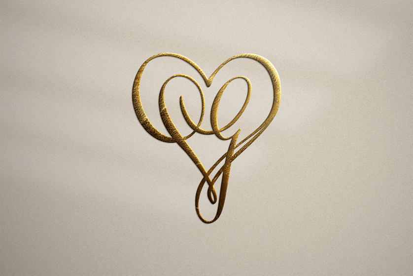
The Classic Monogram: An Heirloom Written in Initials
There is a particular quietness to a mark that was made for one person alone.
It does not announce itself, yet it is never mistaken for another.
A monogram of this kind is not decoration; it is a signature carried into every object it touches.
This is the territory the atelier inhabits, letter by letter, generation after generation.
What follows is a study of why that territory still matters.
Some families arrive already carrying centuries of visual history.
Others are simply ready to begin one.
Either way, the process asks the same question: what deserves to be carried forward, and in what form?
The answer rarely arrives quickly, and it is rarely simple, but it is always worth the patience it requires.
The Art of Monograms
Long before logos became commonplace, the most enduring marks of distinction belonged not to companies, but to individuals.
A name reduced to its essential letters has always carried more weight than a name written in full.
This is the quiet paradox at the center of monogram design: less becomes more the moment restraint enters the room.
The discipline is not in adding flourish but in removing everything that does not serve the letterform.
A well-considered classic monogram proves this point better than almost any other object a designer can produce.
Each bespoke monogram begins as a study of a single person’s history before it becomes a study of shape.
A designer who understands this does not start with a typeface; they start with a conversation.
What emerges from that conversation is rarely obvious in the first sketch.
It takes patience to let initials stop looking like abbreviations and start looking like architecture.
Typography alone cannot account for what makes a monogram succeed.
A typeface provides raw material, but the letters must still be persuaded to coexist.
This persuasion happens in the negative space as much as in the ink itself.
The gaps between strokes often determine whether a composition reads as elegant or merely crowded.
A designer trained only in software will often overlook this, mistaking density for richness.
Density is rarely the goal; clarity almost always is.
A monogram must be legible from across a room and still reward close inspection.
Few objects are asked to perform at both distances simultaneously.
This dual requirement is what separates monogram design from ordinary lettering work.
The atelier tests every composition at both scales before calling it finished.
A mark that fails at either distance is sent back to the drawing board.
This is tedious work, and tedium is precisely what most commercial design avoids.
The avoidance of tedium is, in many respects, the avoidance of true craft.
Craft has never been efficient, and it was never meant to be.
Efficiency serves volume; craft serves the individual piece in front of it.
A bespoke commission has no volume to serve, only a single client and a single mark.
This singular focus changes the entire calculus of the design process.
There is no template to reach for, no prior solution to recycle.
Each commission must justify its own existence from the very first sketch.
This is demanding for the designer and rewarding for the client.
The reward is a mark that could not have been produced for anyone else.
Originality of this kind cannot be claimed; it can only be demonstrated.
The demonstration takes the form of the finished monogram itself.
When a client sees their mark for the first time, the reaction is rarely analytical.
It is closer to recognition, as though the design had simply been waiting to be found.
That sense of recognition, more than any technical achievement, is the goal of the discipline.
It is the moment the entire process has been quietly building toward.
Hand drawing still plays a role in the earliest stages of this process, even within a fully digital studio.
A pencil forces a kind of decisiveness that a cursor does not always demand.
Lines committed by hand carry a confidence that can later be refined with software but rarely replaced by it.
This is not sentimentality about tradition for its own sake.
It is simply an acknowledgment of where good instincts tend to originate.
The atelier treats digital tools as a means of precision, not as a substitute for judgment.
Judgment remains the one element no software update has managed to automate.
It is trained slowly, through years of comparing what looks right against what merely looks acceptable.
That distinction, subtle as it sounds, is the entire foundation of the discipline.
A Lineage of Letters
To understand a contemporary commission, it helps to walk backward through the centuries that shaped it.
Collections held by institutions such as the Metropolitan Museum of Art preserve the quiet evidence of how personal marks evolved across continents and courts.
What they reveal is not a single lineage but many, converging again and again on the same idea.
Each era developed its own reasons for the personal mark, yet the underlying impulse remained remarkably constant.
Antiquity
The First Personal Seals
Signet rings carved with initials or emblems authenticated documents long before literacy was widespread, making the mark itself a form of trusted signature.
Medieval Era
Heraldry Enters the Household
Family arms moved from the battlefield banner to the household seal, embedding lineage into everyday correspondence and property.
Renaissance
Artisans Claim Their Initials
Painters and goldsmiths began signing masterworks with interlaced initials, elevating the monogram from mark of ownership to mark of authorship.
18th Century
Linen, Silver, and Society
Monogrammed linen and silverware became a quiet marker of household standing, exchanged as part of a bride’s trousseau across Europe.
Early 20th Century
The Monogram Meets Modern Travel
Steamer trunks and motorcars carried initials into a newly mobile world, turning the monogram into a companion for a life in motion.
Present Day
A Return to the Personal
In an era saturated with mass-produced symbols, the handcrafted monogram has returned as a deliberate act of individuality.
Legacy & Family Heritage
In communities where legacy is valued as deeply as innovation, identity often extends beyond a name.
It becomes a symbol, one capable of representing a family, a celebration, or a personal story for generations.
A family that commissions a monogram is rarely thinking only of the present occasion.
They are thinking of the shelf, the drawer, or the wall where the mark will still be found decades from now.
This is the quiet responsibility the atelier accepts with every heraldic crest it designs.
A crest is not simply drawn; it is researched, discussed, and reconciled with the family’s own account of itself.
Some families arrive with an existing emblem inherited from a grandparent or an ancestral home.
Others arrive with nothing more than a surname and a sense that something permanent should exist.
Both are legitimate starting points, and both deserve the same rigor of research.
The atelier treats each family’s history as source material rather than decoration.
This means asking questions most designers never think to ask.
What trade built the family’s fortune.
What land they farmed, what port they sailed from, what craft they practiced before the first monogram was ever needed.
These details rarely appear literally in the final design, yet they shape every decision within it.
A family descended from agricultural exporters may inspire a composition with a grounded, horizontal weight.
A family descended from maritime traders may inspire one with a more vertical, wind-swept line.
None of this is obvious to an outside viewer, and it is not meant to be.
It is meant to be felt by the family itself each time they encounter the mark.
This is the essential difference between a monogram and a logo.
A logo is built to be recognized by strangers.
A monogram is built to be recognized, and felt, by kin.
Legacy of this kind cannot be manufactured quickly, which is precisely why the process is unhurried.
Every generation that inherits the mark inherits the research behind it as well.
That inheritance, more than the ink itself, is the true commission.
Family history rarely arrives as a tidy narrative.
It arrives instead as fragments: a photograph, a surname spelled two different ways, a story remembered only in outline.
Part of the atelier’s task is to gather these fragments before a single sketch begins.
This gathering resembles the work of an archivist more than the work of a graphic designer.
Old letters, family bibles, and inherited jewelry often hold clues no interview could surface alone.
A signet ring passed down for three generations may carry a symbol no living relative can fully explain.
Part of the commission becomes recovering that explanation, or honoring it even when it cannot be recovered.
Not every family history is celebratory, and the atelier does not pretend otherwise.
Some families carry difficult chapters alongside their proud ones.
A thoughtful mark does not erase this complexity; it simply chooses what deserves to be carried forward.
This is a delicate editorial decision, made in close conversation with the family itself.
No designer should make that decision unilaterally, and the atelier never does.
The family remains the author of their own story throughout the process.
The designer’s role is closer to translator, converting narrative into form.
This translation is never literal, and it should never attempt to be.
A family’s occupation, faith, or homeland might inform a single line rather than an entire symbol.
Subtlety here is not a limitation; it is the entire craft.
A crest that explains itself too plainly loses the quiet dignity that makes it worth commissioning.
The best family emblems reward a second glance rather than exhausting themselves on the first.
Children who grow up beneath such a mark often ask about it only once they are old enough to appreciate the answer.
That delayed curiosity is, in its own way, a measure of success.
A symbol that reveals itself slowly tends to be trusted more than one that announces itself immediately.
This patience mirrors the patience already required of family history itself.
Nothing about lineage unfolds quickly, and a family emblem should not pretend otherwise.
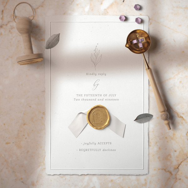
The finished crest becomes, in time, simply another chapter in the story it was designed to honor.
Some families choose to commission a companion piece alongside the crest itself, a short written account of the history behind it.
This document travels with the artwork, so that future generations inherit context along with the symbol.
Without it, even the most beautiful mark risks becoming ornamental rather than meaningful.
A crest without its story is simply decoration wearing the costume of significance.
The atelier encourages this written companion piece whenever a family’s history is complex enough to warrant it.
Marks of Lineage
The Inherited Emblem
Some commissions begin with a family crest already in existence, refined rather than replaced.
The First Monogram
Other families are commissioning their very first mark, becoming the founding generation of a new visual lineage.
The Shared Surname
A single surname can yield distinct marks for different branches of the same extended family.
Royal Traditions
No history of the personal mark is complete without the courts that elevated it into ceremony.
Royal houses across Europe turned the monogram into a language of its own, legible to those trained to read it and quietly commanding to those who were not.
A sovereign’s cipher was never chosen casually; it was deliberated with the same gravity as a coronation gown.
Archives maintained by institutions such as the Royal Collection Trust preserve centuries of these ciphers, etched into silver, carved into stone, and stitched into state regalia.
What these archives reveal is a discipline strikingly close to the atelier’s own.
Royal monograms were rarely improvised; they were drawn, revised, and approved through a formal process not unlike a modern commission.
Symmetry mattered because a throne room rewards symmetry.
Legibility mattered because a banner must be read from a distance.
Permanence mattered most of all, because a royal cipher was expected to outlast the monarch who commissioned it.
A family pursuing a luxury family crest today inherits this same expectation, even without a throne to justify it.
The expectation is simply this: the mark should be worthy of being seen a century from now.
Heraldic tradition offers a vocabulary for meeting that expectation.
Charges, tinctures, and ordinaries are not arbitrary; each carries a meaning refined over centuries of use.
A chevron can suggest protection.
A rising sun can suggest renewal.
An interlaced cipher can suggest two lineages joined as one.
None of these devices are chosen for their appearance alone; they are chosen for what they are able to say.
This is the deeper lesson royal tradition offers the modern client.
A crest is not a portrait; it is closer to a sentence, composed in symbols rather than words.
The atelier borrows this grammar carefully, aware that heraldic convention deserves respect rather than imitation for effect.
A design that misuses heraldic language reads as costume.
A design that understands it reads as continuation.
The difference is invisible to most viewers and unmistakable to the family who commissioned it.
Ceremony has always demanded a particular kind of visual discipline.
A banner carried before a procession cannot afford ambiguity; it must be read in an instant.
This urgency shaped heraldic design long before modern branding ever considered the same problem.
Colors were chosen for contrast at a distance, not merely for symbolic meaning.
Gold beside a dark field, for instance, was prized as much for visibility as for prestige.
The atelier still considers this principle when selecting a palette for a modern commission.
A mark intended for a signet ring behaves differently from one intended for a banner or a door.
Scale changes not only size but also the entire logic of contrast and detail.
Royal courts understood this instinctively, commissioning different versions of a single cipher for different uses.
A monarch’s monogram on a coin looked nothing like the same monogram embroidered onto a state robe.
Both were unmistakably the same mark, adapted with discipline rather than diluted by inconsistency.
This is precisely the standard the atelier applies to a modern family of marks.
A single commission may yield a primary crest, a simplified cipher, and a compact signet variant.
Each must remain unmistakably related while performing correctly at its own scale.
Achieving this consistency requires the same rigor once reserved for royal workshops.
Nothing was left to improvisation in those workshops, and nothing is left to it here.
Ceremonial protocol also dictated hierarchy, a concept many modern clients overlook entirely.
Not every element of a crest carries equal weight, and a design should say so visually.
A motto is subordinate to a shield; a shield is subordinate to the initials it may frame.
Respecting this hierarchy prevents a composition from feeling cluttered or uncertain of its own purpose.
Royal heraldry, for all its ornament, was rarely uncertain of its purpose.
Every element earned its place through function as much as through beauty.
Modern commissions benefit enormously from holding themselves to the same standard.
Ornament without function eventually reads as noise rather than nobility.
The atelier would rather deliver something quieter and more disciplined than something merely elaborate.
Classic Versus Contemporary
Every commission eventually arrives at a single question of temperament.
Should the mark lean toward the classic monogram tradition of centuries past, or toward a more contemporary restraint?
Neither answer is superior; each simply serves a different sensibility.
Understanding the difference helps a client recognize which register speaks to their own history and taste.
Two Temperaments, One Standard of Craft
Classic
Contemporary
Line Quality
Ornamented, calligraphic strokes
Clean, architectural strokes
Typical Setting
Heraldic crests, formal silver
Signet rings, modern stationery
Historical Reference
Renaissance and royal cipher work
Mid-century minimalist design
Best Suited To
Multigenerational family emblems
Personal, singular identity marks
Emotional Register
Ceremonial and reverent
Quiet and understated
A monogram is never finished the day it is drawn; it is finished the day it is finally forgotten as a design and remembered only as a name.
Bespoke Weddings
Few occasions ask more of a personal symbol than a wedding.
In a single mark, two histories must be joined without either one disappearing into the other.
This is a more delicate task than uniting two names; it is uniting two visual inheritances.
The atelier begins by studying each family’s existing marks, if any exist at all.
Where no existing mark exists, the couple’s own story becomes the source material instead.
A wedding monogram is asked to perform for decades, not for a single afternoon.
It will appear on the invitation, then quietly migrate to linens, stationery, and eventually to a signet design passed to the next generation.
This migration is precisely why restraint matters more at a wedding than almost anywhere else.
A mark designed only for a single evening will feel out of place on the silver twenty years later.
A mark designed with permanence in view will feel correct at every stage of that journey.
Symbolism plays a larger role here than in almost any other commission the atelier undertakes.
An interlaced cipher can represent partnership without stating it outright.
A shared line or shared curve between two initials can suggest union more elegantly than any ornament.
Couples often arrive expecting elaborate detail and leave preferring quiet precision instead.
This shift in preference is not persuasion; it is education, offered gently across the design process.
Once a couple understands why restraint reads as more expensive than excess, they rarely ask for excess again.
The finished mark becomes a kind of private vow, visible only to those who know to look for it.
Guests may notice the monogram on a menu card without ever grasping its full significance.
The couple, and eventually their children, will understand it completely.
This quiet asymmetry, legible to some and invisible to others, is the very essence of a personal emblem.
A wedding monogram rarely lives in isolation; it anchors an entire stationery suite.
Save-the-dates, invitations, programs, and thank-you notes all draw from the same visual language.
Consistency across these pieces matters more than most couples anticipate before the process begins.
A guest who receives four mismatched treatments over the course of a wedding season senses something amiss, even without naming it.
The atelier builds each mark with this full sequence in mind from the very first sketch.
This means considering how the cipher will look printed in foil, engraved in silver, and embossed on heavy cotton stock.
Each medium behaves differently, and a mark that ignores this will eventually fail one of them.
Foil rewards fine, confident lines; engraving rewards slightly bolder ones.
Reconciling both requirements within a single elegant form is part of the technical discipline behind the craft.
Blended families present their own particular challenge, one the atelier increasingly welcomes.
A couple may wish to honor two sets of parents, or children from a previous marriage, within a single mark.
This is rarely solved by adding more letters; it is solved by thoughtful hierarchy instead.
A primary cipher can carry the couple’s initials while a secondary element quietly acknowledges the wider family.
Subtlety again proves more effective than literalism in situations this emotionally layered.
Anniversaries offer a second, quieter occasion for commissioning work of this kind.
A couple celebrating twenty-five years together may commission an evolved version of their original wedding mark.
The evolution should feel like maturation, not replacement.
Elements of the original design are typically preserved, refined rather than discarded.
This continuity mirrors the marriage itself, changed by time yet still recognizably its original self.
Few gestures communicate the endurance of a relationship as quietly as a mark that has aged alongside it.
The atelier keeps meticulous records of every wedding commission for precisely this reason.
A couple returning after a decade should never be asked to start entirely from scratch.
Their history, like the mark itself, deserves continuity.
This is a small courtesy that reflects a much larger philosophy about what these commissions are for.
The Forms a Monogram May Take
A single commission rarely produces a single design.
It produces a family of related marks, each suited to a different context and surface.
Recognizing these forms in advance helps a client understand where their own commission is likely to lead.
The Interlocking Cipher
Two or three letters woven into a single continuous form, favored for rings, stationery, and formal linens.
The Family Crest
A fuller heraldic composition that may include a shield, motto, or symbolic charges drawn from a family’s history.
The Wedding Monogram
A joined mark built for two names, designed to endure well beyond the ceremony that inspired it.
The Newborn Monogram
A gentler composition intended to grow with a child, from nursery keepsakes to adult correspondence.
The Signet Monogram
A compact design engineered for the scale of a ring, where clarity must survive at a fraction of an inch.
The Identity Monogram
A minimalist mark built for an individual or a discerning brand seeking quiet, lasting distinction.
The Vocabulary of Distinction
Interlacing
Letters overlap and share strokes, a technique borrowed directly from Renaissance goldsmiths.
Negative Space
The unmarked areas within a monogram often carry as much design intention as the letters themselves.
Proportion
A monogram must hold its balance whether engraved at an inch or printed across a stationery suite.
Luxury Identity
Luxury has always communicated more through restraint than through volume.
The great maisons of Europe understood this before the word branding entered common use.
A single letter, quietly repeated across a canvas trunk or a silk scarf, could communicate provenance more convincingly than any written claim.
This is the lesson the atelier carries from historic brand identity into personal commission work.
A mark earns prestige not by insisting on it but by behaving as though prestige were already assumed.
This requires a discipline closer to heraldic authority than to contemporary marketing.
Bodies such as the College of Arms have long governed how personal and institutional emblems are granted, recorded, and preserved.
Their standards, developed over centuries, still inform how the atelier approaches symmetry, hierarchy, and restraint.
A design that borrows this discipline reads as considered rather than decorative.
The distinction matters because luxury clients can sense the difference instantly, even without articulating it.
An architect commissioning a personal mark wants the same rigor they apply to a structural drawing.
An attorney wants the same precision they apply to a contract.
A physician wants the same care they apply to a diagnosis.
Each profession recognizes discipline when it sees it, regardless of the medium.
This is why the atelier’s process resembles engineering as much as it resembles art.
Every angle is measured, every curve is tested against the letters beside it, and nothing is approved until it withstands scrutiny.
The result is a mark that feels less designed than discovered, as though the letters had always wanted to sit together this way.
This sense of inevitability is the truest signature of luxury identity work.
It cannot be rushed, and it cannot be faked convincingly for long.
Clients who have commissioned lesser work elsewhere often recognize the difference the moment they see a finished atelier mark.
They rarely need it explained to them twice.
Entrepreneurs building a distinguished practice face a version of this same challenge.
A firm’s identity is often expected to communicate credibility before a single meeting takes place.
A personal monogram can accomplish this more convincingly than an elaborate logo ever could.
Clients of a boutique practice are rarely persuaded by scale; they are persuaded by evident care.
A single, well-considered mark signals that care more efficiently than an entire brand guideline.
This is why so many venerable firms, from ateliers to private banks, still rely on a single cipher.
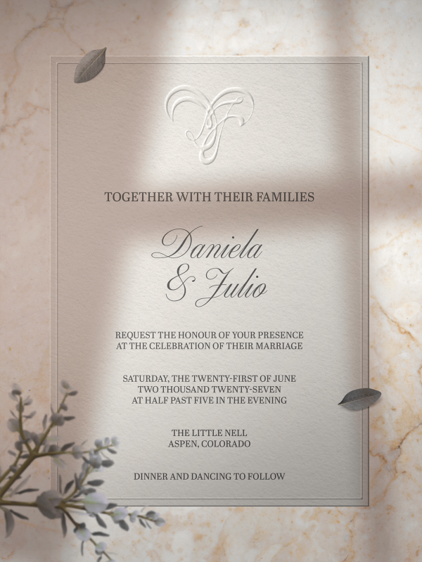
The cipher becomes shorthand for a reputation built over years, sometimes decades.
New practices cannot borrow that reputation, but they can borrow the discipline that eventually earns it.
Choosing restraint from the outset signals patience, and patience itself reads as a form of confidence.
A firm that rushes its visual identity often rushes other decisions as well, at least in a client’s estimation.
Perception of this kind is rarely fair, yet it is remarkably consistent.
The atelier has watched this pattern repeat across industries, from law to medicine to private finance.
In each case, the clients most worth attracting responded to quiet confidence rather than loud assertion.
Materials play their own quiet role in this perception.
A mark engraved into brass or pressed into heavy cotton paper communicates permanence that a screen cannot.
This is not nostalgia; it is simply an accurate reading of how trust is built.
Digital identities can be altered in an afternoon; engraved ones cannot.
Clients sense this difference, even when they could not explain the mechanism behind it.
A firm willing to commit a mark to metal is, in effect, making a public statement of confidence.
That statement carries weight precisely because it cannot be easily reversed.
The atelier encourages this kind of commitment whenever a client’s ambitions can support it.
Not every young practice is ready for it, and the atelier says so honestly when asked.
Readiness matters more than eagerness in a decision this permanent.
When the moment does arrive, the resulting mark tends to outperform anything hurried into existence earlier.
Quiet luxury, as a phrase, has become almost fashionable in recent years, which is somewhat ironic given what it actually describes.
True restraint was never meant to be a trend; it was simply the oldest standard luxury ever held itself to.
The atelier’s approach predates the phrase and will likely outlast it as well.
A mark built on genuine restraint does not need a marketing term to justify its value.
It simply continues to look correct long after the term itself has fallen out of fashion.
From Sketch to Seal
A finished monogram is the visible result of a process that most clients never fully see.
Understanding its stages helps explain why the work cannot be hurried without cost to the result.
None of these stages can be safely compressed without risk to the final mark.
01
Consultation
A private conversation establishes history, purpose, and the surfaces the mark will eventually inhabit.
02
Research & Symbolism
Family history, heraldic precedent, and cultural context are studied before a single line is drawn.
03
Sketching
Multiple compositional directions are explored by hand before any direction is chosen for refinement.
04
Refinement
The chosen direction is measured, balanced, and tested at multiple scales for clarity and permanence.
05
Final Artwork
The completed mark is delivered in the formats required for engraving, print, and future generations.
Voices of the Atelier
Every commission concludes not with an invoice but with a relationship.
The following reflections come from clients who commissioned marks meant to last well beyond the season in which they were made.
Their words say more about the process than any description the atelier could offer on its own.
“Our family crest now sits above a mantel that has held three generations, and it finally looks as though it belongs there.”
A Family in Charleston — South Carolina
“The process felt less like hiring a designer and more like consulting an archivist who happened to draw beautifully.”
A Collector in Santa Fe — New Mexico
“Our wedding monogram now appears on everything from the linens to our son’s christening gown, and it has never once felt dated.”
A Couple in Savannah — Georgia
“As an architect, I recognized the same discipline in this work that I demand of my own drawings, and that recognition sold me immediately.”
An Architect in Boston — Massachusetts
Long before logos became commonplace, the most enduring marks of distinction belonged not to companies, but to individuals.
The Atelier Journal
Craftsmanship is often described as a talent, though it behaves far more like a discipline of patience.
A single monogram may pass through dozens of studies before it is ever presented to the client who commissioned it.
Few of those studies are ever seen; most are simply set aside once they have taught the designer something the previous version had not.
This is the invisible labor luxury design rarely advertises, though it is the labor that justifies everything visible.
The atelier holds itself to standards documented by scholarly bodies such as the Heraldry Society, whose research keeps historic convention alive for contemporary use.
Consulting this tradition is not an aesthetic affectation; it is a form of accountability.
A designer who understands why a chevron traditionally suggests protection will use it with intention rather than decoration.
A designer who does not understand this risks reducing centuries of meaning to mere pattern.
The atelier chooses accountability over convenience at every stage of the process.
This sometimes means telling a client that their instinct, though well intentioned, would compromise the mark’s longevity.
Such conversations are never comfortable, yet they are always in service of the same goal.
The goal is a mark the client’s grandchildren will one day inherit without needing it explained.
Design of this permanence cannot be produced on a marketing timeline.
It requires the same unhurried rhythm found in traditional ateliers, where a single piece might occupy a craftsman for weeks.
Digital tools accelerate certain stages of the work, yet judgment cannot be automated.
A trained eye must still decide when a curve is a fraction too wide, or a serif a fraction too heavy.
This is the quiet, largely unglamorous discipline behind every finished monogram the atelier delivers.
It rarely photographs well, and it rarely makes for compelling marketing copy.
It is, nonetheless, the entire foundation on which the atelier’s reputation rests.
Readers who value that foundation are precisely the readers this Journal is written for.
Refusal is an underappreciated part of the design process.
Knowing which sketch to discard is often more valuable than knowing which one to keep.
Early in a designer’s training, every idea feels worth pursuing.
Experience teaches the opposite: most ideas are worth abandoning quickly, in service of the few that are not.
The atelier discards far more than it ever presents to a client.
This ratio is rarely discussed openly, yet it explains a great deal about the finished work’s quality.
A studio that shows a client its first idea is, in most cases, showing its weakest one.
Restraint applies to process as much as it applies to the final composition.
Patience, too, is a discipline that must be practiced rather than assumed.
A designer under deadline pressure tends to settle for adequate rather than correct.
The atelier structures its calendar specifically to avoid this compromise.
Commissions are accepted only when there is sufficient time to do the work properly.
This occasionally means a longer wait for a prospective client, and the atelier is candid about that wait.
Most clients, once they understand the reasoning, find the wait reassuring rather than frustrating.
It signals that the same care will be extended to their own commission when its turn arrives.
Tools have changed considerably over the atelier’s years of practice, though judgment has not.
Digital software allows faster iteration, yet it cannot substitute for a trained eye evaluating the result.
A curve can be technically correct and still feel wrong, for reasons no software can flag.
Only experience teaches a designer to notice that wrongness and to trust the instinct to fix it.
This is the aspect of the craft least visible to a client and most essential to the outcome.
It cannot be taught quickly, and it cannot be outsourced without loss.
The atelier considers this instinct its most valuable asset, more valuable than any single tool it uses.
Protecting that instinct, through patience and refusal alike, remains the quiet discipline behind every finished mark.
Correspondence with a client often continues quietly for years after a commission is delivered.
A family expanding its crest for a new grandchild will return to the same archive rather than start anew.
This continuity is only possible because early decisions were documented with the same care as the final artwork.
Nothing about this record-keeping is glamorous, yet it protects decades of future work.
A single misplaced file could sever a family’s visual history from one generation to the next.
The atelier treats that possibility as unacceptable, and organizes its practice accordingly.
This is craftsmanship extended into stewardship, a responsibility that outlasts any individual commission.
By the Numbers
Craftsmanship resists easy measurement, though certain figures still help illustrate the atelier’s approach.
They are offered here in the spirit of transparency rather than persuasion.
10+
Years of Design Practice
6
Continents Reached by Commission
100%
Digitally Delivered Artwork
3
Generations a Mark Is Built to Serve
Notes on Craftsmanship
Digital, Not Diminished
A fully digital process allows precision at any scale without sacrificing the discipline of traditional design.
No Two Alike
Every commission begins from a blank study rather than a template, ensuring no mark is repeated for another client.
Built for the Bench
Final artwork is prepared to the exacting standards required by engravers, printers, and silversmiths alike.