Custom Couple Monogram: Two Names Made One
Custom Couple Monogram: Two Names Made One
The Art of Monograms
There is a particular kind of mark that belongs to two people at once.
It is not his, and it is not hers, but something composed from both.
This is the quiet premise of the custom couple monogram, a discipline older than the modern wedding and far older than branding.
Two names, once joined, were rarely left to sit politely side by side on a page.
They were resolved into a single form, legible to the couple and beautiful to everyone else.
A custom couple monogram continues that tradition, translated for a couple who will use their mark long after the celebration ends.
It appears first, perhaps, on an invitation.
It rarely stays there.
It travels onward to correspondence, to linens, to a signet ring, and eventually to a nursery door.
This reflection considers what a custom couple monogram actually is, and why the finest examples endure.
It traces the form through royal precedent and heraldic tradition.
It follows the mark into weddings, family legacies, and the quiet architecture of a luxury identity.
Throughout, a single conviction holds steady.
A custom couple monogram is not merely two initials rendered attractively.
It is a shared language, built once, and read for a lifetime by the two people who commissioned it.
Readers who value permanence over novelty will recognize the argument immediately.
The Art of Monograms
What a Custom Couple Monogram Truly Is
A custom couple monogram is often mistaken for a decorative flourish, chosen quickly to finish a stationery suite.
In practice, it belongs to a far older discipline than the contemporary wedding industry suggests.
Its lineage runs through personal seals, engraved silver, and the interlaced ciphers once reserved for noble households.
What separates a custom couple monogram from ordinary lettering is intention.
It is not selected from a gallery of interchangeable templates.
It is composed, letter by letter, until the arrangement feels inevitable rather than assembled.
A well-considered custom couple monogram carries two family histories folded into a single, legible form.
It should read as though it always existed, waiting only to be discovered by the two people it belongs to.
This is a considered act of shared self-definition, rendered in line and proportion rather than words.
A couple monogram, properly built, becomes a private language between two people and everyone who loves them.
It is engraved, embroidered, printed, and eventually inherited.
This permanence is precisely why the design process resists shortcuts.
A custom couple monogram differs from a commercial mark in one essential way.
It is designed to be loved by two people, not merely recognized by strangers at a distance.
That distinction is what gives the mark its emotional gravity.
Every curve, every overlap, every decision about balance becomes a decision about how a marriage wishes to present itself.
This is not vanity; it is stewardship of a moment that will not repeat itself.
A monogram also carries a quiet discipline that pure decoration does not.
Every letterform included must earn its place in the final composition.
This discipline separates a couple monogram worth inheriting from initials arranged only to look pleasant for one afternoon.
Some couples arrive at their first consultation already certain of what their monogram should say.
Others arrive with only a feeling, unable yet to describe it in words.
Both starting points are equally valid, and neither produces a less considered outcome.
The atelier’s task, in either case, is to listen before proposing a single direction.
A couple who feels rushed through this listening stage rarely feels satisfied with what follows.
This is why the earliest conversation is treated with the same care as the final refinement.
A custom couple monogram commissioned in haste tends to reveal that haste within a few short years.
One built with patience tends to feel, if anything, more resonant as time passes.
That asymmetry, more than any single design principle, is what the atelier holds to on every commission.
On Intention
A custom couple monogram is not chosen from a catalogue; it is composed from two names until it feels inevitable.
The Atelier Journal
Monogram, Cipher, and Crest
The vocabulary surrounding personal symbols is used loosely, and clarity serves a couple well before any commission begins.
A classic monogram interlaces initials into a single, legible composition.
A cipher takes that interlacing further, favoring ornamental flourish and private legibility over instant recognition.
A crest, by comparison, borrows the pictorial grammar of heraldry rather than relying on letterforms alone.
A custom couple monogram sits closest to the first of these traditions, though it often borrows quietly from the other two.
Where a crest speaks through shield and charge, a couple monogram speaks through the architecture of the letters themselves.
Couples drawn to a more private, ornamental interlace often find a natural home in the cipher tradition instead.
That tradition prizes concealment as much as clarity, rewarding the viewer willing to look twice.
A couple monogram, by contrast, must remain legible enough to anchor an entire celebration at a glance.
This distinction shapes the entire brief a couple ultimately brings to their designer.
Neither form is superior to the other; each answers a different instinct about how a marriage wishes to be remembered.
Some couples begin this conversation while still exploring a simpler single-initial mark for one partner alone.
Only later do they discover how differently the question changes once a second name enters the composition.
A monogram built for one person answers a question of identity.
A monogram built for two people answers a question of union.
That shift changes nearly every proportion, spacing, and hierarchy decision that follows.
Clients occasionally arrive requesting one term while genuinely describing the needs of another.
Part of the atelier’s first conversation with any couple is simply establishing which form the occasion actually calls for.
A couple seeking a formal heraldic statement is not asking the same question as a couple seeking a quiet personal mark.
Misreading this question at the outset is among the most common causes of an unsatisfying commission.
For this reason, the atelier treats the initial conversation with as much care as the design work itself.
A conversation that clarifies purpose early tends to shorten every stage that follows, rather than lengthen it.
The terminology may feel like a small distinction to a couple encountering it for the first time.
In practice, it shapes nearly every subsequent decision, from letterform to material to final application.
| Mark | Core Basis | Typical Use | Intended Lifespan |
|---|---|---|---|
| Custom Couple Monogram | Two initials resolved into one composition | Invitations, linens, engraved gifts | A lifetime, often inherited |
| Cipher | Ornamental interlacing, private legibility | Correspondence, keepsakes, seals | Decades to generational |
| Crest | Heraldic symbol, shield and charge | Ceremonial objects, estate use | Generational |
| Family Emblem | An entire lineage rendered as one mark | Heirlooms, correspondence, archives | Generational |
Understanding this table clarifies why a couple monogram is rarely a simple task.
It draws on the permanence expected of a crest, the intimacy expected of a cipher, and the clarity expected of a monogram, all within one composition.
A mark with no formal grounding tends to feel decorative rather than considered.
A mark with too much heraldic weight can feel borrowed from a history the couple does not actually share.
The craft lies in finding the correct proportion between these instincts.
Every couple’s names carry their own visual opportunities and constraints.
Some initials interlace beautifully; others require a more architectural approach built around negative space.
This is why no two commissions at the atelier ever share a template.
The finest symbols are rarely created to follow trends. They are created to outlive them.
Royal Traditions
A Lineage of Joined Names
The instinct to mark a union with a symbol did not begin with modern weddings.
It began with sovereigns, houses, and estates that needed a visual shorthand for alliance.
A royal cipher was never merely decorative; it signified authority, lineage, and the formal joining of two houses into one visual identity.
European sovereigns adopted paired ciphers upon marriage, joining two royal initials into a single engraved mark.
That mark then appeared on state documents, on wedding china, and on the gates of royal residences.
A single royal marriage could occupy engravers, embroiderers, and silversmiths for months, all working from one approved cipher.
Heraldic scholarship has long distinguished between a coat of arms and a personal cipher.
The former follows strict compositional rules, while the latter allows more personal expression within its formality.
This distinction remains observed today by the institutions historically responsible for regulating heraldry, which still grant and record personal marks under long-established law.
A cipher might change with each marriage, reflecting individual taste, while the underlying arms of a house often remained fixed across generations.
This tension between personal expression and institutional continuity is one of the more fascinating aspects of royal visual culture.
What is instructive here is not the ornament surrounding these marks, but their underlying restraint.
A royal wedding cipher rarely exceeds two interlaced letters, regardless of how elaborate its setting becomes.
A crown, a wreath, or an interlace pattern may surround the letters, but the letters themselves remain uncluttered.
This hierarchy of emphasis is precisely what allows a royal cipher to remain legible across generations.
By the nineteenth century, the ceremonial monogram had migrated well beyond royal households.
Merchant families, industrialists, and the newly prosperous began commissioning their own marks for silver, linen, and stationery.
A wedding monogram became a marker of a family’s arrival into a certain visual literacy.
It was proof that a household understood the difference between a name and a mark.
That distinction still matters, because a name identifies while a mark represents.
The custom couple monogram, in its current form, sits at the intersection of these two histories, the sovereign cipher and the domestic monogram.
It borrows the formality of the first and the intimacy of the second.
A modern couple commissioning such a mark is, whether they realize it or not, continuing this exact tradition at a personal scale.
The tools have changed; the instinct has not.
Antiquity
Personal marks pressed into wax and clay served as early instruments of authorship and union.
Medieval Europe
Interlaced initials appeared on seals and manuscripts, governed by an emerging heraldic grammar.
Renaissance Courts
Paired ciphers formalized as instruments of alliance between marrying houses.
Georgian & Victorian Era
Engraved couple monograms became a fixture of wedding silver, linen, and stationery.
Twentieth Century
Luxury houses translated the personal cipher into a repeatable, recognizable mark.
Present Day
The custom couple monogram re-emerges as a deliberate alternative to template-driven design.
The through-line across each of these periods is restraint rather than embellishment.
A couple’s mark did not require decoration to communicate meaning; it required precision.
That principle has not changed, even as the applications have multiplied considerably.
A couple need not claim royal lineage to borrow this discipline for their own monogram.
The lesson is structural, not aristocratic: fewer letters, held to a higher standard, communicate more.
This is a lesson the atelier applies whether a commission is grand or entirely intimate.
A Note on Lineage
The custom couple monogram did not emerge from modern branding; it descends directly from centuries of royal and family ciphers marking union.
The Atelier Journal
The Architecture of a Couple Monogram
Every couple monogram commissioned at GUSTAVO ATHAYDE follows a disciplined sequence, refined over more than a decade of practice.
The process begins with listening rather than sketching.
A couple’s letters are only the raw material; the meaning comes from what those letters are meant to carry.
I ask about the history behind two names, the occasion prompting the commission, and the objects the mark will eventually inhabit.
A monogram destined for a wedding invitation behaves differently than one destined for a signet ring or a family gate.
Scale, material, and viewing distance all shape the earliest structural decisions.
Once this context is established, I explore letterform pairings by hand before any digital tool enters the process.
Hand-drawn exploration preserves a warmth and irregularity that purely digital construction often flattens away too early.
Dozens of interlace possibilities are tested at this stage, most of them discarded within minutes.
The goal is not to find every possible arrangement, but to recognize the one that feels inevitable once it appears.
From the strongest hand-drawn studies, I move into precise digital construction, where proportion and line weight are refined to exacting standards.
Every curve is checked against the others for consistency of stroke and rhythm.
A monogram with inconsistent line weight reads as unfinished, regardless of how clever its interlace may be.
This stage often takes longer than couples expect, precisely because the adjustments being made are so small.
A shift of half a degree in one letter’s angle can change the entire balance of the mark.
Once the core composition is resolved, I test it at multiple scales and applications relevant to the couple’s intended use.
A mark that reads beautifully at the size of a welcome sign may lose clarity when reduced to the size of a ring engraving.
Anticipating this range of application from the outset prevents costly redesign later in the process.
Only after this testing is complete does a monogram move toward final delivery and, where relevant, production guidance.
Throughout the entire sequence, revision is expected and welcomed rather than treated as failure.
The finest couple monograms I have designed rarely emerged fully formed from a first sketch.
They arrived through patient refinement, conversation, and a willingness to set aside an early favorite in service of a stronger result.
This is, in many ways, the atelier philosophy in miniature: craft rewards those willing to work slowly toward permanence.
It helps to think of the process the way a portrait painter might think of a sitting.
Two subjects rarely call for identical treatment, even when the compositional rules being followed remain constant.
Lighting shifts, posture shifts, and the painter’s decisions shift accordingly, all while staying within a shared discipline.
A couple monogram works the same way, holding proportion and restraint steady while the letters themselves change entirely.
A designer who skips ahead to letterforms without first understanding the couple risks producing something competent but hollow.
The mark might satisfy on a purely visual level while still failing to represent the two people it was meant to serve.
Avoiding that outcome is, in many respects, the entire discipline being practiced here.
1
Listen
Understand both names, both families, and the occasion behind the commission.
2
Sketch
Explore letterform pairings by hand, before any digital tool is used.
3
Construct
Refine proportion and line weight with exacting digital precision.
4
Test
Confirm legibility across every intended scale and material.
5
Deliver
Prepare final files for engraving, embroidery, print, and archive.
On Balance
Neither partner’s initial should visually dominate the other; a couple monogram must honor two names without favoring either.
Bespoke Weddings
Two Names, One Composition
A wedding remains one of the most meaningful occasions for commissioning a couple monogram.
Two family names are, quite literally, being asked to become one visual form.
This is a design challenge unlike any other in the atelier’s practice, because it must honor two separate histories at once.
The technical question of interlace becomes, in a couple monogram, also a question of balance between families.
Neither partner’s initial should visually dominate the other, regardless of alphabetical order or personal preference.
Achieving this balance requires careful attention to stroke weight, letter height, and the negative space each initial occupies.
Some pairings interlock naturally, their curves and counters meeting without any real friction.
Others resist one another, requiring careful adjustment before the composition settles into place.
This resistance is not a design failure; it is simply the raw material the designer has been given.
The task is to resolve that resistance without ever making the effort visible in the finished mark.
A monogram that looks labored has not yet been resolved, regardless of how many hours were spent on it.
A monogram that looks effortless has usually taken far longer than a casual observer would ever guess.
Some couples request a strictly symmetrical treatment, with neither initial appearing to precede the other.
Others prefer a more sequential arrangement, echoing the order in which their names are spoken together.
Both approaches are equally valid; the correct choice depends entirely on how the couple wishes to be represented.
A third option interlaces both initials into a single unified glyph, carrying real risk but exceptional reward when resolved well.
The decision between these approaches is rarely made on aesthetic preference alone.
It is made by testing each option against the specific letterforms a couple has actually brought to the table.
This same discipline governs a custom wedding monogram in every material it will eventually inhabit.
A template assumes every pair of initials behaves identically, which simply is not true.
Two rounded letters interlace differently than two angular ones, and no template can account for that distinction.
Only a process that begins with the actual letters in question can resolve this properly.
This is why the atelier tests each pairing directly rather than beginning from a pre-made library of shapes.
Recognizing which path a given pairing wants to take is itself a considerable part of the craft.
Symmetrical Pairing
Two initials of equal visual weight, mirrored around a shared center line.
Sequential Composition
Initials arranged in the order names are spoken, favoring clarity over strict symmetry.
Interlaced Glyph
Two letters merged into a single continuous form, demanding exceptional proportion.
Framed Composition
Initials unified within a wreath, shield, or border for added formality.
Many couples come to this process assuming their monogram will only ever appear on their wedding invitation.
In practice, a well-designed couple monogram tends to accompany a couple for decades.
It appears on anniversary gifts, home linens, and eventually the family stationery passed to their own children.
This long horizon is why I discourage overly trend-driven choices during the commission, even when a couple is drawn to a current style.
A mark chosen to feel current at the moment of a wedding often feels dated within a single decade.
A mark chosen for enduring proportion tends to feel just as appropriate at a fiftieth anniversary as on the wedding day itself.
On Permanence
A couple monogram that can travel gracefully from an invitation to a fiftieth-anniversary gift has succeeded at its deepest purpose.
Bespoke Weddings
Where a Couple Monogram Lives
A custom couple monogram earns its place across an entire life together, not merely a single invitation card.
Its versatility is part of what makes the investment in proper design worthwhile.
It must function on a printed invitation and on an engraved band with equal grace.
It must be legible at the scale of a wax seal and dignified at the scale of a welcome sign.
These are not decorative concerns alone; they are structural design problems that require genuine craftsmanship to resolve.
A mark that only performs at one scale has not yet been fully designed.
Stationery is the most obvious application, and often the first one couples imagine.
Save-the-dates, invitations, and correspondence cards all benefit from a mark that ties the entire suite together.
The more interesting applications tend to emerge later in the planning process.
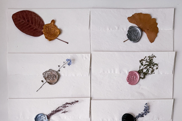
A monogrammed wax seal closing an invitation envelope carries a weight no printed return address ever could.
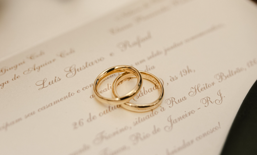
A discreet engraving inside two wedding bands turns a private object into a quiet record of the union.
A hand-embroidered detail on a linen napkin ages gracefully, gaining rather than losing character over time.
A cake server or a set of toasting glasses becomes a functional heirloom rather than a decorative one.
A well-considered custom wedding logo is, by definition, never limited to invitation scale alone.
It must also work small enough for a ring engraving and bold enough for a sign greeting arriving guests.
This range is what separates a genuine couple monogram commission from a sticker chosen out of a catalogue.
Couples are often surprised by how long the list of eventual applications grows once the mark itself is finished.
A composition originally intended only for invitations frequently ends up requested for far more personal objects.
A leather passport holder, a set of monogrammed robes, a piece of stationery used years into the marriage.
None of these requests are unusual; they are, in fact, the most common outcome of a properly built mark.
Once a couple has a symbol they trust, they tend to look for reasons to use it.
This is precisely the outcome the atelier designs toward from the very first sketch.
A mark built only for one surface will eventually disappoint a couple who wants to use it everywhere.
A mark built for versatility from the outset will meet that demand without requiring a single revision.
Some couples request a simplified variant of their monogram for the smallest digital applications.
This variant must still relate clearly to the primary mark, never feeling like a separate identity invented for convenience.
Maintaining that relationship across every scale is, in many ways, the quiet technical achievement behind a resolved monogram.
Architectural applications carry their own particular demands, quite distinct from anything printed on paper.
Stone and metal forgive far less than ink, and a design untested against these materials often fails quietly once installed.
This is why the atelier treats architectural application as a distinct discipline, not a simple resizing exercise.
2
Names distilled into a single, lasting composition
40+
Interlace variations typically explored per commission
100+
Years a well-engraved couple monogram can remain legible
1
Mark, built once, intended to serve a marriage for life
Built for Every Surface
A properly commissioned couple monogram performs at ring-engraving scale and welcome-sign scale without compromise.
Legacy & Family Heritage
The Couple Monogram in the American Household
Couples who commission a monogram in the United States often arrive with a different history than their European counterparts.
That history shapes the work in meaningful ways.
Rather than inheriting a mark across many centuries, many households are establishing one for the first time.
This often coincides with a wedding, a significant anniversary, or the founding of a shared enterprise.
This absence of an inherited starting point is not a limitation; it is, in many respects, a rare freedom.
A couple building their first mark can draw consciously on whichever traditions resonate most.
European heraldry, classical calligraphy, or a more contemporary interpretation of restraint are all available to them.
I find these commissions particularly rewarding, precisely because the resulting mark carries no obligation to any prior version.
It answers only to the couple’s own considered intentions.
Family-owned businesses across the country have long understood the value of a mark that signals permanence rather than trend.
A monogram applied to a family enterprise communicates continuity in a way a purely commercial logo rarely achieves.
It suggests the business is an extension of a household, not a venture built for quick exit.
This distinction matters enormously to couples who think in terms of decades rather than fiscal quarters.
Philanthropic culture, too, has long made use of discreet personal marks.
A monogram embossed onto correspondence accompanying a gift allows a couple’s identity to be present without becoming the center of attention.
This quality of quiet presence is, in many ways, the defining characteristic of the tradition as a whole.
Architectural applications carry particular weight, especially among couples restoring or building a shared home.
A monogram worked into a gate, a mantel, or a stair rail can root a newly built house in a sense of continuity it might otherwise lack.
Collections that preserve centuries of ceremonial personal marks demonstrate how much a paired cipher can encode without a single written word.
Viewing that record, whether in person or through scholarly documentation, offers a masterclass in restraint applied at the highest level of craft.
Even a couple with no centuries-old lineage can, through a thoughtfully designed monogram, begin building a visual legacy of their own.
This is, in the end, the promise every couple monogram ultimately offers, regardless of a family’s particular history.
It does not require an ancient lineage to justify its creation.
It requires only the intention to build something worth passing on.
The country’s regard for permanence, more broadly, is easy to overlook from the outside.
Families here tend to measure standing not by visible display but by how long an enterprise or a name has endured.
A couple monogram built for this sensibility rarely benefits from excessive flourish or ornamentation.
It benefits instead from a quiet confidence, the same quality that defines a well-run family business across generations.
Couples relocating from elsewhere often notice this cultural difference within their first year of planning together.
The atelier adjusts its recommendations accordingly, without ever imposing a single regional aesthetic on every commission.
A monogram commissioned in this spirit should feel native to its community without ever feeling provincial or dated.
Achieving that balance is, in many respects, the entire craft of designing for real people rather than an abstract audience.
On First Marks
A couple building their first monogram carries no obligation to any prior version, only to their own considered intentions.
On Quiet Presence
The most enduring couple monograms are present without demanding attention, closer to a signature than a slogan.
The Atelier Journal
Voices from the Atelier
Couples rarely describe a monogram commission in the language of graphic design.
They describe it, instead, in the language of memory and inheritance.
What follows are reflections offered after their own commissions were complete.
“We came in expecting a monogram for our invitations and left with something we now see engraved into everything we own together.
It has quietly become our household’s mark, on our correspondence and, this year, on a christening cup.”
— Margaret and Everett H., Newlyweds · Greenwich, Connecticut
“I come from a family of grain farmers, and I wanted our mark to feel like an extension of that history rather than a separate identity invented for one day.
What was designed for us honored both of our families without contradiction, and it has aged better than anything I could have chosen quickly.”
— A Groom, Napa Valley, California
“What struck me most was the restraint in the process itself; every proposal felt considered rather than decorative.
Our monogram took several months, and every one of those months is visible in the precision of the final result.”
— The Delacroix Family, Charleston, South Carolina
“Our mark now appears on things I never imagined it would, from my husband’s cufflinks to our front door’s brass knocker.
Guests frequently assume it has existed for generations, which is exactly the quiet permanence we hoped for.”
— Adaeze O., Physician · Aspen, Colorado
Beyond the Wedding Day
Couples consistently report using their commissioned mark for decades after the ceremony, far beyond its original stationery purpose.
Luxury Identity
The Couple Monogram as Luxury Identity
Luxury identity, at its most refined, rarely announces itself through logos in the conventional sense.
The most enduring names in fine craft and hospitality have long favored symbols that reward proximity over symbols that demand attention.
A couple monogram fits naturally within this philosophy, precisely because its legibility increases the closer one looks.
This is the opposite operating principle of most contemporary branding, which is built to be understood instantly from a distance.
A monogram asks something different of its audience: patience, and a willingness to look twice.
For a couple building a shared identity, this quality can function as a quiet filter.
Those who take the time to notice the interlace tend to be precisely the people such a mark hopes to reach.
This is not exclusivity for its own sake, but a form of honest signaling about the values the mark represents.
A monogram communicates craftsmanship through its own construction, before a single word of explanation is ever offered.
Societies devoted to the study and preservation of heraldic tradition continue to document how carefully personal marks were once recorded and interpreted.
Their records reach back generations and remain a living reference rather than a historical curiosity.
The answer to keeping a mark from feeling stale lies almost entirely in the discipline exercised during the original design.
A monogram built on classical proportion, rather than a fashionable typographic trend, does not require the periodic refresh many contemporary logos eventually need.
This is a meaningful advantage for any couple seeking a mark that will represent them for a decade or longer.
Application consistency matters as much as the design of the monogram itself.
A shared identity built around a monogram should apply that mark with the same restraint across every surface.
Overuse dilutes the very quality that made the monogram distinctive in the first place.
I generally counsel couples toward fewer, more deliberate placements rather than saturating every available surface.
A mark that appears everywhere quickly loses the sense of quiet significance that made it worth commissioning at all.
This principle of restraint extends to color as well.
The most successful couple monograms rely on a limited palette, often no more than two tones, applied with total consistency.
This discipline is not a limitation; it is precisely what allows the mark to feel timeless rather than tied to a particular era’s color trends.
A monogram, treated with this level of care, becomes an asset that compounds in meaning the longer it is used correctly.
Couples building a professional identity around a shared mark often ask how to avoid it feeling stale over time.
An attorney, a physician, a restaurateur, or a founding pair each faces the same underlying question of endurance.
The answer, in every case, lies in the restraint exercised during the original composition rather than in any later refresh.
A mark that never chased a trend has no trend to outlive, and so it simply continues to feel correct.
On Application
A couple monogram that appears everywhere quickly loses the quiet significance that made it worth commissioning at all.
A couple monogram is content to be understood eventually, by those willing to look closely enough to earn the recognition.
The Atelier Journal
Craftsmanship, Restraint, and the Discipline of Less
Craftsmanship, in the context of couple monogram design, is ultimately a discipline of subtraction.
Every commission begins with more possibilities than the final design will ever contain.