
The Custom Family Monogram: A Timeless Family Mark
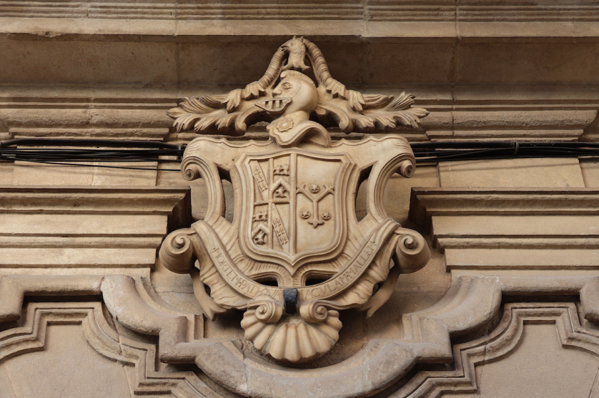
The Custom Family Monogram: A Name Made Heirloom
The Art of Monograms
A Mark Built to Be Inherited
A custom family monogram is not an ornament applied to a household after the fact.
It is the household distilled, rendered in a form quiet enough to last generations.
Long before logos became commonplace, the most enduring marks of distinction belonged not to companies, but to families.
A surname carries history that a single signature can never quite hold on its own.
A custom family monogram exists to give that history a visible, lasting shape.
It is not chosen from a gallery of ready-made letter arrangements.
It is composed, letter by letter, until it feels less designed than remembered.
This distinction sounds subtle until two marks are placed side by side.
One feels assembled, however competently, from parts that happen to fit.
The other feels inevitable, as though no other arrangement of those letters was ever possible.
Families rarely arrive able to name this difference in advance.
They arrive, instead, with a sense that a family name deserves more consideration than it has yet received.
A custom family monogram answers that instinct directly, without requiring the family to explain it in technical terms.
The work of this atelier is to draw the answer already latent in the letters, rather than to invent one from outside.
This is a modest ambition on its surface, and a demanding one in practice.
Most identity work today is optimized for speed, and permanence is quietly sacrificed to it.
A custom family monogram inverts that priority at every stage of its making.
It favors depth over velocity, and restraint over the reflex to add.
What follows is an account of why that inversion still matters, and how it is achieved.
It is not a tutorial, because a mark of this weight is never assembled from a set of instructions.
It is closer to an editorial reflection on a discipline older than the modern idea of branding itself.
Readers need not be commissioning anything at all to find value in what follows here.
Some arrive simply curious why a monogram still commands quiet authority in a crowded visual world.
Others arrive already certain they wish to commission a mark for their own family.
Both are welcome in equal measure, and both will meet the same underlying argument throughout.
A family name, rendered with care, is closer to an heirloom than to an asset.
That is the premise from which every custom family monogram at this atelier begins.
Royal Traditions
The Long Lineage of the Family Mark
The custom family monogram did not begin in a design studio; it began on seals, coins, and cornerstones.
Ancient households pressed their initials into wax and metal long before anyone called the practice identity design.
The letterform was chosen because it could be recognized instantly, even by those who could not read a word of text.
Medieval scribes carried this instinct further, weaving family initials into manuscripts as marks of authorship and ownership.
By the Renaissance, merchant families had adopted personal marks to authenticate goods traveling unfamiliar and dangerous routes.
A monogram, in that era, functioned as both signature and guarantee of a family’s word.
European courts refined the practice into a formal visual grammar, governed by proportion rather than passing whim.
Institutions devoted to the study of that grammar continue to document its precedents in remarkable detail today.
Records preserved by an organization devoted to the study of this formal design language trace how personal marks were once granted, governed, and inherited.
Royal monograms in particular were treated as instruments of governance, appearing on currency and state seals alike.
This heritage is the quiet foundation beneath every custom family monogram produced in the present day.
Few families arrive aware of this lineage, though nearly all recognize it once it has been described to them.
The instinct to compress a family’s identity into a single mark is, in this sense, far older than any client.
It is a human instinct, not a marketing invention arriving with the twentieth century.
The holdings maintained by the collections assembled by Europe’s royal households across centuries preserve extraordinary examples of family marks applied to silver, porcelain, and architecture.
Viewing that history closely offers a masterclass in restraint applied at the very highest level of craft.
Antiquity
Households stamped personal initials into coins, seals, and ceramics as early instruments of recognition and ownership.
Medieval Europe
Scribes and noble houses wove family initials into manuscripts and seals, binding identity to lineage and craftsmanship.
The Renaissance
Merchant families and monarchs alike adopted refined personal marks to authenticate goods and private correspondence.
Georgian & Victorian Eras
The family monogram became a fixture of established households, engraved onto silver, linen, and stationery.
Twentieth Century
Enduring luxury houses translated the family mark into the very foundation of brand identity itself.
Present Day
The custom family monogram re-emerges as a considered inheritance for families across every region and profession.
Each era refined the same underlying principle, namely that a name distilled into letters can carry authority across generations.
A design unaware of this lineage tends to feel merely fashionable rather than genuinely founded.
A design composed with awareness of it tends to feel inevitable, as though it could not have been arranged any other way.
This is precisely why the atelier studies precedent before beginning any new custom family monogram.
History, treated this way, is not ornamental context; it is a working design tool applied to every commission.
On Lineage
A family mark composed without awareness of its own history tends to repeat mistakes long since resolved by earlier craftsmen.
Luxury Identity
What Sets a Custom Family Monogram Apart
The word custom is used loosely across the design world, often without much justification behind it.
A typeface selected from a menu of presets is not a custom family monogram, regardless of how it is marketed.
Custom work, properly understood, means built from first principles for one specific family and its history.
That distinction matters more than most families initially assume when they begin searching for a mark.
A generic monogram generator applies the same underlying logic to every set of initials it is given.
It cannot account for the particular geometry of a family’s letters, only an approximation of them.
It cannot account for the story a family wants the mark to carry, because it was never told one.
A custom family monogram begins from the opposite direction entirely, starting with conversation rather than a template.
The letters are studied individually before they are ever combined into a single composition.
Some pairings interlace naturally, while others require considerable adjustment to read cleanly at every scale.
A skilled hand recognizes which letters resist combination and compensates through proportion and spacing.
This is largely invisible work, in the sense that a family rarely sees the discarded attempts.
They see only the final resolution, which is precisely the intended outcome of the entire process.
A closer study of the difference between a truly personalized monogram and a generic alternative only deepens this same argument.
The comparison below outlines what separates these two approaches in practical, observable terms.
| Consideration | Custom Family Monogram | Generic Template |
|---|---|---|
| Origin | Composed individually for one family and its history | Applied identically to any name entered |
| Letterform testing | Tested across scale, material, and application | Rarely tested beyond a single preview screen |
| Exclusivity | Unique to a single family and its descendants | Available to any purchaser at any time |
| Symbolic depth | Reflects a specific family narrative and values | Carries no narrative beyond the letters shown |
| Longevity | Designed to be inherited across generations | Designed to be replaced within a few seasons |
The table above is not a judgment on convenience; it is simply a description of two different intentions.
A custom family monogram is commissioned by those for whom convenience was never the primary objective.
It is commissioned, instead, by those seeking a mark worth inheriting rather than a mark worth using briefly.
This is the same logic that has always separated fine bespoke tailoring from ready-to-wear clothing.
The finished garment may look similar from a distance, yet up close the difference is unmistakable.
A custom family monogram operates under this exact principle, applied to identity rather than to fabric.
In communities where legacy is valued as deeply as innovation, identity often extends beyond a name. It becomes a symbol capable of representing a family for generations.
The Art of Monograms
The Anatomy of a Family Composition
Beneath the surface of any custom family monogram lies a set of principles rarely discussed outside the atelier.
These principles are not stylistic preferences; they are structural requirements for a mark meant to endure.
Letterform selection determines whether initials feel timeless or merely fashionable within a narrow window.
Proportion determines whether a composition feels resolved or simply assembled from adjacent parts.
Negative space is treated as an active design element rather than empty background around the letters.
Scalability determines whether a mark performs equally well on a signet ring and on a building facade.
Each of these elements is considered independently before they are ever combined into a single mark.
A classic monogram draws on proportions established over centuries, without ever feeling old-fashioned or dated.
The overview below outlines how each principle functions within a completed family commission.
Letterform
Typographic choices are drawn from traditions deep enough to carry genuine authority rather than passing style.
Proportion
Initials are weighted so the most significant letter anchors the composition without ever announcing itself.
Negative Space
The space within and around each letter is composed with the same intention as the letters themselves.
Hierarchy
When several family initials combine, one is permitted to lead without ever dominating its neighbors.
Interlace
The manner in which the letters join one another is often the single most defining decision in the mark.
Scalability
A finished mark is tested from the scale of a cufflink to the scale of an architectural detail.
When these elements align, a custom family monogram becomes legible in a single glance rather than a studied read.
That immediacy is the quiet signature of a mark that has been properly resolved from the outset.
A mark that skips any one of these principles tends to fail quietly, over years, rather than immediately.
This is why the atelier treats all six as inseparable requirements rather than optional considerations.
For families who eventually wish to formalize their initials within a shield, the same rigor governs every monogram crest commission the atelier undertakes.
On Scale
A mark tested only at one size has not yet been tested at all; a true family monogram performs everywhere it appears.
On the Classic Monogram
A classic monogram is not a period costume; it is a set of proportions that have simply refused to go out of date.
Legacy & Family Heritage
The Custom Family Monogram and the Question of Inheritance
A family crest and a custom family monogram are close relations, though they are not strictly identical.
A crest typically encodes lineage across generations, governed by formal heraldic convention and precedent.
A custom family monogram typically encodes a household through its initials, gathering meaning as it is passed down.
The distinction matters less than the intention behind it, which remains consistent across both forms.
Both exist to answer the same quiet question, namely what will remain once the original owners are gone.
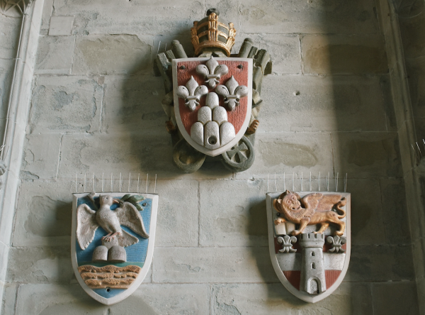
Families who commission this work rarely think only of the present occasion prompting the conversation.
They think, more often, of a grandchild encountering the same mark decades from now, without any context.
A monogram intended to function this way must be built with unusual restraint from its earliest sketch.
Trend-driven ornamentation dates a mark quickly, while considered proportion does not date at all.
This is why the atelier resists fashionable flourishes in favor of quieter, structural decisions.
The process typically begins with a conversation about what the family actually wishes to preserve.
Sometimes it is a surname threatened by the ordinary erosions of time, distance, or marriage.
Sometimes it is a set of values the family has long associated with its own name and standing.
Sometimes it is simply the wish to mark a particular moment worth remembering with formal weight.
Whatever the motivation, the resulting mark is built to be inherited rather than merely used for a season.
The atelier follows a disciplined sequence for every family commission, refined across more than a decade of practice.
1
Listen
A private conversation establishes the family’s history, values, and the occasions the mark will serve.
2
Explore
Multiple letterform directions are drawn by hand, tested, and narrowed before any is presented.
3
Refine
The chosen direction is refined for proportion, negative space, and balance across every scale.
4
Validate
The mark is tested from stationery to signage, confirming it holds at every size and material.
5
Deliver
The completed family monogram is delivered with guidance for its consistent, lasting use.
Each stage exists to remove uncertainty before a family ever commits to a single final direction.
By the time delivery occurs, the outcome rarely feels like a surprise to the family receiving it.
It feels, instead, like confirmation of something the family already sensed was correct from the beginning.
A truly enduring family mark rewards a second look, and a third, across an entire lifetime of use.
It becomes, in time, something closer to a private language than to a graphic applied to paper.
On the Family Emblem
A family emblem differs from an individual monogram chiefly in its intended audience, namely the generations not yet born.
Legacy & Family Heritage
The Custom Family Monogram in the American Household
American families who commission a custom family monogram often arrive with a different history than their European counterparts.
That history shapes the work in meaningful and frequently rewarding ways.
Rather than inheriting a mark across many centuries, many American households are establishing one for the very first time.
This often coincides with a wedding, a significant anniversary, or the founding of a family enterprise.
This absence of an inherited starting point is not a limitation; it is, in many respects, a rare freedom.
A family building its first mark can draw consciously on whichever traditions resonate most with its own story.
Whether European heraldry, classical calligraphy, or a more contemporary interpretation of restraint, the choice belongs to the family alone.
I find these commissions particularly rewarding, precisely because the resulting mark carries no obligation to any prior version.
It owes its integrity only to the family’s own considered intentions, and to nothing borrowed carelessly.
Family-owned businesses across the United States have long understood the value of a mark that signals permanence rather than trend.
A monogram applied to a family enterprise communicates continuity in a way a purely commercial logo rarely achieves.
It suggests the business is an extension of a household, not a venture built merely for a quick exit.
This distinction matters enormously to families who think in terms of decades rather than fiscal quarters.
Philanthropic culture, too, has long made use of discreet personal marks, particularly among families who prefer their giving to remain understated.
A monogram engraved into a modest plaque, or embossed onto correspondence accompanying a gift, allows a family’s identity to be present without becoming the center of attention.
This quality of quiet presence is, in many ways, the defining characteristic of the family monogram tradition as a whole.
Architectural applications also carry particular weight, especially among families restoring or building homes intended to remain in the family.
A monogram worked into a gate, a mantel, or a stair rail can root a newly built home in a sense of continuity it might otherwise lack.
Even a family with no centuries-old lineage can, through a thoughtfully designed monogram, begin building a visual legacy that future generations will inherit and extend.
This is, in the end, the promise every custom family monogram ultimately offers, regardless of a family’s particular history or geography.
It does not require an ancient lineage to justify its creation.
It requires only the intention to build something genuinely worth passing on.
On First Marks
A family building its first monogram carries no obligation to any prior version, only to its own considered intentions.
Royal Traditions
Royal Precedent and the Ceremonial Family Mark
No account of the custom family monogram is complete without acknowledging its royal and ceremonial origins.
European monarchs were among the first to formalize personal initials into instruments of governance and continuity.
A royal cipher appeared on currency, on state seals, and on the correspondence of an entire court.
These marks were never merely decorative; they functioned as legal and symbolic instruments of authority.
Records held by the heraldic authority responsible for granting personal arms in England continue to formalize this tradition under long-established law.
Their archives reveal how carefully proportion, symmetry, and hierarchy were once governed by formal convention.
A royal monogram was rarely the work of a single hand; it was refined across successive reigns.
This iterative refinement is part of why these marks still feel authoritative many centuries later.
Contemporary family commissions borrow directly from this discipline, even when the family is not descended from nobility.
The same principles of proportion and restraint apply equally to a family, a practice, or a private individual.
What differs is the scale of consequence, not the underlying rigor of the process itself.
A modern family does not require the historical weight of a crown to deserve this level of care.
It requires only a name worth treating with the same seriousness a court once applied to its own.
Royal households also understood the family mark as a tool of continuity across generations.
A family’s core letterforms might persist even as individual members added or altered small details in their own time.
This layered approach to identity, honoring the past while making room for the present, offers a useful model for families today.
A monogram commissioned for a contemporary household can draw on ancestral initials while reflecting the individuals who currently carry the name.
The result is a mark that feels inherited rather than invented, even when it is created entirely anew.
It is worth noting that royal monograms were rarely designed in isolation from the broader visual culture of their time.
Architecture, textiles, and ceremonial objects all echoed the same proportions found in a court’s chosen mark.
This coherence across mediums is part of what gave these marks their lasting sense of authority.
The same lesson applies directly to a contemporary custom family monogram commission of any scale.
A mark used consistently across every application will always read as more authoritative than one used sporadically.
On Provenance
A family monogram inspired by royal tradition deserves genuine study, not merely the surface borrowing of its appearance.
The Atelier Journal
Craftsmanship, Restraint, and the Discipline of Less
Craftsmanship, in the context of family monogram design, is ultimately a discipline of subtraction.
Every commission begins with more possibilities than the final design will ever contain.
The work of the atelier is not to add complexity, but to identify which single arrangement carries the intended meaning most clearly.
This is a philosophy borrowed, in part, from classical architecture and calligraphy alike.
Both traditions are built on the conviction that proportion communicates more powerfully than ornament.
A well-trained eye can sense when a monogram has one stroke too many, even without articulating precisely why.
Developing that eye takes years, and I continue to refine my own through constant study of historical examples.
Restraint, however, should never be mistaken for simplicity in the dismissive sense of the word.
A restrained monogram is often the product of far more decisions than an elaborate one.
Every element that survives the editing process has been tested against its own removal.
This is slower work, and it resists the shortcuts that faster design methods often rely upon.
Families occasionally arrive expecting a rapid turnaround, having encountered template-based monogram tools elsewhere.
Explaining the difference between an automated arrangement of letters and a genuinely composed family mark is one of the most important conversations I have at the outset.
The two are not competing products; they serve entirely different purposes and entirely different expectations of permanence.
A monogram intended to last across generations cannot be generated in minutes, regardless of how sophisticated the underlying software might be.
It requires the accumulated judgment of a trained hand, weighing decisions a computer cannot yet make with genuine discernment.
This is not a criticism of technology broadly; digital tools play an essential role throughout my own process.
The judgment applied to those tools, however, remains entirely human, shaped by years of study and observation.
I often tell families that a monogram is finished not when nothing more could be added, but when nothing more could be removed without loss.
3–5
Design directions explored for every family commission before one is finally chosen
40+
Interlace variations typically considered during the exploration stage
100+
Years a well-proportioned family mark can remain legible on engraved silver
1
Mark, built once, intended to serve a family for generations to come
These figures describe restraint rather than scale, which is precisely the underlying point of the exercise.
A custom family monogram, like true luxury, is not measured by how frequently it changes over time.
It is measured, instead, by how rarely it ever needs to change at all.
A monogram is finished not when nothing more could be added, but when nothing more could be removed without loss.
The Atelier Journal
Material, Scale, and the Life of the Mark
Contemporary production methods have expanded what a custom family monogram can achieve without altering the discipline required to design one well.
Engraving, embroidery, laser cutting, and fine printing each interpret a monogram’s lines slightly differently.
A well-prepared design anticipates these differences from the very outset rather than discovering them late.
I prepare every finished family monogram across multiple technical formats, ensuring the mark performs with equal precision whether cut into stone or stitched into linen.
This preparation is invisible to the family in the final product, yet it determines whether a mark ages gracefully across decades of varied use.
A monogram intended for a signet ring must remain legible at a scale smaller than a fingernail.
This places real constraints on stroke thickness and on the negative space between letters.
The same monogram, enlarged for an architectural gate, must instead account for viewing distance and appropriate visual weight.
Reconciling these competing demands within a single coherent design is one of the more technically demanding aspects of the atelier’s work.
Color, too, carries meaning within the older visual traditions from which this discipline descends.
Gold has long signified generosity, silver has signified peace, and deep blue has signified loyalty carried across generations.
A family monogram may draw quietly on this vocabulary, even when its primary content is a set of initials rather than a pictorial charge.
The holdings of one of the world’s great encyclopedic museums of decorative and applied art preserve silverwork, textiles, and personal seals that reveal how seriously earlier generations treated the visual signature of a family.
These objects were rarely anonymous; they were commissioned, considered, and passed down with the same care given to jewelry.
Examining that history closely reveals how rarely the most enduring marks relied on visual abundance to communicate authority.
They relied instead on consistency, on proportion, and on a willingness to leave well-resolved work alone.
Restraint tends to serve a family monogram well in exactly this respect.
Gradients and overly ornamental transitions rarely age gracefully, particularly once a mark is engraved or embroidered rather than printed.
A flat, confident color choice, applied consistently, will almost always outperform a more elaborate palette over time.
Material honesty matters throughout; a monogram should be designed for how it will actually be produced, not only for how it appears on a screen.
This principle extends to paper stock, thread weight, and even the finish of a wax seal pressed onto correspondence.
A fine line that reads beautifully in digital form may disappear entirely once engraved into silver.
This is why material testing belongs inside the design process itself, not as an afterthought once a concept has already been approved.
Longevity, in the end, is not only about the concept behind a family monogram.
It is also about whether the mark was built to survive the many physical forms it will eventually take.
A beautiful monogram that fails to reproduce cleanly at a smaller scale has not truly succeeded at its purpose.
Preparing a mark to endure that kind of timeline requires thinking well beyond the immediate application in front of a family today.
This is why the atelier treats file preparation and material testing with the same seriousness as the original design work itself.
On Preparation
A beautiful family monogram that fails to reproduce cleanly at a smaller scale has not truly succeeded at its purpose.
On Color
A flat, confident palette, applied consistently, almost always outlasts a more elaborate one once a mark is engraved or embroidered.
Luxury Identity
Where a Custom Family Monogram Lives
A finished custom family monogram is expected to perform across a wide range of contexts and materials.
It may appear on personal stationery one day and on a storefront facade the very next.
It may be engraved into silver, embossed into leather, or rendered as a small digital favicon.
Each of these contexts places different demands on legibility, weight, and overall proportion.
A mark that only works at one scale has not yet been fully resolved by its designer.
The atelier tests every commission across the applications most relevant to a given family’s actual life.
This testing phase is rarely visible to the family, though its absence would be immediately obvious.
A mark that blurs at small sizes or feels sparse at large ones has failed a basic requirement.
Basic requirements of this kind are non-negotiable, regardless of how elegant a design appears on a single screen.
Some families require only a handful of applications; others require dozens across an entire enterprise.
A private household may need the mark only for stationery and a small collection of personal objects.
A family business may need it across signage, packaging, and a complete digital presence.
Both cases receive the same underlying rigor, adjusted only in scope rather than in standard.
The most successful family marks I have designed rely on a limited palette, often no more than two tones.
This discipline is not a limitation; it is precisely what allows the mark to feel timeless rather than tied to a particular era.
The progress below reflects how deliberately each quality is weighted within a resolved family commission.
Structural Interlace95%
Historical Fidelity90%
Cross-Material Consistency92%
Restraint in Application97%
Application consistency matters as much as the design of the monogram itself.
A family identity built around a monogram should apply that mark with the same restraint across every surface.
Overuse dilutes the very quality that made the mark distinctive in the first place.
I generally counsel families toward fewer, more deliberate placements rather than saturating every available surface.
A monogram that appears everywhere quickly loses the sense of quiet significance that made it worth commissioning at all.
On Application
A family monogram used sparingly retains an authority that the same mark, scattered across every surface, quietly surrenders.
On Materials
The right material does not merely display a family monogram; it participates in how the mark ages and is remembered.
Bespoke Weddings
When a Family Monogram Begins at a Wedding
A wedding remains one of the most meaningful occasions for commissioning a custom family monogram.
Two family names are, quite literally, being asked to become one visual form.
This is a design challenge unlike any other in the atelier’s practice, because it must honor two separate histories at once.
The technical question of interlace becomes, in a wedding commission, also a question of balance between families.
Neither partner’s initial should visually dominate the other, regardless of alphabetical order or personal preference.
Achieving this balance requires careful attention to stroke weight, letter height, and the negative space each initial occupies.
Many couples come to this process assuming their monogram will only ever appear on their wedding invitation.
In practice, a well-designed wedding monogram tends to accompany a couple for decades, appearing on anniversary gifts and home linens.
Eventually it becomes family stationery passed to their own children, long after the celebration itself has ended.
This long horizon is why I discourage overly trend-driven choices during the wedding commission process.
A monogram chosen to feel current at the moment of a wedding often feels dated within a single decade.
A monogram chosen for enduring proportion tends to feel just as appropriate at a fiftieth anniversary as it did on the wedding day.
Couples frequently ask how their new mark should relate to any existing family monograms on either side.
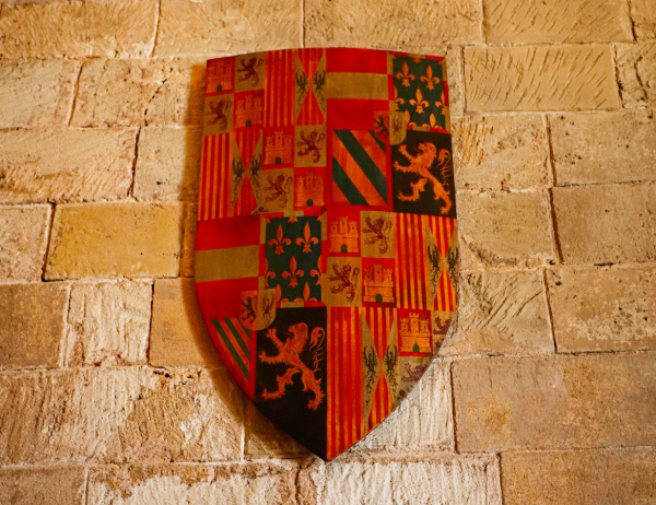
There is no single correct answer, though most successful wedding marks draw quiet inspiration from both families rather than replacing either lineage.
A subtle nod to a grandmother’s engraved silver, or a father’s signet ring, can be woven into the new mark without overwhelming it.
Couples drawn to a fuller heraldic treatment of this same union often find a natural home in the wedding crest tradition instead.
This kind of layered reference rewards close attention from those who know the families well, while remaining simply elegant to everyone else.
A wedding monogram is, in many respects, the first shared symbol a couple will ever commission together.
It deserves the same patience and precision the atelier brings to any heritage commission, because for the couple receiving it, the significance is every bit as great.
On Balance
In a wedding monogram, neither family’s initial should outrank the other; the composition is a quiet act of diplomacy.
The Atelier Journal
Voices from the Atelier
Families rarely describe a custom family monogram commission in the language of graphic design.
They describe it, instead, in the language of memory, inheritance, and quiet recognition.
The reflections below are drawn from families who have commissioned this particular work.
Names have been abbreviated throughout, to preserve the privacy each family is rightfully owed.
“Working with the atelier felt less like commissioning a graphic and more like being interviewed for a small piece of our family history worth preserving. The mark now sits on our stationery and, quietly, on my father’s old signet ring, which we had re-engraved to match.”
The Halloran Family · Boston, Massachusetts
“What struck me most was the restraint in the process itself; every proposal felt considered rather than decorative. Our commission took several months, and every one of those months is visible in the precision of the final result.”
The Whitfield Family · Charleston, South Carolina
“I did not expect a monogram commission to involve this much genuine conversation about our family’s history, but it shaped the entire design. The mark now sits above our front gate, and it has already prompted conversations with neighbors about its meaning.”
The Delacroix Family · New Orleans, Louisiana
“As a family that runs a small vineyard, we needed a mark that felt inherited rather than invented for marketing purposes. The monogram the atelier designed achieves exactly that; guests frequently assume it has existed for generations.”
The Alden Family · Napa Valley, California