The Monogram Crest: Where Letterform Meets Lineage
THE ART OF MONOGRAMS
The Monogram Crest: Where Letterform Meets Lineage
A monogram crest occupies a particular kind of middle distance.
It is not a pure initial, resolved only in letterform, and it is not a pure escutcheon, built only from pictorial charges.
It is both at once, and the discipline lies entirely in how the two are made to agree.
Where a classic monogram speaks in the private language of initials, a crest monogram borrows the grammar of heraldry to say something more permanent.
It suggests a household rather than a single signature, a lineage rather than a season.
This is why families drawn to the form rarely arrive asking for decoration.
They arrive asking for a way to hold two truths at once: their own initials, and something that will outlast the person who commissioned it.
What follows is not a tutorial on fonts or shield shapes.
It is an account of why this particular hybrid endures, and what it asks of the family who chooses to commission one.
A monogram is intimate by design, legible to anyone who already knows the name behind it.
A crest is public by design, built to be read by strangers across a room or a generation.
The monogram crest asks both registers to occupy the same small composition without either one overwhelming the other.
That balance is not achieved by combining the two forms carelessly.
It is achieved by understanding, in some depth, what each form was originally built to do.
A family rarely commissions this hybrid on impulse.
The decision tends to follow a period of reflection about what the family actually wants a mark to accomplish.
Some arrive having already commissioned a personal monogram years earlier, and find it no longer speaks for the household they have since become.
Others arrive with a documented history rich enough to justify a full family crest, yet still want their own initials legible somewhere within it.
The monogram crest resolves both situations at once, without asking either concern to be set aside.
It is worth saying plainly that this form is not simply a more elaborate monogram.
It is a distinct discipline, governed by its own proportions, its own restraint, and its own standard of historical accuracy.
Treating it as decoration, rather than as a considered synthesis of two older traditions, tends to produce marks that feel busy rather than authoritative.
The atelier’s approach begins from the opposite assumption: that the fewer decisions made, the more convincingly the mark will read.
Every subsequent section of this account returns to that same premise in a different form.
THE ART OF MONOGRAMS
What a Monogram Crest Actually Is
A monogram crest is, at its simplest, a set of initials composed within the formal structure of a shield.
The initials carry the intimacy of a classic monogram, while the shield carries the discipline of heraldic tradition.
Neither element is decorative in the finished design.
The shield is not a frame borrowed for visual interest; it is the compositional field that governs every other decision.
The letters are not simply centered within that field and left alone.
They are drawn to correspond with the shield’s proportions, so the whole composition reads as a single considered mark rather than two ideas placed side by side.
This is a much harder discipline than it sounds.
A shield built for pictorial charges does not naturally accommodate the negative space a letterform requires to remain legible.
Reconciling the two takes a design vocabulary most monogram work never needs to develop.
A family commissioning a monogram crest is usually choosing it for a specific reason.
They want the personal register of initials, but they also want the composition to feel inherited rather than invented.
A pure monogram, however elegant, reads as belonging to an individual moment in a family’s history.
A monogram crest reads as belonging to the family itself, independent of who currently carries the initials.
This distinction matters more than it may first appear.
An individual’s monogram can retire gracefully when that individual is no longer the primary bearer of the name.
A family’s monogram crest does not retire in the same way, because it was never built around a single person to begin with.
It was built around a set of initials understood to belong to a lineage, carried differently by each generation that inherits it.
This is also why the monogram crest sits at a slightly different register than a purely decorative cipher.
A cipher is judged almost entirely on its visual interlace, on how gracefully the letters resolve into one another.
A monogram crest is judged on that same visual discipline, but also on whether the shield around it earns its formal claim.
A poorly proportioned shield undermines the letters inside it just as surely as poorly drawn letters undermine the shield.
The finished mark succeeds only when both halves are treated with equal seriousness.
There is also a practical dimension to this distinction that families discover only after living with the mark for some time.
A monogram crest applied to a signet ring must remain legible at a scale far smaller than the one at which it was first designed.
The same composition, applied later to a study door or a piece of architecture, must scale upward without losing its original proportion.
Very few marks are asked to perform across that entire range, from a fingernail-sized engraving to a door-sized application.
This is precisely why the shield’s internal geometry is resolved with such care before any final approval is given.
A composition that only works at one scale has not actually been resolved, regardless of how attractive it appears in a single presentation.
The atelier tests every proposed monogram crest across several scales before a family is asked to make a final decision.
This testing is not a formality; it frequently reveals weaknesses that are invisible in a single static rendering.
A letterform that reads clearly on a full page can blur into illegibility once reduced to the size of a cufflink.
Catching that failure early, before a mark reaches production, is one of the quieter disciplines this work requires.
Families rarely see this stage of the process, yet it shapes the final composition as much as any single creative decision.
A DUAL GRAMMAR
The monogram crest must satisfy the rules of letterform and the rules of heraldry at once.
NOT A HYBRID FOR ITS OWN SAKE
The form exists because some families need both intimacy and permanence in a single mark.
BUILT FOR INHERITANCE
Unlike a personal monogram, the mark is designed to be carried by more than one bearer of the initials.
ROYAL TRADITIONS
Origins: Where Heraldry Meets the Initial
The shield did not originate as a decorative device.
It began on medieval battlefields, where a knight in full armor needed a mark that could be recognized from a distance.
Colors, charges, and divisions of the field were codified precisely so that no two houses could claim the same combination.
The institution long responsible for granting and recording these armorial bearings still maintains that principle of exclusivity today.
the institution long responsible for granting and recording armorial bearings still maintains that principle of exclusivity today.
That discipline of uniqueness is one of the reasons heraldic grammar has endured so far past its original battlefield purpose.
A system built to prevent confusion in combat proved equally useful centuries later, once armor gave way to correspondence and architecture.
The initial, meanwhile, followed an entirely separate lineage.
Personal ciphers appear in Roman signet rings, in Byzantine imperial seals, and later in the illuminated manuscripts of medieval scriptoria.
For most of that history, the initial and the shield had little reason to meet.
A monk’s cipher decorated a manuscript; a knight’s shield identified him in battle.
The two traditions converged gradually, as literacy spread and as families with growing wealth wanted a mark that carried both a name and a formal claim to standing.
By the time monograms migrated from manuscripts to silver, linen, and stationery, the shield had already become a widely understood symbol of formal identity.
Combining the two was a natural, if technically demanding, next step.
A family that had already been granted arms could now render its initials within that same formal field, producing a mark that spoke in two languages at once.
The result was neither purely personal nor purely institutional.
It was something closer to a signature written in the grammar of an institution.
Families exploring their own history often discover this convergence firsthand in a family crest commission, where documented lineage and personal initials are asked to occupy the same shield.
The discipline required to do this correctly has changed remarkably little since its earliest examples.
Marshals of arms in earlier centuries were employed for the specific purpose of preventing two families from adopting an identical combination of charges and colors.
That same care, applied today to a combination of shield and initials, prevents a new monogram crest from ever resembling one already in use elsewhere.
It is a smaller concern for a private commission than it once was for a noble house, but it is not an irrelevant one.
A mark that too closely resembles another family’s identity undermines the very specificity a monogram crest is meant to provide.
This is one of the quieter reasons original research matters so much at the earliest stage of a commission.
A designer unfamiliar with existing heraldic precedent risks producing a composition that merely echoes something already established elsewhere.
A designer who has studied that precedent closely can instead produce something that respects the tradition while remaining entirely the family’s own.
The historical convergence between initial and shield also explains why certain shield shapes feel more suited to letterforms than others.
A pointed, narrow shield leaves little lateral room for a wide initial, while a rounded or oval field accommodates a broader letterform more comfortably.
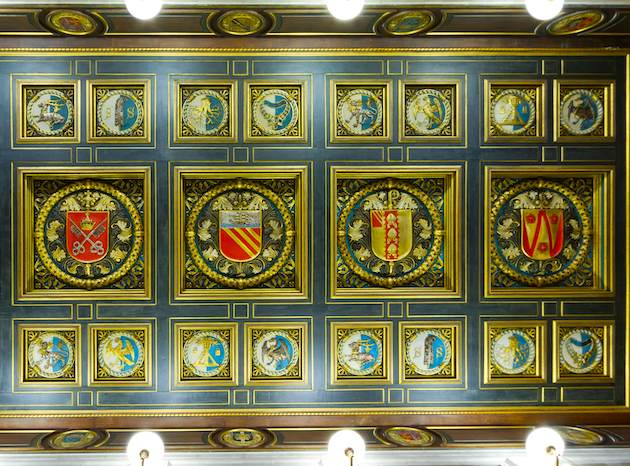
Choosing the shield’s outer shape is, in this sense, already a decision about which letters it will eventually need to hold.
This is rarely obvious to a family at the outset of a commission, since the two decisions feel separate until they are tested together.
It becomes obvious very quickly once the first sketches are drawn, and it is precisely why the two elements are developed in tandem rather than in sequence.
This is also why a monogram crest commission rarely benefits from rushing directly to a preferred shield shape before the letters themselves have been drafted.
The two decisions inform each other, and treating them separately tends to produce a composition that feels assembled rather than composed.
THE ART OF MONOGRAMS
The Anatomy of a Monogram Crest
A monogram crest is built from a small number of interdependent elements.
The shield, or field, establishes the outer boundary within which every other decision is made.
Its proportions are chosen first, since a stretched or compressed shield will distort every letterform placed inside it.
Within that field, the initials are drawn specifically for the composition rather than borrowed from an existing typeface.
A typeface designed for a page rarely survives the compression a shield’s interior demands.
Letters must be redrawn, often stroke by stroke, until they resolve comfortably within the available space.
Tincture, the formal term for color, is applied with the same restraint heraldry has always demanded.
A field crowded with color competes with the letters it is meant to support.
The most successful monogram crests tend to use one or two tinctures at most, reserving additional color for a supporting motto or border where one is included.
A motto, when present, occupies a scroll beneath or around the shield and is treated as a secondary element rather than a competing focal point.
Its role is to add a sentence’s worth of meaning without pulling attention away from the primary composition.
Some families choose to omit the motto entirely, judging that the initials and shield already say enough on their own.
That omission is a legitimate design decision, not an incomplete one.
Restraint, in this form as in most luxury design, is rarely a compromise.
It is usually the clearest sign that a composition has been resolved correctly.
The negative space surrounding the letters deserves the same attention as the letters themselves.
In a shield of modest size, the space between a letter’s strokes and the shield’s border carries almost as much visual weight as the strokes it surrounds.
Too little space and the composition feels cramped; too much and the letters lose their anchoring relationship to the field around them.
Finding the correct balance is closer to an exercise in proportion than an exercise in decoration.
The border of the shield itself, whether rendered as a simple outline or left implied by the tincture alone, is another decision made with restraint in mind.
A heavy, ornamented border tends to compete with the letters it surrounds, drawing attention away from the composition’s actual content.
A thin, confident border, or no border at all beyond the edge of the tincture, usually serves the letters better.
This is a case where the absence of a decision is itself a considered decision, not an oversight.
Every element included in the final composition should be able to justify its presence on its own terms.
If a border, a charge, or a secondary flourish cannot explain what it contributes, it is generally removed before the design is presented to the family.
This discipline is difficult to teach and easier to demonstrate, which is part of why the atelier prefers to walk families through several resolved and unresolved examples during the earliest consultations.
Seeing the difference directly tends to clarify, more effectively than any explanation, why restraint produces a stronger result.
The Shield
The formal field that establishes proportion and governs every other element placed within it.
The Letterform
Initials redrawn specifically for the composition, never borrowed directly from an existing typeface.
The Tincture
A restrained palette, chosen for meaning rather than visual appeal alone.
The Motto
An optional phrase, secondary to the shield, included only when it earns its place.
A monogram crest is judged twice: once as a letterform, and once as a claim to a shield.
ROYAL TRADITIONS
Tincture, Charge, and Letter: How Meaning Is Layered
Classical heraldry never treated color as a matter of taste.
Gold traditionally signified generosity, silver signified peace, and deep blue signified loyalty carried across generations.
A monogram crest inherits this same discipline, even when its primary content is a set of initials rather than a pictorial charge.
The tincture chosen behind or around the letters is not selected for how well it photographs.
It is selected for what it is understood to communicate, in a visual language older than the family commissioning the mark.
Some families choose to reference a specific charge alongside their initials, a single small symbol drawn from a documented family history.
A ship might reference a maritime trade, an oak might reference land held across generations, and a compass might reference a family defined by long travel.
This charge is always kept small and subordinate to the letters themselves.
The moment a charge begins to compete with the initials for attention, the composition has drifted from monogram crest into something closer to a full coat of arms.
Archival institutions holding centuries of royal and noble insignia demonstrate just how disciplined this restraint once was, even at the most elevated levels of commission.
Archives held by one of the world’s most storied royal collections reveal centuries of monarchs and noble houses favoring restraint over crowded ornamentation.
Their collections show monarchs and noble houses alike favoring a small number of confidently rendered elements over a crowded field of symbols.
That same restraint, applied at a private and contemporary scale, is what separates a considered monogram crest from an overworked one.
A family does not need centuries of documented nobility to apply this principle correctly.
It only needs the discipline to choose fewer elements and trust each one to carry more weight.
The relationship between tincture and letterform also affects legibility in ways that are easy to overlook during early design review.
A pale gold letter on a pale field will read beautifully in a finished rendering but disappear entirely once engraved into silver or embossed into leather.
This is why every proposed tincture pairing is tested against its intended material application before it is finalized.
A composition intended primarily for engraving is developed differently than one intended primarily for printed stationery, even when the underlying shield and letters remain identical.
Engraving relies on line and depth rather than color, so a composition built around a bold tincture contrast must be reconsidered entirely for that context.
A family that intends to use its monogram crest across several materials should expect the design process to account for each application from the outset.
Retrofitting a composition built for one material onto another, after the fact, rarely produces a result equal to one considered from the beginning.
This is one of several reasons the earliest consultation asks so many questions about intended use before a single sketch is produced.
A mark intended primarily for a signet ring is designed under different constraints than one intended primarily for a formal invitation suite.
Both can share the same underlying initials and shield, but the specific rendering of each is adjusted to its context.
COLOR AS LANGUAGE
Tincture is chosen for documented meaning, never for aesthetic preference alone.
A CHARGE, NOT A CROWD
Any pictorial element included must remain subordinate to the initials at the composition’s center.
THE ART OF MONOGRAMS
Monogram Crest, Classic Monogram, or Family Crest
Families new to bespoke identity design often arrive uncertain which form actually suits them.
A classic monogram is built purely from letterforms and speaks most naturally to an individual or a married couple.
A family crest is built purely from pictorial charges and speaks to an entire lineage, independent of any single set of initials.
A monogram crest sits between the two, carrying the personal specificity of initials within the institutional formality of a shield.
Choosing incorrectly among the three rarely produces a poor design; it more often produces a design that is quietly asked to do work it was never built for.
A classic monogram commissioned to represent an entire household across generations will eventually feel undersized for that purpose.
A full family crest commissioned to sit on a young couple’s everyday stationery can feel oversized for that same purpose.
A family exploring the difference in detail can review the reasoning behind a bespoke monogram commission directly, alongside the considerations that shape the more personal form.
The monogram crest is often the right answer for a family that wants both registers without committing fully to either extreme.
It reads as personal enough for daily correspondence, yet formal enough to appear on a signet ring or a study door without feeling borrowed.
That versatility is precisely why the form has found renewed interest among American families who value continuity without requiring centuries of documented lineage to justify it.
A family only two generations old can commission a monogram crest with exactly the same integrity as one tracing its history back centuries.
What matters is not how long the family has existed, but how honestly the mark reflects what it intends to carry forward.
Some families ask whether they might eventually need all three forms, and the honest answer is that many households do, for different purposes.
A couple might commission a decorative cipher for their wedding stationery, a monogram crest for their household correspondence, and eventually a full family crest once their own descendants are old enough to inherit it.
Each mark serves its own occasion without being asked to substitute for the others.
Commissioning all three at once is unusual, but commissioning them in sequence, across years or even decades, is a pattern the atelier sees regularly.
This sequencing tends to feel natural rather than redundant, since each mark answers a different question the family is asking at a different point in its history.
A family early in its own formation, perhaps recently married with young children, is often better served by the monogram crest than by a full family crest built prematurely.
The full crest can always follow later, once the family’s own history has accumulated enough specific material to justify the additional charges a true crest requires.
Choosing the monogram crest first is, in many cases, simply an honest acknowledgment of where a family currently stands in its own timeline.
There is no penalty for starting with the more modest form and expanding later; the two are designed to work together rather than in competition.
This flexibility is one of the quieter advantages of the monogram crest, and it is rarely the reason a family first considers commissioning one.
It tends to become apparent only after the mark has been in use for some years, once a family recognizes how naturally it accommodates the household’s own evolution.
Mark
Represents
Typical Use
Classic Monogram
An individual or a married couple
Linens, luggage, personal stationery
Monogram Crest
A lineage, expressed through inherited initials
Signet rings, correspondence, study doors
Family Crest
An entire household across generations
Architecture, heirlooms, formal documents
THE ATELIER JOURNAL
The Atelier Process: From Consultation to Composition
Designing a monogram crest begins with conversation, not sketching.
The earliest sessions are devoted to understanding a family’s initials, its documented history, and the occasions the mark is intended to serve.
Only once that context is understood does symbolic research begin in earnest.
This stage draws on historical heraldic reference to ensure the proposed shield, tincture, and any accompanying charge have genuine precedent.
Nothing is invented arbitrarily, and nothing is borrowed carelessly from an already registered design.
A period of refinement follows, during which several early directions are narrowed toward a single disciplined composition.
This stage typically takes longer than any other, since restraint requires far more judgment than addition.
A family is shown fewer options as the process advances, not more, as the design converges toward its final form.
Some families arrive already certain they want a decorative cipher for a single occasion rather than a lasting monogram crest.
That distinction is worth resolving early, since a cipher monogram and a monogram crest are built to very different standards of permanence.
A cipher can be playful and tied to a single celebration; a monogram crest is built to be used, unchanged, for decades.
Once the composition is resolved, the final mark is prepared for every application a family is likely to need.
This includes engraving specifications, stationery proofs, and a simple internal record of the mark’s correct proportions and colors.
That record matters more than it may initially seem.
A crest rendered slightly differently on a signet ring than on stationery begins to lose the authority that consistency provides.
The consultation stage often takes longer than families expect, and this is by design rather than by inefficiency.
A family’s initials are, in most cases, fixed and cannot be revisited once a composition has been finalized and produced.
This permanence justifies a slower pace than most commercial design projects allow, since the cost of an early mistake compounds across every future application.
Symbolic research, the second stage, frequently surfaces family history that had not been discussed in years, sometimes not since a grandparent’s own lifetime.
Families are occasionally surprised by what surfaces during this stage, discovering a maritime trade, a landholding, or a professional distinction they had not thought to mention at the outset.
This is one of the unplanned benefits of the process, separate entirely from the finished mark itself.
Refinement, the third stage, is deliberately the slowest and least glamorous part of the commission.
Early concepts are shown, discussed, and narrowed, often across several rounds, before a single direction is selected for final development.
Families sometimes ask why this stage cannot be shortened, particularly when an occasion such as a wedding is approaching on a fixed calendar.
The atelier’s answer is consistent: a crest completed too quickly rarely receives the same scrutiny as one allowed its proper course, and that scrutiny is precisely what produces a mark worth keeping for decades.
01
Discovery
Extended conversation to understand the family’s initials, history, and intended occasions.
02
Symbolic Research
Identification of a shield form, tincture, and any charge with genuine historical precedent.
03
Concept Refinement
Narrowing toward a single composition, favoring restraint over addition at every stage.
04
Formal Delivery
A complete mark prepared for engraving, stationery, and architectural application.
First Commission
The founding generation formalizes its initials into a single considered shield.
Private Use
The mark appears quietly on correspondence, signet rings, and personal stationery.
Celebratory Occasions
Weddings and christenings introduce the mark to a wider circle of family and friends.
Generational Transfer
Descendants inherit the mark, using it exactly as it was originally composed.
BESPOKE WEDDINGS
Occasions Worth a Monogram Crest
A monogram crest is rarely commissioned for a single event, but certain occasions tend to prompt the decision.
A wedding is among the most common, particularly when two family names are being joined into a single household identity for the first time.
The shield offers a formal way to hold both families’ initials without either name appearing to outrank the other.
A newborn’s arrival is another common occasion, especially for families who intend the mark to travel with that child into adulthood.