
The Heraldic Crest: A Legacy Cast in Symbol
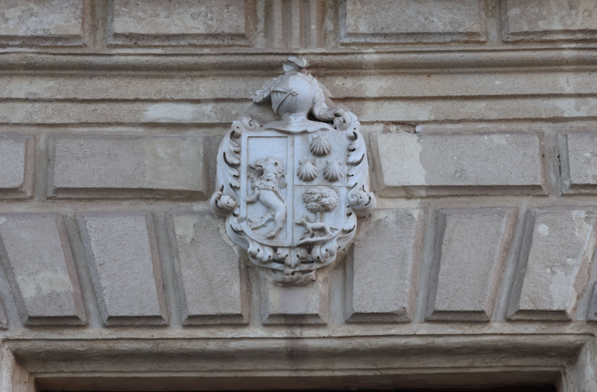
THE ART OF MONOGRAMS
The Heraldic Crest: A Mark Carried Beyond the Shield
Long before a family required a name to be written down, it required a symbol to be recognized by.
The heraldic crest was born from necessity, and endured for reasons that became far more personal.
On a medieval battlefield, a helm obscured every face beneath it.
What distinguished one knight from another was the device fixed above his helmet.
That device, the crest, became a kind of silent introduction.
It spoke before its bearer could remove a visor and speak for himself.
Centuries later, the function has changed, though the instinct behind it has not.
A heraldic crest today is rarely mounted on steel.
It appears instead on stationery, on silver, on the seal of a private letter.
Its purpose, remarkably, remains unchanged.
It still announces who someone is before a single word is exchanged.
I have come to think of the crest as a discipline rather than a decoration.
Every line within it is drawn from a vocabulary centuries in the making.
Every proportion answers to rules established long before questions of taste became personal.
This is what separates a heraldic crest from an ornament chosen for its appearance alone.
A crest is composed the way a sentence is composed, with grammar rather than guesswork.
That grammar is what allows a crest to be read, not merely admired.
For families who commission this work, the crest becomes a form of permanent correspondence.
It speaks to descendants who have not yet been born.
It speaks to a history that, in many families, has never been recorded anywhere else.
I have designed crests for individuals building a name and for families safeguarding one already centuries old.
In both cases, the ambition is identical.
The goal is a mark that will outlive its first bearer by several generations.
What follows is an examination of what a heraldic crest is, where it originated, and why it continues to matter.
It is written for those who have begun to consider commissioning a mark of their own.
It is also written for those who simply wish to understand a tradition they encounter more often than they realize.
A crest is not a logo, and it was never meant to compete with one.
It belongs to an older category of symbol, one built to be inherited rather than replaced.
What follows is an invitation into that category, its history, its grammar, and its enduring relevance today.
I will not pretend this study is a substitute for a private conversation about a family’s own history.
It is instead the context I wish every client had before that conversation begins.
A crest commissioned with this context tends to arrive at a stronger result, and arrives there faster.
Understanding why a rule exists makes it far easier to trust the designer applying it.
That trust, more than any single sketch, is what allows a truly considered mark to take shape.
THE ART OF MONOGRAMS
Crest, Coat of Arms, and the Modern Crest Monogram
The word crest is frequently used loosely, and it is worth restoring its precise meaning.
In strict heraldic terms, the crest is only one component of a much larger composition.
The full arrangement, properly called an achievement of arms, includes the shield, the helm, the mantling, and the motto.
The crest itself sits above all of it, mounted on a torse at the very top of the helm.
It was, historically, the single element most visible from a distance on a crowded tournament field.
For that reason, it was often the simplest and boldest part of the entire composition.
A lion, a hand grasping an arrow, a closed helm, a single feather — these were built to be recognized at a glance.
The shield beneath it, by contrast, carried the more elaborate and specific detail of the family’s full arms.
Over time, common usage in America loosened this distinction considerably.
Today the word crest is used, more often than not, to describe the entire personal emblem.
I use it this way throughout the atelier’s work, in keeping with how nearly every client refers to their own commission.
This is where a contemporary practice enters the conversation: the crest monogram.
A crest monogram takes the traditional architecture of a crest and resolves its center around a family’s initials.
It is neither a full historical achievement of arms, nor a simple decorative mark.
It sits deliberately between the two, honoring the form of the former while carrying the personal specificity of the latter.
For a family without a documented historical coat of arms, this is often the more honest starting point.
It does not claim a lineage the family cannot verify.
It builds, instead, an entirely new mark that begins its own record starting today.
This is a meaningful distinction, and one I raise with every client before a single sketch is drawn.
A commissioned crest can either continue a verified history or begin one.
Both are legitimate, and both require the same discipline to execute well.
What they share is a formal structure that has remained remarkably stable since the medieval period.
That structure is precisely why the crest continues to read as authoritative rather than arbitrary.
A symbol invented without reference to this structure tends to look exactly like what it is: invented.
A symbol built within it tends to look as though it has always existed.
That impression, more than any single visual choice, is what clients are actually commissioning.
It is the same impression I aim for in every atelier project, whether the request is for a full crest or for a crest built around a monogram at its center.
The grammar changes very little between the two.
Only the emphasis shifts, from a family’s full history to the letters at its center.
Clients occasionally ask whether one approach is more legitimate than the other.
It is not, and I say so directly whenever the question arises.
A documented coat of arms carries genuine historical weight, and I treat that weight with real respect.
A newly composed crest monogram carries no less integrity, provided it is built with the same discipline.
History, after all, has to begin somewhere for every family that now holds one.
A Note on Terminology
Heraldic purists distinguish crest from coat of arms, but American usage has folded both into a single familiar word.
A symbol built without reference to heraldic structure tends to look exactly like what it is: invented.
ROYAL TRADITIONS
Origins on the Tournament Field
The crest’s earliest function was entirely practical, and its elegance came later.
By the twelfth century, plate and mail had made individual soldiers nearly indistinguishable from one another.
A commander needed a way to identify his own men amid the chaos of a charge.
A knight needed a way to be recognized by his own household after the fighting ended.
The solution was mounted above the head, where it could be seen over the tops of shields and the crush of other helms.
What began on the battlefield was quickly adopted by the tournament, a far more theatrical setting.
Tournaments were public spectacles, attended by nobility who came specifically to watch and be seen.
A striking crest was, in this setting, closer to a performance than a necessity.
It announced not only identity but ambition, wealth, and taste.
This is a discipline with its own recorded terminology and formal history, one that scholars have documented meticulously across nearly a thousand years.
What survives from this period is a set of conventions that still govern serious heraldic design today.
A crest was expected to be legible from a distance, which meant bold shapes and limited detail.
It was expected to be distinct from the crests of rival houses, which meant genuine invention within a shared vocabulary.
And it was expected to be dignified, never comic, never fashionable in a way that would quickly date it.
These three expectations have not weakened with time.
A modern crest, commissioned for a family rather than a battlefield, is judged by nearly the same standard.
Does it read clearly at a glance, whether embossed on paper or engraved into silver?
Is it distinct enough to be recognized as this family’s mark and no other’s?
Will it still feel dignified in fifty years, rather than dated within five?
These questions shaped medieval design, and I ask them of every commission that crosses the atelier’s desk today.
What changes is the context, not the underlying discipline.
A crest no longer needs to be seen across a battlefield.
It does still need to be seen, understood, and remembered in a single glance.
That requirement has outlived the armor, the horses, and the tournaments themselves.
It is, in some sense, the only part of the tradition that truly matters.
Everything else was circumstance.
The demand for instant, dignified recognition was, and remains, the entire point.
It is easy, from a modern vantage point, to romanticize this history into pure spectacle.
The truth is more practical, and in some ways more compelling.
A crest earned its permanence by solving a real problem, not by decorating an already-solved one.
That practical origin is precisely why the form has survived so many changes in fashion.
A symbol built to solve a genuine problem rarely goes out of style entirely.
Built for Distance, Not Detail
The most historically accurate crests favor bold, legible shapes over intricate ornament, a discipline still followed today.
THE ART OF MONOGRAMS
The Grammar of a Crest: Tinctures, Charges, and the Blazon
A crest is not assembled from whatever shapes happen to look attractive together.
It is composed according to a formal grammar, developed and refined across centuries of practice.
That grammar begins with tincture, the heraldic term for color.
Historically, only a limited palette was permitted: two metals and a small set of true colors.
The metals were gold, called Or, and silver, called Argent.
The colors included azure, gules, sable, vert, and purpure — blue, red, black, green, and purple.
A strict rule governed how these could be combined.
Color was never placed directly on color, and metal was never placed directly on metal.
This was not an aesthetic preference so much as a practical necessity.
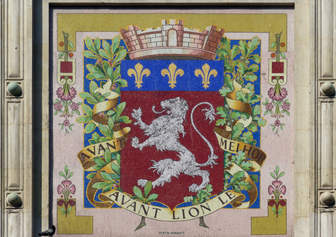
A design that violated it lost the very legibility a crest existed to provide.
Next comes the charge, the heraldic term for any symbol placed upon the shield or crest.
A charge could be an animal, a plant, a weapon, or a geometric device known as an ordinary.
Each carried associations understood within societies devoted entirely to preserving its correct practice for the specific meanings attached to them.
A lion suggested courage, an eagle suggested nobility, a closed hand suggested fidelity or restraint.
None of these associations were arbitrary, and a serious designer still respects them today.
Finally comes the blazon, the precise written description used to record a coat of arms in words rather than images.
A blazon reads almost like a legal formula, specifying tincture, charge, and position in an exact prescribed order.
This formality allowed a crest to be reconstructed accurately from text alone, without ever seeing the original artwork.
It is, in effect, the earliest form of design documentation in Western visual culture.
I still draft an informal version of a blazon for every commission the atelier completes.
It ensures that a family’s mark can be recreated precisely, on any material, at any future scale.
This grammar can feel demanding to a client encountering it for the first time.
In practice, it is liberating rather than restrictive.
A designer working within real constraints tends to produce work with far more integrity than one working without any.
The rules of tincture and charge exist to protect the clarity of the final mark.
Clarity, in the end, is the entire reason a crest is commissioned in the first place.
Clients rarely arrive already fluent in this vocabulary, and they are not expected to.
Part of the atelier’s role is translating these formal constraints into decisions a family can understand intuitively.
A conversation about tincture becomes a conversation about which colors feel true to a family’s own story.
A conversation about charge becomes a conversation about which symbol actually earns its place in the design.
The grammar remains formal throughout, even when the conversation itself feels entirely personal.
| Element | Historical Function | Contemporary Application |
|---|---|---|
| Tincture | Two metals, five colors, governed by strict placement rules | Palette selection for stationery, engraving, and digital use |
| Charge | Symbolic figure carrying an established meaning | Personal or family symbol chosen with intention |
| Blazon | Formal written description enabling exact reconstruction | Design specification guiding every material application |
| Mantling | Cloth drapery protecting the helm from sun and rain | Ornamental framing device around the central mark |
Why the Rules Still Matter
A crest built without regard for tincture and charge conventions often loses the legibility that gives the form its authority.
LEGACY & FAMILY HERITAGE
Lineage Made Visible: How a Crest Becomes Family Heritage
A name can be spoken by anyone, but a crest can only be inherited.
This is the quality that makes it such a natural vessel for family heritage.
A crest commissioned today is not designed to serve only its first generation.
It is designed with the assumption that a grandchild, not yet born, will one day recognize it instantly.
This assumption changes how the work must be approached from the very first sketch.
A trend-driven mark cannot fulfill this purpose, however striking it looks in the present moment.
A mark built on enduring heraldic structure has a far better chance of surviving changing tastes.
I ask every family the same question at the start of a heritage commission.
What do you want your grandchildren to understand about this family, without being told directly?
The answers vary enormously, and each one shapes a different visual decision.
Some families point to a profession practiced across three or four generations.
Others point to a place, a region their family has called home since before living memory.
Still others point to a value: discretion, generosity, resilience, faith.
A well-designed a family crest commissioned to carry a full lineage finds a way to encode this answer without spelling it out literally.
This is a subtler task than it sounds, and it is where most of the atelier’s real work happens.
A charge chosen too literally reads as illustration rather than symbol.
A charge chosen with restraint rewards a viewer who takes the time to understand it.
That reward, delayed rather than immediate, is precisely what gives a crest its quiet authority.
Families who commission this work are rarely seeking to impress a stranger.
They are seeking to leave something legible to their own descendants.
This distinction matters enormously, and it changes the entire brief.
A mark meant to impress chases attention.
A mark meant to be inherited chases permanence instead.
The finest heritage crests I have designed were never the loudest submissions in the room.
They were the ones that felt, from the very first draft, as though they had always belonged to that family.
This is, I think, the truest measure of success for any heritage commission.
Not whether a family is impressed on delivery day, but whether their grandchildren feel the same way decades later.
That second reaction cannot be observed directly, which makes it easy to overlook during the design process.
I keep it in mind anyway, at every stage, because it is the only reaction that actually matters.
A crest built with that horizon in view tends to look different from one built for an afternoon’s approval.
FIRST GENERATION
A single individual commissions a mark, often to accompany a milestone or a new chapter.
SECOND GENERATION
Children inherit the mark on correspondence, objects, and eventually their own households.
A WEDDING
The family mark is joined, formally or informally, with the mark of another lineage.
PRESENT DAY
The crest continues in circulation, recognized instantly by those who carry it forward.
Designed for a Reader Not Yet Born
A heritage crest is judged less by its first impression than by whether a grandchild will recognize it as unmistakably their own.
THE ART OF MONOGRAMS
From Shield to Silver: A Crest Across Generations
A heraldic crest was never designed to live in only one place.
It moved historically from the battlefield to the household, and it continues moving today.
A well-designed crest must therefore perform across an enormous range of materials.
It must read clearly engraved into silver at the scale of a signet ring.
It must also read clearly printed at the scale of a formal letterhead.
This range is precisely why the discipline of tincture and charge matters so much in practice.
A design dependent on delicate detail collapses the moment it is reduced to a small scale.
A design built on strong, simple structure survives that reduction without losing its identity.
I test every crest across several material applications before a family ever approves the final design.
This includes personal stationery, engraved objects, and increasingly, digital correspondence.
The atelier applies the same standard to a private cipher composed for a single name, where a name rather than a full history anchors the composition.
In both cases, the test is identical: does the mark survive being reduced to its smallest honest form?
A recent commission, one such commission completed for a family rebuilding its own record, illustrates this range particularly well.
The mark needed to feel equally authoritative on a wax seal and on a digital signature.
Achieving that consistency required real restraint at every stage of the design process.
Ornamental detail that looked beautiful in a large-format rendering was quietly removed.
What remained was a structure strong enough to survive any material a family might choose.
This is, in many ways, the entire discipline of heraldic design compressed into a single principle.
Build for the smallest application a mark will ever face, not the largest.
Everything else follows naturally from that constraint.
A family that understands this principle tends to make far better decisions during the design process.
They stop asking for more detail, and start asking for more clarity instead.
That shift, more than any single stylistic choice, produces the crests that age the best.
I have watched families arrive expecting an elaborate composition, only to leave commissioning something quieter.
That change of heart is rarely disappointing to them once they understand the reasoning behind it.
A crest crowded with detail photographs poorly, prints inconsistently, and engraves with difficulty.
A crest built on a handful of confident decisions does none of those things.
It simply works, in every material a family will ever ask of it.
Personal Stationery
The crest appears in restrained gold or black foil at the head of formal correspondence.
Engraved Silver
Flatware, frames, and presentation pieces carry the mark at its smallest, most exacting scale.
Wax and Signet
A single die, cut once, allows the crest to seal correspondence for generations to come.
Digital Presence
The same structure resolves cleanly into a favicon or a digital signature without alteration.
Designed for the Smallest Scale First
A crest engraved onto a signet ring must remain legible; everything larger than that scale is comparatively forgiving.
ROYAL TRADITIONS
Royal Traditions and the Authority Behind the Crest
Heraldry did not develop as a private hobby, however personal its results eventually became.
It developed under the authority of monarchies that required order in an otherwise chaotic system of symbols.
Without regulation, two unrelated families might easily adopt the same device by pure coincidence.
To prevent this, formal heraldic authorities were established, tasked with granting and recording new arms.
In England, this responsibility has belonged for centuries to an official body still charged with granting and recording new arms.
Similar institutions exist across much of Europe, each maintaining its own historical archive.
These bodies did not merely rubber-stamp new designs.
They enforced the same grammar of tincture and charge discussed earlier in this study.
A submission that violated fundamental heraldic rules was simply refused, regardless of a petitioner’s rank.
This is part of what gives historical heraldry its enduring credibility.
It was never simply decorative; it was governed, recorded, and defended by formal institutions.
The royal households of Europe took this seriously precisely because a crest signified real authority.
A monarch’s own arms appeared on currency, on seals of state, and on the uniforms of entire armies.
Getting the symbol wrong was never treated as a trivial error.
Today, collections maintained today for public and scholarly study preserve extraordinary examples of this royal heraldic tradition for public study.
Viewing these collections firsthand reveals a level of discipline rarely associated with royal ceremony.
Every color, every charge, every proportion follows rules established centuries before any specific monarch’s reign.
This is precisely the discipline I try to bring into every private commission.
A family crest will never carry the weight of a national seal.
It can, however, carry the same internal logic, the same respect for an established grammar.
That respect is what separates a genuinely considered mark from an invented one.
It is the difference between a symbol that merely looks impressive and one that reads as authentic.
Royal tradition did not invent taste in heraldry.
It enforced discipline, and discipline, more than any single decorative choice, is what taste actually depends on.
A private family will never be summoned before a heraldic authority the way a medieval petitioner once was.
There is still real value in behaving as though such scrutiny were possible.
Designing as if every decision might be formally questioned tends to produce sturdier, more considered work.
It removes the temptation to include an element simply because it looks appealing in isolation.
Every element instead has to justify its place within the whole, exactly as royal heraldry once demanded.
Governed, Not Merely Decorative
Historical heraldic authorities enforced strict rules of tincture and charge, refusing submissions that broke them regardless of rank.
THE ATELIER JOURNAL
Measured in Craft: The Atelier’s Discipline Applied to a Crest
Every crest that leaves the atelier passes through a deliberately unhurried process.
This is not a matter of preference so much as necessity.
A mark intended to last generations cannot be rushed through in an afternoon.
The earliest stage involves extensive research into a family’s own history, profession, and geography.
Only once that research is complete does the atelier begin exploring visual directions.
Multiple directions are typically developed before any single concept is presented to a client.
This is intentional, and it protects against settling too quickly on the first workable idea.
A family should never feel they are choosing from a single option dressed up as several.
Each direction explored must stand entirely on its own merit.
Once a direction is selected, refinement becomes the primary activity for several additional weeks.
Proportions are adjusted by fractions of a degree, repeatedly, until the composition feels inevitable.
This stage is invisible to most clients, yet it accounts for the majority of the total design time.
It is also the stage most responsible for whether a crest ages gracefully or does not.
A rushed refinement stage produces a mark that looks correct today and dated within a decade.
A patient one produces a mark indistinguishable, in its confidence, from something centuries old.
This patience is measurable, even if it rarely appears in a finished presentation.
It is reflected in how many directions were explored, how many scales were tested, and how long true refinement took.
These measures matter less for their own sake than for what they protect: the family’s long-term interest in the mark.
A client rarely asks to see these numbers directly, and I do not lead with them in early conversations.
They matter here because they explain, honestly, where the time in a commission actually goes.
Very little of it is spent drawing.
Most of it is spent deciding, discarding, and deciding again, until only the necessary remains.
3
Design Directions Explored Per Commission
40+
Scale Applications Tested Before Approval
Generations
The Intended Lifespan of Each Mark
Patience as a Design Principle
The refinement stage of a crest commission is largely invisible to a client, yet it determines whether the mark ages well.
BESPOKE WEDDINGS
Bespoke Weddings: When Two Crests Become One Mark
A wedding presents heraldry with one of its oldest and most delicate problems.
Two families, each with a history of its own, must somehow be represented by a single mark.
Historically, this was solved through a technique called impalement, joining two coats of arms side by side.
The husband’s arms occupied one half, the wife’s the other, united within a single shield.
Contemporary commissions rarely require such literal formality, though the underlying idea remains useful.
A wedding crest should feel like a genuine union rather than one family’s mark with a minor addition.
This requires listening carefully to both families before a single sketch begins.
What does each family’s existing visual language already communicate?
Where can those languages meet without either one dominating the final composition?
These questions take considerably longer to answer than the technical drawing that follows them.
A wedding crest, once completed, tends to outlive the ceremony by decades.
It appears on invitations first, then on linens, then eventually on the belongings of an entirely new household.
In time, it becomes the mark a couple’s own children recognize as uniquely theirs.
This is precisely the outcome every element of the design process is built to support.
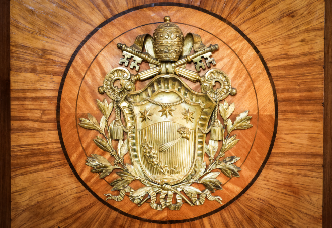
The crest is not a keepsake of a single day.
It is the visual foundation of a family that has only just begun.
I find this particular category of commission among the most meaningful the atelier undertakes.
Two people arrive with two separate histories, and leave with the beginning of a shared one.
The crest that results is rarely the largest or most elaborate the atelier produces.
It is, however, often the one carried forward with the most genuine affection.
A Mark That Outlives the Ceremony
A wedding crest is designed to move from invitation to household object, eventually recognized by an entirely new generation.
“Our families had never met before the engagement, and I worried our histories would feel mismatched on paper. What was designed instead felt like it had always belonged to both of us.”
C. Ashworth-Reyes — Bride, Savannah, Georgia
“I have used my own family’s crest my entire life, and I was hesitant to change anything about it for the wedding. The final mark somehow honored it while still making room for my wife’s family.”
J. Whitfield — Groom, Charleston, South Carolina
LUXURY IDENTITY
Luxury Identity: The Crest as Professional Distinction
A heraldic crest is not reserved exclusively for families with centuries of documented lineage.
Increasingly, individuals building a professional identity commission one as a foundation of their own.
An attorney, a physician, an architect, a private advisor — each carries a reputation built over years.
A crest gives that reputation a visual anchor, one far more distinctive than a conventional logotype.
This is a use of heraldic tradition that would have been unfamiliar to a medieval knight.
It would not, however, have felt entirely foreign to the merchant houses of Renaissance Florence or Venice.
Those houses adopted personal marks for precisely this reason, to signal authority in a competitive marketplace.
A modern professional commissioning a crest built around a personal monogram follows that same instinct today.
The process, however, still follows the same disciplined atelier structure used for any heritage commission.
Research comes first, focused this time on a profession’s history and a client’s specific practice.
Concept development follows, exploring several directions before any single one is refined.
Refinement follows concept, often the longest single stage of the entire process.
Only then does the mark move toward its final applications, across signage, stationery, and digital presence.
A crest built this carefully carries a different authority than one generated in an afternoon.
Clients and colleagues alike tend to sense the difference, even without being able to fully articulate why.
That difference is the entire value of commissioning bespoke work rather than settling for a template.
A template can be purchased in an afternoon, and replaced just as quickly by the next one.
A commissioned crest resists that cycle entirely, by design.
It is built to remain a professional’s mark for the full length of a career, not a single season of it.
That permanence is, for many professionals, the entire appeal of pursuing this route in the first place.
01
Consultation
A private conversation establishes the history, profession, and ambition behind the commission.
02
Research & Concept
Several distinct visual directions are explored before any single one advances.
03
Refinement
Proportions, tinctures, and charges are adjusted repeatedly until the mark feels inevitable.
04