
Luxury Monogram Crest: Letter Meets Shield
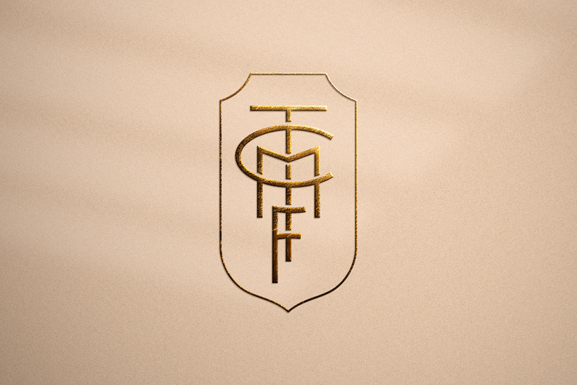
The Luxury Monogram Crest, Drawn Between Letter and Shield
THE ART OF MONOGRAMS
A Mark Suspended Between Two Traditions
A luxury monogram crest occupies a register few clients know exists until they first encounter it.
It is not a classic monogram, though it borrows that discipline’s typographic restraint entirely.
It is not a full family crest, though it borrows that tradition’s gravity and formal bearing.
It sits deliberately between the two, elevated beyond initials alone, yet lighter than a granted coat of arms.
This particular register exists because a great many clients want more than letters can offer on their own.
They do not, however, want the full weight of a formal heraldic achievement they have no claim to.
A luxury monogram crest resolves this tension directly, without pretending to a lineage that was never granted.
It takes a set of initials and elevates them with a single, carefully chosen charge or device.
That charge is never selected at random, and it is never borrowed from a family with no connection to the client.
It is drawn from documented personal history, a profession, a place, or a value the client wishes to carry forward.
The result reads as considerably more than a monogram, without ever overstating its own formal authority.
Long before logos became commonplace, the most enduring marks of distinction belonged not to companies, but to individuals.
A luxury monogram crest continues that lineage directly, adapted for a client who wants letters with real gravity.
This publication considers what that particular register requires, and why it rewards genuine patience.
It is not a tutorial, because a mark of this significance is never assembled from a set of instructions.
It is closer to an editorial account of a discipline that borrows from two older traditions at once.
Some readers arrive simply curious about where a monogram ends and a crest properly begins.
Others arrive already certain they wish to commission such a mark, seeking context before the conversation starts.
Both readers are welcome here in equal measure, and both will encounter the same underlying argument throughout.
This distinction sounds subtle until the two registers are placed side by side and studied at length.
A monogram alone can feel modest for a client whose history genuinely carries considerable documented weight.
A full crest, by contrast, can feel presumptuous for a client without a formally granted lineage behind them.
A luxury monogram crest resolves this discomfort by claiming exactly what it can honestly claim, no more.
This honesty is, in many respects, the entire ethical foundation of the atelier’s approach to the hybrid form.
Nothing about the finished mark should ever suggest an authority the client has not genuinely earned or documented.
This is why the consultation begins with history rather than with aesthetic preference of any particular kind.
A client’s profession, their family’s trade, a meaningful place, or an inherited detail all become candidate material.
From that material, a single charge is eventually chosen, tested, and paired carefully with the client’s own initials.
The result should feel, above all, like something the client already possessed before the commission ever began.
It should read as a discovery rather than an invention, however new the finished composition genuinely is.
This standard is difficult to meet consistently, and it is precisely why the atelier treats every hybrid commission with such care.
A Note on Register
A luxury monogram crest is not a shortened crest or an inflated monogram; it is its own considered discipline.
THE ART OF MONOGRAMS
Why the Hybrid Form Is the Harder Discipline
A common assumption holds that combining a monogram with a crest simply means adding decoration to letters.
In practice, the opposite proves true almost without exception across the atelier’s own commissions.
A luxury monogram crest is considerably harder to compose correctly than either of its parent forms alone.
A classic monogram answers to one discipline, namely the proportion and interlace of letterforms themselves.
A full family crest answers to an entirely different discipline, governed by field, charge, and tincture.
A luxury monogram crest must answer to both disciplines simultaneously, without either one overwhelming the other.
This is a considerably harder balance to strike than most clients anticipate before their first conversation.
Too much letterform, and the charge reads as an afterthought pinned onto an otherwise complete monogram.
Too much charge, and the letters shrink into a mere label beneath what becomes, in effect, a miniature crest.
Neither imbalance produces the register a client is actually seeking when they commission this particular mark.
The correct proportion places the letters and the charge in genuine conversation with one another.
Each element must feel necessary to the other, as though the composition could not exist with only one present.
This is precisely why a generic monogram generator cannot produce a luxury monogram crest of any real quality.
Such tools were built to arrange letters, not to reconcile letters with the formal grammar of heraldic charge.
A skilled hand must understand both traditions independently before it can ever combine them convincingly.
This dual fluency is rare, and it is the primary reason the hybrid form is commissioned less often than either parent.
This same discipline underlies every bespoke monogram commission produced within the atelier, regardless of its eventual complexity.
A client rarely arrives already able to articulate why this particular register appeals to them.
They arrive, instead, with a sense that plain initials feel insufficient for what they intend the mark to carry.
A luxury monogram crest answers that instinct directly, without requiring the client to justify it further.
The conversation begins with the letters, moves to the client’s own documented history, and only then to the charge.
Nothing about the process is reversed, because a charge selected before the letters are resolved rarely sits well.
The letters establish the composition’s core geometry; the charge is then fitted to serve that geometry, not compete with it.
This ordering sounds procedural, yet it is the single most consequential decision in the entire commission.
A luxury monogram crest built in the wrong order tends to feel assembled rather than genuinely composed.
One built in the correct order tends to feel, from its very first presentation, as though it could not exist otherwise.
That feeling of inevitability cannot be manufactured through speed, and it cannot be faked through added detail.
It can only be earned through the same patient, dual-discipline study the atelier brings to every hybrid commission.
There is a further reason the hybrid register rewards patience more than either parent form taken alone.
A monogram can be corrected quickly if a proportion feels wrong, since only letterform is at stake.
A crest can likewise be adjusted, since its grammar is well documented and its rules are widely understood.
A luxury monogram crest offers no such shortcut, because an error in one half distorts the reading of the other.
A charge slightly too large makes the letters beneath it feel like an afterthought rather than the composition’s core.
Letters slightly too dominant make the charge feel decorative rather than genuinely meaningful to the mark.
Correcting one side without disturbing the other requires a slower, more deliberate kind of revision throughout.
This is why early drafts of a hybrid commission are tested as a whole, never refined piece by piece in isolation.
A designer must hold both halves in mind simultaneously, adjusting one only in light of how it affects the other.
This simultaneous attention is, in practice, the clearest marker of genuine skill in this particular discipline.
Clients rarely see this invisible labor, since it produces no dramatic before-and-after to point toward directly.
What they see instead is a finished mark that simply feels correct, without being able to explain precisely why.
That inexplicable rightness is, in the end, the entire product of the dual-discipline process described here.
On Dual Discipline
A luxury monogram crest asks a designer to master two grammars at once, never to blend them carelessly into one.
LEGACY & FAMILY HERITAGE
A Hybrid Tradition, Traced Through History
The instinct to pair a personal initial with a chosen device is considerably older than any modern commission.
Merchant seals of the medieval period frequently combined an owner’s mark with a small emblem of trade or origin.
A wool merchant’s seal might carry his initials beside a small woven device, marking both identity and craft at once.
This pairing served a practical purpose long before it ever became a matter of aesthetic preference.
A single initial could be forged or misread; an initial paired with a distinctive charge was harder to imitate.
The hybrid form, in other words, began as a security measure before it evolved into a considered art.
Independent scholarship devoted to the preservation of this grammar, recorded and studied at length by dedicated societies, continues to document these pairings with real precision.
That record shows the hybrid device appearing across trade guilds, minor gentry, and merchant households alike.
None of these early bearers held a formally granted coat of arms in the fullest heraldic sense.
What they held instead was a considered device, personal to their own household and their own trade.
This is precisely the register a luxury monogram crest occupies today, adapted for an entirely contemporary client.
Each era refined the same underlying principle, that letters paired with a chosen device can carry more than either alone.
A design unaware of this lineage tends to feel merely decorative rather than genuinely founded in precedent.
A design composed with awareness of it tends to feel settled, as though it belongs to a tradition rather than a trend.
This is why the atelier studies precedent closely before proposing a single letterform or charge to any client.
History, treated this way, is not decorative context; it is a working design tool applied with real consequence.
It is worth noting how differently each era solved the technical problem of combining letter and charge.
Wax seals demanded bold, simplified forms that could be struck cleanly without losing essential definition.
Engraved silver permitted finer detail, allowing letterform and charge to interlock with genuine subtlety.
Printed stationery, arriving later, demanded forms that could be reproduced consistently at considerable scale.
A luxury monogram crest commissioned today inherits every one of these historical constraints in its own right.
A mark composed without awareness of them often repeats mistakes long since resolved by earlier craftsmen.
A mark composed with that awareness tends to feel resolved from its very first presentation to a client.
It is worth dwelling briefly on why the hybrid form persisted so consistently across each of these eras.
A monogram alone, in periods before mass literacy, offered relatively little protection against forgery or confusion.
A full coat of arms, meanwhile, remained legally restricted to households with a formally recognized grant.
The paired letter-and-device mark filled the considerable space between these two limitations rather naturally.
It offered more security than initials alone, without requiring the formal process a full grant demanded.
This practical origin explains why the hybrid form has never entirely disappeared from private visual culture.
It answers a need that neither a bare monogram nor a formally restricted crest can fully satisfy alone.
That need is, if anything, more relevant today than it was during the eras first described above.
A contemporary client faces no legal restriction on commissioning a crest, yet most have no documented right to one.

A luxury monogram crest offers the same considered middle ground their historical predecessors once relied upon.
Medieval Trade
The Merchant’s Paired Seal
Trade guilds and merchant households combined an owner’s initial with a small device, marking identity and craft together.
Renaissance
The Household Cipher
Prosperous families without formal arms adopted paired letter-and-device marks to authenticate goods and correspondence.
17th–18th Century
Formal Convention Emerges
Courts across Europe began codifying how initial and charge could be combined without infringing on formal heraldic grant.
Georgian & Victorian
The Domestic Hybrid
The paired mark entered daily life, engraved onto silver and pressed into stationery across the merchant and professional classes.
Twentieth Century
A Quiet Private Register
The hybrid form persisted as a discreet alternative to formal arms, favored by households without a granted coat of arms.
Present Day
The Luxury Monogram Crest
A contemporary household commissions the hybrid mark deliberately, honoring both traditions without formally claiming either alone.
On Precedent
The paired letter-and-device mark was never a shortcut to formal heraldry; it was, and remains, its own considered tradition.
ROYAL TRADITIONS
Royal Precedent for the Paired Device
No institution demonstrates the pairing of cipher and charge with more discipline than the royal courts of Europe.
A sovereign’s personal badge frequently accompanied a royal cypher, appearing together on regalia and correspondence.
The cypher identified the individual monarch; the badge carried a symbol tied to dynasty, motto, or personal history.
Together, the two elements performed precisely the function a luxury monogram crest performs for a private client today.
The institution long responsible for regulating English heraldic identity continues to formalize how personal badges and cyphers may be combined under long-established convention.
Its archives reveal how carefully proportion, hierarchy, and restraint were once governed in these paired devices.
A royal badge was rarely as elaborate as a full achievement of arms, and this restraint was entirely deliberate.
It needed to be reproduced quickly, on livery, on plate, and on a household’s everyday correspondence.
This practical constraint produced marks of remarkable clarity, legible even at considerable distance or small scale.
The collections assembled by Europe’s royal households over centuries preserve extraordinary examples of cypher and badge paired together across porcelain, silver, and textile.
Viewing this material, even at a distance, offers a genuine education in restraint applied at the highest level of craft.
A modern luxury monogram crest borrows directly from this discipline, even when no formal title stands behind it.
The same principles of proportion and restraint apply equally to a private household as they once did to a court.
What differs is the scale of consequence, never the underlying rigor brought to the composition itself.
A contemporary client does not require royal rank to deserve this same level of considered craft.
They require only a name, and a story, worth pairing with a device chosen for reasons that genuinely matter.
European courts also demonstrated remarkable consistency in how a paired device was applied across every surface.
A badge that appeared one way on silver and another way on stationery quickly lost its intended authority.
This consistency, maintained over decades and sometimes centuries, is what gave these marks their lasting weight.
A luxury monogram crest benefits from the identical discipline, applied with the same seriousness at a private scale.
There is a lesson here for any client tempted to vary a finished mark casually across different applications.
The strongest historical hybrids nearly always resisted that particular temptation, whatever the era in question.
Their makers understood that consistency, not variation, was what allowed a mark to be recognized instantly.
Royal badges also demonstrate something important about the relationship between a device and the story behind it.
A badge was never chosen arbitrarily, however decorative it might appear to an untrained eye today.
Each element carried a specific reference, to a marriage, a territory, a motto, or a documented family event.
A viewer familiar with the court could read this history in the badge, even without any accompanying text.
A luxury monogram crest aspires to the same quality of legibility for those who know the client well.
It should reward a family member’s or close friend’s closer attention with real, documented meaning.
It need not, and should not, attempt to explain itself fully to a stranger encountering it for the first time.
This selective legibility is, in fact, one of the hybrid form’s most distinctive and valuable qualities.
It functions as a quiet signal to those who already understand its reference, and simply as an elegant mark to everyone else.
The Principle of Quiet Authority
A royal badge never explained itself, because its meaning was already understood by everyone who encountered it.
LUXURY IDENTITY
Placing the Luxury Monogram Crest Among Its Relations
Clients new to this register often ask how a luxury monogram crest differs from its two nearest relations.
The honest answer begins with scope, since each form is built to represent a different weight of claim.
A classic monogram represents a single bearer, resolved entirely through letterform and typographic proportion.
It carries no charge, no tincture, and no formal heraldic grammar beyond the letters themselves.
A full family crest represents an entire household, built from documented history and formal heraldic convention.
It typically involves field, charge, tincture, and a shield, each governed by centuries of established grammar.
A luxury monogram crest sits deliberately between these two, borrowing structure from both without fully claiming either.
It elevates initials with a single considered charge, without assembling the full apparatus of a formal achievement.
This makes it particularly well suited to a client who wants gravity without overstating an unclaimed lineage.
It also makes it considerably more demanding to compose than either of its two parent forms taken alone.
A designer must resolve letterform and charge together, rather than treating one as a mere addition to the other.
The comparison below sets these three related marks side by side, clarifying where each is genuinely suited.
None of the three forms is inherently superior to the others; each answers a different kind of intention.
A client’s own history, and the weight they wish their mark to carry, should determine which register is correct.
The atelier discusses this openly with every new client, well before any letterform is proposed or sketched.
A client who overstates their history through an inappropriate register rarely feels comfortable with the result.
A client guided honestly toward the correct register tends to trust the finished mark considerably more.
This honesty at the outset is, in many respects, the single most valuable part of the entire consultation.
It is worth noting that clients sometimes arrive requesting one register while actually needing another entirely.
A client requesting a full crest, on closer conversation, often possesses a rich personal story but no documented lineage.
In these cases, a luxury monogram crest frequently satisfies the underlying wish more honestly than a full crest would.
A client requesting only a simple monogram, meanwhile, sometimes carries a history that clearly deserves more weight.
Here too, the hybrid register can offer a more accurate reflection of what the client is actually trying to express.
This diagnostic conversation, conducted early and without pressure, prevents a great deal of later dissatisfaction.
It is far easier to adjust course before a single sketch exists than after a client has grown attached to a direction.
The atelier treats this early conversation as seriously as any later stage of the design process itself.
Consideration
Luxury Monogram Crest
Classic Monogram
Full Family Crest
Represents
One bearer, elevated by a chosen charge
A single individual, through letterform alone
An entire household across generations
Formal Grammar
Borrows structure without full heraldic claim
None; typography and proportion only
Full field, charge, and tincture convention
Typical Use
Signet rings, formal stationery, engraved silver
Correspondence, luggage, daily accessories
Architecture, formal documents, heirlooms
Longevity
Designed for decades of formal, private use
Designed to remain legible for a lifetime
Designed to remain legible for generations
Exclusivity
Singular to one bearer’s documented story
Singular once personalized
Singular to one house
A Point of Distinction
A luxury monogram crest never pretends to a lineage it cannot document; it borrows grammar, never false claim.
THE ART OF MONOGRAMS
The Anatomy of a Luxury Monogram Crest
Beneath the surface of any luxury monogram crest lies a set of principles rarely discussed outside the atelier.
These principles are not stylistic preferences; they are structural requirements for a mark meant to endure.
Letterform determines whether the initials at the composition’s core feel timeless or merely fashionable.
Charge determines what the client has chosen to represent, drawn from documented history rather than decoration.
Tincture, the formal language of heraldic color, governs contrast and hierarchy between letter and charge alike.
Proportion determines whether the composition feels resolved or simply two elements placed near one another.
Hierarchy determines whether the letters or the charge leads the composition, and how confidently that choice is made.
Scalability determines whether the finished mark performs equally well on a signet ring and on formal stationery.
Each of these six elements is considered independently before they are ever combined into a single composition.
A closer look at the discipline of true interlace clarifies how demanding the letterform half of this equation actually is.
The charge, meanwhile, is never selected from a catalogue of generic heraldic symbols chosen for their appearance alone.
It is drawn from a client’s documented profession, a family trade, a place of meaning, or an inherited detail.
A charge without this grounding tends to read as costume rather than considered personal symbolism.
A charge properly grounded in a client’s own story tends to feel inevitable once it is finally proposed.
This is precisely why the consultation phase asks so many questions before a single sketch is ever produced.
The atelier wants to understand what a client’s initials have already been asked to carry before this commission began.
Only once that context is understood does a suitable charge begin to suggest itself naturally to a trained eye.
A design unaware of this discipline often repeats mistakes long since resolved by earlier craftsmen and courts.
A design composed with full awareness of it tends to feel settled from its very first presentation to a client.
Tincture deserves particular attention, since it is often the element clients understand least before their first conversation.
In formal heraldry, tincture follows strict rules governing which colors and metals may sit beside one another.
A luxury monogram crest need not follow every one of these rules with the rigidity a formal grant would require.
It should, however, respect the underlying logic, since a viewer familiar with heraldry will notice when it is ignored.
This is a small detail with outsized consequence, since it separates a genuinely informed design from a merely decorative one.
The atelier studies tincture convention closely, even for commissions that will never be formally registered anywhere.
Hierarchy, meanwhile, is often the single hardest decision within the entire six-part structure described above.
A client’s instinct is frequently to give the charge and the letters equal visual weight throughout the composition.
In practice, equal weight tends to produce a composition that reads as two separate elements rather than one mark.
A confident hierarchy, by contrast, produces a composition a viewer can read correctly in a single glance.
Letterform
Typographic choices are drawn from traditions deep enough to carry genuine, shared authority.
Charge
A single symbol, drawn from documented history rather than decoration, elevates the letters it accompanies.
Tincture
The formal language of heraldic color governs contrast and hierarchy between charge and letter alike.
Proportion
The two halves of the composition are weighted so that neither element overwhelms the other.
Hierarchy
One element leads the composition, and that choice is made deliberately rather than left to chance.
Scalability
A finished mark is tested from the scale of a signet ring to the scale of formal architectural use.
On Grounding
A charge borrowed from nowhere in particular reads as decoration; a charge drawn from documented history reads as truth.
THE ATELIER JOURNAL
How a Luxury Monogram Crest Commission Proceeds
Commissioning a luxury monogram crest is closer to a private consultation than to an ordinary transaction.
The process begins with conversation rather than with a questionnaire handed across a desk to a new client.
Personal history, professional context, and intended application are discussed before any sketching begins at all.
Only once that context is understood does the atelier begin exploring specific letterform and charge directions.
Multiple design directions are typically developed before a single one is ever presented to the client.
Refinement continues until the mark performs correctly at every scale it is likely to encounter in daily use.
The final stage is not delivery alone, but guidance on how the mark should be applied consistently thereafter.
This structure exists to protect a client from a common risk, namely settling too quickly on the wrong direction.
Each stage exists to remove uncertainty before a client ever commits to a single, final composition.
By the time delivery occurs, the outcome rarely feels like a surprise to the client receiving it.
It feels, instead, like confirmation of something the client already sensed was correct from the beginning.
The consultation phase alone often runs longer than clients initially expect before their first meeting.
The atelier wants to understand what a client’s name and history have already been asked to carry.
These questions seem tangential until the moment they quietly determine the entire structure of the finished mark.
The research phase that follows studies both typographic and heraldic precedent relevant to the specific commission.
Only with that research complete does composition begin, letterform and charge explored together rather than separately.
Refinement, historically, consumes the largest share of total effort across any commission of this particular kind.
This proportion surprises most first-time clients, who assume the initial concept is the hardest part of the process.
In practice, the opposite proves true, and the smallest final adjustments decide almost everything that matters.
Validation, the stage before final delivery, tests the mark across every application a client is likely to require.
A signet ring, a piece of stationery, and an engraved case each place different demands on the same finished mark.
A luxury monogram crest that passes this testing has earned its place across a client’s entire material life.
One that fails at even a single scale is sent back for further refinement before delivery is ever considered.
This standard is unforgiving by design, since a client will encounter the mark across every one of these contexts eventually.
Delivery, when it finally arrives, includes guidance on maintaining the mark’s consistency across future applications.
A household that varies a mark carelessly across different surfaces slowly dilutes the very authority it was built to carry.
The atelier considers this guidance as essential to the commission as the design work that precedes it.
01
Consultation
A private conversation establishes history, profession, and the client’s intention for the mark.
→
02
Research
Typographic and heraldic precedent relevant to the specific commission are studied in depth.
→
03
Composition
Letterform and charge are explored together, each tested against the other for balance.
→
04
Refinement
Proportion, tincture, and hierarchy are resolved across several careful, deliberate passes.
→
05
Delivery
The finished mark is prepared for engraving, stationery, and formal application alike.
LUXURY IDENTITY
Craft in Numbers
Craftsmanship resists easy measurement, though certain figures still illuminate what a commission involves.
A single luxury monogram crest typically explores several distinct pairings of letterform and charge.
This range exists because the correct pairing for a given name and history is rarely obvious immediately.
Multiple scales are tested for every finished mark, from ring-sized engraving to formal architectural use.
A mark that only works at a single scale has not, in the fullest sense, been properly finished by its designer.
These figures describe restraint rather than scale, which is precisely the underlying point of the exercise.
A luxury monogram crest, like true luxury generally, is not measured by how frequently it changes over time.
It is measured, instead, by how rarely it ever needs to change at all once it has been properly delivered.
A design finalized too quickly tends to reveal that haste within the first few years of ordinary use.
A design finalized with patience tends to remain unremarked upon, precisely because nothing about it feels wrong.
This is the paradox at the center of the entire practice, stated plainly rather than left implicit.
The best compliment a finished mark can receive is silence, in the sense that it draws no unwanted attention.
3–5
Charge directions explored per commission
25+
Letterform and charge pairings considered
100+
Years a well-proportioned mark can remain legible
1
Mark, built once, intended to serve a lifetime
On Restraint
A single, well-chosen charge carries more authority than several competing for the same small composition.
LUXURY IDENTITY
The Measure of Restraint
Luxury has often been mistaken for abundance, and that mistake shapes a great deal of ordinary design work.
In truth, the most enduring luxury communicates through absence rather than excess of any kind.
A luxury monogram crest succeeds when it says less, not more, about the client or household it represents.
Every unnecessary flourish is an opportunity for the mark to age poorly within a single decade.
This is the same philosophy that governs a well-considered bespoke commission of any kind at this atelier.
The discipline required to remove rather than add is often underestimated by first-time clients entirely.
It is far easier to add a second charge to a composition than to justify why the first one belongs there alone.
The decorative arts holdings of one of the world’s great encyclopedic museums still preserve marks belonging to monarchs and merchants alike, offering a masterclass in restraint.
Viewing this material, even at a distance, illustrates how rarely the finest historical marks relied on excess.
The proportions below reflect how deliberately each stage of a hybrid commission is weighted in actual practice.
Refinement consistently consumes the largest share of total effort, which surprises most first-time clients.
This ratio is precisely inverted from how most clients imagine the design process actually working in practice.
Anyone can add a second charge to a composition; the discipline lies in recognizing when the first one is enough.
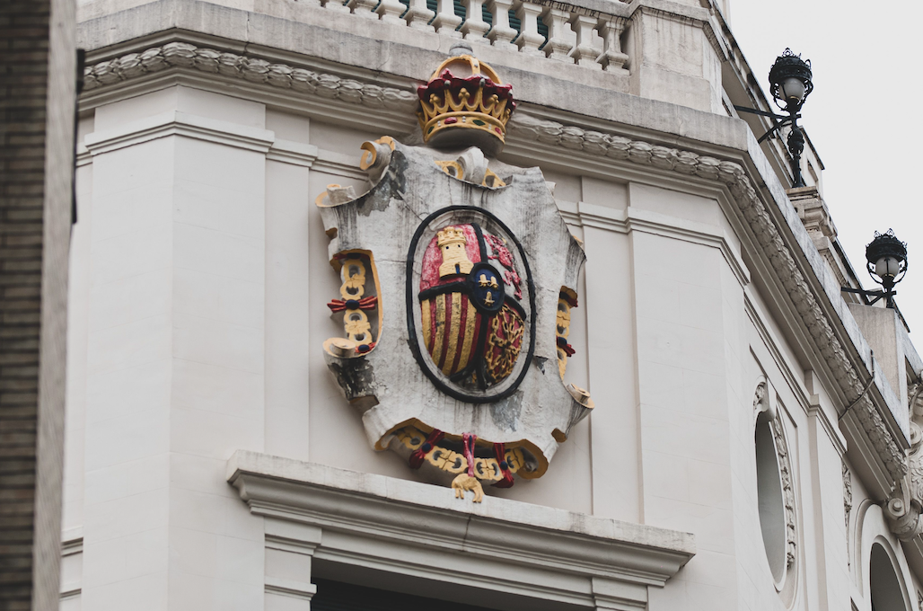
A finished luxury monogram crest is one from which nothing further could be removed without genuine loss.
That is the standard the atelier holds itself to, and it is an unforgiving one to meet consistently.
A design that strains for attention betrays a certain anxiety about whether it will be noticed at all.
A design that withholds announces, without a single word, that it has nothing left to prove to anyone.
In the vocabulary of luxury, restraint has always been understood as the highest form of confidence available.
Consultation & Listening20%
Charge & Letterform Research25%
Composition & Refinement40%
Delivery & Handoff15%