
The Personal Monogram: A Private Language of Identity
The Personal Monogram: A Private Language of Identity
A name is given to us before we have any say in the matter.
A personal monogram is the moment we take that name back and make it entirely our own.
Long before logos became commonplace, the most enduring marks of distinction belonged not to companies, but to individuals.
The personal monogram descends directly from that older tradition, one with a documented lineage stretching back through antiquity.
It is neither a logo in the commercial sense nor a decorative flourish borrowed from a font menu.
It is a considered composition of initials, built to represent a single, specific life.
In communities where legacy is valued as deeply as innovation, identity often extends beyond a name.
It becomes a symbol, one capable of representing a person, a household, or a story carried across generations.
This is the territory the personal monogram occupies, and it is worth understanding why that territory matters.
What follows is not a tutorial on letterforms or a roundup of trending styles.
It is an examination of what a personal monogram actually does, and why discerning individuals continue to commission one.
A personal monogram is, at its core, an argument about permanence made in a world defined by disposability.
Nearly everything encountered in a given week is designed to be replaced within a season.
A personal monogram is designed with the opposite intention entirely.
It is meant to be engraved, embossed, or woven once, and then encountered for decades without alteration.
This is a deliberately unfashionable proposition, and that is precisely its appeal.
The individuals who commission a personal monogram are rarely chasing a current aesthetic movement.
They are, instead, seeking a visual counterpart to something they already understand about themselves.
A name carries a history of its own, shaped by family, geography, and circumstance.
A personal monogram distills that history into a form that can be seen in an instant, rather than explained over the course of a conversation.
This is not a small achievement.
Compressing an entire identity into a handful of interlaced letters requires both technical skill and genuine understanding of the person involved.
The chapters that follow examine each dimension of that process in turn.
Together, they form less a checklist than a portrait of a discipline, one that rewards patience over speed and specificity over convenience.
Readers already familiar with monogram tradition may recognize much of what follows.
Those encountering it for the first time will, hopefully, come away understanding why the form has never truly gone out of style.
The Personal Monogram as an Origin Point
Every mark of visual identity, whether personal or commercial, begins with a single decision.
Someone decides that a set of letters deserves to become a form.
The personal monogram is this decision in its purest expression.
It carries no product line, no shareholder, and no market position to defend.
It exists to represent one individual, rendered with the same discipline a master engraver would bring to a signet ring.
The earliest known examples of this practice appear on ancient coinage, where a ruler’s initials were interlaced into a single stamped device.
That impulse, to compress an identity into a single legible form, has never gone out of fashion.
It has only changed its materials, moving from bronze and wax to linen, silver, and now digital surfaces.
A personal monogram commissioned today sits within that same continuous lineage.
It is not a trend responding to this particular decade.
It is a private artifact, intended to outlast the circumstances of its creation.
For many clients, the process begins with a name that feels unfinished without a visual counterpart.
A name spoken aloud carries history, but a name rendered as a monogram carries presence.
It can be embossed into stationery, engraved into a signet ring, or woven into household linens.
In each application, it performs the same quiet function: announcing, without announcing loudly, exactly whose it is.
This restraint is central to the form.
A personal monogram succeeds not by demanding attention but by rewarding it.
The finest symbols are rarely created to follow trends.
They are created to outlive them.
This origin point matters because it establishes the correct expectations for the entire commissioning process.
A client seeking a personal monogram is not shopping for a graphic in the way one might shop for a logo.
They are, whether they use this language or not, commissioning a small piece of applied heraldry.
That distinction changes how the work should be approached from the very first conversation.
A graphic designer building a commercial logo asks what a market wants to see.
An atelier composing a personal monogram asks what a specific individual’s name deserves to become.
The two questions produce entirely different working methods, even when the visual output looks superficially similar.
One is a response to external demand.
The other is a response to a single, particular life.
This is why a personal monogram commissioned with genuine care so rarely resembles anything else on the market.
It cannot, because it was never built to satisfy a broad audience in the first place.
It was built to satisfy one reader: the person who will carry it forward.
Classic Monograms and the Discipline of a Personal Monogram
Classic monograms share a common visual grammar, even across centuries and countries.
That grammar rests on proportion, restraint, and a willingness to let negative space carry meaning.
A personal monogram inherits this grammar directly, rather than inventing a new one for the sake of novelty.
The relationship between the letters matters more than any single letterform in isolation.
Two initials interlaced with care read as a single unified mark, not as two separate characters placed side by side.
This is the difference between a monogram and a mere abbreviation.
An abbreviation saves space; a monogram creates meaning.
Classic monograms typically favor serif letterforms, chosen for their historical resonance and their legibility at small scale.
A personal monogram intended for a signet ring must resolve clearly at a fraction of an inch.
The same mark, enlarged for an architectural application, must hold its composure at several feet.
This dual requirement, legibility at every scale, is one of the most demanding aspects of the discipline.
It separates a considered commission from a hurried template.
Hierarchy also plays a defining role in classic monograms.
When multiple initials are combined, one letter is typically given greater visual weight, often the surname initial.
This is not an arbitrary styling choice.
It reflects centuries of convention regarding how a name is read and understood within a family structure.
A personal monogram, in this sense, is a small essay on identity, written entirely in the language of proportion.
For those exploring a bespoke monogram, this same discipline of proportion and hierarchy governs the entire process.
Nothing in a well-composed monogram is accidental.
Every curve and counter has been resolved through iteration, not guesswork.
Much of this discipline has been preserved and documented by a society devoted entirely to the study of heraldic tradition, whose records continue to inform serious letterform study.
Proportion, in particular, deserves more attention than it typically receives in casual conversation about design.
A monogram that appears balanced at a glance has usually undergone dozens of small adjustments invisible to anyone but the person who made them.
The width of a stroke, the angle of an interlace, the precise distance between two letters: each detail is considered individually.
None of these decisions are visible on their own.
Together, they determine whether a mark feels resolved or merely assembled.
This is the difference a trained eye notices immediately, even without being able to articulate exactly why.
Classic monograms also depend heavily on negative space, the area around and within the letters themselves.
Negative space is frequently treated as an afterthought in less considered designs.
In a properly composed personal monogram, it is treated as a full participant in the composition.
The eye reads a monogram as a single unified shape, not as a collection of separate letters.
Negative space is what allows that unified reading to happen.
Without it, even well-drawn letters can read as cluttered or competitive with one another.
This is why the composition of a personal monogram is rarely finished quickly.
Each adjustment to one letter changes the negative space around every other letter in the mark.
The Personal Monogram Across Generations
A personal monogram rarely remains the property of a single generation.
Once established, it tends to migrate, appearing on objects that are themselves built to last.
Silver place settings, linen tablecloths, and leather correspondence cases have long served as vessels for this migration.
Each object becomes a quiet form of inheritance, carrying a mark forward long after the occasion that inspired it.
This is the mechanism by which a personal monogram becomes something closer to a family crest.
The two are related but distinct.
A personal monogram represents an individual; a family crest represents a lineage.
Yet the personal monogram is very often the seed from which that larger heritage grows.
A grandparent’s engraved hairbrush, a father’s cufflinks, a mother’s monogrammed handkerchief: each is a personal monogram first.
Only with time and repetition does it accumulate the weight of a family symbol.
This is why the composition of a personal monogram deserves unusual care.
A mark commissioned today may be encountered by descendants who never met the person it represents.
In that moment, the monogram becomes their only direct visual connection to that individual’s identity.
It is, in a very real sense, a form of correspondence with the future.
This is not an abstract idea for many of the families who commission this work.
A signet ring passed from father to son often carries a personal monogram composed decades earlier, sometimes for someone the current wearer never met.
The mark becomes a point of contact across a gap that no photograph or letter can quite close in the same way.
There is something almost architectural about this function.
A well-built structure outlives its original architect; a well-composed personal monogram outlives the individual it first represented.
Both depend on the same principle: sound fundamentals matter more than fashionable details.
A monogram overloaded with of-the-moment flourishes will feel dated within a decade.
A monogram built on classical proportion tends to feel, if anything, more resonant with each passing year.
This is one of the more counterintuitive aspects of the discipline.
The mark that looks least like a trend today is often the one best positioned to be treasured tomorrow.
A personal monogram is not created for the moment it is worn. It is created for the moment, decades later, when someone else discovers it.
Antiquity
Greek city-states and individual craftsmen combined initials into single marks stamped onto coins and ceramics, establishing the earliest recorded precedent for the personal monogram.
Medieval Period
Personal marks migrated onto seals and signet rings, becoming instruments of both identity and authority for those who carried them.
Renaissance Courts
Patrons and merchant families adopted refined monograms as marks of personal and commercial distinction, often applied to correspondence and household objects.
Nineteenth Century
The personal monogram became a fixture of domestic life among the educated and prosperous, appearing on linen, silver, and stationery as a mark of considered taste.
Twentieth Century
Luxury houses formalized the logic of the personal monogram into brand identity, translating an individual mark into a commercial one.
Present Day
The personal monogram has returned to its original purpose: a private, individually commissioned symbol, resistant to mass production and digital replication.
Royal Precedent for the Personal Monogram
No institution has shaped the visual grammar of the personal monogram more thoroughly than the royal courts of Europe.
A sovereign’s cipher functioned as an instrument of governance long before it became an object of aesthetic admiration.
It appeared on military regalia, on state correspondence, and on porcelain services distributed across an empire.
These traditions are preserved today within an archival collection preserving centuries of royal visual culture, where centuries of monarchical visual culture remain available for study.
The rules governing these royal marks were rarely improvised.
They followed strict conventions codified by the institution historically responsible for granting armorial bearings, conventions that continue to inform serious heraldic design.
A personal monogram commissioned in the present day does not claim royal status by association.
It does, however, draw on the same underlying logic: that a name, properly composed, can carry authority without a single spoken word.
This is why so many personal monograms favor restraint over ornamentation.
Royal precedent taught that authority is communicated through proportion and consistency, not through excess.
A monogram crowded with flourishes reads as decoration.
A monogram built on disciplined letterform reads as identity.
Clients drawn to a cipher monogram often cite this same royal lineage as part of what attracted them to the form in the first place.
There is a quiet confidence in choosing a mark that has already been tested across centuries of continuous use.
It is worth remembering that royal monograms were rarely designed for private enjoyment alone.
They were designed to be read from a distance, on a banner or a carriage door, and understood instantly by an observer who might never meet the sovereign in person.
That requirement, legibility without explanation, remains a useful test for any personal monogram today.
If a mark requires a caption to be understood, it has not yet been fully resolved.
European heraldic tradition also established the idea that a personal mark could carry meaning through its individual elements.
A particular interlace, a particular flourish, a particular arrangement of initials: each carried associations that an informed observer would recognize.
A personal monogram commissioned today rarely aims for this level of symbolic density.
It does, however, benefit from the same underlying idea, that a visual choice can carry meaning beyond mere decoration.
This is part of what separates a considered commission from an arbitrary one.
Every decision in a well-built personal monogram can be explained, even if that explanation is never spoken aloud.
A Note on Provenance
The personal monogram belongs to a visual tradition older than most surviving national flags.
A Reflection
Restraint, not embellishment, has always been the signature of an authoritative personal mark.
On Continuity
A well-composed personal monogram is designed to remain legible and dignified across an entire lifetime.
The Personal Monogram in the Language of Luxury
Luxury, properly understood, has very little to do with cost and a great deal to do with intention.
A personal monogram operates in exactly this register.
It is not valuable because it is expensive to produce.
It is valuable because it cannot be duplicated, templated, or purchased off a shelf.
This distinction separates a commissioned personal monogram from the countless generic initial designs available through mass-market platforms.
A generic initial design is chosen from a catalog.
A personal monogram is composed, iterated, and refined specifically for the individual it represents.
The difference is immediately visible to a trained eye, and increasingly visible to a discerning one as well.
As luxury houses rose across Paris, London, and Vienna, the personal monogram evolved into something larger: the house mark.
Yet the underlying logic never changed.
A single set of initials, properly composed, could carry the full weight of an identity.
This is the same logic a private individual commissions today, whether for personal stationery, a signet ring, or a family residence.
It is worth pausing on why this luxury logic transferred so easily from the personal monogram to the commercial one, rather than the other way around.
The personal monogram came first, historically speaking, and the commercial house mark borrowed its authority.
A brand wished to feel as considered, as permanent, and as specific as an individual’s own signature.
The irony is that many contemporary buyers now encounter the logic in reverse, associating monograms primarily with commercial brands rather than personal identity.
A returning personal monogram, commissioned specifically for an individual rather than a company, restores the original order.
It reclaims a visual language that predates every luxury house currently using it.
This is part of why the experience of commissioning a personal monogram can feel unexpectedly significant to first-time clients.
They are not adopting a borrowed aesthetic from a brand they admire.
They are returning to the source from which that aesthetic originally came.
| Consideration | Generic Initial Design | Commissioned Personal Monogram |
|---|---|---|
| Origin | Selected from a pre-made catalog | Composed specifically for one individual |
| Letterform Hierarchy | Applied uniformly regardless of name | Resolved through the specific letters involved |
| Scalability | Often unresolved at extreme sizes | Tested across signet, stationery, and architectural scale |
| Longevity | Tied to a passing design trend | Built to remain dignified across decades |
| Uniqueness | May be shared by unrelated individuals | Original and unrepeated |
Where the Personal Monogram Travels
A personal monogram, once composed, rarely stays confined to a single application.
It moves fluidly across the objects and occasions that make up a considered life.
This mobility is part of its enduring appeal.
A single mark can dignify a letter, a ring, a door, and a keepsake, all without alteration.
Understanding where a personal monogram is likely to travel is part of designing it correctly from the outset.
A mark intended only for a business card will be composed differently than one intended for a signet ring, a monogrammed robe, and a front door all at once.
The most versatile personal monograms are those designed with this range of applications in mind from the very beginning.
This is one of the reasons the consultation phase of a commission asks so many questions about lifestyle and intended use.
A client who travels frequently may prioritize a mark that reads clearly on luggage and passport cases.
A client focused on a family residence may prioritize a mark suited to ironwork, stone, or glass.
Neither priority is more correct than the other.
They simply require different technical considerations during the composition process.
Personal Stationery
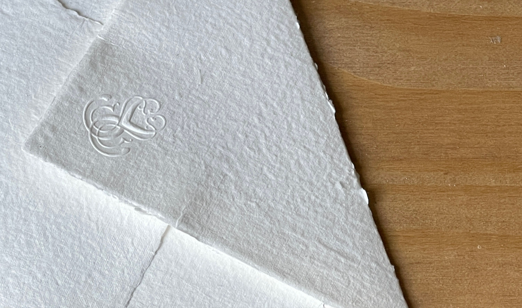
A personal monogram embossed or engraved onto correspondence paper signals care before a single word is read.
Signet Rings & Seals
Reduced to its smallest scale, a personal monogram must remain legible in wax or metal.
Household Linens
Monogrammed linens have long served as a quiet, domestic form of personal identity.
Architectural Presence
Some clients choose to render a personal monogram at true architectural scale, on a gate or facade.
Digital Identity
A personal monogram increasingly appears as a considered digital mark, from email signatures to private websites.
Heirloom Objects
Silver, leather, and porcelain surfaces have long carried personal monograms intended to be passed down.
A Note on Versatility
A single personal monogram can dignify a ring, a letter, and a facade without ever being redesigned.
On Application
The most successful personal monograms are tested across every surface before a final direction is approved.
A Reflection
Mobility across objects is not an afterthought; it is part of how a personal monogram is originally composed.
Commissioning a Personal Monogram: The Atelier Process
The process of commissioning a personal monogram is deliberately unhurried.
It begins not with a font selection, but with a conversation about the individual the mark will represent.
This conversation shapes every decision that follows, from letterform to proportion to eventual application.
A personal monogram cannot be resolved correctly without first understanding the life it is meant to accompany.
Only once that understanding is established does the compositional work begin in earnest.
This unhurried pace is often unfamiliar to clients accustomed to faster commercial design timelines.
A logo can sometimes be produced in a single afternoon; a personal monogram rarely should be.
The additional time is not a matter of inefficiency.
It reflects the number of considerations a single mark must satisfy: legibility, hierarchy, historical resonance, and personal specificity, all at once.
Clients who have gone through the process often describe the middle stages as the most revealing.
Seeing multiple directions side by side clarifies, often for the first time, what they actually wanted their mark to communicate.
This clarity rarely arrives before the process begins.
It emerges through the process itself, which is part of why the atelier approach differs so significantly from a template-based alternative.
01Consultation
A private discussion establishes the initials involved, the intended applications, and the tone the mark should carry.
02Research & Concept
Historical letterform traditions are studied and several initial directions are composed for review.
03Refinement
The strongest direction is refined across multiple scales, testing legibility from signet to architectural presence.
04Delivery & Application
The finished personal monogram is delivered in the formats required for stationery, engraving, or digital use.
The Personal Monogram as a Considered Investment
Clients occasionally ask how to think about a personal monogram in terms of value.
The honest answer is that its value compounds rather than depreciates.
A trend-driven design loses relevance the moment the trend passes.
A properly composed personal monogram gains meaning with every year it remains in use.
This is not a marketing claim; it is simply how considered design behaves over time.
The same mark that appears on a young professional’s first business correspondence may later appear on a wedding invitation, a nursery keepsake, or an heirloom gift.
Each new application deepens the mark’s association with a specific, continuous identity.
This is the quiet arithmetic behind why so many discerning individuals choose to commission rather than select from a template.
A template can be replaced at any time, by anyone, at minimal cost.
A commissioned personal monogram cannot be replaced without acknowledging that something specific and considered has been lost.
This asymmetry is precisely what gives the commissioned version its lasting weight.
It is also why so many personal monograms eventually become part of estate planning conversations, alongside jewelry, property, and other considered inheritances.
A mark that has represented someone faithfully for decades takes on a significance that a hastily selected initial design simply cannot replicate.
This is not sentimentality for its own sake.
It reflects a genuine difference in how considered objects accumulate meaning over time.
2,000+Years of documented monogram tradition
100%Bespoke composition, no two alike
3Design directions typically explored per commission
GenerationsThe intended lifespan of a well-composed mark
Value, in the case of a personal monogram, is measured in decades rather than dollars.
A Reflection
The most meaningful personal monograms rarely reveal themselves fully at first glance.
On Discretion
A well-composed mark rewards close attention rather than demanding it.
A Note on Permanence
A personal monogram intended for engraving is composed with the expectation that it will outlast its first owner.
The Question of How Many Initials a Personal Monogram Should Carry
One of the first questions raised in any consultation concerns the number of letters a personal monogram should carry.
There is no universally correct answer, though there are meaningful considerations on each side.
A single-letter personal monogram carries an almost architectural weight.
It reduces an entire identity to one form, which demands that the letter itself be composed with exceptional care.
There is nowhere for a single letter to hide; every proportion is immediately visible.
This approach tends to suit individuals drawn to a minimalist sensibility, where restraint itself becomes the statement.
A two-letter personal monogram, often combining a given name and surname initial, is the most historically common configuration.
It balances legibility with a genuine sense of composition, since two letters can be interlaced in a way a single letter cannot.
This configuration also tends to translate well across the widest range of applications, from stationery to a signet ring.
A three-letter personal monogram introduces additional complexity, often incorporating a middle initial or a secondary family name.
Composing three letters into a single unified mark is considerably more demanding than composing two.
The additional letter must be integrated without overwhelming the composition or forcing an artificial hierarchy onto the design.
This is where the surname convention discussed earlier becomes especially useful, anchoring the composition around the most structurally significant letter.
Clients are rarely asked to make this decision in isolation.
The choice is usually clarified through the same consultation process that establishes intended applications and overall tone.
A name with naturally compatible letterforms may lend itself easily to three initials.
A name with more challenging letter combinations may read more successfully with two, or even one.
This is a technical judgment as much as a personal preference, which is precisely why the composition process benefits from experienced guidance.
There is no shortcut that replaces testing a specific set of letters against a specific set of applications.
What looks resolved on a screen does not always resolve the same way when engraved at the scale of a signet ring.
This is one of the more overlooked aspects of a properly commissioned personal monogram.
The final composition has typically been tested well beyond the format in which a client first encounters it.
Voices on the Personal Monogram
Clients rarely describe the experience of commissioning a personal monogram in technical terms.
They describe it instead as a form of recognition, seeing a version of their own identity rendered with unexpected clarity.
The following reflections come from individuals who have completed this process.
When I first saw the completed monogram, I understood immediately why this process requires time. It looked as though it had always existed.
— A. Whitfield, Estate Attorney, Charleston, South Carolina
I commissioned my personal monogram for correspondence, and it has since appeared on everything from my luggage to my daughter’s christening gown.
— Dr. M. Solano, Physician, Austin, Texas
The process felt less like hiring a designer and more like being interviewed about my own life. That difference shows in the final mark.
— R. Beaumont, Principal, Architecture Studio, Denver, Colorado
My personal monogram now sits on my grandmother’s silver alongside her own initials from decades ago. Seeing them together changed how I understood the whole idea of legacy.
— C. Ashworth, Founder, Private Advisory Firm, Boston, Massachusetts
The Atelier Journal: Notes on the Personal Monogram
Every personal monogram begins as a private negotiation between restraint and expression.
Too much restraint, and the mark fails to feel personal at all.
Too much expression, and it collapses into decoration rather than identity.
The discipline lies in finding the narrow, considered space between the two.
This is not a mechanical process, despite how methodical it may appear from the outside.
Every initial carries its own visual temperament.
Some letters are naturally angular, others naturally round, and the composition must resolve these differences without flattening them.
A skilled hand does not force letters into a predetermined template.
It listens to what the letters themselves suggest, and builds outward from there.
This is, perhaps, the truest definition of craftsmanship available in this particular discipline.
It is not the application of a formula.
It is the patient resolution of a specific, individual problem.
A personal monogram, in the end, is simply that problem solved with care.
This philosophy extends beyond any single commission.
It shapes how the atelier approaches every project, regardless of scale or application.
A signet ring and an architectural gate present very different technical challenges, but they are approached with the same underlying discipline.
Restraint first.
Proportion second.
Only then, if the composition calls for it, a measure of expressive detail.
This ordering is rarely reversed, because reversing it tends to produce marks that feel decorative rather than considered.
The goal is never to impress at first glance.
The goal is to reward every subsequent glance with the same quiet sense of rightness.
That quality, more than any single technical achievement, is what separates lasting design from passing decoration.
Materials and the Personal Monogram: Silver, Wax, and Ink
A personal monogram is never designed in the abstract.
It is designed with a specific material destination already in mind, even when that destination is still being decided.
Silver behaves differently from wax, and wax behaves differently from printed ink.
A mark that reads beautifully on paper may lose definition entirely once engraved into a curved silver surface.
This is why material consideration enters the process far earlier than most clients expect.
Engraving, in particular, imposes its own discipline on a composition.
A line that appears elegant when drawn digitally must still be physically cut, which places real limits on how thin or how ornate a stroke can become.
A personal monogram intended for engraving is therefore composed with a slightly heavier hand than one intended for print alone.
This is not a compromise; it is simply a different set of physical rules.
Wax seals present their own considerations entirely.
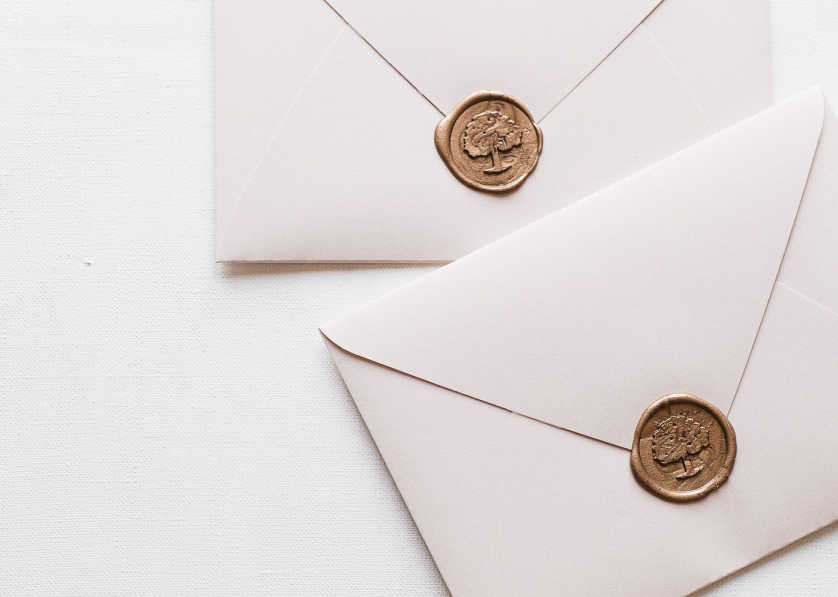
A monogram pressed into wax must resolve as a raised or recessed impression, legible even when the wax itself is imperfectly applied.
Fine interior details tend to disappear in this format, which is why wax seal monograms often favor bolder, simpler compositions.
Printed applications, by contrast, offer the greatest flexibility.
Stationery, invitations, and digital formats can accommodate finer detail than engraving or wax typically allow.
This is why many clients commission a primary personal monogram alongside a simplified variant suited to more demanding physical formats.
Both versions are built from the same underlying composition.
One is simply adapted to the practical realities of the material it will inhabit.
This adaptability is part of what makes a well-composed personal monogram genuinely durable.
It does not merely survive across generations; it survives across an entire range of physical contexts within a single generation.
A mark that only functions in one material has not yet been fully resolved as a personal monogram in the fullest sense.
There is also the question of color, which behaves differently across materials in ways that are easy to underestimate.
A gold foil stamp on cream stationery reads entirely differently than the same composition rendered in dark ink on white card stock.
Neither approach is inherently superior.
Each simply calls for a slightly different weighting of line and form to achieve the same underlying sense of balance.
Metal engraving introduces yet another variable: the play of light across a recessed or raised surface.
A monogram engraved into silver will catch light differently depending on the angle from which it is viewed.
This is part of why a physical proof, rather than a digital rendering alone, remains an essential step before any engraving is finalized.
A composition that looks perfect on a screen can still surprise its maker once light and metal are involved.
This is not a flaw in the process; it is simply evidence that materials have their own opinions worth listening to.
A Note on Materials
A personal monogram intended for engraving is composed with different proportions than one intended for print alone.
On Adaptability
The strongest personal monograms are tested across silver, wax, and paper before a final direction is approved.