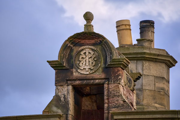
The Custom Cipher Monogram: A Name as Architecture
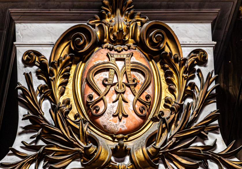
The Art of Monograms
The Custom Cipher Monogram: A Name Written as Architecture
A cipher is the quietest way a person can sign the world.
It does not announce a name so much as distill one, reducing an entire identity to a handful of interwoven letters.
A custom cipher monogram is that distillation made permanent, composed for a single person and intended to outlast them.
Where an ordinary logo is built to be noticed at once, a cipher is built to be recognised slowly, by those who already understand what it stands for.
This is a different ambition entirely, and it asks a different kind of design discipline to satisfy it.
The word cipher once meant something hidden, a code legible only to those who held its key.
A personal cipher preserves a trace of that original meaning, offering itself first as an elegant form and only afterward as a name.
This gentle concealment is not evasion; it is a form of restraint, and restraint is the governing instinct behind every mark of genuine distinction.
What follows is not a tutorial and not a catalogue of styles.
It is an account of why the custom cipher monogram endures, where it comes from, and what it asks of the person who chooses to commission one.
We will move through royal chanceries, family archives, wedding traditions, and the ateliers where these marks are still composed with historical rigour and contemporary discipline alike.
Throughout, a single theme recurs, quietly and without apology.
The finest ciphers are not designed to follow the moment of their making; they are designed to outlive it.
On Restraint
A cipher communicates through what it withholds as much as through what it shows, saying only what is necessary and never more.
It is worth pausing, at the outset, on how differently a cipher behaves compared with almost every other mark we encounter in ordinary life.
A commercial logo is designed to arrest attention, to interrupt, and then to be replaced when its season has passed.
A cipher is designed to be lived with, encountered thousands of times across a lifetime, and to feel exactly as considered on the final viewing as it did on the first.
That single requirement changes everything about how the mark must be composed.
It cannot rely on novelty, because novelty is precisely the quality that ages first.
It must rely instead on proportion, hierarchy, and the disciplined handling of the space between letters.
These are architectural concerns more than decorative ones, which is why a serious cipher resembles a small building more than a drawing.
The Art of Monograms
What a Custom Cipher Monogram Actually Is
A cipher, in the strictest sense, is a set of initials arranged as a single composed form rather than merged into decorative interlace.
This distinction is subtle, and it is frequently lost in casual conversation, where cipher and monogram are used interchangeably.
Historically, a monogram fused letters into one inseparable glyph, while a cipher arranged distinct letters into a balanced, legible relationship.
A royal cipher, for example, typically presents its letters clearly, often mirrored or repeated, rather than dissolving them into a single knot.
The practical consequence is that a cipher tends to read more openly, retaining the individual dignity of each letter within a unified whole.
A custom cipher monogram, then, is a cipher composed specifically for one person, family, or union, rather than selected from an existing template.
The word custom is not a marketing flourish here; it describes a genuine difference in how the mark is made.
A generated mark approximates a shape and applies it to any name that happens to fit.
A commissioned cipher begins from the specific letters involved, their particular widths, their ascenders and descenders, and the way they naturally wish to relate.
No two names present the same compositional problem, which is precisely why no two ciphers should arrive at the same solution.
Cipher, Not Merely Monogram
A cipher keeps its letters legible and distinct within a unified composition, where a fused monogram dissolves them into a single decorative knot.
This is also why the form rewards a designer who thinks in proportion rather than ornament.
The temptation, with any set of initials, is to add: a flourish here, an enclosing ring there, a small charge to fill an awkward gap.
The discipline of the cipher runs in the opposite direction, toward removal, toward the fewest elements that can carry the full weight of a name.
A cipher that needs decoration to feel complete has usually not yet been resolved at the level of its letters.
When the letters themselves are correct, ornament becomes unnecessary, and its absence begins to feel like confidence rather than austerity.
The tradition of the composed personal mark is far older and more varied than most people assume, spanning coins, seals, manuscripts, and eventually the printed page.
Anyone drawn to the broader history of these forms will find that the study of personal monograms opens onto two thousand years of continuous practice.
The cipher is one branch of that history, distinguished by its clarity and its close association with authority.
It is the branch that kings and chanceries favoured precisely because it could be recognised without being fully decoded.
A cipher that cannot be read at a glance has not been resolved, since clarity is the first requirement and ornament is never a substitute for it.
Understanding this at the outset changes how a person approaches the commission itself.
They arrive not asking for decoration, but for a form that will hold a name with dignity for as long as the name is carried.
That is a serious request, and it deserves a correspondingly serious process.
There is a further reason the cipher rewards this kind of attention, and it has to do with the nature of the letters themselves.
Letters were never designed to be combined; they were designed to stand independently within a word.
Asking two or three of them to share a single composition is therefore an act of genuine invention rather than mere arrangement.
The accomplished designer treats this constraint as the entire point of the exercise, not as an inconvenience to be worked around.
This is precisely why a cipher composed with care differs so markedly from one assembled from a menu of interchangeable parts.
The first belongs to exactly one name and could belong to no other; the second could belong to anyone at all.
That specificity, more than any single stylistic flourish, is what a person is truly commissioning.
Royal Traditions
The Cipher and the Grammar of Sovereignty
No institution shaped the cipher more decisively than the European royal court.
A sovereign’s cipher was never merely decorative; it was an instrument of governance, a way of extending the ruler’s presence into rooms and territories they would never personally visit.
The same intertwined letters appeared on military regalia, state correspondence, porcelain services, and the ironwork of palace gates.
This repetition was deliberate, a visual constancy meant to reinforce the permanence of the throne itself.
A cipher that shifted unpredictably from one surface to the next would have undermined the very authority it existed to project.
The systems governing how these marks could be composed grew remarkably precise over the centuries.
Rules concerning proportion, the placement of crowning elements, and the arrangement of supporting ornament became a discipline in their own right.
Institutions were established specifically to grant and record this visual language, and their work continues, without interruption, to the present day.
The formal grammar behind these marks can still be traced through the heraldic authority that grants and records personal arms in England, whose officers have overseen the granting of personal arms in England since the fifteenth century.
What their records reveal is not rigidity but rigour, a conviction that precision was never the enemy of beauty but the very thing that gave a royal mark its authority.
Antiquity
Combined initials appear on Greek and Roman coins and seals as an early guarantee of origin and authorship.
Early Medieval
Carolingian rulers formalise the cipher as a sovereign seal, merging faith, governance, and identity into a single mark.
The Chanceries
Royal secretariats codify the cipher as an instrument of state, applied consistently across correspondence and regalia.
The Age of Courts
Sovereign ciphers extend across porcelain, silver, architecture, and ceremonial dress, unifying an entire household under one signature.
Nineteenth Century
Luxury houses in Paris, London, and Vienna build brand identities upon a founder’s personal cipher.
Present Day
Individuals, families, and couples commission bespoke ciphers as a deliberate alternative to disposable design.
The historical record of monarchical taste makes plain how thoroughly the cipher permeated both daily and ceremonial life.
A survey of one of the world’s most storied ceremonial collections, preserved and open to the public reveals cutlery, drapery, carriage panels, and stonework all carrying the same cipher, a household rendered legible under one visual signature.
This was branding centuries before the word existed, executed with a level of craft that serious ateliers still study today.
What made the royal cipher so effective was, above all, its restraint.
A single mark, applied consistently, communicated more authority than an ever-changing catalogue of symbols ever could.
This lesson, arguably the most important that royal tradition offers, remains just as relevant to a private individual composing a personal mark now.
On Consistency
A cipher gains authority the way a royal seal once did, through unwavering repetition across every surface it is permitted to touch.
The throne understood something every serious commission still depends upon: consistency is what allows a symbol to become a legacy.
A change to a royal cipher was never undertaken lightly, since it implied a change in the authority the mark represented.
Court officials responsible for these marks operated with a precision that modern brand guidelines still strive to match.
Every element, from the width of a supporting flourish to the angle of a crowning device, was governed by established convention.
This was not bureaucratic excess but an understanding that a symbol’s power depends entirely on its reliability.
That understanding carries forward directly into private commissions, where a personal cipher gains its quiet authority through exactly the same mechanism.
It is worth dwelling on how deliberately these households managed the visual consistency of their marks across every surface and every generation.
A cipher was not permitted to drift from one application to the next simply because a new craftsman found a more fashionable treatment appealing.
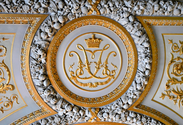
The proportions were fixed, recorded, and defended, precisely so that the mark would remain recognisable across a reign and beyond it.
This is the discipline a serious atelier still borrows from royal practice, translated to a private and contemporary scale.
A cipher documented with the same rigour can be reproduced faithfully for a lifetime, whether pressed into wax or reduced for a screen.
The lesson is not that a person requires a crown to justify such care, but that the care itself is what confers authority.
Authority, in this reading, is not inherited; it is composed, maintained, and quietly earned through consistency.
“Long before logos became commonplace, the most enduring marks of distinction belonged not to companies, but to individuals.”
The Art of Monograms
Cipher, Monogram, or Crest: Choosing the Right Form
People new to bespoke identity frequently arrive uncertain which form actually suits them.
The three most commonly confused are the cipher, the fused monogram, and the crest, and each answers a genuinely different question.
A cipher composes distinct initials into a clear, unified relationship, favouring legibility and a certain restrained authority.
A fused cipher monogram in its more decorative register interlaces those same letters into a single ornamental knot, prized for its intimacy and craft.
A crest, by contrast, borrows the formal grammar of heraldry, placing initials or charges within the structure of a shield.
Choosing incorrectly rarely produces an ugly design; it more often produces a design quietly asked to do work it was never built for.
A cipher commissioned to carry the full ceremonial weight of a lineage may eventually feel too modest for that purpose.
A full heraldic composition placed on everyday correspondence can feel oversized for that same purpose.
The art of the initial consultation lies largely in identifying which form the situation genuinely calls for.
For families who want both the intimacy of initials and the formality of a shield, the hybrid monogram crest often resolves the tension without asking either instinct to be set aside.
Three Related Forms, Compared
| Form | Governing Logic | Best Suited To |
|---|---|---|
| Cipher | Distinct initials composed into a clear, unified relationship | Personal stationery, jewellery, quiet professional identity |
| Fused Monogram | Letters interlaced into a single ornamental glyph | Linens, heirloom objects, ceremonial keepsakes |
| Monogram Crest | Initials set within the formal structure of a shield | Signet rings, household correspondence, architectural use |
| Full Family Crest | Pictorial charges representing an entire lineage | Architecture, formal documents, generational inheritance |
None of these forms is superior to the others; each simply serves a different intention.
A cipher tends to suit the individual who values discretion, the professional who wants a mark that signals judgement rather than volume.
It reads as personal without becoming private, and as formal without becoming ceremonial.
This is precisely the register that suits so many contemporary commissions, where the goal is quiet distinction rather than overt display.
On Choosing Well
The wrong form rarely produces a poor design; it produces a good design asked to perform a role for which it was never intended.
It is also worth noting that these choices are not mutually exclusive across a lifetime.
A person might commission a cipher for their own correspondence, a crest for their household, and a decorative monogram for a single celebration.
Each mark answers a different question the person is asking at a different point in their life.
Commissioning all three at once is unusual; commissioning them in sequence, across years, is a familiar and entirely natural pattern.
What unites them is the same governing instinct, an insistence on permanence over trend and on meaning over mere decoration.
It helps, at the outset, to be honest about what a person actually wants a mark to accomplish.
Some arrive wanting the intimacy of a private cipher for their own correspondence and nothing more.
Others want a mark that can carry the weight of a household, or one that will eventually pass to children not yet grown.
Naming that intention early tends to shorten every stage that follows, rather than lengthen it.
The Atelier Journal
The Grammar of the Interlace
The composition of a cipher is deceptively simple in appearance and genuinely demanding in execution.
Two or three letters must be resolved into a single coherent form without any one of them losing its identity.
This requires the designer to think simultaneously about typography, symmetry, and legibility at radically different scales.
A cipher destined for a signet ring must remain legible at the size of a fingernail.
The same composition, applied to a gate or a bookplate, must hold its proportion across an entirely different range.
Few design problems demand this breadth of scale fidelity from a single small composition.
The process typically begins with the letters themselves, their natural proportions, their ascenders, and their descenders.
Some letter combinations interlock with obvious grace, while others require significant invention to feel resolved.
A skilled designer treats this not as an obstacle but as the central creative challenge of the entire commission.
On Negative Space
The space within and around a cipher is an active design element, not the empty area left over once the letters have been drawn.
Negative space receives as much attention as the letterforms it surrounds.
In a composition of modest size, the gap between a stroke and its neighbour carries almost as much visual weight as the stroke itself.
Too little space and the cipher feels cramped; too much and the letters lose their anchoring relationship to one another.
Finding the correct balance is closer to an exercise in proportion than an exercise in decoration.
Hierarchy matters as well, particularly in ciphers built from three or more initials.
Not every letter deserves equal visual weight, and the strongest compositions make this hierarchy feel inevitable rather than imposed.
Typically the surname initial, or the most phonetically prominent letter, anchors the composition, with the remaining letters arranged around it.
This is a decision made through iteration rather than formula, and it is where the discipline most resembles architecture.
There is a particular moment experienced designers describe as the composition settling.
It is the point at which a cipher stops looking like an arrangement of letters and begins to look like a single, inevitable form.
This moment cannot be forced, and it rarely arrives on the first attempt.
It tends to emerge only after several rounds of adjustment, each refining the relationship between the letters slightly further.
A designer with genuine experience learns to recognise this moment, and to resist the temptation to keep adjusting once it arrives.
Overworking a composition past this point is a common error, one that introduces unnecessary complexity in the name of improvement.
The moment a cipher begins to look inevitable is the moment the design is finished, and further adjustment past that point tends only to subtract.
Restraint, once again, proves to be the discipline that separates a lasting mark from an overwrought one.
This is why the refinement stage is treated with particular care, each candidate tested against demanding conditions before it is considered complete.
A cipher that survives this scrutiny tends to survive everything that follows it.
A cipher is judged twice, once as a set of letters and once as a single composed form, and it must satisfy both readings at exactly the same time.
It is also worth noting how differently various historical traditions approached this same fundamental problem.
Some favoured strict symmetry, mirroring one letter against another along a central axis with almost mathematical precision.
Others favoured a deliberate asymmetry, allowing one letter to lead while the remainder receded into supporting roles.
Neither approach was inherently superior; each simply reflected different priorities regarding legibility, ornament, and material.
Studying these variations reveals just how flexible the underlying grammar of the cipher has always been.
The same essential principles of unity, hierarchy, and negative space can produce remarkably different results depending on the tradition a designer draws upon.
This flexibility is one of the reasons the discipline has never grown stale, even after two thousand years of continuous practice.
A cipher composed today and one composed three centuries ago share more in common than most objects separated by so much time.
The Atelier Journal
From Consultation to Composition
Designing a custom cipher begins with conversation, not with sketching.
The earliest sessions are devoted to understanding a person’s initials, their story, and the occasions the mark is intended to serve.
Only once that context is understood does the visual work begin in earnest.
This stage draws on typographic and historical reference, so the composition is rooted in genuine precedent rather than passing style.
Nothing is invented arbitrarily, and nothing is borrowed carelessly from a form already established elsewhere.
01
Consultation
An extended conversation about the name, its story, and where the mark will live.
→
02
Research
Typographic and historical grounding, so the composition rests on genuine precedent.
→
03
Concept
Several distinct directions explored, each resolving proportion and hierarchy differently.
→
04
Refinement
A single direction tested against demanding scale conditions, from ring to bookplate.
→
05
Delivery
The finished mark prepared for stationery, engraving, textile, and digital use.
A period of refinement follows, during which several early directions are narrowed toward a single disciplined composition.
This stage typically takes longer than any other, since restraint requires far more judgement than addition.
A person is shown fewer options as the process advances, not more, as the design converges toward its final form.
This convergence is deliberate, and it is often the opposite of what people expect from a creative process.
They imagine an ever-widening field of possibilities, when in fact the work is a steady narrowing toward inevitability.
On Patience
A cipher completed too quickly rarely receives the scrutiny that produces a mark worth keeping for decades; the slower pace is the point.
The consultation stage frequently surfaces personal history that had not been discussed in years.
A middle initial carried for three generations, a name anglicised at a border, a letter that once belonged to a grandparent: these details shape the work.
The broader tradition of the composed personal mark offers a deep well of precedent for these decisions, and it rewards study before a single stroke is drawn.
Once the composition is resolved, the finished cipher is prepared for every application the person is likely to need.
This includes engraving specifications, stationery proofs, and a simple record of the mark’s correct proportions and spacing.
That record matters more than it may initially seem.
A cipher rendered slightly differently on a ring than on a letterhead begins to lose the authority that consistency provides.
This is why the atelier treats documentation as part of the commission rather than an optional courtesy.
A mark without a record of its own proportions is, in a meaningful sense, only half delivered.
Luxury Identity
Where the Cipher Lives
A finished cipher is only the beginning of its life.
The true test of a composition is how gracefully it performs across the many surfaces it will eventually occupy.
Personal correspondence remains one of the most enduring applications, particularly for those who still value the ritual of a written letter.
Engraved objects present a different test, since the mark must translate cleanly into a physical, dimensional medium.
Cufflinks, signet rings, flasks, and jewellery all demand a level of simplification that a flat drawing does not require.
Personal Stationery
Correspondence, cards, and personal documents carry the cipher as a quiet signature of authorship.
Engraved Objects
Signet rings, silver, and cufflinks demand a composition that survives translation into metal.
Wax and Seal
Pressed into wax, a cipher returns to its oldest function, marking a letter as genuinely one’s own.
Linen and Textile
Woven or embroidered, the mark must simplify gracefully when rendered in thread.
Architectural Detail
Worked into a gate, a library, or ironwork, the cipher becomes a quiet signature within a home itself.
Digital Identity
As a favicon or profile mark, the cipher must remain legible reduced to a handful of pixels.
Architectural applications push the composition further still, sometimes requiring a cipher to remain legible from a considerable distance.
A gate, a facade, or a family archive carved in stone must communicate the same identity as a mark the size of a postage stamp.
Few design problems test proportional integrity as thoroughly as this range of scale.
Digital identity has added an entirely new category of application in recent decades.
A cipher now frequently appears as a favicon, a social profile mark, or a watermark on a professional portfolio.
These small-format uses demand a simplicity that many historic ciphers, designed for engraving rather than screens, were never required to achieve.
This is one of the genuine design challenges of the present era, and it is solved not by abandoning historic proportion but by refining it with contemporary discipline.
On Digital Fluency
A well-built cipher must read clearly reduced to the size of a favicon without ever abandoning the historic proportion that gives it authority.
The strongest ciphers composed today manage to satisfy both worlds at once.
They read as entirely at home pressed into wax and equally at home reduced to sixteen pixels on a screen.
This dual fluency, historic in spirit and contemporary in application, is the clearest evidence that the discipline remains very much alive.
A complete commission is therefore delivered across a range of formats, vector and raster alike, so the mark can pass to an engraver, a printer, or a developer without any loss of fidelity.
A cipher that cannot be cleanly engraved, or that dissolves when reduced for digital use, has failed a fundamental requirement of the commission.
There is a particular satisfaction in watching a cipher accumulate meaning across the surfaces of an ordinary life.
The mark that first appeared on a sheet of correspondence returns, years later, on a piece of silver chosen precisely because the cipher already felt settled.
Later still, it might be worn quietly on a ring, or pressed into the wax of a letter that matters enough to seal by hand.
Each of these appearances is possible only because the original composition was built with enough restraint to belong in all of them.
A mark overloaded with of-the-moment flourishes rarely survives this journey with its dignity intact.
One built on genuine proportion tends to move between contexts without ever appearing to strain.
This quiet adaptability is not an accident of the design; it is the direct result of the discipline applied to it from the first sketch.
Legacy & Family Heritage
Voices of Distinction
The atelier hears from individuals and families across the country, each arriving with a different reason for wanting the form.
What follows are a few of their own words, offered in their own voice.
“When the composition was finished, it felt as though it had always existed and we had simply uncovered it. It has not needed a single revision since.”
Eleanor V.
Estate Owner, Boston, Massachusetts
“I commissioned the cipher for my practice stationery, and later for the door of my chambers. It performs identically at both scales, which is the only proof that matters to me.”
William H.
Attorney at Law, Charleston, South Carolina
“What struck me most was the restraint. Nothing about the final mark felt like it was trying too hard, and that quiet confidence is exactly what we wanted.”
Cecilia & James T.
Newport, Rhode Island
“A single interwoven pair of letters carried more authority than the crowded logo I had used for a decade. I only wish I had commissioned it sooner.”
Margaret L.
Architect & Collector, San Francisco, California
These accounts differ in circumstance, yet they converge on the same observation.
A commissioned cipher does not merely look considered; it continues to feel considered, decades after the moment of its creation.
That endurance is the quality clients most often name, and it is the one a generated mark can never quite replicate.
Clients rarely praise a cipher for how striking it looked on the first day, but for how naturally it still belongs on the thousandth.
It is worth noting how consistently the theme of quiet confidence recurs across these voices.
None of them describe the mark as loud, or clever, or fashionable, and none of them intended it to be.
They describe it, instead, as correct, and correctness of this kind tends to remain quietly obvious for a very long time.
The Art of Monograms
On the Letters Themselves
One of the first decisions in any commission concerns how many letters the cipher should carry.
A single letter is the most demanding composition, since there is nowhere at all to distribute visual weight.
Two letters introduce a relationship, and that relationship must be resolved with real care.
Three letters, the most traditional configuration, allow a central letter to anchor the composition.
There is no universally correct answer, and the right count depends entirely on the name and its intended use.
A person with a short, distinctive name may find that a single well-proportioned letter says everything required.
A couple joining two names may find that two interlaced letters best represent the union.
A family with a long-standing surname may prefer three letters, honouring first, middle, and family initials together.
Each configuration carries its own historical precedent, and none is more legitimate than another.
When the aim is a durable, repeatable mark for professional life, the discipline overlaps closely with that of the initials logo, where clarity at every scale becomes the governing criterion.
On Letter Count
Fewer letters do not mean less work; compressing a name removes every place a designer might otherwise hide an imprecise decision.
A related decision concerns whether a cipher should be built on strict symmetry or on a more deliberate asymmetry.
Symmetrical compositions carry an immediate sense of order, reading as formal, ceremonial, or classical.
Asymmetrical compositions can feel more contemporary, provided the imbalance is intentional rather than accidental.
The danger with asymmetry lies in mistaking carelessness for intention.
An asymmetrical mark must still obey an underlying logic, even if that logic is not immediately obvious to the eye.
Without that logic, an asymmetrical composition simply reads as unresolved.
This is a subtle distinction, and one that separates a deliberate decision from an unfinished one.
The tradition behind these choices is documented with real seriousness by those who study it.
A society devoted to the study of heraldic tradition continues to record how personal marks have been composed, granted, and interpreted across the centuries.
That ongoing body of scholarship makes it possible to build a contemporary cipher that respects its lineage rather than merely borrowing its appearance.
A person need not fully understand this history to commission a cipher correctly.
They need only a designer willing to carry that discipline on their behalf.
Symmetry does not excuse imprecision, and asymmetry does not excuse carelessness, for both are simply different routes toward an inevitable form.
Some names lend themselves naturally to one approach over another, based purely on the shapes of their letters.
Other names offer genuine flexibility, and the choice becomes a matter of temperament rather than necessity.
In those cases, the preference of the person who will carry the mark is given considerable weight.