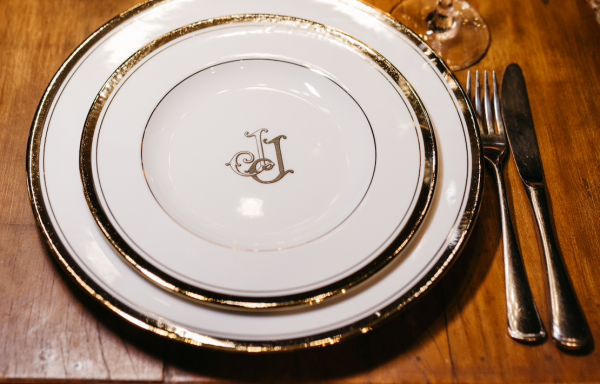
Personalized Couple Monogram: Two Lives, One Enduring Mark
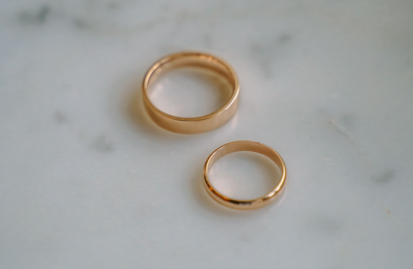
The Personalized Couple Monogram: A Mark Built to Outlast the Occasion
On the mark two people choose to share, long after any single occasion has passed.
This is an editorial account of that choice, not a design tutorial.
It considers what a personalized couple monogram asks of its maker, and of the two who keep it.
The classic monogram tradition has always known how to speak for one; this is how it learns to speak for two.
THE ART OF MONOGRAMS
What a Personalized Couple Monogram Actually Represents
A personalized couple monogram is not a wedding accessory, and it was never meant to be one.
It is a considered visual form built to represent two people as a single, permanent identity.
The classic monogram tradition has spoken for one name at a time for centuries.
A couple monogram asks that same disciplined tradition to speak, correctly, for two names at once.
This is a different problem than a wedding crest, and a different problem than an engagement mark.
Many ateliers conflate the two, and the confusion costs their clients something real.
A mark meant only for an engagement season answers a narrower question than a couple truly needs answered.
It typically claims only first initials, deliberately withholding any shared surname not yet in use.
A personalized couple monogram carries no such restriction, and no such timeline.
It may include a surname initial already claimed, already lived with, already true.
It may just as easily represent two people who never intend to share a legal name at all.
Two architects opening a joint practice want this mark as much as any bride ever has.
Two people marking a decade together, with no ceremony behind them, want it in equal measure.
The atelier composes this mark the same way regardless of the occasion that prompted the request.
What matters is the relationship the mark represents, not the calendar date attached to it.
This is the essential distinction worth stating plainly before any letter is sketched.
It is also the distinction most generic pairing tools have no capacity to recognize at all.
A tool built to output a mark in seconds cannot ask what occasion, if any, actually prompted the request.
It can only assume every pair of letters is arriving under identical circumstances, which is rarely true.
A closer look at how a bespoke mark is composed for one name alone clarifies why two names demand an even greater discipline.
That earlier discipline governs every decision made once a second identity enters the composition.
The classic monogram favors symmetry, restraint, and a visible debt to historical letterform.
A personalized couple monogram inherits every one of those disciplines, and adds one further demand.
Two identities must be represented with genuinely equal visual weight, never one favoring the other.
This is a harder problem than it appears from outside the craft.
A single name has only itself to satisfy; two names must satisfy each other as well.
I have watched clients arrive assuming this is simply a monogram with an extra letter inserted.
It rarely works that way in practice, and I explain why during the very first conversation.
Adding a second identity to a composition changes its entire underlying architecture, not merely its length.
The negative space between two names carries as much meaning as either name alone.
A generic pairing tool has no capacity to weigh that negative space with any real judgment.
It can only apply an identical formula to whichever two sets of letters are entered into it.
A personalized couple monogram is composed instead through conversation, letterform study, and patient revision.
That process is slower than any generator, and considerably more likely to still feel correct in twenty years.
Permanence, not speed, has always been the actual point of the commission.
I remind clients of this early, since the slower pace can feel unfamiliar in a culture built for instant results.
Most, once they see the difference in the finished mark, no longer mind the extra weeks it required.
A commission built to last five decades can reasonably ask for five extra weeks at the outset.
This is why the atelier treats the duogram tradition as a related but distinct commission, built for a narrower occasion than this one.
A personalized couple monogram is not bound to any single occasion; it is bound only to the two people it represents.
Unlike a duogram, it may claim a shared surname initial the moment that name has genuinely been claimed.
The classic monogram tradition, applied here, asks two identities to carry precisely equal visual weight.
THE ART OF MONOGRAMS
Two Names, Considered as a Single Form
Every personalized couple monogram begins with two separate letterforms, studied independently before they meet.
A letter must hold its own structural integrity before it can be trusted to share space with another.
This principle borrows directly from classical architecture, where a column must stand before a portico can rely on it.
Calligraphy teaches the second half of the lesson: where a letterform is permitted to bend, and where it is not.
Some letters interlace generously, settling into balance within the first few sketches.
Others resist interlace altogether, and a trained hand learns to respect that resistance rather than force it.
A composition that forces two unwilling letters together tends to look strained under close inspection.
I would rather simplify a design than compel two letterforms into an unnatural embrace.
This restraint is rarely the easier path, whatever it might appear to be from a distance.
A personalized couple monogram succeeds the moment neither letter can be removed without the mark losing its meaning.
That standard sounds simple stated aloud, and it is considerably harder to achieve in practice.
The composition must read as inevitable, as though no other arrangement had ever been possible.
Inevitability of this kind is manufactured through dozens of small, deliberate decisions.
None of those decisions are visible individually once the finished mark is delivered.
Their absence, however, is exactly what a viewer notices when a generic pairing feels wrong without knowing why.
I have learned to treat that vague sense of wrongness as useful information rather than an inconvenience.
It usually points to one specific decision left unresolved, hiding somewhere beneath an otherwise competent sketch.
Order matters as much as interlace, and clients rarely arrive with a fixed opinion about it.
Some prefer strict alphabetical convention, placing whichever initial comes first on the left.
Others prefer whichever order simply composes more gracefully once the two forms are joined.
There is no universally correct answer, and I distrust any studio that insists otherwise.
What matters far more than order is the discipline of genuine visual balance between the two letters.
A personalized couple monogram that favors one identity, even subtly, tends to dissatisfy at least one half of the pairing.
I test every direction against this single standard before any other consideration is permitted to intrude.
Does either letter read as the dominant partner in the composition, even faintly.
If the honest answer is yes, the direction is set aside, however elegant it looks in isolation.
This is a design principle, though it is quietly also a statement about the relationship the mark represents.
Clients rarely ask me to articulate this explicitly, and most understand it the moment it is named.
The strongest personalized couple monograms treat the space between the two letters as their true subject.
It is that shared space, not either letterform alone, that gives the composition its particular warmth.
I have come to think of that negative space as the actual handshake between two identities.
The letters simply provide the occasion for it, and the composition succeeds or fails around it.
Clients rarely arrive expecting this, though most recognize it immediately once it has been pointed out.
ROYAL TRADITIONS
A Royal Precedent for a Mark Built for Two
No account of the paired personal mark is complete without its royal precedent.
European courts were composing shared ciphers centuries before any atelier described one as personalized.
A monarch and a consort were frequently represented not by one letter but by two, interlaced with evident care.
This was rarely treated as decoration; it was treated as a formal statement about a union.
The institutions responsible for granting personal arms in England still preserve much of that careful discipline today.
The rules that governed a royal cipher were never assembled from a fixed, reusable template.
Each cipher was composed anew, adjusted to the reign, the alliance, and the specific occasion it marked.
Symmetry between the two interlaced letters mattered as much then as it does in a contemporary commission.
Engravers were instructed, in numerous surviving commissions, to give equal visual weight to both initials.
A cipher in which one letter visibly outranked the other was considered a genuine failure of the engraver’s craft.
One of Europe’s principal royal archives preserves numerous examples of these paired ciphers across several centuries.
They appear on state silver, on ceremonial linens, and on the facades of shared residences alike.
What survives, consistently, is a refusal to let either letter overshadow its partner.
That restraint, more than any particular ornament, is the real inheritance a personalized couple monogram draws from royal tradition.
Scholarship devoted to the formal study of heraldic tradition has documented this discipline across many generations of European practice.
What that scholarship shows, again and again, is that customization and tradition were never genuinely in tension.
A cipher, properly composed, never abandoned tradition; it simply applied tradition to one specific case.
This is precisely the same principle that governs a personalized couple monogram commissioned today.
A court engraver centuries ago and an atelier now are, in this narrow sense, solving the identical problem.
How do two identities become a single legible mark, without either identity disappearing into the other.
16th –17th Century
The Composed Royal Cipher
European courts begin formally pairing initials for royal marriages and dynastic alliances.
18th Century
The Engraver’s Convention
Master engravers establish interlace conventions that treat symmetry as a point of professional honor.
19th Century
The Household Adoption
Paired-initial marks migrate from royal courts into aristocratic and merchant households across Europe.
20th Century
The Personal Cipher, Broadened
Couples of every kind, not only sovereigns, begin commissioning shared marks for correspondence and keepsakes.
Present Day
The Personalized Commission
The personalized couple monogram is recognized as a distinct commission, answerable to no single occasion.
It would be a mistake to treat this history as ornamental trivia unrelated to a contemporary commission.
The conventions established across those centuries still govern how a personalized couple monogram is composed correctly today.
Legibility at a distance, symmetry between the two forms, and restraint were never simply aesthetic preferences.
They were practical requirements for marks meant to be recognized instantly, often at considerable distance.
A royal cipher had to be identifiable on a passing carriage, a distant banner, or a formal seal.
That same demand for instant legibility applies to a personalized couple monogram engraved onto a small signet ring.
Working within these inherited constraints is less a limitation than an inheritance worth accepting gladly.
LUXURY IDENTITY
Set Beside Its Related Forms
Clients frequently arrive uncertain which of several related marks actually suits their circumstances.
The personalized couple monogram, the duogram, and the wedding monogram share a common ancestry.
They do not, however, serve the same moment, and confusing them costs a client real satisfaction later.
A duogram is deliberately narrow: two first initials, composed specifically for the season before a wedding.
A wedding monogram generally arrives after the ceremony, once a shared surname initial is available to it.
A personalized couple monogram sits outside both timelines, answerable to neither an engagement nor a ceremony.
It may borrow a surname initial already claimed, or it may represent two people who never intend to share one.
The table below reflects how I explain this distinction during an initial consultation.
I encourage every client to read it before we discuss a single sketch or letterform.
Most clients arrive having used these terms interchangeably, without realizing how differently each one behaves.
A short conversation early in the process prevents a mismatch that would otherwise surface much later.
Choosing the Right Form for the Relationship
| Form | Letters Used | Governing Occasion |
|---|---|---|
| Duogram | First initials only | Engagement, before any surname is shared |
| Wedding Monogram | Initials claimed at the ceremony | The wedding itself, and its immediate aftermath |
| Personalized Couple Monogram | Any letters the two people actually hold | No single occasion — any established shared identity |
| Family Crest | Symbols beyond letters alone | A household’s established, multi-generational history |
None of these forms should be understood as simply a smaller or larger version of another.
Each has its own conventions, its own governing occasion, and its own visual grammar.
A personalized couple monogram is, in a real sense, the most flexible of the four.
It does not need a wedding to justify it, and it does not need to withhold a name not yet earned.
It only needs two people who have decided, for whatever reason, to be represented together.
This flexibility is precisely why the form suits such a wide range of clients at the atelier.
Newly engaged couples commission it, as do couples married for decades who never had a formal mark made.
Professional partners commission it, as do close companions who will never describe themselves as married at all.
The atelier does not ask a couple to justify their relationship before agreeing to compose their mark.
It asks only what the two letters, or two names, are meant to say once joined.
This is, I think, the more respectful way to approach a commission built around something as personal as a relationship.
A designer’s role is to listen and render, not to gatekeep who deserves a considered mark and who does not.
BESPOKE WEDDINGS
Choosing and Ordering the Letters
The first real decision in any personalized couple monogram commission is which letters actually belong in it.
Some couples want their given names represented, first initial beside first initial.
Others prefer a shared surname initial, paired with a single given initial chosen to represent them both.
A few request three letters entirely, treating the composition closer to a small family monogram.
None of these choices is more correct than another, though each changes the entire commission.
I ask, early in every consultation, what occasion the mark is meant to serve, since occasion shapes register considerably.
An engagement piece can afford romance that a professional practice generally should not attempt.
A closer look at how a custom pairing is composed for an engagement clarifies the same discipline applied more broadly.
The underlying principle does not change simply because the occasion or the letters involved have changed.
Every decision, from letterform to negative space, is still made in service of one specific relationship.
Once the letters are settled, a second and less obvious decision remains: their order.
Some clients follow strict alphabetical convention without exception, regardless of how the result reads.
Others choose whichever order simply composes more gracefully once the two forms are interlaced.
I test every proposed order against a single, unchanging standard before anything else is considered.
Does either letter dominate the composition, even subtly, once the two are placed together.
If the honest answer is yes, I set the direction aside and propose an alternative.
A few clients specifically request a deliberate asymmetry, wanting one letter to lead by clear intention.
This is a legitimate request, and I execute it gladly when it reflects a genuine, considered choice.
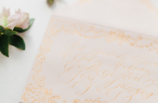
The distinction that matters is between an asymmetry that is chosen and one that is simply unresolved.
A chosen asymmetry carries a logic a viewer can sense, even without being able to name it precisely.
An unresolved asymmetry, by contrast, simply looks like an error nobody corrected.
Order becomes further complicated when the two letters involved are visually similar to one another.
I ask couples to sit with a proposed order for a few days before approving it outright.
A decision that felt obvious in the room sometimes reads differently once seen again a week later.
Two rounded letters, or two letters sharing a dominant vertical stroke, compete for identical visual territory.
Resolving that competition sometimes requires a slight adjustment of scale, so one letter recedes just enough.
This adjustment is subtle enough that most viewers never consciously register it, though they feel its absence.
A client rarely requests this adjustment explicitly; they simply notice, correctly, when an early draft feels crowded.
I have learned to anticipate this crowding before a client has to name it, from studying the letterforms together.
Certain pairings interlace naturally, sharing a stroke or curve without any forced adjustment at all.
Other pairings resist interlace entirely, and forcing them together produces a mark that looks strained under scrutiny.
In those cases, I recommend a composition that places the letters side by side rather than interlaced.
This is not a lesser solution; it is simply the correct one for that particular pair of letters.
A personalized couple monogram should never insist on interlace for its own sake, at legibility’s expense.
Clients occasionally request interlace specifically because they associate it with tradition, without weighing its structural cost.
I explain, honestly, when a requested interlace will compromise legibility more than it adds meaningful character.
Most clients, once shown the comparison directly, choose legibility over an association they had not fully examined.
BESPOKE WEDDINGS
Where a Personalized Couple Monogram Lives
A finished personalized couple monogram is expected to perform across a genuinely wide range of contexts.
It may appear on personal correspondence one season and on a small leather case the very next.
It may be engraved into silver, embossed into leather, or rendered as a small digital mark.
Each of these contexts places a different demand on legibility, line weight, and overall proportion.
A mark that only works at one scale has not yet been fully resolved by its designer.
The atelier tests every commission across the specific applications most relevant to a given couple’s life.
Some couples need only a handful of applications; others need the mark across an entire shared household.
Both cases receive the same underlying rigor, adjusted only in scope rather than in underlying standard.
Engagement Stationery
A personalized couple monogram introduces a shared identity before any wedding detail has been finalized.
The Ceremony Program
Placed at the top of a program, the mark frames the occasion without overstating it.
Personal Correspondence
Thank-you notes and early acknowledgments carry a consistent identity long before any registry closes.
Professional Signage
A partnership’s shared letters, custom-fitted to office entrances, nameplates, and correspondence alike.
Keepsake Objects
An engraved case, a frame, or a small box becomes an early artifact of a shared history.
The Anniversary Gift
A mark commissioned years into a relationship carries the same discipline as one made at its outset.
None of these applications share identical requirements, and that variance is precisely the point of a custom process.
A generic pairing, generated once, is typically asked to serve every one of these contexts unchanged.
It rarely performs equally well across all of them, since it was never built with any one of them in mind.
A personalized couple monogram is built with its primary destination in mind from the very first sketch.
Later applications are then tested against that original resolution, rather than treated as an afterthought.
This sequencing, more than any single stylistic choice, is what separates genuine custom work from a shortcut.
Consistency across every application, rather than novelty within any single one, is what builds lasting authority.
A mark used consistently will always read as more considered than one used only sporadically across a household.
A signet ring is viewed at close range, upside down, sideways, and often in poor light.
A composition assuming only one fixed viewing angle will disappoint the moment the ring is actually worn.
Architectural or engraved applications must be resolved with tolerances considerably tighter than paper allows.
THE ATELIER JOURNAL
Craft in Numbers
Craftsmanship resists easy measurement, though certain figures still illuminate what a commission involves.
A single personalized couple monogram typically explores several distinct interlace directions before one is chosen.
This range exists because the correct solution for two specific letters is rarely obvious immediately.
Multiple scales are tested for every finished mark, from ring-sized engraving to stationery-sized print.
A mark that only works at a single scale has not, in the fullest sense, been properly finished.
3–5
Interlace directions explored per commission
40+
Letterform pairings considered before one is chosen
100+
Years a well-proportioned mark can remain legible on silver
2
Identities, balanced so neither ever outranks the other
Consultation & Listening
Letterform Exploration
Refinement & Testing
Final Delivery & Handoff
Refinement consistently consumes the largest share of total effort, which surprises most first-time clients.
This ratio is precisely inverted from how most couples imagine the design process actually working.
Most assume the initial sketch is the hard part, and refinement a mere formality that follows it.
In practice, the opposite proves true, and the last small adjustments decide considerably more than the first bold idea.
These figures describe restraint, not scale, which is precisely the underlying point of the exercise.
A personalized couple monogram, like true luxury, is not measured by how frequently it changes.
It is measured, instead, by how rarely it ever needs to change at all.
In practice, the last small adjustments to an interlace decide considerably more than the first bold sketch.
THE ATELIER JOURNAL
Inside the Atelier: How the Mark Is Built
Clients occasionally ask why two letters require several distinct stages to resolve properly.
The honest answer is that most of the time is spent narrowing options, not generating them.
Producing a competent pairing of two letters is, comparatively, quick work for an experienced hand.
Recognizing which competent pairing is the correct one for these two specific people takes considerably longer.
That recognition often benefits from stepping away from a direction and returning to it with fresh eyes.
A composition that looked resolved on a Tuesday can reveal a flaw by the following week.
I build this reflective distance directly into every commission, rather than treating it as an inconvenience.
01
Consultation
Both names, the occasion, and the register the mark must hold are established through conversation.
02
Letterform Study
Each letter is studied independently for its natural weight before any pairing is attempted.
03
Interlace Exploration
Multiple ways of joining the two letters are sketched and compared side by side.
04
Balance Review
Every direction is tested against strict symmetry, so neither identity dominates the other.
05
Application Testing
The strongest direction is tested against its intended destination, from ring to linen.
06
Refinement
Fine adjustments to weight, spacing, and proportion are made until the mark feels inevitable.
07
Delivery
The finished mark is prepared across every application the couple intends to use.
A personalized couple monogram commission typically moves at a deliberate, unhurried pace, and no apology follows that.
Two letters require fewer structural decisions than a full family crest built from multiple symbolic elements.
This narrower scope does not mean the work demands less care, only that fewer variables are in play.
Every commission still passes through the same disciplined sequence as a considerably larger one.
I mention this so clients understand that efficiency here is never a shortcut taken at quality’s expense.
It is simply the natural result of a smaller, more precisely defined design problem.
I keep a working file open on every commission until a couple has approved every intended application.
This means an approval for stationery does not close the file if a signet ring is still to come.
Revisiting the same working file for each new application preserves a consistency a fragmented process would risk losing.
A mark approved once for paper and redrawn separately for metal invites small, accumulating inconsistencies over time.
The atelier’s process resists this fragmentation by design, and not by accident of workflow.
LEGACY & FAMILY HERITAGE
From a Shared Mark to a Family Legacy
Legacy is often imagined as something inherited only after a long life has already passed.
In practice, legacy begins the moment two people decide to represent themselves as one household.
A personalized couple monogram marks that beginning with more honesty than most symbols manage.
It does not claim generations that have not yet happened, nor promise permanence it cannot guarantee.
It simply states, clearly and quietly, that a shared chapter has already started.
Families who later commission a full family crest often trace its origin to a mark much like this one.
The two-name form becomes the first line of a visual history that grows outward from there.
I have watched this pattern repeat across very different households, in very different regions of the country.
A young couple in one commission becomes, decades later, grandparents commissioning a fuller family emblem.
The personalized couple monogram they once carried on a wedding program still hangs, quietly, in a hallway.
A closer study of how a paired two-letter mark matures over years clarifies why restraint matters at the very outset.
Scholarship devoted to heraldic tradition has long documented how personal marks evolve rather than simply disappear.
A two-name form is rarely a final destination; it is far more often a considered starting point.
Some individuals commission an initials logo entirely on their own, long before any couple’s mark enters the picture.
This is one reason the atelier encourages restraint at this stage rather than early excess.
A mark built to grow with a household should not attempt to say everything about it at once.
A crowded early composition leaves little room for the crest that may one day follow it.
A disciplined one leaves exactly the right amount of visual space for that future development.
This is, I believe, the difference between decoration and design that genuinely respects time.
Every family with a long history was, at some point, simply two people beginning something together.
A shared mark does not need to anticipate grandchildren to be worth commissioning well today; it only needs to represent, honestly, the two people who are commissioning it now.
The mark they carried at that beginning is often the earliest surviving object of that story.
Families who understand this tend to make calmer, more confident decisions throughout the design process.
They are not attempting to solve for every future contingency within a single piece of artwork.
They are simply asking for a mark that tells the truth about where they stand today.
This honesty, more than any assumption about the future, is what gives a personalized couple monogram its integrity.
I try to communicate this clearly, since some clients feel pressure to plan a mark too far ahead.
A personalized couple monogram does not need to anticipate every future chapter to be worth commissioning well now.
THE ATELIER JOURNAL
Voices of the Atelier
The truest measure of a personalized couple monogram is not how it looks on delivery, but how it ages afterward.
Clients rarely describe the process in technical terms when asked to reflect on the experience.
They describe it, instead, in terms of recognition, partnership, and a certain quiet relief.
The reflections below are drawn from clients across several regions who have commissioned this particular work.
Names have been abbreviated throughout, to preserve the privacy each client is rightfully owed.
“We had been married eleven years and never once had a shared mark made. It felt, once we saw it, like something that should have existed since our very first year together.”
R. & M. Calloway · Charleston, South Carolina
“As two physicians opening a joint practice, we needed a mark that read as equal partnership rather than one name leading the other. It does exactly that, without a single word required.”
Dr. A. Osei & Dr. J. Lindqvist · Minneapolis, Minnesota
“I did not expect two initials to carry so much weight, yet that is precisely what happened when we first saw the finished composition.”
The Ferraro Family · Providence, Rhode Island
“Our mark has traveled from a wedding program to a vineyard label to a christening gift, and it has never once looked dated to either of us.”
S. & N. Whitfield · Sonoma County, California
LUXURY IDENTITY
A Personalized Couple Monogram for Partnership and Practice
Personal symbols have always migrated, eventually, into the language of professional identity.
A personalized couple monogram is no exception, particularly among partners who have built something together.
Two founders, two physicians sharing a practice, two architects with a joint studio, all share the same need.
Each of these partnerships wants a mark that represents both names equally, without ambiguity about seniority.