
Custom Monograms: The Quiet Architecture of a Name
Custom Monograms: The Private Language of a Classic Personal Mark
An editorial study of the custom monogram, from royal cipher to private commission.
THE ART OF MONOGRAMS
The Custom Monogram as Personal Symbol
A name is the first inheritance most of us receive, long before we understand its weight.
Custom monograms take that inheritance and give it a form worth keeping.
They are not decoration in the ordinary sense of the word.
They are a private architecture, built from the letters that already belong to you.
In a world saturated with mass-produced identity, a personal mark still carries unusual authority.
It cannot be purchased off a shelf or downloaded in an afternoon.
It must be composed, considered, and refined until it feels inevitable.
That refinement is the difference between an initial and a monogram.
An initial merely identifies.
A monogram, done well, communicates something closer to character.
The distinction between a personal monogram and a generic letter treatment is not subtle once you have seen both.
One is drawn for a single, specific person.
The other is drawn for anyone, which is to say, for no one in particular.
Custom monograms exist at the intersection of typography, heraldry, and portraiture.
They borrow the discipline of letterform design.
They borrow the symbolism of family and rank from heraldic tradition.
And they borrow the intimacy of portraiture, because a well-made monogram resembles its owner.
This is why the process resists shortcuts.
A monogram built in minutes tends to look like it was built in minutes.
A monogram built with patience tends to look like it has always existed.
That quality of permanence is what discerning clients are actually commissioning.
Not a symbol, but the impression that the symbol arrived rather than was manufactured.
The pursuit of that impression defines the atelier’s entire practice.
Every commission begins with listening rather than drawing.
The letters come first, but the story behind them matters more.
A family history, a wedding date, a professional milestone, a name passed down for generations.
Each detail shapes decisions that a template could never anticipate.
This is the essential argument for a custom monogram over a generic one.
Custom work responds to a life.
Generic work responds to a market.
The difference shows immediately to anyone who knows what they are looking at.
And increasingly, clients do know what they are looking at.
Taste has become more literate, even as mass production has become more convenient.
People who once accepted a stock initial now ask why they should.
This article considers that question in full.
It is worth pausing on why a simple pair of letters can carry this much weight in the first place.
Letters are, after all, abstract shapes, agreed upon collectively rather than chosen individually.
A monogram takes that shared alphabet and bends it toward something singular.
It performs a small act of reclamation, turning a public system into a private mark.
This is not unlike what a tailor does with a bolt of ordinary cloth.
The material is common; the cut, the fit, and the intention are not.
A custom monogram applies that same logic to identity rather than fabric.
The letters were always there, waiting for someone to arrange them with care.
What changes is the attention paid to how they meet, overlap, and balance one another.
That attention is precisely what a generic solution is not built to provide.
It is built to provide something adequate, quickly, at scale, for anyone who asks.
A custom monogram is built to provide something correct, patiently, for one person who asked.
The two outcomes look similar only from a distance and to an untrained eye.
Up close, one feels considered, and the other feels assembled.
That feeling, more than any technical detail, is what clients are ultimately paying attention to.
It is also, not incidentally, what makes the commission worth undertaking in the first place.
ROYAL TRADITIONS
A Living History
The personal mark has a history considerably older than the word monogram itself.
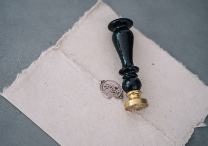
Ancient rulers pressed ciphers into wax and clay long before paper existed.
These marks authenticated documents, sealed treaties, and identified property across vast distances.
A symbol, once established, could speak for its owner in rooms that owner never entered.
That principle has not changed in several thousand years.
Medieval Europe refined the practice considerably, tying personal marks to lineage and land.
Institutions such as those documented by centuries of heraldic record preserved centuries of this heraldic record with remarkable precision.
A family’s emblem was not chosen casually.
It was granted, inherited, and defended, often across many generations.
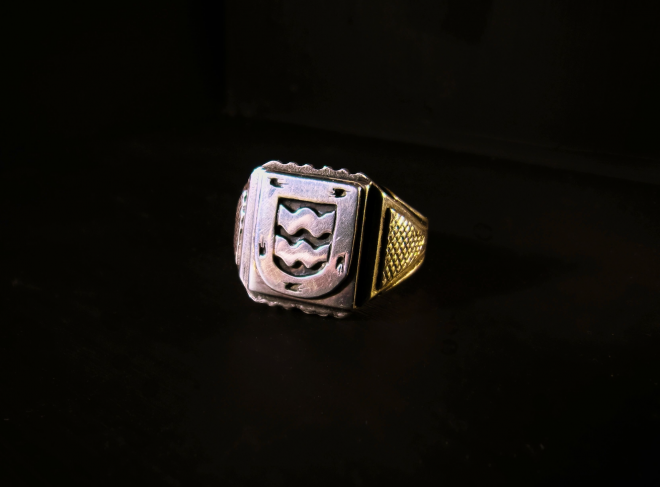
The monogram, in this context, functioned as a compressed form of heraldry.
Fewer elements, but no less intention behind each one.
Renaissance courts brought a new sensibility to the practice.
Artists and craftsmen began treating the monogram as a design problem worth solving elegantly.
Letterforms interlaced with the same rigor applied to architecture and manuscript illumination.
Collections held by institutions like museum collections still preserve objects marked this way.
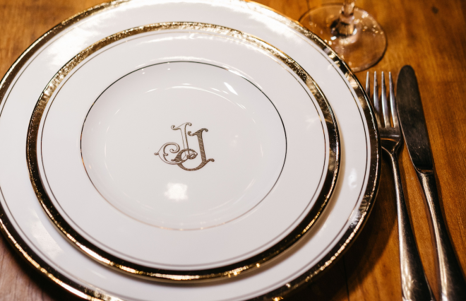
Silver, porcelain, and linen carried monograms as a matter of course among distinguished households.
The mark traveled with the object, and the object traveled with the family.
By the eighteenth century, the monogram had become a fixture of aristocratic life across Europe.
Royal households used monograms on correspondence, on stationery, and on ceremonial objects alike.
The archives maintained by royal archives offer a rare window into how carefully these marks were considered.
Nothing about a royal cipher was left to chance.
Proportion, balance, and symbolism were treated with the same gravity as a coat of arms.
The nineteenth century widened the practice beyond royal and noble households.
A rising merchant and professional class adopted the monogram as a mark of arrival.
It signaled taste, education, and a certain seriousness about one’s own identity.
This period also formalized much of the heraldic language still referenced today.
Organizations such as the formal language of heraldry continue to document and interpret that formal language for contemporary audiences.
The twentieth century introduced new materials and new applications for the personal mark.
Monograms appeared on luggage, on automobiles, and eventually on the earliest branded goods.
Yet the underlying logic remained unchanged from its medieval origins.
A mark exists to say: this belongs to someone in particular.
Contemporary custom monograms inherit this entire lineage, whether the client is aware of it or not.
Choosing a personal mark today still means participating in a very old conversation.
The tools have changed considerably.
The impulse behind the practice has not changed at all.
It is easy to forget how much deliberation went into marks that now seem simply decorative.
A royal cipher was rarely the work of a single afternoon, no matter how effortless it appears today.
Court artists studied proportion, precedent, and symbolism before committing to a final composition.
Mistakes were not easily corrected once a mark had been engraved into silver or stone.
This permanence forced a level of care that modern, easily revised design sometimes lacks.
There is something instructive in that constraint for contemporary practice.
Working as though a decision were permanent tends to produce better decisions.
Even where revision is technically possible, treating the mark as final sharpens the process considerably.
This is one lesson the atelier draws directly from centuries of heraldic and royal precedent.
Another lesson concerns restraint, which recurs throughout this history with surprising consistency.
The most celebrated historical marks were rarely the most elaborate ones.
They were, instead, the most legible, the most balanced, and the most quietly confident.
Ornamentation was added sparingly, and only where it served the composition as a whole.
This preference for restraint over excess has aged remarkably well across several centuries.
It remains the clearest guiding principle for anyone designing a personal mark today.
Antiquity
The Sealed Mark
Rulers and merchants used engraved ciphers to authenticate documents and goods across distance.
Medieval Europe
Heraldic Formalization
Personal marks became tied to lineage, land, and formally granted family emblems.
Renaissance
The Designed Cipher
Interlaced letterforms were treated as a serious design discipline, applied to silver and stationery.
18th–19th Century
Aristocratic Refinement
Royal households and rising professional classes alike adopted the monogram as a mark of distinction.
20th Century
New Applications
The personal mark expanded onto luggage, correspondence, and early branded identity systems.
Present Day
The Custom Commission
Custom monograms now serve individuals, families, and brands who value permanence over trend.
LUXURY IDENTITY
The Meaning of Custom
The word custom is used loosely across the design world, often without much justification.
A font selected from a menu is not a custom monogram, regardless of how it is marketed.
Custom, properly understood, means built from first principles for one specific person.
That distinction matters more than most buyers initially realize.
A generic monogram generator applies the same underlying logic to every set of initials it receives.
It cannot account for the particular geometry of your letters, only an approximation of them.
It cannot account for the story you want the mark to carry, because it was never told one.
A custom monogram begins from the opposite direction entirely.
The letters are studied individually before they are combined.
Some pairings interlace naturally, and others require considerable adjustment to read cleanly.
A skilled hand recognizes which letters resist combination and compensates with proportion and spacing.
This is invisible work, in the sense that the client rarely sees the failed attempts.
They see only the final resolution, which is precisely the point.
Custom monograms also account for application in a way templates cannot.
A mark intended for a signet ring behaves differently than one intended for stationery.
A design intended for engraving must simplify in ways a printed mark does not require.
Scale changes everything about a monogram’s construction.
A custom process treats each intended surface as a separate design problem, not an afterthought.
This is precisely the diligence a generic template is not built to provide.
What reads elegantly at two inches may collapse into illegibility at a quarter inch.
Custom work anticipates every scale the mark will actually encounter.
This is why a proper commission includes testing across materials and sizes before anything is finalized.
Generic monograms are rarely tested this way, because testing is expensive and templates are not meant to be.
The economics of mass production and the economics of custom work pull in opposite directions.
One rewards speed and volume.
The other rewards precision and restraint.
Clients who understand this distinction rarely return to generic solutions once they have experienced custom work.
The difference is not subtle to a trained eye, and it becomes less subtle to an untrained one over time.
Custom monograms are also, by definition, exclusive to their owner.
No template library, no matter how vast, can offer this guarantee.
A design drawn once, for one client, cannot appear on someone else’s luggage the following year.
That exclusivity carries real weight for clients building a lasting personal or family identity.
It is the same logic that has always separated bespoke tailoring from ready-to-wear clothing.
The finished garment may look similar from a distance.
Up close, the difference in fit, in intention, and in permanence is unmistakable.
Custom monograms operate under the same principle, applied to identity rather than fabric.
There is also a question of intention that separates the two approaches entirely.
A generic tool asks only for your letters; it never asks why those letters matter to you.
A proper commission asks that question first, and lets the answer inform every decision that follows.
This is not a marketing distinction so much as a structural one.
The workflow itself is organized differently depending on which question comes first.
Templates are organized around output speed, because volume is the entire business model behind them.
Custom commissions are organized around outcome quality, because a single mark is the entire deliverable.
These are not compatible priorities, however much marketing language sometimes suggests otherwise.
A studio cannot optimize simultaneously for speed at scale and depth for one client.
Choosing custom work means choosing depth, and accepting the patience that depth requires.
Most clients who make this choice report the same realization afterward.
They had underestimated how much the process itself would reveal about their own preferences.
Reviewing early letterform studies tends to clarify what a client actually wants, even when they could not articulate it beforehand.
This clarifying function is, in its own way, as valuable as the finished mark.
A template offers no equivalent moment of reflection, because it offers no process to reflect on.
Custom Monogram vs. Generic Template
Consideration
Custom Monogram
Generic Template
Design origin
Drawn individually for one client
Applied identically to any name
Letterform testing
Tested across scale and material
Rarely tested beyond a preview screen
Exclusivity
Unique to a single owner
Available to any purchaser
Symbolic depth
Reflects personal or family narrative
Carries no specific narrative
Longevity
Designed to be inherited
Designed to be replaced
Application range
Adapted for engraving, print, and fabric
Optimized for a single generic use
THE ART OF MONOGRAMS
The Personal Monogram
Every custom commission is, at its heart, a personal monogram before it is anything else.
The word personal is not sentimental filler here.
It describes the actual mechanics of how the mark comes into being.
A true bespoke monogram cannot be separated from the individual whose initials it carries.
The letterforms may follow classical conventions, but their arrangement responds to a specific brief.
Some clients want restraint above all else, a mark that whispers rather than announces.
Others want a monogram substantial enough to anchor a signet ring or a library bookplate.
Neither preference is more correct than the other.
Both require the same underlying discipline to execute well.
The personal monogram also functions as a kind of quiet biography.
A single initial might honor a grandparent’s given name, carried forward by design rather than words.
Two interlaced initials might commemorate a marriage without stating the obvious explicitly.
Three initials arranged in a traditional hierarchy might signal formality, tradition, or professional standing.
The choices are small, but they accumulate into something with genuine meaning.
This is where a custom process earns its value most clearly.
A template cannot ask which grandparent, or why that particular arrangement matters to you.
A considered commission can, and often does, change its final form because of the answer.
The personal monogram also travels well across a client’s life.
A mark composed thoughtfully at twenty-five can still feel correct at sixty.
This is because the design was never chasing a trend in the first place.
It was answering a specific question about identity, and that question does not expire.
Trends, by contrast, expire reliably and often quickly.
A monogram built to follow one will need replacing within a decade, sometimes sooner.
This is a quiet but persuasive argument for restraint in the design process itself.
The most enduring personal monograms tend to avoid ornament for its own sake.
Every flourish must justify its presence, or it is removed.
This editing process is unglamorous, but it is the actual work of the craft.
Clients rarely see the discarded versions, only the mark that survived scrutiny.
That survival is not an accident.
It is the result of a process built specifically to test whether a mark deserves to last.
A personal monogram, once finished, should feel less designed than discovered.
As though the letters were always going to resolve this way, given enough attention.
That feeling of inevitability is the clearest signal that the commission has succeeded.
It is also, not coincidentally, the hardest quality to manufacture at scale.
There is a particular satisfaction clients describe upon seeing a finished personal monogram for the first time.
It is rarely surprise, in the sense of encountering something unexpected.
It is closer to recognition, as though the mark confirms something the client already sensed about themselves.
This response is difficult to manufacture through a template, however sophisticated the underlying software.
Software can generate combinations quickly, but it cannot recognize a client’s own sense of self.
Only a conversation, however brief, can begin to approach that recognition.
This is why the consultation stage of a commission is never treated as a formality.
It is treated as the foundation the entire mark will eventually rest upon.
Skipping or rushing this stage tends to produce technically competent marks that still feel slightly hollow.
The letters are correct, the proportions are sound, and yet something essential is missing.
That missing element is almost always a genuine understanding of the person behind the initials.
Restoring that understanding to the center of the process is the entire purpose of a personal monogram commission.
Single Initial
A quiet, restrained mark suited to correspondence, linens, and understated personal objects.
Interlaced Pair
Two letters woven together, often chosen to mark a marriage or a close family bond.
Traditional Triad
Three initials arranged by classical convention, favoring formality and inherited structure.
Cipher Composition
A denser interlace built for engraving, signet work, and objects meant to be held closely.
LUXURY IDENTITY
The Classic Monogram
Classic and contemporary are not opposites in monogram design, though they are often treated that way.
A classic monogram simply draws on proportions and conventions established over centuries of practice.
This does not mean the mark looks old-fashioned or dated.
It means the mark is built on principles that have already survived changing tastes.
Proportion is the first of these principles, and the least negotiable.
Letters must relate to one another with a balance the eye accepts instinctively.
Too much weight on one letter, and the composition tips visually off balance.
Too little contrast between letters, and the arrangement reads as noise rather than a mark.
Classical monogram design solved these problems long before modern software existed to test them.
Restraint is the second principle, and perhaps the more difficult one to honor.
It is tempting to add flourish to justify the effort behind a commission.
The most experienced hands resist that temptation almost entirely.
A classic monogram earns its presence through precision, not through decoration.
Every curve, serif, and interlace serves the legibility and balance of the whole.
Nothing is included merely because it can be.
Symmetry, or its deliberate absence, is the third principle worth understanding.
Some initials interlace naturally into a symmetrical composition.
Others require asymmetry to read clearly, and forcing symmetry onto them weakens the result.
Recognizing which approach a given set of letters requires takes considerable experience.
This is not a decision that can be automated reliably, regardless of the software involved.
Classic monograms also draw meaningfully from heraldic convention, even without a formal coat of arms attached.
The hierarchy of letters, the direction of interlace, and the framing devices used all descend from that tradition.
A designer fluent in this history brings a vocabulary that shortcuts cannot replicate.
This fluency shows up in small decisions throughout a commission.
Where to place the dominant letter, how much negative space to preserve, when to simplify further.
None of these decisions are arbitrary once you understand the tradition behind them.
A classic monogram, done properly, should feel timeless rather than merely old.
Timeless design ages without embarrassment.
Old design ages into a specific decade and stays there, uncomfortably, for the owner.
This is the standard the atelier holds itself to on every commission.
Not novelty for its own sake, and not nostalgia for its own sake either.
Simply proportion, restraint, and symbolism, applied with genuine care to a specific name.
That combination is harder to achieve than it sounds, and rarer than most people assume.
It is also, when achieved, unmistakable.
Clients tend to recognize a well-proportioned classic monogram even before they can explain why it works.
This instinctive recognition is, in a sense, the entire test a finished mark must pass.
If a client has to be persuaded that a mark is correct, the mark likely is not finished yet.
A properly resolved classic monogram tends to announce its own correctness without much explanation required.
This does not mean the process behind it was simple.
It means the difficulty was resolved before the client ever saw the result.
That is, in fact, the entire purpose of the refinement stage described later in this article.
Classic design, at its best, hides its own labor completely.
The viewer sees only balance, proportion, and quiet confidence.
They do not see the dozen discarded studies that preceded the final composition.
This invisibility of effort is not an accident, and it is not modesty for its own sake.
It reflects a specific belief about what a personal mark should communicate.
A monogram should communicate the owner’s identity, not the designer’s process.
Keeping process invisible is, paradoxically, some of the hardest work a designer performs.
THE ATELIER JOURNAL
The Atelier Process
A custom monogram commission unfolds in a deliberate sequence, rather than a single sitting.
Each stage exists to protect the quality of the final mark.
Skipping a stage tends to produce work that looks rushed, because it was.
The process begins with a private consultation rather than a questionnaire.
Names, dates, family history, and intended application all shape the brief from the outset.
This is where the commission becomes personal rather than procedural.
From there, initial letterform studies begin, exploring how the specific letters behave together.
Some combinations resolve quickly, and others take considerably longer to find their balance.
Multiple directions are typically explored before a single one is refined further.
This is not indecision; it is due diligence applied to a permanent object.
Once a direction is chosen, refinement begins in earnest.
Proportion, spacing, and weight are adjusted with a level of scrutiny most clients never fully see.
The mark is tested at the scales it will actually be used at, not merely on a screen.
A monogram destined for a signet ring is checked at ring scale specifically.
A monogram destined for stationery is checked against the exact stock it will be printed on.
This testing phase catches problems a generic process would never think to look for.
Only after this scrutiny does a mark move toward final approval.
The client reviews the refined direction and confirms every detail before anything is finalized.
Adjustments at this stage are still welcomed, because permanence deserves patience.
Once approved, the finished files are prepared for whatever application the client requires.
Engraving houses, stationers, and craftsmen each require slightly different file preparation.
Getting this technical detail right prevents costly mistakes further down the line.
The atelier oversees this handoff closely, rather than treating delivery as an afterthought.
A monogram is only as good as its worst execution, however well it was designed.
This is why the process does not end at the design file.
It ends when the mark exists correctly on the object it was always intended for.
That final step is often invisible to the client, and entirely essential to the result.
The entire sequence, from consultation to delivery, typically unfolds across several weeks.
Rushing any stage compromises the ones that follow it.
Patience, in this context, is not a virtue so much as a technical requirement.
Clients occasionally ask why the process cannot be compressed for an urgent occasion.
It sometimes can, within reason, but compression always comes at a cost somewhere in the sequence.
Usually that cost falls on the exploration stage, where fewer directions are tested before a final choice.
This is a reasonable tradeoff for a genuinely urgent occasion, and the atelier will say so plainly.
It is a poor tradeoff when urgency is simply a matter of preference rather than necessity.
Most clients, once the reasoning is explained, choose to protect the timeline rather than shorten it.
They recognize that a monogram intended to last decades deserves a process measured in weeks, not days.
This is not a sales position; it is simply an honest account of how good work gets made.
The same honesty applies to every stage of the sequence described here.
Nothing is hidden from the client, and nothing is rushed without their explicit understanding of the tradeoff.
This transparency is, in its own quiet way, part of what a client is actually commissioning.
01
Consultation
A private discussion establishes names, history, and the intended application of the mark.
→
02
Letterform Study
Initial combinations are explored to find how the specific letters interlace and balance.
→
03
Refinement
The chosen direction is tested across scale, material, and application before approval.
→
04
Client Review
The refined mark is presented for approval, with room for final adjustment.
→